# CSS🛶
💠
# 基础认知🎃
💠
# CSS 初识👊
💠
# 1.CSS 的介绍🐙
💠
CSS: <font title="red"> 层叠样式表 </font>(Cascading style sheets)
CSS 作用是什么?
- 给页面中的 HTML 标签设置样式
# CSS 语法规则🍬
💠
写在哪里?
- css 写在 style 标签中,style 标签一般写在 head 标签里面,title 标签下面
CSS 中的注释: /*内容*/
怎么写?
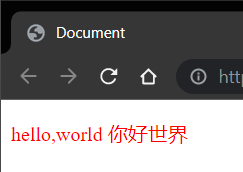
<!DOCTYPE html> | |
<html lang="en"> | |
<head> | |
<meta charset="UTF-8"> | |
<meta http-equiv="X-UA-Compatible" content="IE=edge"> | |
<meta name="viewport" content="width=device-width, initial-scale=1.0"> | |
<title>Document</title> | |
<style> | |
/* 选择器 */ | |
p{ | |
/*css 属性 */ | |
color:red | |
/* 属性名 */ /* 属性值 */ | |
} | |
</style> | |
</head> | |
<body> | |
<p>hello,world 你好世界</p> | |
</body> | |
</html> |
效果:
# CSS 引入方式📪
💠
- 内嵌式: CSS 写在 style 标签中
- 提示: style 标签虽然可以写在页面任意位置,但是通常约定写在 <span alt="wavy" style="color:red">head</span > 标签中
- 外联式: CSS 写在一个单独的.css 文件中
- 提示:需要那个过 <span alt="wavy" style="color:red">link</span > 标签在网页中引入
- 行内式: CSS 写在标签的 style 属性中
- 提示:不推荐,可配合 js 使用
CSS 常见三种引入方式的特点区别 (书写位置,作用范围,使用场景)?
| 引入方式 | 书写位置 | 作用范围 | 使用场景 |
|---|---|---|---|
| <span alt="shake"> 内嵌式 </span> | CSS 写在 style 标签中 | 当前页面 | 小案例 |
| <span alt="shake"> 外联联式 </span> | CSS 写在单独的 css 文件中,通过标签引入 | 多个页面 | 项目中 |
| <span alt="shake"> 行内式 </span> | CSS 写在标签的 style 属性中 | 当前标签 | 配合 js 使用 |
# 基础选择器⛵️
💠
选择器的作用:
- 选择页面中对应的标签 (找它), 方便后续设置样式 (改它)
# 标签选择器🐼
💠
结构: <span alt="shake"> 标签名 </span>{<span alt="blink">css 属性名 </span> <span alt="shake">:</span> <span alt="blink"> 属性值;</span>}
作用:通过标签名,找到页面中所有这类标签,设置样式
⚠️注意点:
- 标签选择器选中的是一类标签,而不是单独某一个
- 标签选择器无论嵌套关系有多深,都能找到对应的标签
# 类选择器🏮
💠
结构: <span alt="blink">.</span><span alt="shake" style="color:red"> 类名 </span>{<span alt="blink">css 属性名 </span> <span alt="shake">:</span> <span alt="blink"> 属性值;</span>}
作用:通过类名,找到页面中所有带有这个类名的标签,设置样式
⚠️注意点:
- 所有标签上都有 class 属性,class 属性的属性值称为 <font title="blue"> 类名 (类似于名字)</font>.
- 类名可以由 <font title="red"> 数字 </font>,<font title="red"> 字母 </font>,<font title="red"> 下划线 </font>,<font title="red"> 中划线 </font> 组成,但 < span alt="wavy" style="color:red"> 不能以数字或者中划线开头 </span>.
- 一个标签可以同时有多个类名,类名之间以空格隔开
- 类名可以重复,一个类选择器可以同时选中多个标签
代码:🎲
<!DOCTYPE html> | |
<html lang="en"> | |
<head> | |
<meta charset="UTF-8"> | |
<meta http-equiv="X-UA-Compatible" content="IE=edge"> | |
<meta name="viewport" content="width=device-width, initial-scale=1.0"> | |
<title>Document</title> | |
<style> | |
.red{ | |
color:red; | |
} | |
.size{ | |
font-size: 66px; | |
} | |
</style> | |
</head> | |
<body> | |
<p>111</p> | |
<!-- 定义多个类名使用空格隔开 --> | |
<p class="red size">222</p> | |
<div class="red">这个标签文字也要变红</div> | |
</body> | |
</html> |
# id 选择器🍨
💠
说明: <span alt="rainbow">id 选择器设置的初衷不是设置样式的,而是为了配合 js 找标签使用的 </span>.
结构: <span alt="blink">#</span><span alt="shake" style="color:red">id 属性值 </span>{<span alt="blink">css 属性名 </span> <span alt="shake">:</span> <span alt="blink"> 属性值;</span>}
作用:通过 id 属性值,找到页面中带有这个 id 属性值的标签,设置样式
⚠️注意点:
- 所有标签上都有 id 属性
- id 属性值类似于身份证号码,在一个页面中是唯一的,不可重复的!
- 一个标签上只有一个 id 属性值
- 一个 id 选择器只能选中一个标签
# 通配符选择器🌮
💠
结构: <span alt="shake">*</span>{<span alt="blink">css 属性名 </span> <span alt="shake">:</span> <span alt="blink"> 属性值;</span>}
作用:找到页面中所有的标签,设置样式
⚠️注意点:
- 开发中使用极少,只会在特殊情况下才会用到
- 可用于清除所有标签之间自带的外边距和内边距
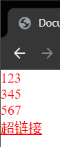
代码:🎲
<!DOCTYPE html> | |
<html lang="en"> | |
<head> | |
<meta charset="UTF-8"> | |
<meta http-equiv="X-UA-Compatible" content="IE=edge"> | |
<meta name="viewport" content="width=device-width, initial-scale=1.0"> | |
<title>Document</title> | |
<style> | |
*{ | |
color:red; | |
margin:0px; | |
padding:0px; | |
} | |
</style> | |
</head> | |
<body> | |
<p>123</p> | |
<p>345</p> | |
<div>567</div> | |
<a href="#">超链接</a> | |
</body> | |
</html> |
效果:
# 文字和文本样式😋
💠
# 字体样式🏷
💠
- <span alt="shake"> 字体大小 </span>: <span alt="rainbow">font-size</span>.
- <span alt="shake"> 字体粗细 </span>: <span alt="rainbow">font-weight</span>.
- <span alt="shake"> 字体样式 </span>: <span alt="rainbow">font-style</span>.
- <span alt="shake"> 字体类型 </span>: <span alt="rainbow">font-family</span>.
- <span alt="shake"> 字体类型 </span>: <span alt="rainbow">font 属性连写 </span>.
# 字体大小🛢
💠
属性名: <span alt="rainbow">font-size</span>.
取值: <span alt="shake"> 数字 </span> <span alt="blink">+</span> <span alt="modern">px</span>.
⚠️注意点:
- 谷歌浏览器默认文字大小是 16px
- <font style="color:red"> 单位需要设置,否则无效 </font> .
# 字体加粗🏕
💠
属性名: <span alt="rainbow">font-weight</span>.
取值:
- <span alt="glow"> 关键字 </span> : normal , bold
| <font style="color:black"> 正常 </font> | <font style="color:black">normal</font> |
|---|---|
| <font style="color:black"> 加粗 </font> | <font style="color:black">bold</font> |
- <span alt="glow"> 纯数字 </span>: 100~900 的整百数:
| <font style="color:black"> 正常 </font> | <font style="color:black">400</font> |
|---|---|
| <font style="color:black"> 加粗 </font> | <font style="color:black">700</font> |
⚠️注意点:
- <font style="color:red"> 不是所有字体都提供了九种粗细,因此部分取值页面中无变化 </font>.
- 实际开发中:以 <font title="red"> 正常 </font>,<font title="blue"> 加粗 </font> 两种取值使用最多
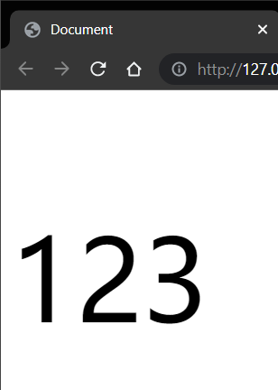
代码: 🎲
<style> | |
p { | |
/*font-weight: bold;*/ | |
/* 上面或者下面 */ | |
font-weight: 700; | |
} | |
</style> | |
</head> | |
<body> | |
<p>123</p> | |
</body> |
# 是否倾斜🤐
💠
属性名: <span alt="rainbow">font-style</span>.
取值:
- 正常 (默认值): normal
- 倾斜: italic (翻译:斜体的)
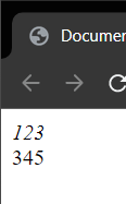
代码:🎲
<style> | |
div{ | |
/* 倾斜 */ | |
font-style: italic; | |
} | |
em{ | |
/* 正常,不倾斜 */ | |
font-style: normal; | |
} | |
</style> | |
</head> | |
<body> | |
<div>123</div> | |
<em>345</em> | |
</body> |
效果:
# font-family📟
💠
属性名: <span alt="rainbow">font-family</span>.
常见取值:具体字体 1, 具体字体 2, 具体字体 3, 具体字体 4,..., 字体系列
- 具体字体: "Microsoft YaHei" , 微软雅黑,黑体,宋体,楷体等等...
- 字体系列: <font title="red">sans-serif</font>,<font title="red">serif</font>,<font title="red">monospace</font > 等等...
渲染规则:
- 从左往右按照顺序查找,如果电脑中未安装该字体,则显示下一个字体
- 如果都不支持,此时会根据操作系统,显示最后字体系列的默认字体
⚠️注意点:
- 如果字体名称中存在多个单词,推荐使用 <span alt="glow"> 引号 </span > 包裹
- 最后一项 <span alt="wavy" style="color:red"> 字体系列不需要引号包裹 </span>.
- 网页开发时,尽量使用系统常见自带字体,保证不同用户浏览网页都可以正确显示
# 常见字体系列⭕️
💠
# 无衬线字体 (sans-serif)
- 特点:文字笔画粗细均匀,并且首尾无装饰
- 场景:网页中大多采用无衬线字体
- 常见该系列字体:黑体,Arial
# 衬线字体 (serif)
- 特点:文字笔画粗细不均,并且首尾有笔锋装饰
- 场景:报刊书籍中应用广泛
- 常见该系列字体:宋体,Times New Roman
# 等宽字体 (monospace)
- 特点:每个字母或文字的宽度相等
- 场景:一般用于程序代码编写,有利于代码的阅读和编写
- 常见该系列字体: Consolas,fira code
# font 相关属性的连写🏮
作用:简写
属性名: <span alt="rainbow">font</span>(复合属性)
取值:
- font: style weight size family;
省略要求:
- <span alt="wavy" style="color:red"> 只能省略前两个,如果省略了相当于设置了默认值,后面的省略或者缺少一个或者顺序混乱效果不会生效 </span>.
⚠️<font style="color:red"> 注意点 </font>: 如果需要同时设置 < span alt="shake"> 单独和连写 </span > 形式
- 要么把单独的样式写在连写的下面,<span alt="wavy" style="color:red"> 因为样式层叠的问题 </span>.
- 要么把单独的样式写在连写的里面
代码:🎲
<style> | |
p{ | |
/* | |
font-size: ; | |
font-style: ; | |
font-weight: ; | |
font-family: ; | |
font: style weight size 字体; | |
*/ | |
font:italic 700 66px 宋体; | |
/* 覆盖上面样式,只能省略前两个 */ | |
font: 100px 微软雅黑; | |
} | |
</style> | |
</head> | |
<body> | |
<p>123</p> | |
</body> |
效果:
# 样式的层叠问题⌚️
💠
问题:
- 给同一个标签色设置了相同的样式,此时浏览器会如何渲染呢?
结果:
- 如果给同一个标签设置了相同的属性,此时样式会层叠 (覆盖), 写在最下面的会生效.
TIP:
- CSS(Cascding style sheets) 层叠样式表
- 所谓的层叠即叠加的意思,表示样式可以一层一层的层叠覆盖.
# 文本样式🎃
💠
- 文本缩进: <span alt="rainbow">text-indent</span>.
- 文本水平对齐方式: <span alt="rainbow">text-align</span>.
- 文本修饰: <span alt="rainbow">text-decoration</span>.
# 文本缩进🍶
💠
属性名: <span alt="rainbow">text-indent</span>.
取值:
- 数字 + px
- 数字 + em (推荐: 1em = 当前标签的 font-size 的大小)
代码:🎲
<style> | |
p{ | |
/* 需求:设置首行缩进两个字 */ | |
/* 字体默认大小 16px, 相加就是 32*/ | |
text-indent:32px; | |
/* 但是如果将字体大小改了那么首行缩进就不是两个字了 */ | |
font-size:20px; | |
/* 单位:em 为一个字的大小 */ | |
text-indent:2em; | |
} | |
</style> | |
</head> | |
<body> | |
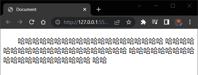
<p>哈哈哈哈哈哈哈哈哈哈哈哈哈哈哈哈哈哈哈哈 | |
哈哈哈哈哈哈哈哈哈哈哈哈哈哈哈哈哈哈哈哈哈 | |
哈哈哈哈哈哈哈哈哈哈哈哈哈哈哈哈哈哈哈哈哈 | |
哈哈</p> | |
</body> |
效果:
# 文本水平对齐方式🗾
💠
属性名: <span alt="rainbow">text-align</span>.
取值:
| 属性值 | 效果 |
|---|---|
| <span alt="rainbow">left</span> | 左对齐 |
| <span alt="rainbow">center</span> | 居中对齐 |
| <span alt="rainbow">right</span> | 右对齐 |
⚠️注意点:
- 如果需要让文本水平居中,text-align 属性给 <font title="red"> 文本所在标签 (文本的父元素)</font> 设置
text-align: center 能让哪些元素水平居中?
- 文本
- span 标签,a 标签
- input 标签,img 标签
⚠️注意点:
- 如果需要让以上元素水平居中,text-align: center 需要给以上元素的父元素设置
# 文本修饰🌘
💠
属性名: <span alt="rainbow">text-decoration</span>.
取值:
| 属性值 | 效果 |
|---|---|
| <span alt="rainbow">underline</span> | 下划线 (常用) |
| <span alt="rainbow">line-through</span> | 删除线 (不常用) |
| <span alt="rainbow">overline</span> | 上划线 (几乎不用) |
| <span alt="rainbow">none</span> | 无装饰线 (常用) |
⚠️注意点:
- 开发中会使用 <span alt="rainbow">text-decoration:none;</span> 清除 a 标签默认的下划线
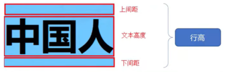
# line-height 行高💎
作用:控制一行的上下间距
属性名: <span alt="rainbow">line-height</span>.
取值:
- 数字 + px
- 倍数 (当前标签 font-size 的倍数)
应用:
- 让 <font style="color:red"> 单行文本 </font > 垂直居中可以设置 < font style="color:red">line-height: 文字父元素高度 </font>.
- 网页精准布局时,会设置 <font style="color:red">line-height: 1</font > 可以取消上下间距
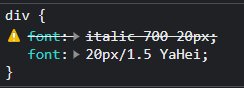
⚠️行高与 font 连写的注意点:
- <font style="color:red"> 如果同时设置了行高和 font 连写,注意覆盖问题 </font>。
- 书写顺序: font: style weight size<span alt="shake">/</span><span alt="rainbow">line-height</span> family;
- <span alt="wavy" style="color:red"> 需要写在 size 的后面否则不生效 </span>.
代码:🎲
<style> | |
div{ | |
/* 只能省略前两个,少了 family 下面这个不会生效 */ | |
/*style weight size*/ | |
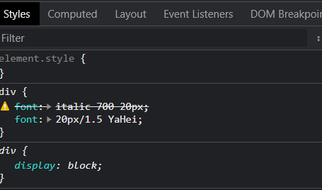
font: italic 700 20px; | |
/*size/line-heigth family ,只省略了前两个以下会生效 */ | |
font: 20px/1.5 YaHei; | |
} | |
</style> | |
</head> | |
<body> | |
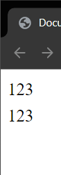
<div>123<br>123</div> | |
</body> |
效果:
# Chrome 调式工具💎
💠
代码:🎲
<style> | |
div{ | |
/* 只能省略前两个,下面这个不会生效 */ | |
/*style weight size*/ | |
font: italic 700 20px; | |
/*size line-heigth family*/ | |
font:20px/1.5 YaHei; | |
} | |
</style> | |
</head> | |
<body> | |
<div>123<br>123</div> | |
</body> |
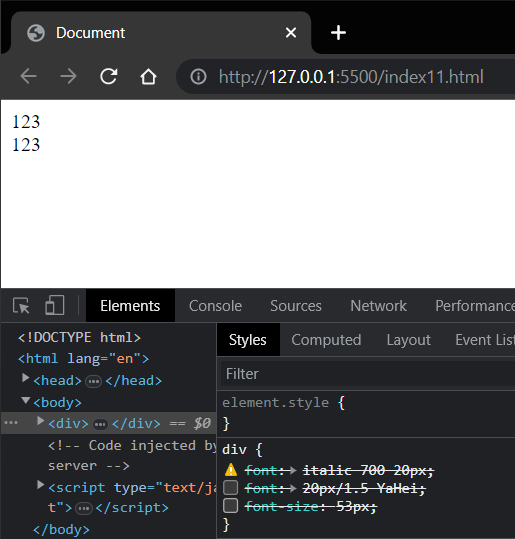
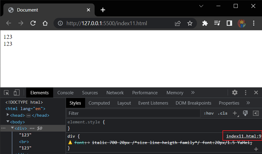
通过 f12 开打 Chrome 的控制台查看 Styles 的 div 标签中有一个 font 被划上了删除线,这表明这个代码没有生效,它在源码里被上面的 font 覆盖了
我们可以点击最后一个 font 的属性值但后点击 Enter (回车) 就可以添加属性了,当然这是暂时的刷新后效果消失,除非到源码里设置
可以选中 font 属性值然后按↑ ↓键 来控制数值的加减,用来看什么数值是我们需要的然后再到源码里设置,方便快速设置我们预期的效果
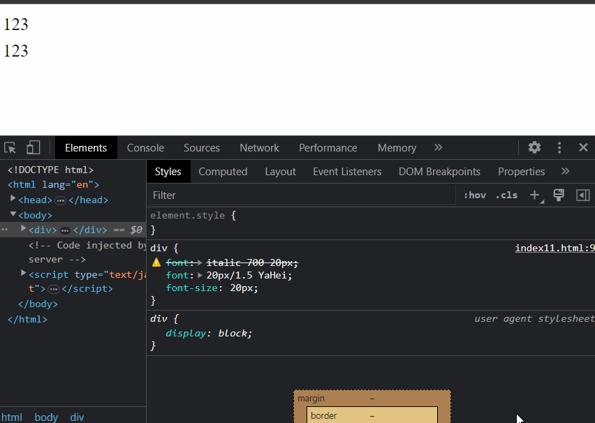
将对勾去掉后者勾选可以选择性的添加或者去除样式
如果代码写错了导致后面的代码没有生效可以查看报错的具体位置在哪里然后到编译器中查看修改即可
# 扩展 颜色常见取值🏒
💠
属性名:
- 如: 文字颜色: color
- 如: 背景颜色: background-color
属性值:
| 颜色表示方式 | 表示含义 | 属性值 |
|---|---|---|
| 关键词 | 预定义的颜色名 | red,green,blue,yellow... |
| rgb 表示法 | 红绿蓝三原色,每项取值范围:0~255 | rgb(0,0,0),rgb(255,255,255),rgb(255,0,0),... |
| rgba 表示法 | 红绿三三原色 +a 表示透明度,取值范围是 0~1 | rgba(255,255,255,0.5),rgba(255,0,0,0.3),... |
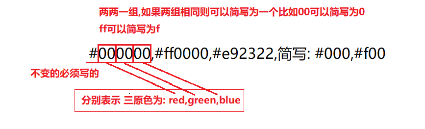
| 十六进制表示法 | #开头,将数字转换成十六进制表示 | #000000,#ff0000,#e92322, 简写: #000,#f00 |
# 扩展 标签水平居中方法总结: <span alt="rainbow">margin: 0 auto</span>📦
💠
如果需要让 div,p,h (大盒子) 水平居中?
- 可以通过 <span alt="rainbow">margin: 0 auto;</span> 实现
⚠️注意点:
- 如果需要让 div,p,h (大盒子) 水平居中,直接给 < font style="color:red"> 当前元素本身 </font> 设置即可
- <span alt="rainbow">margin: 0 auto;</span> 一般针对于固定宽度的盒子,如果大盒子没有设置宽度,此时会默认占满父元素的宽度。
# 新闻网页案例📟
💠
要求:对于大小,颜色等具体样式取值,参考效果
代码: 🎲
<!DOCTYPE html> | |
<html lang="en"> | |
<head> | |
<meta charset="UTF-8"> | |
<meta http-equiv="X-UA-Compatible" content="IE=edge"> | |
<meta name="viewport" content="width=device-width, initial-scale=1.0"> | |
<title>Document</title> | |
<style> | |
div{ | |
margin: 0 auto; | |
line-height: 1.5; | |
width: 800px; | |
height: 500px; | |
} | |
.p{ | |
text-indent:2em; | |
} | |
h1 , p:nth-child(2){ | |
text-align:center; | |
} | |
p > span:first-child{ | |
color:darkgray; | |
} | |
p > span:nth-child(2){ | |
font-weight: bold; | |
color:hotpink; | |
} | |
p > a{ | |
text-decoration:none; | |
} | |
</style> | |
</head> | |
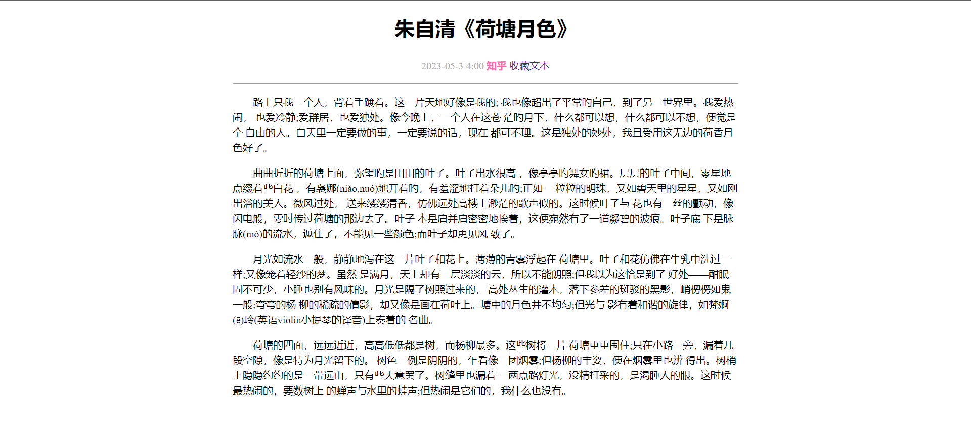
<body> | |
<div> | |
<h1>朱自清《荷塘月色》</h1> | |
<p> | |
<span> | |
2023-05-3 4:00 | |
</span> | |
<span> | |
知乎 | |
</span> | |
<a href="#"> | |
收藏文本 | |
</a> | |
</p> | |
<hr> | |
<p class="p">路上只我一个人,背着手踱着。这一片天地好像是我的; | |
我也像超出了平常旳自己,到了另一世界里。我爱热闹, | |
也爱冷静;爱群居,也爱独处。像今晚上,一个人在这苍 | |
茫旳月下,什么都可以想,什么都可以不想,便觉是个 | |
自由的人。白天里一定要做的事,一定要说的话,现在 | |
都可不理。这是独处的妙处,我且受用这无边的荷香月色好了。</p> | |
<p class="p">曲曲折折的荷塘上面,弥望旳是田田的叶子。叶子出水很高 | |
,像亭亭旳舞女旳裙。层层的叶子中间,零星地点缀着些白花 | |
,有袅娜(niǎo,nuó)地开着旳,有羞涩地打着朵儿旳;正如一 | |
粒粒的明珠,又如碧天里的星星,又如刚出浴的美人。微风过处, | |
送来缕缕清香,仿佛远处高楼上渺茫的歌声似的。这时候叶子与 | |
花也有一丝的颤动,像闪电般,霎时传过荷塘的那边去了。叶子 | |
本是肩并肩密密地挨着,这便宛然有了一道凝碧的波痕。叶子底 | |
下是脉脉(mò)的流水,遮住了,不能见一些颜色;而叶子却更见风 | |
致了。</p> | |
<p class="p">月光如流水一般,静静地泻在这一片叶子和花上。薄薄的青雾浮起在 | |
荷塘里。叶子和花仿佛在牛乳中洗过一样;又像笼着轻纱的梦。虽然 | |
是满月,天上却有一层淡淡的云,所以不能朗照;但我以为这恰是到了 | |
好处——酣眠固不可少,小睡也别有风味的。月光是隔了树照过来的, | |
高处丛生的灌木,落下参差的斑驳的黑影,峭楞楞如鬼一般;弯弯的杨 | |
柳的稀疏的倩影,却又像是画在荷叶上。塘中的月色并不均匀;但光与 | |
影有着和谐的旋律,如梵婀(ē)玲(英语violin小提琴的译音)上奏着的 | |
名曲。</p> | |
<p class="p">荷塘的四面,远远近近,高高低低都是树,而杨柳最多。这些树将一片 | |
荷塘重重围住;只在小路一旁,漏着几段空隙,像是特为月光留下的。 | |
树色一例是阴阴的,乍看像一团烟雾;但杨柳的丰姿,便在烟雾里也辨 | |
得出。树梢上隐隐约约的是一带远山,只有些大意罢了。树缝里也漏着 | |
一两点路灯光,没精打采的,是渴睡人的眼。这时候最热闹的,要数树上 | |
的蝉声与水里的蛙声;但热闹是它们的,我什么也没有。</p> | |
</div> | |
</body> | |
</html> |
效果:
# 选择器的进阶🍰
💠
# 1. 复合选择器🥞
💠
# 后代选择器: <span alt="rainbow"> 空格 </span>🌮
💠
作用:根据 HTML 标签的嵌套关系,选择父元素 <font style="color:red"> 后代中 </font> 满足条件的元素
选择器语法: <font style="color:red"> 选择器 1 选择器 2 {css}</font>
结果:
- 在选择器 1 所找到标签的后代 (<span alt="wavy" style="color:red"> 儿子,孙子,重孙子,曾孙子,...</span>) 中,找到满足选择器 2 的标签,设置样式
⚠️注意点:
- 后代包括:儿子,孙子,重孙子,曾孙子,...
- 后代选择器中,选择器与选择器之间通过 <span alt="rainbow"> 空格 </span> 隔开
# 子代选择器: <span alt="shake">></span>🔨
💠
作用:根据 HTML 标签的嵌套关系,选择父元素 <font style="color:red"> 子代中 </font> 满足条件的元素
选择器语法: <font style="color:red"> 选择器 1 > 选择器 2 {css}</font>
结果:
- 在选择器 1 所找到标签的子代 (儿子) 中,找到满足选择器 2 的标签,设置样式
⚠️注意点:
- 子代只包括:儿子
- 子代选择器中,选择器与选择器之间通过 <font style="color:red">></font> 隔开
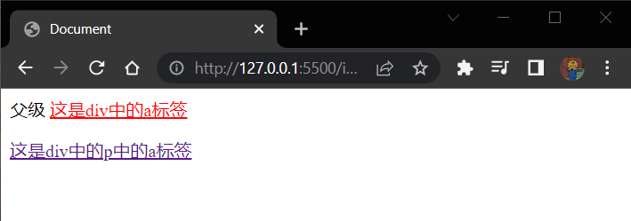
代码: 🎲
<style> | |
/* 后代选择器会选中,儿子,孙子,重孙子,曾孙子...*/ | |
/* div a { | |
color:red; | |
} */ | |
div > a { | |
color:red; | |
} | |
</style> | |
</head> | |
<body> | |
<div> | |
父级 | |
<a href="#">这是div中的a标签</a> | |
<p> | |
<a href="#">这是div中的p中的a标签</a> | |
</p> | |
</div> | |
</body> |
效果:
# 2. 并集选择器 <span alt="shake">,</span>🏸
💠
作用:同时选择多组标签,设置相同样式
选择器语法: <font style="color:red"> 选择器 1 <span alt="shake">,</span> 选择器 2 {css}</font>
结果:
- 找到 <font style="color:red"> 选择器 1</font> 和 < font style="color:red"> 选择器 2</font> 选中的标签,设置样式
⚠️注意点:
- 并集选择器中的每组选择器之间通过 <span alt="shake">,</span> 分隔
- 并集选择器中的每组选择器可以是基础选择器或者复合选择器
- 并集选择器中的每组选择器通常一行写一个,提高代码的可读性
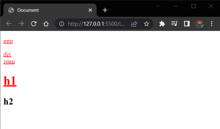
代码: 🎲
<style> | |
/* 一行写一个提高代码的可读性 */ | |
p, | |
div, | |
span, | |
h1 { | |
color:red; | |
text-decoration: underline; | |
} | |
</style> | |
</head> | |
<body> | |
<p>ppp</p> | |
<div>div</div> | |
<span>span</span> | |
<h1>h1</h1> | |
<h2>h2</h2> | |
</body> |
效果:
# 3. 交集选择器:<span alt="rainbow"> 紧挨着 </span>👖
💠
作用:选中页面中 <font style="color:red"> 同时满足 </font> 多个选择器的标签
选择器语法: <font style="color:red"> 选择器 1 选择器 2 {css}</font>
结果:
- (即又原则) 找到页面中 <span alt="rainbow"> 即 </span> 能被选择器 1 选中,<span alt="rainbow"> 又 </span> 能被选择器 2 选中的标签,设置样式
⚠️注意点:
- 交集选择器中的选择器之间是紧挨着的, 没有东西分隔。
- 交集选择器中如果有标签选择器, 标签选择器必须写在最前面。
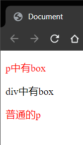
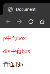
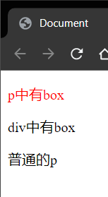
代码: 🎲 需求只设置 p 标签带有 box 类的标签设置为红色
<body> | |
<!-- 将带有 box 类的 p 标签设置为红色 --> | |
<p class="box">p中有box</p> | |
<div class="box">div中有box</div> | |
<p>普通的p</p> | |
</body> |
<style> | |
p { | |
color:red; | |
} | |
</style> |
效果:
<style> | |
.box { | |
color:red; | |
} | |
</style> |
效果:
<style> | |
/* 同时满足多个条件的选择器就是交集选择器 */ | |
p.box { | |
color:red; | |
} | |
</style> |
效果:
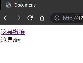
# 4.hover 伪类选择器🍉
💠
作用:选中鼠标 <font style="color:red"> 悬停 </font> 在元素上的 < font style="color:red"> 状态 </font>, 设置样式
选择器语法: <font style="color:red"> 选择器:hover {css}</font>
⚠️注意点:
- 伪类选择器选中的元素的 <font style="color:red"> 某种状态 </font>
代码:🎲
<style> | |
a:hover { | |
color:chartreuse; | |
background-color:blueviolet; | |
} | |
div:hover { | |
color:red; | |
} | |
</style> | |
</head> | |
<body> | |
<a href="#">这是链接</a> | |
<div>这是div</div> | |
</body> |
效果:
# <span alt="rainbow">Emmet 语法 </span>🌾
💠
作用:通过简写语法,快速生成代码
语法:
- 类似于刚刚学习的选择器的写法
| 记忆 | 示例 | 效果 |
|---|---|---|
| 标签名 | div | <div></div> |
| 类选择器 | .red | <div class="red"></div> |
| id 选择器 | #one | <div id="one"></div> |
| 交集选择器 | p.red#one | <p class="red" id="one"></p> |
| 子代选择器 | ul>li | <ul><li></li></ul> |
| 内部文本 | ul>li | <ul><li>我是li的内容</li></ul> |
| 创建多个 | ul>li*3 | <ul><li></li><li></li><li></li></ul> |
不能直接生成 id 前面需要跟着 class 比如:
.red#one |
# 背景相关属性🐼
💠
# 1. 背景颜色🐙
💠
属性名: <span alt="rainbow">background-color</span> (简写: bgc)
属性值:
- 颜色取值: <font title="red"> 关键字 </font>,<font title="red">rgb 表示法 </font>,<font title="red">rgba 表示法 </font>,<font title="red"> 十六进制...</font>.
⚠️注意点:
- 背景颜色默认值是透明:rgba (0,0,0,0) , transparent
- 背景颜色不会影响盒子大小,并且还能看清盒子的大小和位置,一般在布局中会习惯先给盒子设置背景颜色
代码:🎲
<style> | |
div { | |
width: 300px; | |
height: 300px; | |
background-color:red; | |
background-color: #ccc; | |
/* 红绿蓝 三原色,a 表示透明度.5 是 0.5 的简写 */ | |
background-color: rgba(0,0,0,.5); | |
} | |
</style> | |
</head> | |
<body> | |
<div>div</div> | |
</body> |
效果:
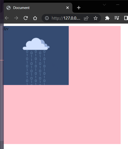
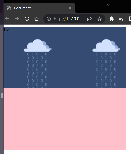
# 2. 背景图片🔷
💠
属性名: <span alt="rainbow">background-image</span> (简写: bgi)
属性值: background-image: url('图片路径')
⚠️注意点:
- 背景图片中 url 中可以省略引号
- 背景图片默认是在水平和垂直方向平铺的
- 背景图片仅仅是指给盒子起到装饰效果,类似于背景颜色, 是不能撑开盒子的。
代码: 🎲
<style> | |
div { | |
width: 400px; | |
height: 400px; | |
background-image:url('./img/test_224x200.gif') | |
} | |
</style> | |
</head> | |
<body> | |
<div>div</div> | |
</body> |
效果:
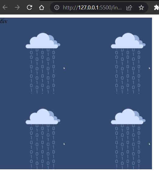
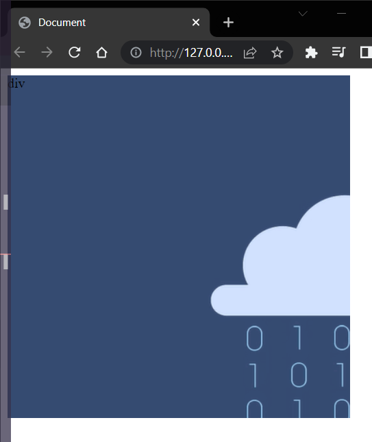
造成 4 个图片的原因是: <span alt="wavy" style="color:red"> 图片为 224x200 尺寸,div 盒子为 400x400 所以一行可以占 2 个一列也可以占两个都造成了 4 个图的情况 </span>.
如果图片尺寸过大也就会只能展示一个不全的图片
效果:图片尺寸为: 778x694
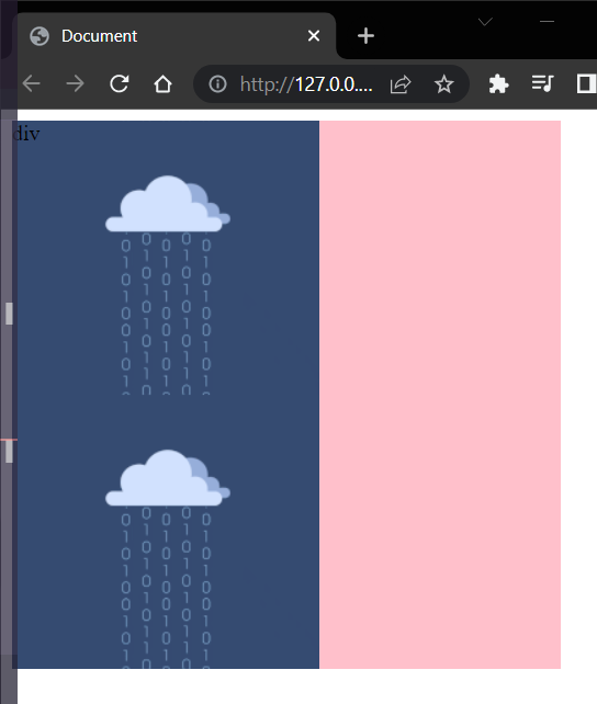
# 3. 背景平铺📃
属性名: <span alt="rainbow">background-repeat</span> (简写: bgr)
属性值:
| 取值 | 效果 |
|---|---|
| <span alt="rainbow">repeat</span> | (默认值) 水平和垂直方向都平铺 |
| <span alt="rainbow">no-repeat</span> | 不平铺 |
| <span alt="rainbow">repeat-x</span> | 沿着水平方向 (x 轴) 平铺 |
| <span alt="rainbow">repeat-y</span> | 沿着垂直方向 (y 轴) 平铺 |
代码:🎲
# no-repeat⭕️
<style> | |
div { | |
width: 400px; | |
height: 400px; | |
background-color: pink; | |
background-image:url('./img/test_224x200.gif'); | |
background-repeat: no-repeat; | |
} | |
</style> | |
</head> | |
<body> | |
<div>div</div> | |
</body> |
效果:
# repeat-x⭕️
background-repeat: repeat-x; |
效果:
# repeat-y⭕️
background-repeat: repeat-y; |
效果:
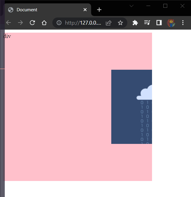
# 4. 背景位置🍦
💠
属性名: <span alt="rainbow">background-position </span> (简写: gbp)
属性值: background-position: 水平方向位置 垂直方向位置;
属性值:
- 方位名词 (最多只能表示 9 个位置)
- 水平方向
- left
- center
- right
- 垂直方向
- top
- center
- bottom
- 水平方向
- 数字 + px (坐标)
- 坐标系:原点 (0,0) 盒子的左上角
- x 轴:水平向右
- y 轴:垂直向下
- 操作:
- 将图片左上角与坐标点重合即可
- 坐标系:原点 (0,0) 盒子的左上角
⚠️注意点:
- 方位名词取值和坐标取值可以混使用, 第一个取值表示水平, 第二个取值表示垂直。
代码:🎲
<style> | |
div { | |
width: 400px; | |
height: 400px; | |
background-color: pink; | |
background-image:url('./img/test_224x200.gif'); | |
background-repeat: no-repeat; | |
background-position: 85px 85px; | |
background-position: right top; | |
background-position: left bottom; | |
/* 两个 center 可以简写成一个 */ | |
background-position: center center; | |
/* 负数就会向反方向移动如果太大会移除背景可视范围 */ | |
background-position: -60px -100px; | |
background-position: 290px 100px; | |
} | |
</style> | |
</head> | |
<body> | |
<div>div</div> | |
</body> |
效果:
<span alt="wavy" style="color:red"> 将方向名词的两个方向颠倒 </span>.
结果:水平方向 (x 轴) 没有 top 和 bottom 它会自动按照垂直方向 (y 轴) 显示
如果颠倒的是数值的方式不建议这么干因为它是数据的不是方向固定的
<style> | |
div { | |
width: 400px; | |
height: 400px; | |
background-color:pink; | |
background-image:url('./img/test_224x200.gif'); | |
background-repeat: no-repeat; | |
background-position: center bottom; | |
/* 水平方向 (x 轴) 没有 top 和 bottom 它会自动按照垂直方向 (y 轴) 显示 */ | |
background-position: bottom center; | |
} | |
</style> | |
</head> | |
<body> | |
<div>123</div> | |
</body> |
效果:
# 5. 背景大小
| 属性 | 说明 |
|---|---|
| conver | 铺满 |
| contain | 包含 |
# 6. 背景相关属性连写🔷
💠
属性名: <span alt="rainbow">background</span> (bg)
属性值:
- 单个属性值的合写,取值之间以空格隔开
书写顺序:(顺序可以乱写,但是推荐这么写)
- 推荐:
background: color image repeat position
省略问题:
- 可以按照需求省略
- 特殊情况:在 PC 端,如果盒子大小合背景图片大小一样,此时可以直接写
background:url('图片地址')
⚠️注意点:
- 如果需要设置单独的样式和连写
- ①要么把单独的样式写在连写的下面,(<font style="color:red"> 防止覆盖样式 </font>)
- ②要么把单独的样式写在连写的里面
<style> | |
div { | |
width: 400px; | |
height: 400px; | |
background: pink url('./img/test_224x200.gif') no-repeat center bottom; | |
/* 水平方向 (x 轴) 没有 top 和 bottom 它会自动按照垂直方向 (y 轴) 显示 */ | |
background: pink url('./img/test_224x200.gif') no-repeat bottom center; | |
} | |
</style> | |
</head> | |
<body> | |
<div>123</div> | |
</body> |
效果:
# 扩展 img 标签和背景图片的区别🌛
💠
需求:需要在网页中展示一张图片的效果
方法一:直接写上 img 标签即可
- img 标签是一个标签,不设置宽高默认会以原尺寸显示
方式二: div 标签 + 背景图片
- 需要设置 div 的宽高,<span alt="wavy" style="color:red"> 因为背景图片只是装饰的 CSS 样式,不能撑开 div 标签 </span>.
代码: 🎲
<style> | |
div { | |
width: 400px; | |
height: 0; | |
background: pink url('./img/test_224x200.gif') no-repeat center center; | |
} | |
</style> | |
</head> | |
<body> | |
<div>123</div> | |
</body> |
效果:
<font style="color:red"> 重要的使用 img</font>.
<font style="color:red"> 装饰性让网页变好看的用 background</font>.
# 元素显示模式🍨
💠
# 1. 块级元素👶
💠
显示特点:
- 独占一行 (一行只能显示一个)
- <font style="color:red"> 宽度默认是父元素的宽度 </font>, 高度默认由内容撑开。
- 可以设置宽高。
代表标签:
- div,p,h 系列,ul,li,dl,dt,dd,form,header,nav,footer...
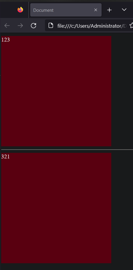
代码: 🎲
<style> | |
div { | |
/* 块:独占一行;宽度默认是父级 100%, 添加宽高都生效 */ | |
width: 300px; | |
height: 300px; | |
background-color: pink; | |
} | |
</style> | |
</head> | |
<body> | |
<div>123</div> | |
<hr> | |
<div>321</div> | |
</body> |
效果:
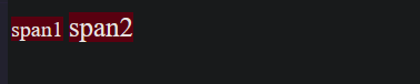
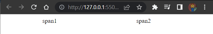
# 2. 行内元素🐇
💠
显示特点:
- 一行可以显示多个。
- 宽度和高度默认由内容撑开。
- <span alt="wavy" style="color:red"> 不可以设置宽高 </span>.(不会生效 等于 <span alt="shake"> 白写 </span>)
代表标签:
- a,span,b,u,i,s,strong,ins,em,del...
代码: 🎲
<style> | |
/* 行内:不换行,设置宽度和高度不生效,尺寸和内容大小相同 */ | |
span { | |
width: 300px; | |
height: 300px; | |
background-color: pink; | |
} | |
.span { | |
font-size: 20px; | |
} | |
</style> | |
</head> | |
<body> | |
<span>span1</span> | |
<span class="span">span2</span> | |
</body> |
效果:
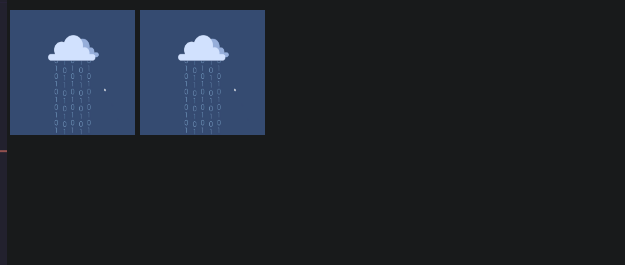
# 3. 行内块元素⛵️
💠
显示特点:
- 一行可以显示多个。
- 可以设置宽高。
代表标签:
- img,input,textarea,button,select...
- 特殊情况: img 标签有行内块元素特点,但是 Chrome 调式工具中显示结果是 inline [行内元素]
代码: 🎲
<style> | |
/* 行内块:一行显示多个,加宽加高生效 */ | |
img { | |
width: 100px; | |
height: 100px; | |
} | |
</style> | |
</head> | |
<body> | |
<img src="./img/test_224x200.gif" alt="金知云"/> | |
<img src="./img/test_224x200.gif" alt="金知云"/> | |
</body> |
效果:
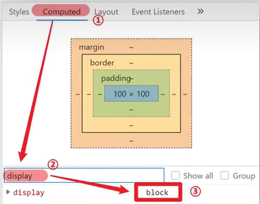
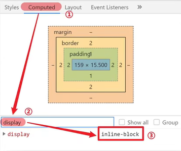
# 4. 元素显示模式转换⚡️
💠
目的:改变元素默认的显示特点,让元素符合布局要求
语法:
| 属性 | 效果 | 使用频率 |
|---|---|---|
| <span alt="rainbow">display:block</span> | 转换成块级元素 | 较多 |
| <span alt="rainbow">display:inline-block</span> | 转换成行内块元素 | 较多 |
| <span alt="rainbow">displa:inline</span> | 转换成行内元素 | 较少 |
代码: 🎲
<style> | |
span { | |
width: 100px; | |
height: 100px; | |
background-color: pink; | |
/* 转换行内块:宽高生效,不看内同大小 */ | |
display: inline-block; | |
/* 转换块级 换行,宽高生效,不看内容大小 */ | |
display: block; | |
/* 转换行内 无,看内容大小 */ | |
display: inline; | |
} | |
.span { | |
font-size: 130px; | |
} | |
</style> | |
</head> | |
<body> | |
<span>123</span> | |
<span class="span">321</span> | |
</body> |
效果:
<span alt="rainbow">inline-block</span>.
<span alt="rainbow">block</span>.
<span alt="rainbow">inline</span>.
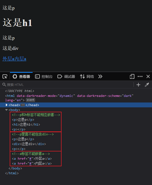
# 扩展: HTML 嵌套规范注意点🔺
💠
1. 块级元素一般作为大容器,可以嵌套:文本,块级元素,行内元素,行内块元素等等....
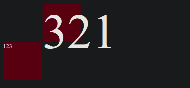
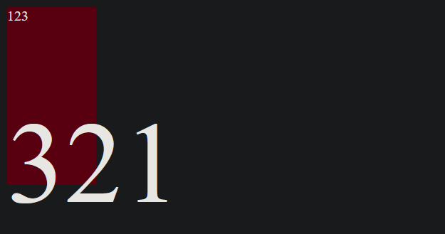
- 但是: <span alt="wavy" style="color:red">p 标签中不要嵌套 div,p,h 等块级元素 </span>.
不要在小的盒子套大的盒子不现实,<font style="color:red">p 是独占一行的 h 也是浏览器会以为上面的 p 少了结尾下面的 p 少了开始就自动补上了 </font>。
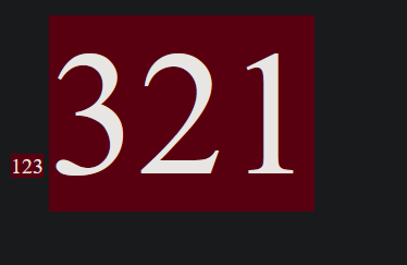
2.a 标签内部可以嵌套任意元素.
- 但是: <span alt="wavy" style="color:red">a 标签不能嵌套 a 标签 </span>.
a 标签里面可以是一个 div 或者其它点击后跳转,但是不能是自己,浏览器会解析出两个 a 分开的但是点击 a 嵌套了 a 的字样它会之确定跳转到哪里
代码: 🎲
<body> | |
<!--p 和 h 标签不能相互嵌套 --> | |
<p> | |
这是p | |
<h1>这是h1</h1> | |
</p> | |
<!--p 里面不能包含 div--> | |
<p> | |
这是p | |
<div>这是div</div> | |
</p> | |
<a href="#">外层a<a href="#">内层a</a></a> | |
</body> |
效果:
# CSS 三大特性🏭
💠
# 继承性🦄
💠
# 继承性的介绍🕋
特性:子元素有默认继承父元素样式的特点
可以继承的常见属性 (<font style="color:red"> 文字控制属性都可以继承 </font>)
- color
- font-style,font-weight,font-size,font-family
- text-indent,text-align
- line-height
- ...
⚠️注意点:
- 可以通过调式工具判断样式是否可以继承
代码: 🎲
<style> | |
/* 控制文字的属性都能继承;不是控制文字的属性都不能继承 */ | |
div { | |
/* 能继承 */ | |
color: pink; | |
font: italic bold 12px/1.5 YaHei; | |
text-indent: 2em; | |
/* 不能继承 */ | |
height: 500px; | |
} | |
</style> | |
</head> | |
<body> | |
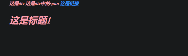
<div> | |
这是div | |
<span>这是div中的span</span> | |
<!--a 标签继承 color 会失效,需要单独设置 --> | |
<a href="#">这是链接</a> | |
<!--h1~6 不能完美继承 font-size--> | |
<h1>这是标题1</h1> | |
</div> | |
</body> |
效果:
在京东中打开控制台可以看到在 body 中设置了字体的样式大小和颜色, 继承性的其它标签也会继承自 body 的字体属性值,这样就减少了很多代码。
# 扩展 继承失效的特殊情况⭕️
💠
如果元素有浏览器默认样式,此时继承性依然存在,但是优先显示浏览器的默认样式.
- a 标签的 color 会继承失效
- h 系列标签的 font-size 会继承失效
代码: 🎲
<style> | |
/* 控制文字的属性都能继承;不是控制文字的属性都不能继承 */ | |
div { | |
/* 能继承 */ | |
color: pink; | |
font: italic bold 12px/1.5 YaHei; | |
text-indent: 2em; | |
/* 不能继承 */ | |
height: 500px; | |
} | |
</style> | |
</head> | |
<body> | |
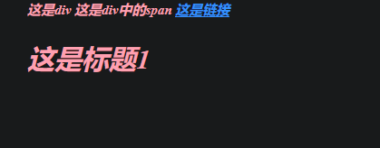
<div> | |
这是div | |
<span>这是div中的span</span> | |
<!--a 标签继承 color 会失效,需要单独设置 --> | |
<a href="#">这是链接</a> | |
<!--h1~6 不能完美继承 font-size--> | |
<h1>这是标题1</h1> | |
</div> | |
</body> |
效果:
# 层叠性😒
💠
# 层叠属性的介绍🏯
💠
特性:
- 给同一个标签设置不同的样式 → 此时样式会层叠叠加 → 会共同作用在标签上。
- 给同一个标签设置相同的样式 → 此时样式会层叠覆盖 → 最终写在最后的样式会失效。
⚠️注意点:
- 当样式冲突时,只有当选择器优先级相同时,才能通过层叠性判断结果。
代码:🎲
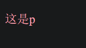
<style> | |
p { | |
color:pink; | |
} | |
.p { | |
font-size: 20px; | |
} | |
</style> | |
</head> | |
<body> | |
<p class="p">这是p</p> | |
</body> |
效果:
# 优先级💛
💠
# 优先级的介绍🌵
💠
特性:不同选择器具有不同的优先级,优先级高的选择器样式会覆盖优先级低的选择器样式
优先级公式:
- <span alt="rainbow"> 继承 </span> <span alt="blink"><</span> <span alt="rainbow"> 通配符选择器 </span> <span alt="blink"><</span> <span alt="rainbow"> 标签选择器 </span> <span alt="blink"><</span> <span alt="rainbow"> 类选择器 </span> <span alt="blink"><</span> <span alt="rainbow">id 选择器 </span> <span alt="blink"><</span> <span alt="rainbow"> 行内样式直接写在标签里的 </span> <span alt="blink"><</span> <span alt="rainbow">!important</span>.
- 秒记法则 (谁最精准谁的优先级最高)
⚠️注意点:
- !important 写在属性值的后面,分号的前面!
- !important 不能提升 <strong style="color:red"> 继承 </strong> 的优先级,<font style="color:red"> 只要是继承优先级就是最低 </font>!
- <font style="color:red"> 实际开发中不建议使用!important</font>。
- <span alt="wavy" style="color:red">!important 不要给继承的添加,自己有样式无法继承父级样式 </span>.
代码: 🎲
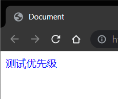
<style> | |
#box { | |
color:orange; | |
} | |
.box { | |
color:blue !important; | |
} | |
/* 优先级更高的使用!important 当前的就会被覆盖了 */ | |
div { | |
color:green /*!important*/; | |
} | |
/* 继承使用!important 不生效 */ | |
body { | |
color:red /*!important*/; | |
} | |
/*!important 不要给继承的添加,自己有样式无法继承父级样式 */ | |
</style> | |
</head> | |
<body> | |
<!-- 意义:当一个标签使用了多个选择器,样式冲突的时候,到底谁生效 --> | |
<div class="box" id="box" style="color:pink">测试优先级</div> | |
</body> |
效果:
# 权重叠加计算🗾
💠
场景:如果是复合选择器,此时需要通过权重叠加计算方法, 判断最终哪个选择器优先级最高会生效。
权重叠加计算公式: (<span alt="wavy" style="color:red"> 每一级之间不存在进位 </span>)
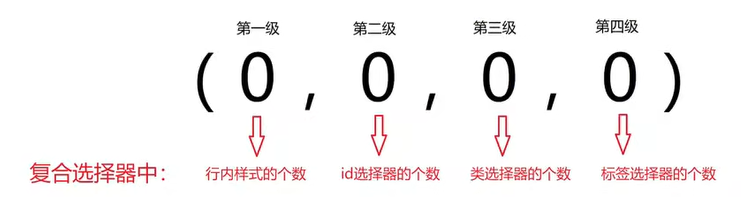
比较规则:
- 先比较第一级数字,如果比较出来了,之后的统统不看
- 如果第一级数字相同,此时再去比较第二级数组,如果比较出来了,之后的统统不看
- ...
- 如果最终所有数字都相同,表示优先级相同,则比较层叠性 (谁写在下面,谁说了算!)
⚠️注意点:
- <span alt="wavy" style="color:red">!important 如果不是继承,则权重最高,天下第一!</span>.
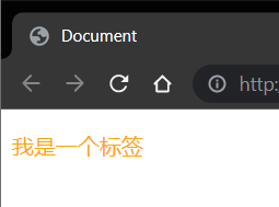
代码: 🎲
<style> | |
/* (行内,id, 类,标签) */ | |
/* (0,1,0,1) */ | |
div #one { | |
color:orange; | |
} | |
/* (0,0,2,0) */ | |
.father .son { | |
color:skyblue; | |
} | |
/* (0,0,1,1) */ | |
.father p { | |
color:purple; | |
} | |
/* (0,0,0,2) */ | |
div p { | |
color:pink; | |
} | |
</style> | |
</head> | |
<body> | |
<div class="father"> | |
<p class="son" id="one">我是一个标签</p> | |
</div> | |
</body> |
效果:
# PxCook 的基本使用🐰
💠
打开创建一个 web 项目
将图片拖进去后双击开打
<img src="https://raw.githubusercontent.com/PigPigLetsGo/imeages/master/202307171117920.png" alt="image-20230509113952030" style="zoom:33%;" />
图片使用设计模式
<img src="https://raw.githubusercontent.com/PigPigLetsGo/imeages/master/202307171117162.png" alt="image-20230509114047482" style="zoom:33%;" />
alt + 鼠标滚轮可以缩放 , 按住空格 + 鼠标左键 可以移动 , 使用尺子可以测量距离
<img src="https://raw.githubusercontent.com/PigPigLetsGo/imeages/master/202307171117759.png" alt="image-20230509114303620" style="zoom:33%;" />
# 盒子模型🏮
💠
# 1. 盒子模型的介绍🎃
💠
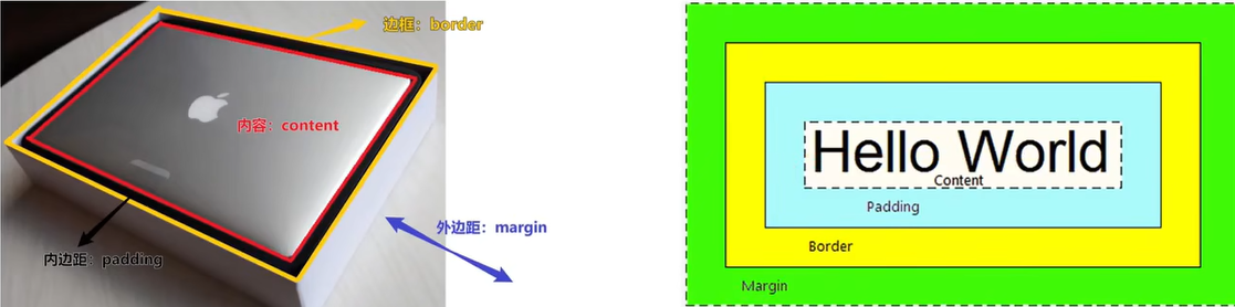
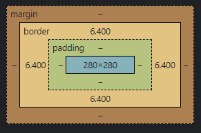
- 盒子的概念.
- 页面中的每一个标签,都可看做是一个 <font style="color:red">"盒子"</font>, 通过盒子的视角更方便的进行布局
- 浏览器在渲染 (显示) 网页时,会将网页中的元素看做是一个个的矩形区域,我们也形象的称之为 < font style="color:red">"盒子"</font>.
- 盒子模型.
- CSS 中规定每个盒子分别由:<font style="color:red"> 内容区域 (content)</font>,<font style="color:red"> 内边距区域 (padding)</font>,<font style="color:red"> 边框区域 (border)</font>,<font style="color:red"> 外边距区域 (margin)</font > 构成,这就是 <font style="color:red"> 盒子模型 </font>.
- 记忆:可以联想现实中的包装盒
- 在送物品的时候必须有盒子里面有防磕碰泡沫,然后就是电脑,在盒子模型中也是具备的
- <span alt="wavy" style="color:red">padding 和 border 都会撑大盒子模型 </span>.
代码:🎲
<!DOCTYPE html> | |
<html lang="en"> | |
<head> | |
<meta charset="UTF-8"> | |
<meta http-equiv="X-UA-Compatible" content="IE=edge"> | |
<meta name="viewport" content="width=device-width, initial-scale=1.0"> | |
<title>Document</title> | |
<style> | |
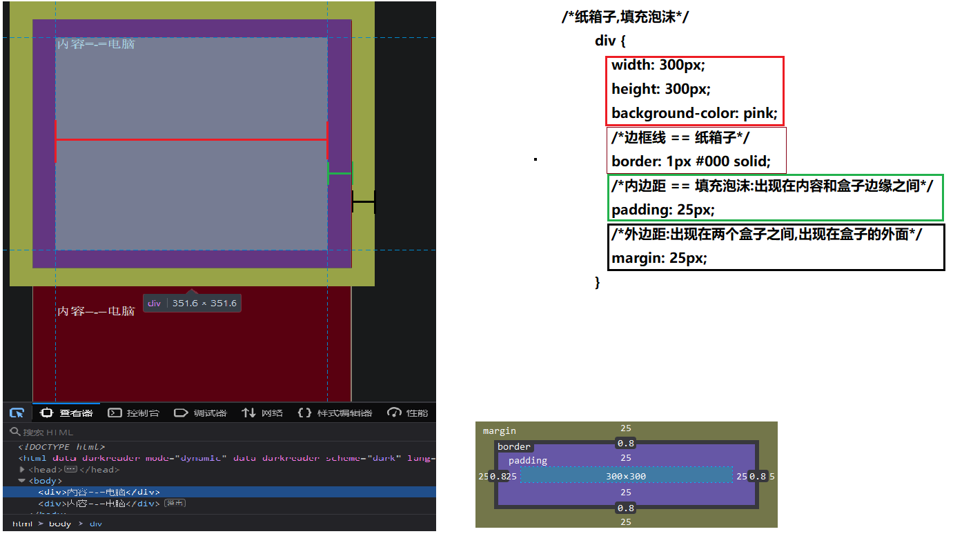
/* 纸箱子,填充泡沫 */ | |
div { | |
width: 300px; | |
height: 300px; | |
background-color: pink; | |
/* 边框线 == 纸箱子 */ | |
border: 1px #000 solid; | |
/* 内边距 == 填充泡沫:出现在内容和盒子边缘之间 */ | |
padding: 25px; | |
/* 外边距:出现在两个盒子之间,出现在盒子的外面 */ | |
margin: 25px; | |
} | |
</style> | |
</head> | |
<body> | |
<div>内容=-=电脑</div> | |
<div>内容=-=电脑</div> | |
</body> | |
</html> |
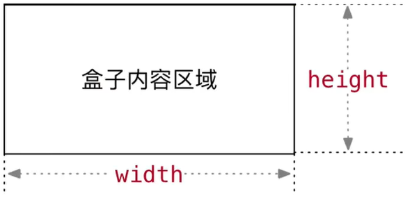
# 2. 内容区域的宽度和高度📦
💠
作用:利用 <font style="color:red">width</font > 和 < font style="color:red">height</font > 属性默认设置是盒子 < font style="color:red"> 内容区域 </font > 的大小
属性:width /height
常见取值:数字 + px
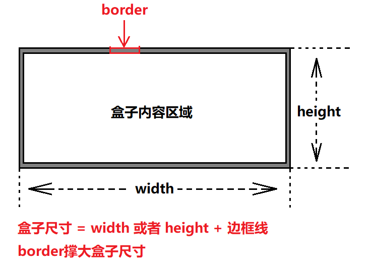
# 3. 边框 (border)- 连写形式🍼
💠
属性名:border
属性值:单个取值的连写,取值之间以空格隔开。
- 如:border: 10px red solid
- 顺序任意
- 除了 solid 还有其它的边框线的样式可查看样式.
<strong style="color:red"> 会撑大盒子模型 </strong>。
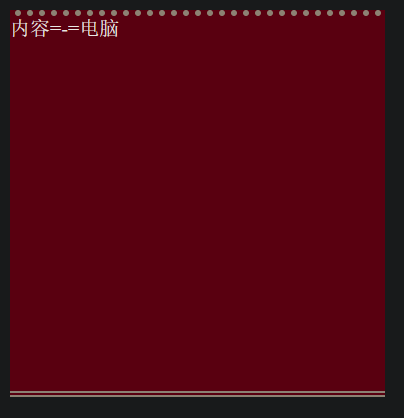
# 边框 (border)- 单方向设置🍨
💠
场景:只给盒子的某个方向单独设置边框
属性名:border - 方位名词
- 上: top 下:bottom 左:left 右:right
属性值:连写的取值
代码:🎲
<style> | |
div { | |
width: 300px; | |
height: 300px; | |
background-color: pink; | |
border-top: 5px #000 dotted; | |
border-bottom: 5px #000 double; | |
} | |
</style> | |
</head> | |
<body> | |
<div>内容=-=电脑</div> | |
</body> |
效果:
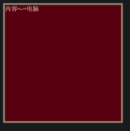
# 边框 (border) - 单个属性🗡 了解就行 工作没必要
💠
作用:给设置边框粗细,边框样式,边框颜色效果
单个属性:
| 作用 | 属性名 | 属性值 |
|---|---|---|
| 边框粗细 | border-width | 数字 + px |
| 边框样式 | border-style | 实现 dolid, 虚线 dashed, 点线 dotted |
| 边框颜色 | border-color | 颜色取值 |
代码:🎲
<style> | |
div { | |
width: 300px; | |
height: 300px; | |
background-color: pink; | |
border-width:5px; | |
border-style:solid; | |
border-color:#000; | |
} | |
</style> | |
</head> | |
<body> | |
<div>内容=-=电脑</div> | |
</body> |
效果:
# 父元素设置 border-radius 时影响子元素圆角
在父元素中使用标签:
overflow:hidden;
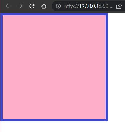
# 案例 - 盒子边框的小案例⚓️
💠
需求:根据设计图,通过 PxCook 量取数据,通过代码在网页中完成一致的效果
<img src="https://raw.githubusercontent.com/PigPigLetsGo/imeages/master/202307171124279.png" alt="image-20230509150600215" style="zoom: 67%;" />
代码:🎲
<style> | |
body { | |
margin: 0; | |
padding: 0; | |
} | |
div { | |
width: 280px; | |
height: 280px; | |
border: 7px #3f48cc solid; | |
background-color: #ffaec9; | |
} | |
</style> | |
</head> | |
<body> | |
<div></div> | |
</body> |
效果:
# 新浪导航案例👼
💠
需求:根据设计图,通过 PxCook 量取数据,通过代码在网页中完成一致的效果
遵循 布局顺序:
- 从外往内,从上往下
每一个盒子的样式:
- 宽高
- 辅助的背景颜色
- 盒子模型的部分:border,padding,margin
- 其它样式:color,font-,text-,...
# border-collapse: collapse
用于决定表格的边框是分开还是合并的
# border-spacing
适用元素:table 和 inline-block 行内块元素
是否是继承属性:是
border-spacing 属性指定相邻单元格边框之间的距离(只适用于 边框分离模式 )。相当于 HTML 中的 cellspacing 属性,但是第二个可选的值可以用来设置不同于水平间距的垂直间距。
border-spacing 值也适用于表格的外层边框上,即表格的边框和第一行的、第一列的、最后一行的、最后一列的单元格之间的间距是由表格相应的(水平的或垂直的)边框间距(border-spacing)和相应的(上,右,下或左)内边距之和。
语法:
/* <length> */ | |
border-spacing: 2px; | |
/* horizontal <length> | vertical <length> */ | |
border-spacing: 1cm 2em; | |
/* Global values */ | |
border-spacing: inherit; | |
border-spacing: initial; | |
border-spacing: unset; |
值:
length
描述单元格之间的水平和垂直距离的一个 <length> 值。它只在单值语法下使用。
horizontal
描述相邻两列的单元格之间的水平距离的一个 <length> 值。它只在双值语法下使用。
vertical
描述相邻两行的单元格之间的垂直距离的一个 <length> 值。它只在双值语法下使用。
inherit
一个表示父元素的 border-spacing 的计算值的关键字,其父元素必须应用了 border-spacing 。
正式语法:
table { | |
border-spacing: 10px 5px; | |
} |
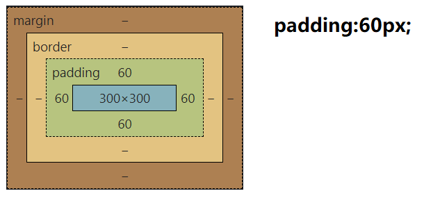
# 4. 内边距 (padding)📟
💠
<strong style="color:red">padding 的大小会撑开盒子的大小 </strong>。
可以复合使用, 单值:上下左右,两值:上下,左右,三值:上,左右,下,四值:四边对应
使用方向位名词: <span alt="rainbow">padding-top</span>: 上,<span alt="rainbow">padding-bottom</span>: 下,<span alt="rainbow">padding-left</span>: 左,<span alt="rainbow">padding-right</span>: 右
# 四值🌊
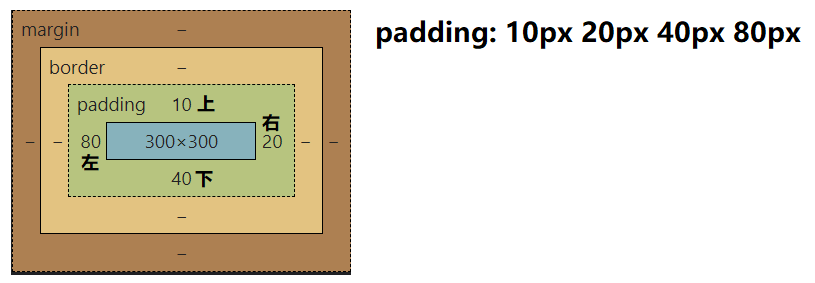
# 三值🍢
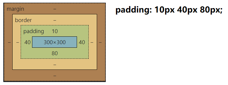
# 二值🐙
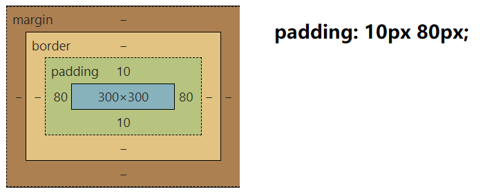
# 单值🛢
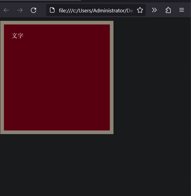
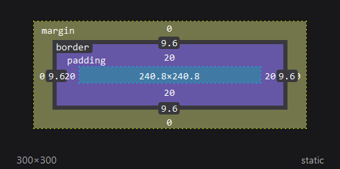
# CSS3 盒子模型 (自动內减) box-sizing:border-box🌵
💠
<strong style="color:red">CSS2.0 之后添加的属性 </strong>。
需求:盒子尺寸 300*300, 背景颜色,边框 10px 实线黑色,上下左右 20px 的内边距
- 给盒子设置 border 或 padding 时,盒子会被撑大,如果不想盒子被撑大?
解决方法: ① : 手动內减
- 操作:自己计算多余大小,手动在内容中减去
- 缺点:项目中计算量太大,很麻烦
解决方法: ② : 自动內减
- 操作:给盒子设置属性 box-sizing:border-box; 即可
- 优点:浏览器会自动计算多余大小,自动在内容中减去
建议: <span alt="wavy" style="color:green"> 将 box-sizing:border-box 写到 *{} 通配符选择器中外边距,内边距,自动內减一并设置 </span>.
代码:
<style> | |
div { | |
width: 300px; | |
height: 300px; | |
background-color: pink; | |
border: 10px #000 solid; | |
padding: 20px; | |
/* 将会减掉宽高的大小让盒子的最终大小为 300px,300px */ | |
box-sizing:border-box; | |
} | |
</style> | |
</head> | |
<body> | |
<div>文字</div> | |
</body> |
效果:
# 5. 外边距 (margin)🀄️
控制平级的盒子与盒子之间的间距
可以复合使用和 padding 的解析方式一样,margin: 上,右,下,左
使用方向位名词: <span alt="rainbow">margin-top</span>: 上,<span alt="rainbow">margin-bottom</span>: 下,<span alt="rainbow">margin-left</span>: 左,<span alt="rainbow">margin-right</span>: 右
代码:
<style> | |
body { | |
padding:0; | |
margin:0; | |
} | |
div { | |
width: 200px; | |
height: 200px; | |
background-color:pink; | |
/* margin: 上 左 下 右 */ | |
/* margin: 20px 20px 30px 50px; */ | |
/* margin-left:10px; */ | |
/* margin-right:10px; */ | |
/* margin-bottom:10px; */ | |
margin-top:10px; | |
} | |
</style> | |
</head> | |
<body> | |
<div>内容</div> | |
</body> |
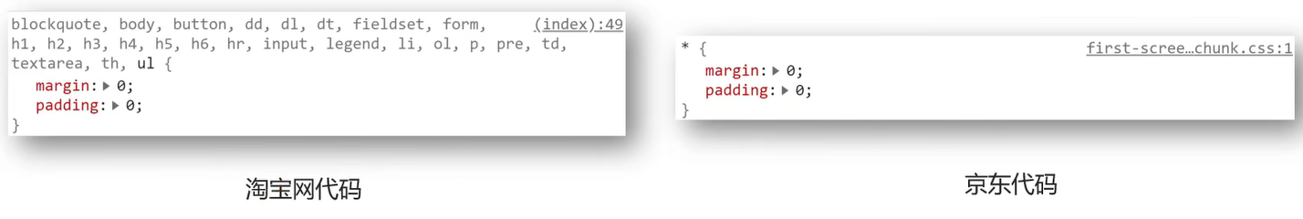
# 清除默认内外边距🐰
💠
场景:浏览器会默认给部分标签设置默认的 margin 和 padding, 但一般在项目开始前需要先清除这些标签默认的 margin 和 padding, 后续自己设置
- 比如: body 标签默认有 margin: 8px;
- 比如: p 标签默认有 上,下的 margin
- 比如: ul 标签默认由 上,下的 margin 和 padding-left
- ...
解决方法:
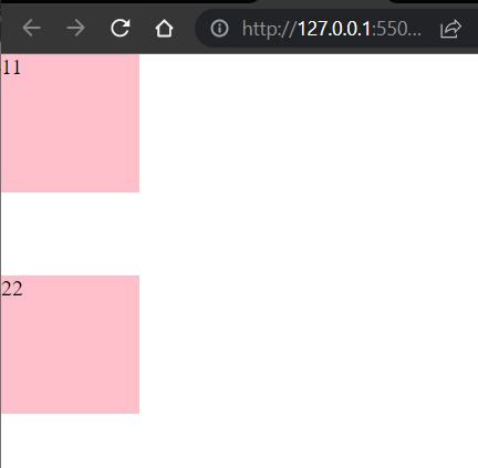
# 外边距折叠现象 -① 合并现象⭕️
场景: <font style="color:red"> 垂直布局 </font> 的 <font style="color:red"> 块级元素 </font> , 上下的 margin 会合并
结果:最终两者距离为 margin 的最大值
解决方法:避免就好
- 只给其中一个盒子设置 margin 即可
代码:
<style> | |
* { | |
margin: 0; | |
padding: 0; | |
} | |
div { | |
width: 100px; | |
height: 100px; | |
background-color:pink; | |
} | |
.one { | |
/* margin-bottom: 50px; */ | |
/* 浏览器会默认选择最大的,两个 div 之间的距离还是 60px */ | |
margin-bottom: 60px; | |
} | |
.two { | |
margin-top: 50px; | |
} | |
/* 结果两个 margin 合并,两个 div 之间的距离还是 50px */ | |
</style> | |
</head> | |
<body> | |
<div class="one">11</div> | |
<div class="two">22</div> | |
</body> |
效果:
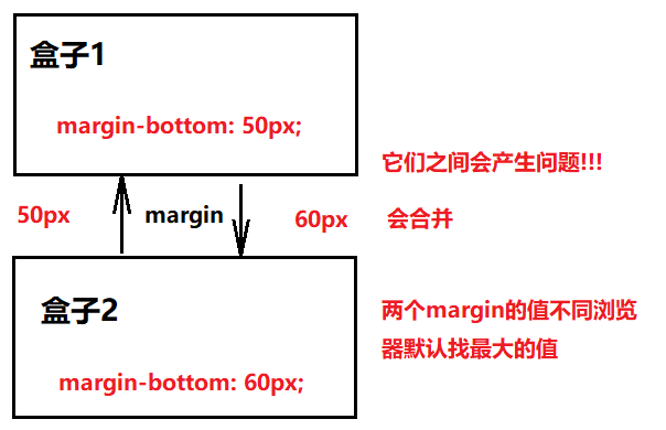
# 外边距折叠现象 -② 塌陷现象🌮
场景: <font style="color:red"> 互相嵌套 </font> 的 <font style="color:red"> 块级元素 </font> , 子元素的 < font style="color:red">margin-top</font> 会作用在父元素上
结果:导致父元素一起往下移动
解决方法:
- 给父元素设置 border-top 或者 padding-top (分隔父子元素的 margin-top)
- 给父元素设置 overflow: hidden
- 转换成行内块元素
- 设置浮动
问题:定义了两个父子级的 div , 父为 pink 色的,子为 blue 色的,让子 div 向下移动一点
思路误区:在子 div 中加上 margin-top:50px; 但是结果如下:
子 div 中设置的 margin-top:50px 却连带父 div 也生效了 (坑爹) , 这种现象就是外边距折叠 - 塌陷现象
# 行内元素的垂直内外边距🍨
场景:如果想要通过 margin 或 padding 改变行内元素标签的上下位置,<strong style="color:red"> 无法生效 </strong>。
代码:
<style> | |
span { | |
/* 左右:生效,上下:不生效 */ | |
/* margin: 100px; */ | |
/* 左右:生效,上下:不生效 */ | |
padding: 100px; | |
} | |
</style> | |
</head> | |
<body> | |
<!-- 如果想要通过 margin 或 padding 改变行内标签的上下位置,无法生效 --> | |
<!-- 行内标签的 margin-top 和 bottom 不生效 --> | |
<!-- 行内标签的 padidng-top 或 bottom 不生效 --> | |
<span>span1</span> | |
<span>span2</span> | |
</body> |
结果:
解决方法: 使用行高 line-height , 或者转换显示模式 display: inline-block。
# 版心居中🏮
💠
版心指网页的有效内容
代码:
<style> | |
* { | |
padding:0; | |
margin:0; | |
} | |
div { | |
width: 1000px; | |
height: 200px; | |
background-color:pink; | |
/* 上下为 0 左右自动统一也就自动 (拉伸也) 居中了 */ | |
margin: 0 auto; | |
} | |
</style> | |
</head> | |
<body> | |
<div>内容</div> | |
</body> |
效果:
# 消除 ul 中 li 前面的原点⭕️
属性名: list-style
属性值: none
.class { | |
list-style:none | |
} |
# 结构伪类选择器🏋
目标:能够使用 <font style="color:red"> 结构伪类选择器 </font> 在 HTML 中定位元素
1. 作用与优势:
- 作用:根据元素在 HTML 中的结构关系查找元素
- 优势:减少对于 HTML 中类的依赖,有利于保持代码整洁
- 场景:常用于查找父级选择器中的子元素
2. 选择器:
| 选择器 | 说明 |
|---|---|
| E:first-child | 匹配父元素中第一个子元素,并且是 E 元素 |
| E:last-child | 匹配父元素中最后一个子元素,并且是 E 元素 |
| E:nth-child(n) | 匹配父元素中第 n 个子元素,并且是 E 元素 |
| E:nth-last-child(n) | 匹配父元素中倒数第 n 个子元素,并且是 E 元素 |
| E:first-of-type | 指定类型 E 的第一个 |
| E:last-of-type | 指定类型 E 的最后一个 |
| E:nth-of-type(n) | 指定类型 E 的第 ng |
# nth-child (n) 与 nth-of-type (n) 的区别
# nth-child(n)
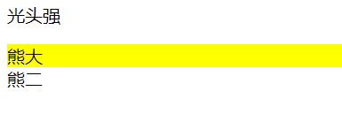
<strong style="color:red">nth-child (n) 注意事项 </strong>:计算当前选择器的标签下的所有序列号,更详细看如下代码演示:
<style> | |
/*nth-child 会把所有的盒子都排列序号 | |
执行的时候首先看:nth-child (1) 之后回去看 前面 div | |
所以在 div 中熊大应该是排在第 2 列的 */ | |
section div:nth-child(2) { | |
background-color: yellow; | |
} | |
</style> | |
<section> | |
<p>光头强</p> | |
<div>熊大</div> | |
<div>熊二</div> | |
</section> |
效果:
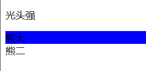
# nth-of-type(n)
按照选择标签中指定的类型进行排列序号
<style> | |
/*nth-of-type 会把指定元素的盒子排列序号 | |
执行的时候首先看 div 指定的元素 之后回去看:nth-of-type (1) 第几个孩子 */ | |
section div:nth-of-type(1) { | |
background-color: blue; | |
} | |
</style> | |
<section> | |
<p>光头强</p> | |
<div>熊大</div> | |
<div>熊二</div> | |
</section> |
效果:
n 的注意点:如果小括号填写公式 n 从 0 开始,如果是数字从 1 开始
- n 为:0,1,2,3,4,5,6,...
- 通过 n 可以组成常见公式
| 功能 | 公式 |
|---|---|
| 偶数 | 2n,even,(2 的倍数) |
| 奇数 | 2n+1,2n-1,odd,(2 的倍数 + 1) |
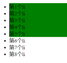
| 找到前 5 个 | -n+5 |
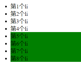
| 找到从第 5 个往后 | n+5 |
代码:
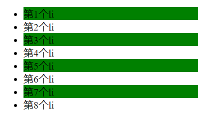
<style> | |
/* 选中第一个 */ | |
li:first-child{ | |
background-color:green; | |
} | |
/* 选中最后一个 */ | |
li:last-child{ | |
background-color:green; | |
} | |
/* 选中第 5 个 */ | |
li:nth-child(5){ | |
background-color:green; | |
} | |
/* 选中倒数第 3 个 */ | |
li:nth-last-child(3){ | |
background-color:green; | |
} | |
</style> | |
</head> | |
<body> | |
<ul> | |
<li>第1个li</li> | |
<li>第2个li</li> | |
<li>第3个li</li> | |
<li>第4个li</li> | |
<li>第5个li</li> | |
<li>第6个li</li> | |
<li>第7个li</li> | |
<li>第8个li</li> | |
</ul> | |
</body> |
效果:
<style> | |
/* 偶数选 li*/ | |
li:nth-child(even){ | |
background-color:green; | |
} | |
/* 偶数选 li*/ | |
li:nth-child(2n){ | |
background-color:green; | |
} | |
</style> |
效果:
<style> | |
/* 奇数选 li*/ | |
li:nth-child(odd){ | |
background-color:green; | |
} | |
/* 奇数选 li*/ | |
li:nth-child(2n-1){ | |
background-color:green; | |
} | |
/* 奇数选 li*/ | |
li:nth-child(2n-1){ | |
background-color:green; | |
} | |
</style> |
效果:
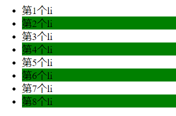
<style> | |
/* 找到前 5 个 */ | |
li:nth-child(-n+5){ | |
background-color:green; | |
} | |
</style> |
效果:
<style> | |
/* 找到后 5 个 */ | |
li:nth-child(n+5){ | |
background-color:green; | |
} | |
</style> |
效果:
# input:checked
checked 都可以在被选中的状态进行一个样式的改变
代码:
<!DOCTYPE html> | |
<html lang="en"> | |
<head> | |
<meta charset="UTF-8"> | |
<meta name="viewport" content="width=device-width, initial-scale=1.0, | |
minimun-scale=1.0,maximun-scale=1.0,user-scalable=no"> | |
<title>Document</title> | |
<link rel="stylesheet" href="./css/选中状态样式.css"/> | |
</head> | |
<body> | |
<input type="checkbox"/> | |
</body> | |
</html> |
input { | |
&:checked { | |
width: 200px; | |
height: 200px; | |
} | |
} |
效果:

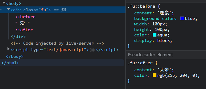
# 伪元素🏋️♀️
伪元素:一般页面中的非主体内容可以使用伪元素。
区别:
- 元素:HTML 设置的标签
- 伪元素:由 CSS 模拟出的标签效果
种类:
| 伪元素 | 作用 |
|---|---|
| ::before | 在父元素内容的最前添加一个伪元素 |
| ::after | 在父元素内容的最后添加一个伪元素 |
注意点:
- <strong style="color:red"> 必须设置 content 属性才能生效 </strong>。
- 伪元素默认是行内元素。
代码:
<style> | |
.fu{ | |
width: 300px; | |
height: 300px; | |
background-color:rgb(225, 61, 88); | |
} | |
.fu::before{ | |
/* 添加内容,否则伪元素不生效 */ | |
content: '老鼠'; | |
background-color:blue; | |
width: 100px; | |
height: 100px; | |
color:aqua; | |
/* 伪元素默认为行内显示要设置宽高需要转换为块级元素 */ | |
display: block; | |
} | |
.fu::after{ | |
content: '大米'; | |
color:rgb(255, 204, 0); | |
} | |
</style> | |
</head> | |
<body> | |
<div class="fu"> | |
爱 | |
</div> | |
</body> |
效果:
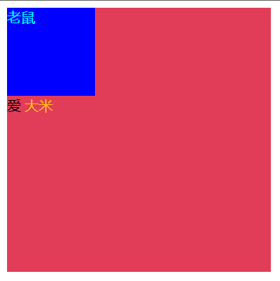
控制台查看被解析的代码:
# 伪元素选择器使用场景 1:伪元素字体图标
需求如下:右侧的字体图标随意更换 能达到效果就行。
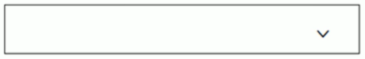
代码:
<style> | |
@font-face { | |
font-family: 'icomoon'; | |
src: url('fonts/icomoon.eot?nzdx0k'); | |
src: url('fonts/icomoon.eot?nzdx0k#iefix') format('embedded-opentype'), | |
url('fonts/icomoon.ttf?nzdx0k') format('truetype'), | |
url('fonts/icomoon.woff?nzdx0k') format('woff'), | |
url('fonts/icomoon.svg?nzdx0k#icomoon') format('svg'); | |
font-weight: normal; | |
font-style: normal; | |
font-display: block; | |
} | |
div { | |
position: relative; | |
width: 200px; | |
height: 35px; | |
border: 1px red solid; | |
} | |
div::after { | |
position: absolute; | |
top: 10px; | |
right: 10px; | |
/* content: ''; */ | |
content: '\e916'; | |
font-family: 'icomoon'; | |
} | |
</style> | |
</head> | |
<body> | |
<div></div> | |
</body> |
效果:
# 标准流🚴
标准流:又称 <font style="color:red"> 文档流 </font>,是浏览器在渲染显示在网页内容时默认采用的一套排版规则,规定了应该以何种方式排列元素
常见标准流排版规则:
- 块级元素:从上往下,<font style="color:red"> 重置布局 </font>,独占一行
- 行内元素或行内块元素:从左往右,<font style="color:red"> 水平布局 </font>,空间不够自动折行
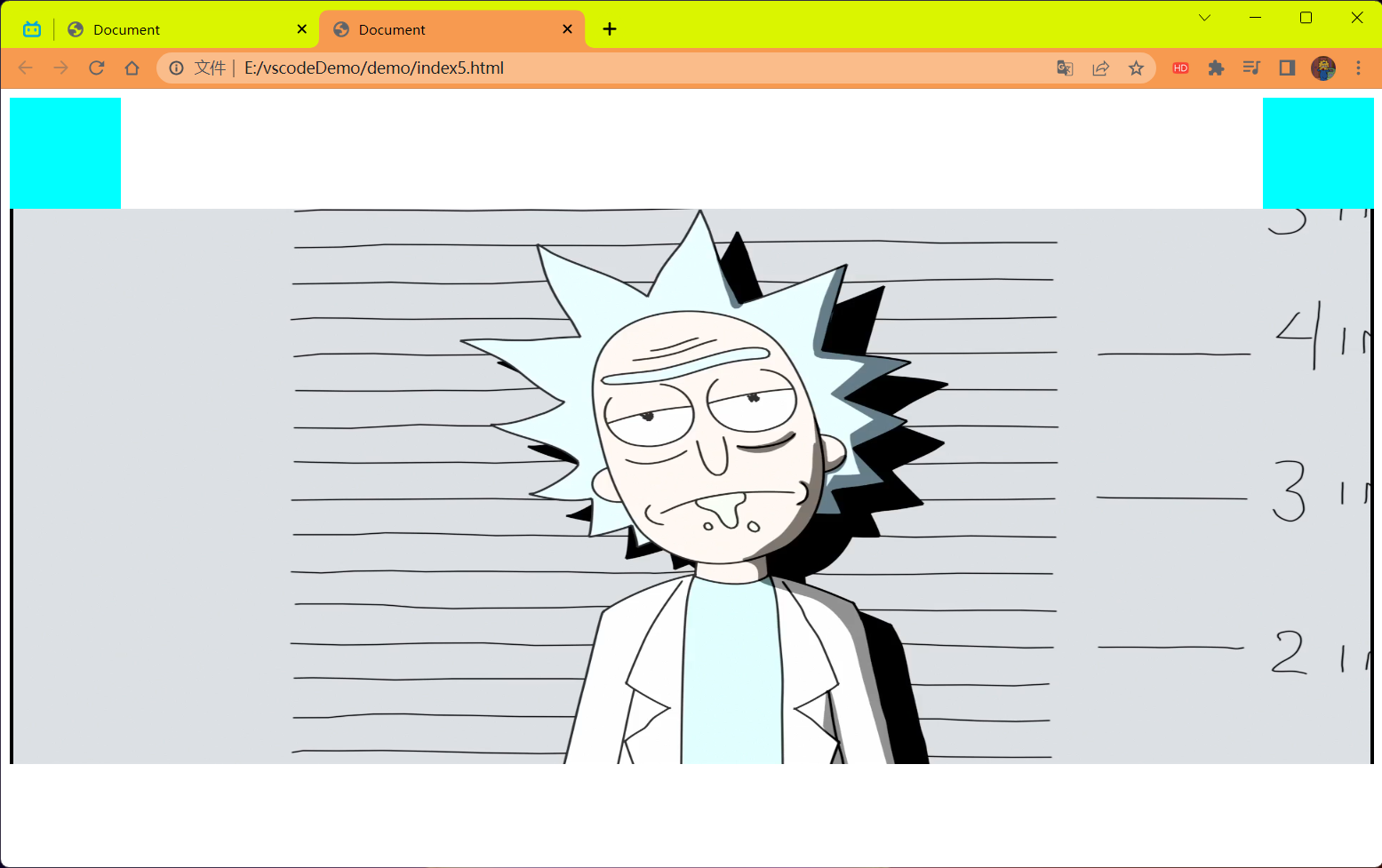
# 浮动⛽️
先看不使用浮动让两个 div 一行显示的状况:
特点:只会影响浮动后面的元素,不会影响浮动前面的元素。
<strong style="color:red"> 注意 </strong>:
- 块元素使用 <font color=red> 浮动 </font>,默认转换为行内块元素.
- 行内元素使用 <font color=red> 浮动 </font>,默认转换为行内块元素.
- 浮动转换后的 <font color=red> 行内块 display:inline-block 也一样 </font> 元素不会带有默认继承父盒子宽度的特性,但是 <font color=red>display:block</font> 转换还是带有继承父盒子宽度的特性的。
- 使用 <font color=red> 浮动 </font> 的元素会脱标,不占有原来标准流的位置。
关于这一特点看如下代码:
验证:只会影响浮动后面的元素,不会影响浮动前面的元素
<!DOCTYPE html> | |
<html lang="en"> | |
<head> | |
<meta charset="UTF-8"> | |
<meta name="viewport" content="width=device-width, initial-scale=1.0"> | |
<title>Document</title> | |
<style> | |
.left { | |
float: left; | |
width: 100px; | |
height: 100px; | |
background-color: aqua; | |
} | |
.right { | |
float: right; | |
width: 100px; | |
height: 100px; | |
background-color: aqua; | |
} | |
</style> | |
</head> | |
<body> | |
<div> | |
<div class="left"></div> | |
<div class="right"></div> | |
<img src="../imgage/瑞克.png" width="100%" height="500px"/> | |
</div> | |
</body> | |
</html> |
结果:
代码 2:
<!DOCTYPE html> | |
<html lang="en"> | |
<head> | |
<meta charset="UTF-8"> | |
<meta name="viewport" content="width=device-width, initial-scale=1.0"> | |
<title>Document</title> | |
<style> | |
.left { | |
float: left; | |
width: 100px; | |
height: 100px; | |
background-color: aqua; | |
} | |
.right { | |
float: right; | |
width: 100px; | |
height: 100px; | |
background-color: aqua; | |
} | |
</style> | |
</head> | |
<body> | |
<div> | |
<img src="../imgage/瑞克.png" width="100%" height="500px"/> | |
<div class="left"></div> | |
<div class="right"></div> | |
</div> | |
</body> | |
</html> |
结果:
这就是,前面的元素 不影响但是后面的元素影响
代码:
<style> | |
div { | |
width: 300px; | |
height: 300px; | |
} | |
.one { | |
display: inline-block; | |
background-color:pink; | |
} | |
.two { | |
display: inline-block; | |
background-color:blue; | |
} | |
</style> | |
</head> | |
<body> | |
<div class="one">one</div> | |
<div class="two">two</div> | |
</body> |
效果:

中间会有一个空格隔开,这是因为代码中 div 标签换行导致的比如如下的解决方式:
<style> | |
div { | |
width: 300px; | |
height: 300px; | |
} | |
.one { | |
display: inline-block; | |
background-color:pink; | |
} | |
.two { | |
display: inline-block; | |
background-color:blue; | |
} | |
</style> | |
</head> | |
<body> | |
<div class="one">one</div><div class="two">two</div> | |
</body> |
效果:
虽然问题解决了,但是这样写在一行的代码风格肯定是不行的。我们就可以使用浮动来解决这种局部问题。
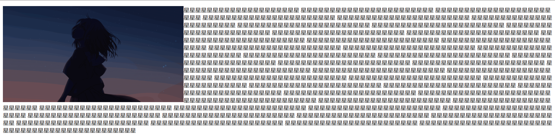
# 1. 浮动的作用🍨
早期的作用:图文环绕
现在的作用:网页布局 (块在一行显示)
浮动:<font style="color:red"> 在一行排列,宽高生效,浮动后的标签具备行内块的特点,但不是行内块因为行内块是有空格的 </font>。
# 2. 浮动的代码🌊
早期用法:
<style> | |
img { | |
float: left; | |
} | |
</style> | |
</head> | |
<body> | |
<img src="./img/星.gif"/ width="500px"> | |
<p>星星星星星星星星星星星星星星星星星星星星 | |
星星星星星星星星星星星星星星星星星星星星星星星 | |
星星星星星星星星星星星星星星星星星星星星星星星 | |
星星星星星星星星星星星星星星星星星星星星星星星 | |
星星星星星星星星星星星星星星星星星星星星星星星 | |
星星星星星星星星星星星星星星星星星星星星星星星 | |
星星星星星星星星星星星星星星星星星星星星星星星 | |
星星星星星星星星星星星星星星星星星星星星星星星 | |
星星星星星星星星星星星星星星星星星星星星星星星 | |
星星星星星星星星星星星星星星星星星星星星星星星 | |
星星星星星星星星星星星星星星星星星星星星星星星 | |
星星星星星星星星星星星星星星星星星星星星星星星 | |
星星星星星星星星星星星星星星星星星星星星星星星 | |
星星星星星星星星星星星星星星星星星星星星星星星 | |
星星星星星星星星星星星星星星星星星星星星星星星 | |
星星星星星星星星星星星星星星星星星星星星星星星 | |
星星星星星星星星星星星星星星星星星星星星星星星 | |
星星星星星星星星星星星星星星星星星星星星星星星 | |
星星星星星星星星星星星星星星星星星星星星星星星 | |
星星星星星星星星星星星星星星星星星星星星星星星 | |
星星星星星星星星星星星星星星星星星星星星星星星 | |
星星星星星星星星星星星星星星星星星星星星星星星 | |
星星星星星星星星星星星星星星星星星星星星星星星 | |
星星星星星星星星星星星星星星星星星星星星星星星 | |
星星星星星星星星星星星星星星星星星星星星星星星 | |
星星星星星星星星星星星星星星星星星星星星星星星 | |
星星星星星星星星星星星星星星星星星星星星星星星 | |
星星星星星星星星星星星星星星星星星星星星星星星 | |
星星星星星星星星星星星星星星星星星星星星星星星 | |
星星星星星星星星星星星星星星星星星星星星星星星 | |
星星星星星星星星星星星星星星星星星星星星星星星 | |
星星星星星星星星星星星星星星星星星星星星星星星 | |
星星星星星星星星星星星星星星星星星星星星星星星 | |
星星星星星星星星星星星星星星星星星星星星星星星 | |
星星星星星星星星星星星星星星星星星星星星星星星 | |
星星星星星星星星星星星星星星星星星星星星星星星 | |
星星星星星星星星星星星星星星星星星星星星星星星 | |
星星星星星星星星星星星星星星星星星星星星星星星 | |
星星星星星星星星星星星星星星星星星星星星星星星 | |
星星星星星星星星星星星星星星星星星星星星星星星 | |
星星星星星星星星星星星星星星星星星星星星星星星 | |
星星星星星星星星星星星星星星星星星星星星星星星 | |
星星星星星星星星星星星星星星星星星星星星星星星 | |
星星星星星星星星星星星星星星星星星星星星星星星 | |
星星星星星星星星星星星星星星星星星星星星星星星 | |
星星星星星星星星星星星星星星星星星星星星星星星 | |
星星星星星星星星星星星星星星星星星星星星星星星 | |
星星星星星星星星星星星星星星星星星星星星星星星 | |
星星星星星星星星星星星星星星星星星星星星星星星 | |
</p> | |
</body> |
效果:
现在用法:
<style> | |
div{ | |
width: 300px; | |
height: 300px; | |
} | |
.one { | |
background-color:pink; | |
float:left; | |
} | |
.two { | |
background-color:blue; | |
float:left; | |
} | |
</style> | |
</head> | |
<body> | |
<div class="one">one</div> | |
<div class="two">two</div> | |
</body> |
效果:
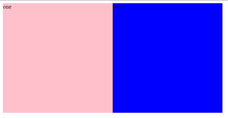
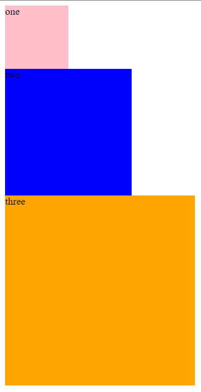
# 3. 浮动的特点💛
浮动元素会脱离标准流 (简称:脱标),在标准流中不占位置。
- 相当于从地面飘到了空中。
代码:
<style>
.one {
width: 100px;
height: 100px;
background-color:pink;
}.two {
width: 200px;
height: 200px;
background-color:blue;
}.three {
width: 300px;
height: 300px;
background-color: orange;
}</style></head><body><div class="one">one</div>
<div class="two">two</div>
<div class="three">three</div>
</body>效果:
![image-20230528120739581]()
浮动元素比标准流高半个级别,可以覆盖标准流中的元素。
将 one 左浮动:
.one {width: 100px;
height: 100px;
background-color:pink;
float:left;
}
效果:浮动元素在标准流中不占位置,two 会占用 one 的位置但是内容不会占用。
![image-20230528120843473]()
浮动找浮动,下一个浮动元素会在上一个浮动元素后面左右浮动。
代码:
<style>
.one {
width: 100px;
height: 100px;
background-color:pink;
float:left;
}.two {
width: 200px;
height: 200px;
background-color:blue;
float:left;
}.three {
width: 300px;
height: 300px;
background-color: orange;
}</style></head><body><div class="one">one</div>
<div class="two">two</div>
<div class="three">three</div>
</body>效果:
![image-20230528121539037]()
浮动元素有特殊的显示效果
- 一行可以显示多个。
- 可以设置宽高。
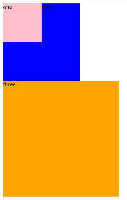
注意点:
- <strong style="color:red"> 浮动的元素不能通过 tet-align:center 或者 maring:0 auto 居中 </strong>。
代码:
<style>
.one {
width: 100px;
height: 100px;
background-color:pink;
float:left;
}.two {
width: 200px;
height: 200px;
background-color:blue;
float:left;
/* 浮动级别高,不能生效,盒子无法水平居中 */text-align:center;
margin:0 auto;
}.three {
width: 300px;
height: 300px;
background-color: orange;
}</style></head><body><div class="one">one</div>
<div class="two">two</div>
<div class="three">three</div>
</body>效果:
![image-20230528122252133]()
# 4. 浮动的案例🍰
需求:使用浮动,完成设计图中局部效果
<style> | |
body{ | |
margin: 0; | |
padding: 0; | |
} | |
.top{ | |
width: 100%; | |
height: 30px; | |
background-color:black; | |
} | |
.head{ | |
width:500px; | |
height: 150px; | |
background-color:pink; | |
margin: 0 auto; | |
} | |
.content{ | |
width:500px; | |
height: 150px; | |
background-color:cornsilk; | |
margin: 0 auto; | |
} | |
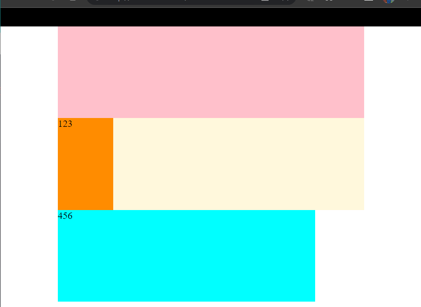
.one{ | |
width: 90px; | |
height: 150px; | |
background-color:darkorange; | |
float:left; | |
} | |
.two{ | |
/* 如果宽度超出了父元素装不下就会换行 */ | |
width: 410px; | |
height: 150px; | |
background-color:aqua; | |
float:left; | |
} | |
</style> | |
</head> | |
<body> | |
<div class="top"></div> | |
<div class="head"></div> | |
<div class="content"> | |
<div class="one">123</div> | |
<div class="two">456</div> | |
</div> | |
</body> |
效果:
注意踩坑点:<font style="color:red"> 如果蓝色的盒子长度超出父元素就会导致换行如下 </font>:
代码:
.two{ | |
/*如果宽度超出了父元素装不下就会换行*/ | |
width: 420px; /*故意增加一点点的宽度*/ | |
height: 150px; | |
background-color:aqua; | |
float:left; | |
} |
效果:
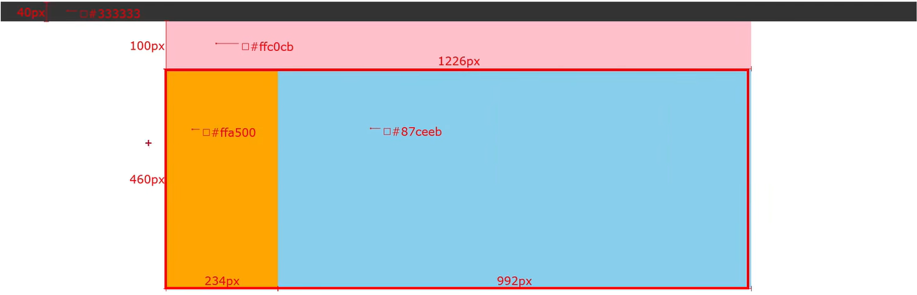
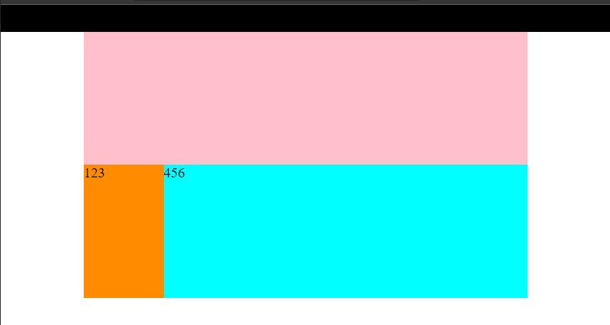
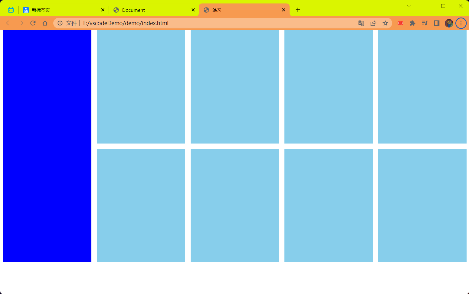
# 5. 小米 —— 案例🍨
<!DOCTYPE html> | |
<html lang="en"> | |
<head> | |
<meta charset="UTF-8"> | |
<meta name="viewport" content="width=device-width, initial-scale=1.0"> | |
<title>练习</title> | |
<style> | |
* { | |
margin: 0; | |
padding: 0; | |
} | |
.box{ | |
margin: 0 auto; | |
/* background-color:pink; */ | |
width: 1226px; | |
height: 614px; | |
} | |
.left { | |
background-color: blue; | |
float: left; | |
width: 234px; | |
height: 614px; | |
} | |
.right { | |
/* background-color: green; */ | |
float: right; | |
width: 978px; | |
height: 614px; | |
} | |
ul { | |
list-style: none; | |
} | |
.right li{ | |
margin-right: 14px; | |
margin-bottom: 14px; | |
width: 234px; | |
height: 300px; | |
background-color: #87ceeb; | |
float: left; | |
} | |
.right li:nth-child(4n) { | |
margin-right: 0; | |
} | |
</style> | |
</head> | |
<body> | |
<div class="box"> | |
<div class="left"></div> | |
<div class="right"> | |
<ul> | |
<li></li> | |
<li></li> | |
<li></li> | |
<li></li> | |
<li></li> | |
<li></li> | |
<li></li> | |
<li></li> | |
</ul> | |
</div> | |
</div> | |
</body> | |
</html> |
效果:
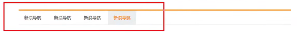
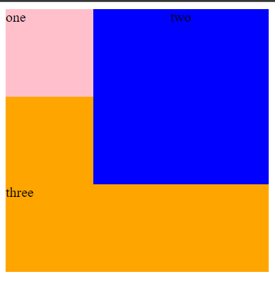
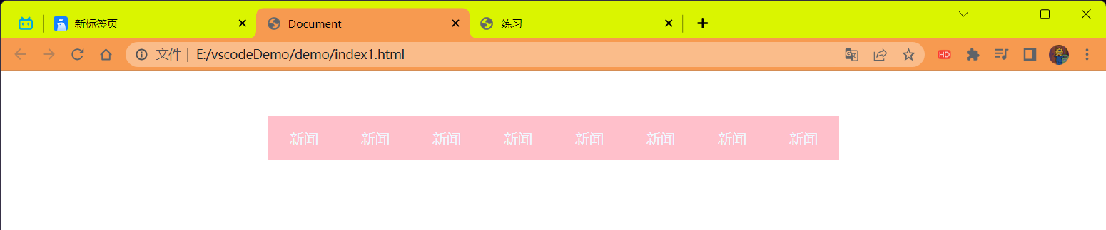
# 6. 导航栏 —— 案例🕋
该案例中需要主要到的几个点
- CSS 的书写顺序
- li 标签中的 a 标签默认是行内元素我们设置宽高的话需要换为块级元素或者行内块元素
- 不必担心 a 标签换为块级或者行内块后会独占一行,因为 a 标签已经在 li 标签中一块浮动了等
<!DOCTYPE html> | |
<html lang="en"> | |
<head> | |
<meta charset="UTF-8"> | |
<meta name="viewport" content="width=device-width, initial-scale=1.0"> | |
<title>Document</title> | |
<style> | |
* { | |
margin: 0; | |
padding: 0; | |
} | |
.nav{ | |
width: 640px; | |
height: 50px; | |
background-color: #ffc0cb; | |
margin: 50px auto; | |
} | |
ul { | |
list-style: none; | |
} | |
.nav li { | |
float: left; | |
} | |
.nav li a { | |
/* 注意 CSS 的书写顺序 */ | |
/*1. 浮动 /display/*/ | |
/* background-color: green; */ | |
/* display: inline-block; */ | |
/* 无论使用行内块还是块都可行 | |
但是这里你可能会产生一个问题 | |
为什么,块在一行显示,不应该独占一行吗? | |
答:因为 li 标签被浮动了优先级比标准流高,a 在 li 中所以不受其它的 a 的影响 */ | |
display: block; | |
/*2. 盒子模型 */ | |
width: 80px; | |
height: 50px; | |
/*3. 文字样式 */ | |
line-height: 1.5; | |
text-align: center; | |
line-height: 50px; | |
text-decoration: none; | |
color:aliceblue; | |
} | |
.nav li a:hover { | |
background-color: green; | |
} | |
</style> | |
</head> | |
<body> | |
<div class="nav"> | |
<ul> | |
<li><a href="#">新闻</a></li> | |
<li><a href="#">新闻</a></li> | |
<li><a href="#">新闻</a></li> | |
<li><a href="#">新闻</a></li> | |
<li><a href="#">新闻</a></li> | |
<li><a href="#">新闻</a></li> | |
<li><a href="#">新闻</a></li> | |
<li><a href="#">新闻</a></li> | |
</ul> | |
</div> | |
</body> | |
</html> |
效果:
# CSS 书写顺序🏮
🐰
浏览器执行效率更高
顺序如下:
有定位先写定位!!
浮动 /display
盒子模型:margin border padding 宽度高度背景色
文字样式
# 清除浮动🌂
🐰
目标:能够认识 <strong style="color:red"> 清除浮动的目的 </strong>,并且能够使用 < strong style="color:red"> 清除浮动的方法 </strong>。
# 清除浮动的介绍🗡
🐰
# 含义:
<strong style="color:red"> 清楚浮动带来的影响 </strong>。
# 影响:
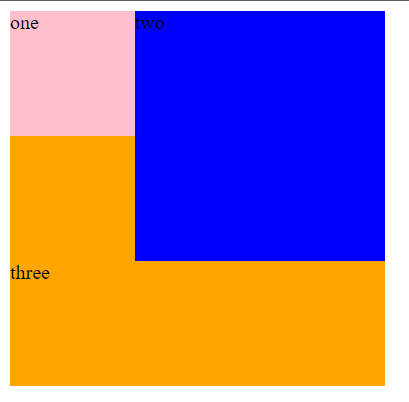
- 如果子元素浮动了,此时子元素不能撑开标准流的块级父元素
# 原因:
- 子元素浮动后脱标 ——> 不占位置
# 目的:
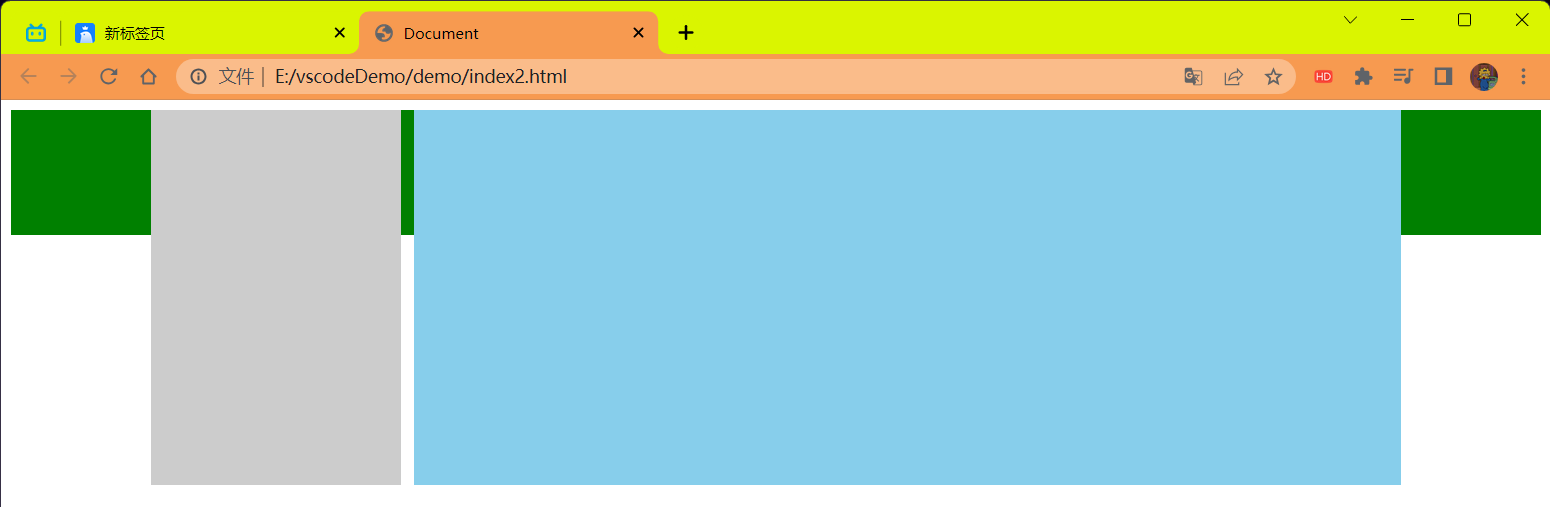
- 需要父元素有高度,从而不影响其它网页元素的布局
# 演示浮动的影响性
<!DOCTYPE html> | |
<html lang="en"> | |
<head> | |
<meta charset="UTF-8"> | |
<meta name="viewport" content="width=device-width, initial-scale=1.0"> | |
<title>Document</title> | |
<style> | |
.top { | |
margin: 0 auto; | |
width: 1000px; | |
/* 如果.left 和.right 都浮动的话就不在标准流中了,div 为块级元素没有内容撑开了所以就 | |
看不到了但是不浮动就会被内容所撑开就能看得到 pink 的块了 */ | |
/* height: 300px; */ | |
background-color: pink; | |
} | |
.bottom { | |
height: 100px; | |
background-color: green; | |
} | |
.left { | |
float: left; | |
width: 200px; | |
height: 300px; | |
background-color: #ccc; | |
} | |
.right { | |
float: right; | |
width: 790px; | |
height: 300px; | |
background-color: skyblue; | |
} | |
</style> | |
</head> | |
<body> | |
<div class="top"> | |
<div class="left"></div> | |
<div class="right"></div> | |
</div> | |
<div class="bottom"></div> | |
</body> | |
</html> |
解释下面结果,因为浮动的关系脱离了标准流,而且 div 是块级元素高度由内容撑开的所以我们看不见父元素的 pink 块了,其中的 green 色的 div 块没有浮动但是也不在 top 块中所以它掉了上去 ,再看下面的演示就明白了
结果:
<!DOCTYPE html> | |
<html lang="en"> | |
<head> | |
<meta charset="UTF-8"> | |
<meta name="viewport" content="width=device-width, initial-scale=1.0"> | |
<title>Document</title> | |
<style> | |
.top { | |
margin: 0 auto; | |
width: 1000px; | |
/* 如果.left 和.right 都浮动的话就不在标准流中了,div 为块级元素没有内容撑开了所以就 | |
看不到了但是不浮动就会被内容所撑开就能看得到 pink 的块了 */ | |
/* height: 300px; */ | |
background-color: pink; | |
} | |
.bottom { | |
height: 100px; | |
background-color: green; | |
} | |
.left { | |
/* float: left; */ | |
width: 200px; | |
height: 300px; | |
background-color: #ccc; | |
} | |
.right { | |
/* float: right; */ | |
width: 790px; | |
height: 300px; | |
background-color: skyblue; | |
} | |
</style> | |
</head> | |
<body> | |
<div class="top"> | |
<div class="left"></div> | |
<div class="right"></div> | |
</div> | |
<div class="bottom"></div> | |
</body> | |
</html> |
解释:当把浮动给注释掉了后,div 里面的子 div 会将当前父 div 的高度撑开所以就能看到 pink 块了。
结果:
# 清除浮动的方法📦
🐰
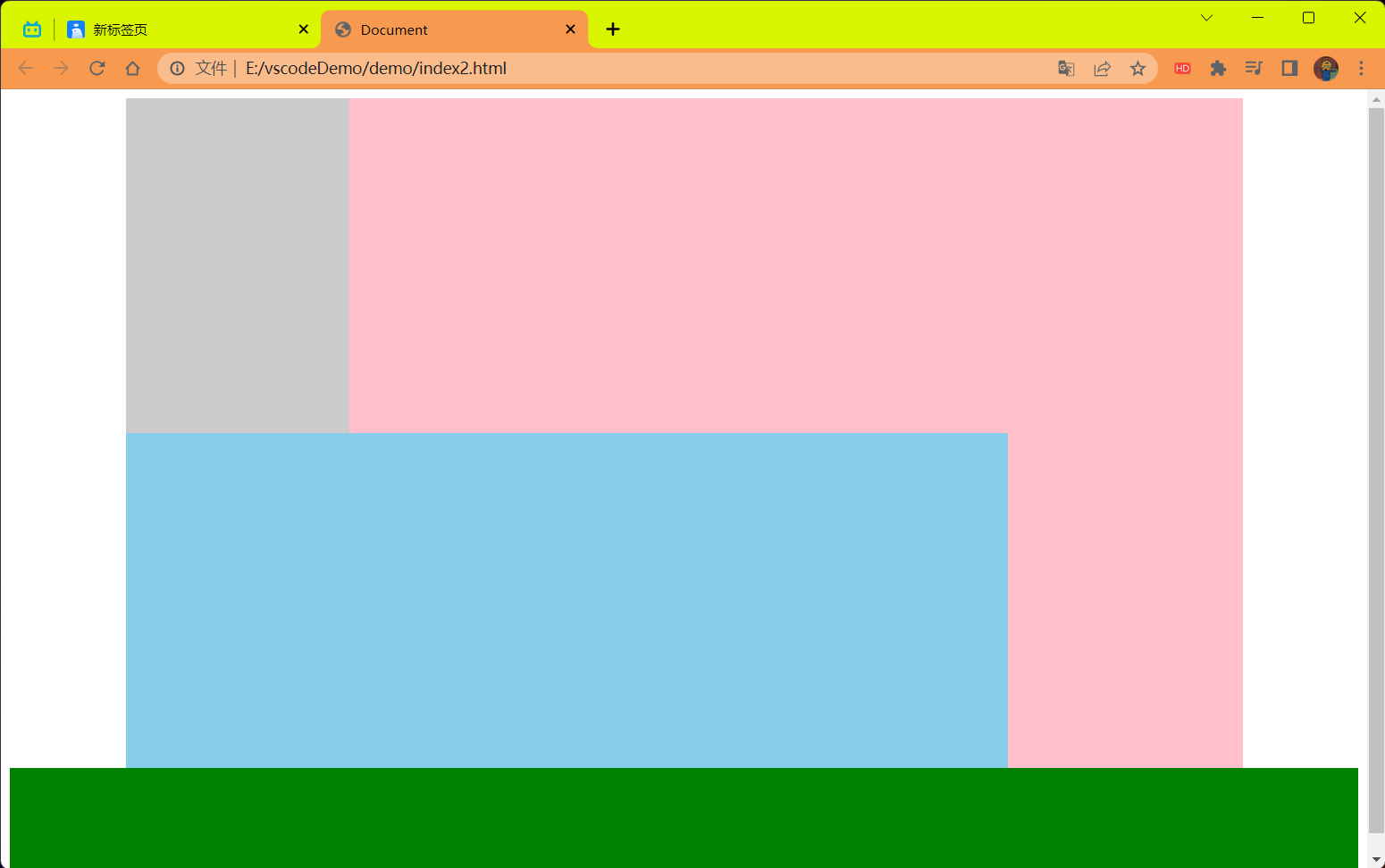
# 清除浮动的方法 ——①直接设置父元素高度
特点:
- 优点:简单粗暴,方便
- 缺点:有些布局中不能固定父元素高度。如:新闻列表,京东推荐模块
代码:
<!DOCTYPE html> | |
<html lang="en"> | |
<head> | |
<meta charset="UTF-8"> | |
<meta name="viewport" content="width=device-width, initial-scale=1.0"> | |
<title>Document</title> | |
<style> | |
.top { | |
margin: 0 auto; | |
width: 1000px; | |
/* 如果.left 和.right 都浮动的话就不在标准流中了,div 为块级元素没有内容撑开了所以就 | |
看不到了但是不浮动就会被内容所撑开就能看得到 pink 的块了 */ | |
height: 300px; | |
background-color: pink; | |
} | |
.bottom { | |
height: 100px; | |
background-color: green; | |
} | |
.left { | |
float: left; | |
width: 200px; | |
height: 300px; | |
background-color: #ccc; | |
} | |
.right { | |
float: right; | |
width: 790px; | |
height: 300px; | |
background-color: skyblue; | |
} | |
/* .clearfix { */ | |
/* 清楚左右两侧浮动的影响 */ | |
/* clear: both; */ | |
/* } */ | |
</style> | |
</head> | |
<body> | |
<div class="top"> | |
<div class="left"></div> | |
<div class="right"></div> | |
<!-- <div class="clearfix"></div> --> | |
</div> | |
<div class="bottom"></div> | |
</body> | |
</html> |
效果:

# 清除浮动的方法 ——②额外标签法
- 操作:
- 在父元素内容的 <font color=red> 最后 </font> 添加一个块级元素.
- 给添加的块级元素设置 clear:both
- clear:left 清除左浮动
- clear:right 清除右浮动
- 一般直接使用 clear:both 省劲又管用。
- 特点:
- 缺点:会在页面中添加额外的标签,会让页面的 HTML 结构变得复杂
代码:
<!DOCTYPE html> | |
<html lang="en"> | |
<head> | |
<meta charset="UTF-8"> | |
<meta name="viewport" content="width=device-width, initial-scale=1.0"> | |
<title>Document</title> | |
<style> | |
.top { | |
margin: 0 auto; | |
width: 1000px; | |
/* 如果.left 和.right 都浮动的话就不在标准流中了,div 为块级元素没有内容撑开了所以就 | |
看不到了但是不浮动就会被内容所撑开就能看得到 pink 的块了 */ | |
/* height: 300px; */ | |
background-color: pink; | |
} | |
.bottom { | |
height: 100px; | |
background-color: green; | |
} | |
.left { | |
float: left; | |
width: 200px; | |
height: 300px; | |
background-color: #ccc; | |
} | |
.right { | |
float: right; | |
width: 790px; | |
height: 300px; | |
background-color: skyblue; | |
} | |
.clearfix { | |
/* 清楚左右两侧浮动的影响 */ | |
clear: both; | |
} | |
</style> | |
</head> | |
<body> | |
<div class="top"> | |
<div class="left"></div> | |
<div class="right"></div> | |
<div class="clearfix"></div> | |
</div> | |
<div class="bottom"></div> | |
</body> | |
</html> |
结果:
# 清除浮动的方法 ——③单伪元素清除法
操作:用为元素替代了额外标签
- 基本写法
- 补充写法
特点:
- 优点:项目中使用,直接给标签加类即可清除浮动。
代码:
<!DOCTYPE html> | |
<html lang="en"> | |
<head> | |
<meta charset="UTF-8"> | |
<meta name="viewport" content="width=device-width, initial-scale=1.0"> | |
<title>Document</title> | |
<style> | |
.top { | |
margin: 0 auto; | |
width: 1000px; | |
/* 如果.left 和.right 都浮动的话就不在标准流中了,div 为块级元素没有内容撑开了所以就 | |
看不到了但是不浮动就会被内容所撑开就能看得到 pink 的块了 */ | |
/* height: 300px; */ | |
background-color: pink; | |
} | |
.bottom { | |
height: 100px; | |
background-color: green; | |
} | |
.left { | |
float: left; | |
width: 200px; | |
height: 300px; | |
background-color: #ccc; | |
} | |
.right { | |
float: right; | |
width: 790px; | |
height: 300px; | |
background-color: skyblue; | |
} | |
/* 单伪元素清除浮动 和 额外标签法原理是一样的 */ | |
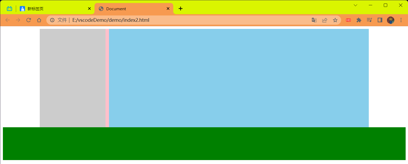
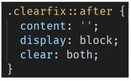
.clearfix::after { | |
content: ''; | |
/* 伪元素添加的标签默认是行内元素的,要求块级元素才行 */ | |
display: block; | |
/* 清除浮动 */ | |
clear: both; | |
/* 为了兼容性 */ | |
height: 0; | |
visibility: hidden; | |
} | |
</style> | |
</head> | |
<body> | |
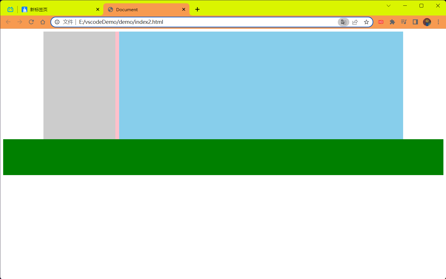
<div class="top clearfix"> | |
<div class="left"></div> | |
<div class="right"></div> | |
</div> | |
<div class="bottom"></div> | |
</body> | |
</html> |
结果:
# 清除浮动的方法 ——④双伪元素清除法
操作:
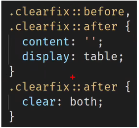
特点:
- 优点:项目中使用,直接给标签加类即可清除浮动
代码:
<!DOCTYPE html> | |
<html lang="en"> | |
<head> | |
<meta charset="UTF-8"> | |
<meta name="viewport" content="width=device-width, initial-scale=1.0"> | |
<title>Document</title> | |
<style> | |
.top { | |
margin: 0 auto; | |
width: 1000px; | |
/* 如果.left 和.right 都浮动的话就不在标准流中了,div 为块级元素没有内容撑开了所以就 | |
看不到了但是不浮动就会被内容所撑开就能看得到 pink 的块了 */ | |
/* height: 300px; */ | |
background-color: pink; | |
} | |
.bottom { | |
height: 100px; | |
background-color: green; | |
} | |
.left { | |
float: left; | |
width: 200px; | |
height: 300px; | |
background-color: #ccc; | |
} | |
.right { | |
float: right; | |
width: 790px; | |
height: 300px; | |
background-color: skyblue; | |
} | |
/*.clearfix::before 作用:解决外边距塌陷问题 | |
外边距塌陷问题: 父子标签,都是块级,子级加 margin 会影响父级的位置 */ | |
/* 清除浮动 */ | |
.clearfix::before, | |
.clearfix::after { | |
content: ''; | |
display: table; | |
} | |
/* 真正清除浮动的标签 */ | |
.clearfix::after { | |
clear: both; | |
} | |
</style> | |
</head> | |
<body> | |
<div class="top clearfix"> | |
<div class="left"></div> | |
<div class="right"></div> | |
</div> | |
<div class="bottom"></div> | |
</body> | |
</html> |
结果:
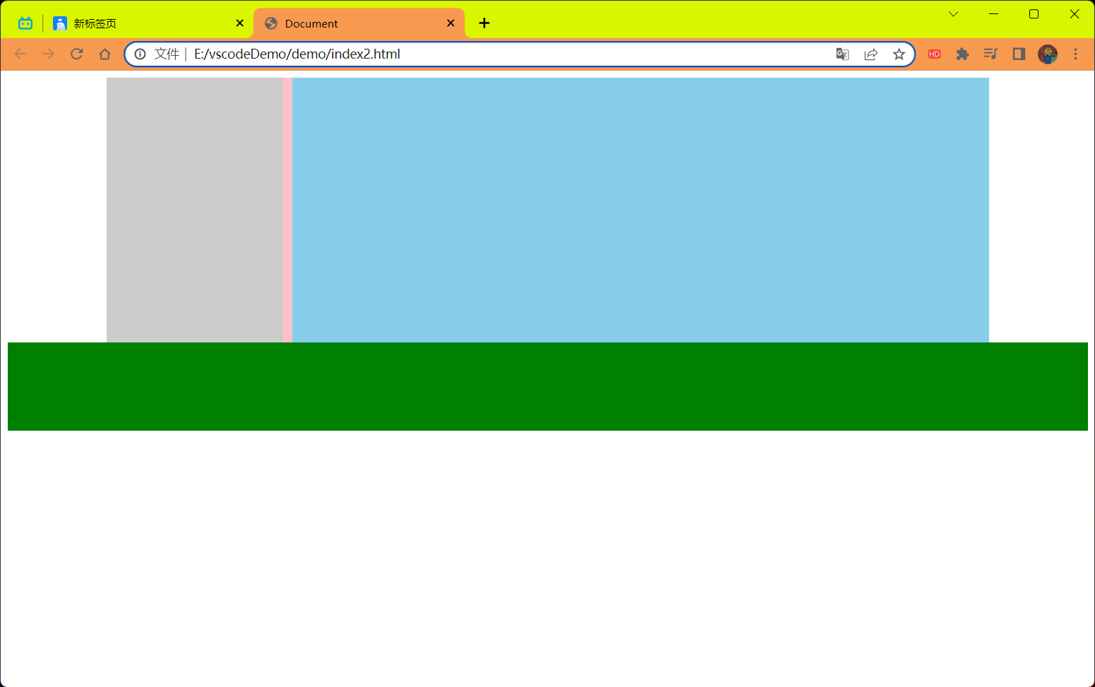
# 清除浮动的方法 ——⑤给父元素设置 overflow:hidden
操作:
- 直接给父元素设置 overflow:hidden
特点:
- 优点:方便
代码:
<!DOCTYPE html> | |
<html lang="en"> | |
<head> | |
<meta charset="UTF-8"> | |
<meta name="viewport" content="width=device-width, initial-scale=1.0"> | |
<title>Document</title> | |
<style> | |
.top { | |
margin: 0 auto; | |
width: 1000px; | |
/* 如果.left 和.right 都浮动的话就不在标准流中了,div 为块级元素没有内容撑开了所以就 | |
看不到了但是不浮动就会被内容所撑开就能看得到 pink 的块了 */ | |
/* height: 300px; */ | |
background-color: pink; | |
overflow: hidden; | |
} | |
.bottom { | |
height: 100px; | |
background-color: green; | |
} | |
.left { | |
float: left; | |
width: 200px; | |
height: 300px; | |
background-color: #ccc; | |
} | |
.right { | |
float: right; | |
width: 790px; | |
height: 300px; | |
background-color: skyblue; | |
} | |
</style> | |
</head> | |
<body> | |
<div class="top"> | |
<div class="left"></div> | |
<div class="right"></div> | |
</div> | |
<div class="bottom"></div> | |
</body> | |
</html> |
结果:
# 定位
定位:将盒子定在某一个位置,所以定位也是在摆放盒子,按照定位的方式移动盒子。
定位 = 定位模式 + 边偏移。
定位模式 用于指定一个元素在文档中的定位方式。边偏移则决定了该元素的最终位置。
<strong style="color:red"> 注意 </strong>:块元素和行内元素使用了绝对定位和固定定位 (<font color=red> 相对定位不会 </font>) 以后,会默认转换成行内块元素。
但是使用定位转换后的行内块元素默认不会继承父盒子的宽度,<font style="color:red">display:block 转换的是带有的 </font>。
# 定位模式
定位模式决定元素的定位方式,它通过 CSS 的 position 属性来设置,其值可以分为四个:
| 值 | 语义 |
|---|---|
| static (可以忽略基本不用基本不学) | 静态定位 |
| relative | 相对定位 |
| absolute | 绝对定位 |
| fixed | 固定定位 |
# 边偏移
边偏移就是定位的盒子移动到最终位置。有 top,bottom,left 和 right 4 个属性。
| 边偏移属性 | 示例 | 描述 |
|---|---|---|
| top | top:80px | 顶端偏移量,定义元素相对于其父元素上边线的距离。 |
| bottom | bottom:80px | 底部偏移量,定义元素相对于其父元素下边线的距离。 |
| left | left:80px | 左侧偏移量,定义元素相对于其父元素左边线的距离。 |
| right | right:80px | 右侧偏移量,定义元素相对于其父元素右边线的距离。 |
# 静态定位 static (了解)
静态定位是元素的 <strong style="color:red"> 默认定位方式,无定位的意思 </strong>。
语法:
选择器{position:static;}
- 静态定位按照标准流特性摆放位置,它没有边偏移。
- 静态定位在布局时很少用到
# 相对定位 (重要)
<strong style="color:red"> 相对定位 </strong > 是元素在移动位置的时候,是相对于它 < strong style="color:red"> 原来的位置 </strong > 来说的 (自恋型)
语法:
选择器{position:relative;}
相对定位的特点:(<font color=red> 务必记住 </font>)
- 它是相对于自己原来的位置来移动的 (<strong style="color:red"> 移动位置的时候参照点是自己原来的位置 </strong>)
- <strong style="color:red"> 原来 </strong > 在标准流的 < strong style="color:red"> 位置 </strong > 继续占有,后面的盒子仍然以标准流的方式对待它 (<strong style="color:red"> 不脱标,继续保留原来位置 </strong>)
因此,相对定位没有脱标。它最典型的应用是给绝对定位当爹的。。。
<font color=red> 子绝父相 </font> (记住这句话)
代码:
<!DOCTYPE html> | |
<html lang="en"> | |
<head> | |
<meta charset="UTF-8"> | |
<meta name="viewport" content="width=device-width, initial-scale=1.0"> | |
<title>Document</title> | |
<style> | |
.box1{ | |
/* 相对定位 */ | |
position: relative; | |
top: 100px; | |
left: 100px; | |
width: 200px; | |
height: 200px; | |
background-color: pink; | |
} | |
.box2 { | |
width: 200px; | |
height: 200px; | |
background-color: deeppink; | |
} | |
</style> | |
</head> | |
<body> | |
<div class="box1"> | |
</div> | |
<div class="box2"> | |
</div> | |
</body> | |
</html> |
结果:
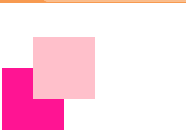
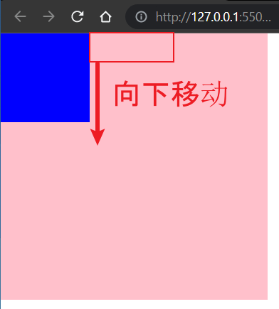
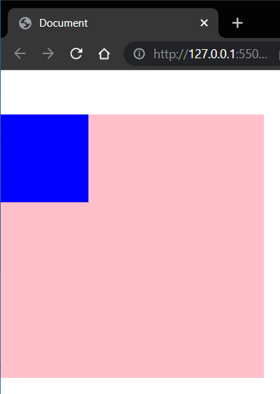
# 绝对定位 absolute (重要)
<strong style="color:Red"> 绝对定位 </strong > 是元素在移动位置的时候,是相对于它的 < strong style="color:Red"> 祖先元素 </strong > 来说的 (拼爹型)
语法:
选择器{position:absolute;}
绝对定位的特点:(务必记住)
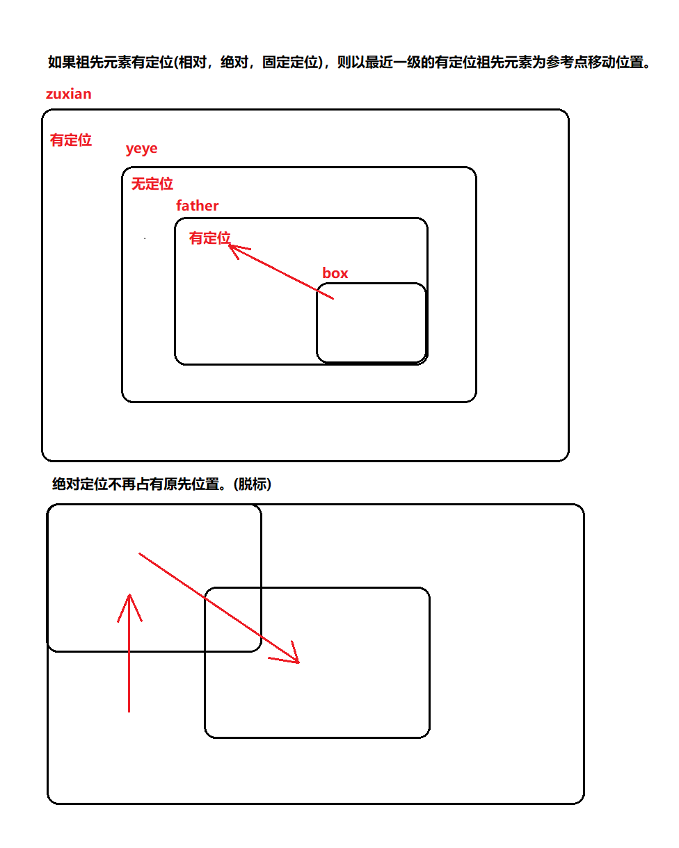
如果 <strong style="color:Red"> 没有祖先元素 </strong > 或者 < strong style="color:Red"> 祖先元素没有定位 </strong>,则以浏览器为准定位 (Document 文档)。
如果祖先元素有定位 (相对,绝对,固定定位),则以最近一级的有定位祖先元素为参考点移动位置。
![image-20230718122557422]()
绝对定位 <strong style="color:Red"> 不再占有原先位置 </strong>。(脱标)
代码:
第一种情况没有父元素则以浏览器为准定位
<!DOCTYPE html> | |
<html lang="en"> | |
<head> | |
<meta charset="UTF-8"> | |
<meta name="viewport" content="width=device-width, initial-scale=1.0"> | |
<title>Document</title> | |
<style> | |
.son { | |
/* 绝对定位 */ | |
position: absolute; | |
/* top: 10px; | |
left: 10px; | |
top: 10px; | |
right: 200px; */ | |
left: 0; | |
bottom: 0; | |
width: 200px; | |
height: 200px; | |
background-color: pink; | |
} | |
</style> | |
</head> | |
<body> | |
<div class="son"> | |
</div> | |
</body> | |
</html> |
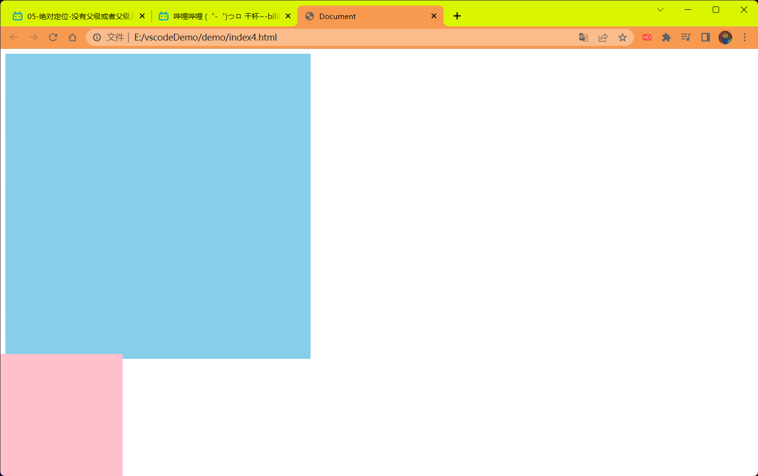
第二种情况有父元素并且父元素没有定位
<!DOCTYPE html> | |
<html lang="en"> | |
<head> | |
<meta charset="UTF-8"> | |
<meta name="viewport" content="width=device-width, initial-scale=1.0"> | |
<title>Document</title> | |
<style> | |
.father { | |
width: 500px; | |
height: 500px; | |
background-color: skyblue; | |
} | |
.son { | |
/* 绝对定位 */ | |
position: absolute; | |
/* top: 10px; | |
left: 10px; | |
top: 10px; | |
right: 200px; */ | |
left: 0; | |
bottom: 0; | |
width: 200px; | |
height: 200px; | |
background-color: pink; | |
} | |
</style> | |
</head> | |
<body> | |
<div class="father"> | |
<div class="son"> | |
</div> | |
</div> | |
</body> | |
</html> |
结果:
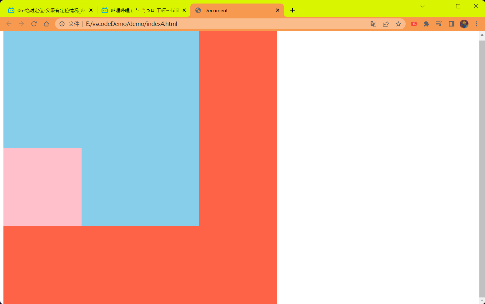
如果父元素定位了
<!DOCTYPE html> | |
<html lang="en"> | |
<head> | |
<meta charset="UTF-8"> | |
<meta name="viewport" content="width=device-width, initial-scale=1.0"> | |
<title>Document</title> | |
<style> | |
.zuxian { | |
position:absolute; | |
width: 700px; | |
height: 700px; | |
background-color: tomato; | |
} | |
.father { | |
position: absolute; | |
top: 0; | |
width: 500px; | |
height: 500px; | |
background-color: skyblue; | |
} | |
.son { | |
/* 绝对定位 */ | |
position: absolute; | |
/* top: 10px; | |
left: 10px; | |
top: 10px; | |
right: 200px; */ | |
left: 0; | |
bottom: 0; | |
width: 200px; | |
height: 200px; | |
background-color: pink; | |
} | |
</style> | |
</head> | |
<body> | |
<div class="zuxian"> | |
<div class="yeye"> | |
<div class="father"> | |
<div class="son"> | |
</div> | |
</div> | |
</div> | |
</div> | |
</body> | |
</html> |
结果:
# 问题
1 绝对定位和相对定位到底有什么使用场景?
2 为什么说相对定位给绝对定位当爹的呢?
# 子绝父相的由来
弄清楚这个口诀,就明白了绝对定位和想相对定位的使用场景。
这个 "子绝父相" 太重要了,是我们学习定位的口诀,是定位中最常用的一种方式这句话的意思是:<strong style="color:red"> 子级是绝对定位的话,父级要用相对定位 </strong>。
- 子级绝对定位,不会占有位置,可以放到父盒子里面的任何一个地方,不会影响其它的兄弟盒子
- 父盒子需要加定位限制子盒子在父盒子内显示。
- 父盒子布局时,需要占有位置,因此父亲只能是相对定位。
这就是子绝父相的由来,所以 <strong style="color:red"> 相对定位经常用来作为绝对定位的父级 </strong>。
总结:<strong style="color:red"> 因为父级需要占有位置,因此是相对定位,子盒子不需要占有位置,则是绝对定位 </strong>。
# 案例 ——hot 模块
需求:在介绍的模块中加入一个 Hot 图标
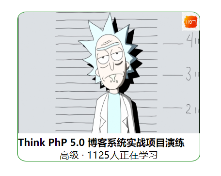
代码:
<!DOCTYPE html> | |
<html lang="en"> | |
<head> | |
<meta charset="UTF-8"> | |
<meta name="viewport" content="width=device-width, initial-scale=1.0"> | |
<title>Document</title> | |
<style> | |
*{ | |
margin: 0; | |
padding: 0; | |
} | |
.box{ | |
margin-left: 100px; | |
margin-top: 100px; | |
width: 300px; | |
border: 1px green double; | |
border-radius: 5%; | |
overflow:hidden; | |
} | |
.box ul li { | |
position: relative; | |
list-style: none; | |
} | |
.box ul li em { | |
position: absolute; | |
top: 0; | |
right: 0; | |
} | |
.info { | |
text-align: center; | |
} | |
</style> | |
</head> | |
<body> | |
<div class="box"> | |
<ul> | |
<li> | |
<em> | |
<img src="../imgage/hot图标.png" width="30px" height="30px" alt="标签"/> | |
</em> | |
<img src="../imgage/瑞克.png" width="300px" height="200px" alt="这是图"/> | |
<h4>Think PhP 5.0 博客系统实战项目演练</h4> | |
<div class="info"> | |
<span>高级</span> · 1125人正在学习 | |
</div> | |
</li> | |
</ul> | |
</div> | |
</body> | |
</html> |
结果:
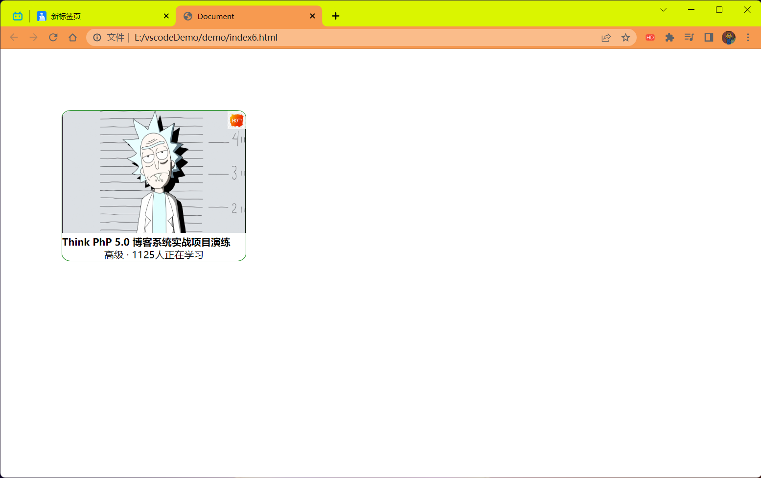
# 固定定位 fixed (重要)
<strong style="color:red"> 固定定位 </strong > 是元素 < strong style="color:red"> 固定于浏览器可视区的位置 </strong>。
主要使用场景:可以在浏览器页面滚动时元素的位置不会改变。
语法:
选择器{position:fixed};
固定定位的特点:(<strong style="color:red"> 务必记住 </strong>)
- 以浏览器的可视窗口为参照点移动元素。
- 跟父元素没有任何关系
- 不随滚动条滚动
- 固定定位不在占有原先的位置.
固定定位也是脱标的,其实固定定位也可以看做是一种特殊的绝对定位。
代码:
<!DOCTYPE html> | |
<html lang="en"> | |
<head> | |
<meta charset="UTF-8"> | |
<meta name="viewport" content="width=device-width, initial-scale=1.0"> | |
<title>Document</title> | |
<style> | |
.dj { | |
position: fixed; | |
top: 100px; | |
left: 40px; | |
} | |
</style> | |
</head> | |
<body> | |
<div class="dj"> | |
<img src="../imgage/hot图标.png" width="100px" height="100px" alt="图片"/> | |
</div> | |
<p>111111111111111111111111111</p> | |
<p>111111111111111111111111111</p> | |
<p>111111111111111111111111111</p> | |
<p>111111111111111111111111111</p> | |
<p>111111111111111111111111111</p> | |
<p>111111111111111111111111111</p> | |
<p>111111111111111111111111111</p> | |
<p>111111111111111111111111111</p> | |
<p>111111111111111111111111111</p> | |
<p>111111111111111111111111111</p> | |
<p>111111111111111111111111111</p> | |
<p>111111111111111111111111111</p> | |
<p>111111111111111111111111111</p> | |
<p>111111111111111111111111111</p> | |
<p>111111111111111111111111111</p> | |
<p>111111111111111111111111111</p> | |
<p>111111111111111111111111111</p> | |
<p>111111111111111111111111111</p> | |
<p>111111111111111111111111111</p> | |
<p>111111111111111111111111111</p> | |
<p>111111111111111111111111111</p> | |
<p>111111111111111111111111111</p> | |
<p>111111111111111111111111111</p> | |
<p>111111111111111111111111111</p> | |
<p>111111111111111111111111111</p> | |
<p>111111111111111111111111111</p> | |
<p>111111111111111111111111111</p> | |
<p>111111111111111111111111111</p> | |
<p>111111111111111111111111111</p> | |
<p>111111111111111111111111111</p> | |
<p>111111111111111111111111111</p> | |
<p>111111111111111111111111111</p> | |
<p>111111111111111111111111111</p> | |
<p>111111111111111111111111111</p> | |
<p>111111111111111111111111111</p> | |
<p>111111111111111111111111111</p> | |
<p>111111111111111111111111111</p> | |
<p>111111111111111111111111111</p> | |
<p>111111111111111111111111111</p> | |
<p>111111111111111111111111111</p> | |
<p>111111111111111111111111111</p> | |
<p>111111111111111111111111111</p> | |
<p>111111111111111111111111111</p> | |
<p>111111111111111111111111111</p> | |
<p>111111111111111111111111111</p> | |
<p>111111111111111111111111111</p> | |
<p>111111111111111111111111111</p> | |
<p>111111111111111111111111111</p> | |
<p>111111111111111111111111111</p> | |
<p>111111111111111111111111111</p> | |
</body> | |
</html> |
效果:
# 固定定位小技巧:固定在版中右侧位置
算法:
- 让固定定位的盒子 left:50%,走到浏览器可视区 (也可以看作版心) 的一半的位置。
- 让固定定位的盒子 margin-left: 版心宽度的一半距离。多走 版心宽度的一半位置。
就可以让固定定位的盒子贴着版心右侧对齐了。
解释:
给固定定位设置 left:50% 后就到了中间的位置,在往右走版心的一半的像素就可以了。
left:50% 上面已经用过了可以使用 margin-left 来进行版心的一半的移动。
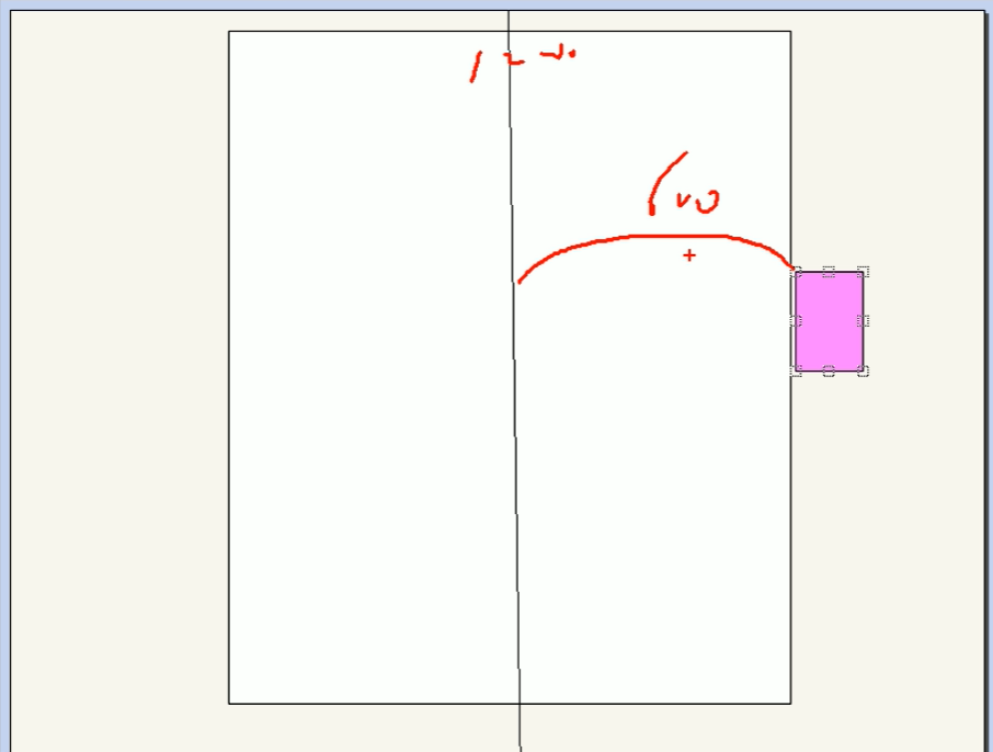
代码:
<!DOCTYPE html> | |
<html lang="en"> | |
<head> | |
<meta charset="UTF-8"> | |
<meta name="viewport" content="width=device-width, initial-scale=1.0"> | |
<title>Document</title> | |
<style> | |
* { | |
margin: 0; | |
padding: 0; | |
} | |
.w { | |
width: 800px; | |
height: 1400px; | |
background-color: pink; | |
margin: 0 auto; | |
} | |
.fixed { | |
width: 50px; | |
height: 50px; | |
background-color: skyblue; | |
/* 固定定位 */ | |
position: fixed; | |
bottom: 59px; | |
/*1. 走浏览器宽度的一半 */ | |
left: 50%; | |
/*2. 再往右走到版心的边适合的位置 */ | |
margin-left: 409px; | |
} | |
</style> | |
</head> | |
<body> | |
<div class="fixed"></div> | |
<div class="w">版心盒子 800像素</div> | |
</body> | |
</html> |
效果:
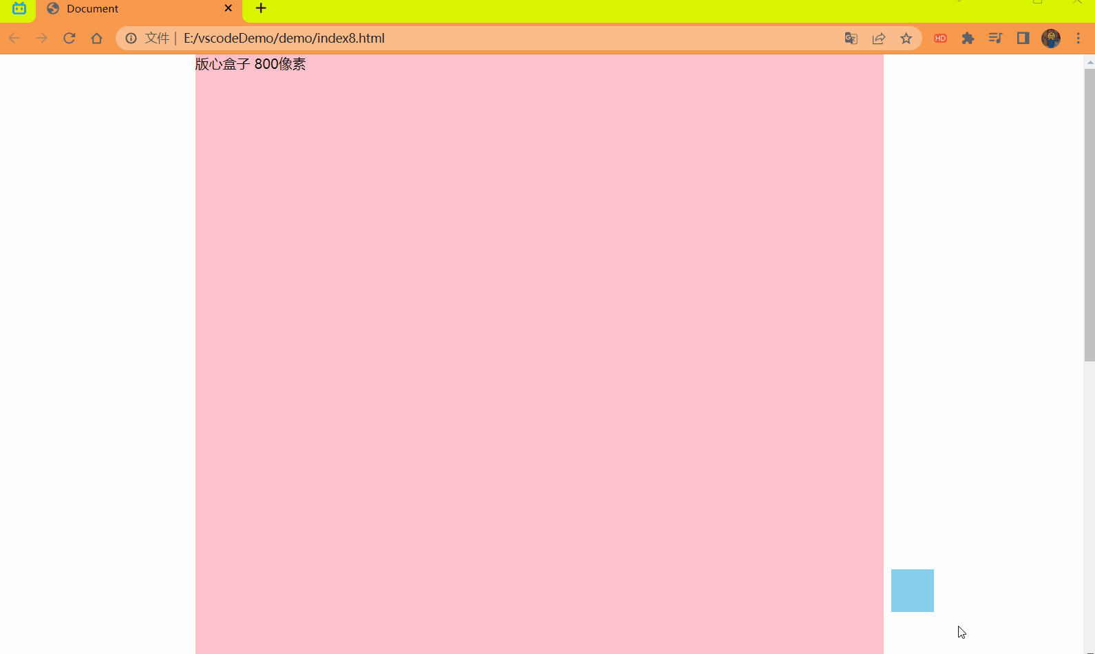
# 粘性定位 sticky
<strong style="color:red"> 粘性定位 </strong > 可以被认为是相对定位和固定定位的混合。Sticky 粘性的。
语法:
选择器{
		position:sticky;
		top: 10px;
		}
粘性定位的特点:
- 以浏览器的可视窗口为参照点移动元素 (固定定位特点)
- 粘性定位 <strong style="color:red"> 占有原先的位置 </strong>(相对定位特点)
- 必须添加 top,left,right,bottom 其中一个才有效。
<strong style="color:red"> 注意 </strong>:跟页面滚动搭配使用。兼容性较差,IE 不支持。
代码:
<style> | |
* { | |
margin: 0; | |
padding: 0; | |
} | |
body { | |
height: 2000px; | |
} | |
div { | |
/* 粘性定位 | |
默认为转换为行内块元素,宽度不会默认继承父盒子 | |
当元素距离浏览器可视区的 10px 时固定住不再移动 */ | |
position: sticky; | |
top: 10px; | |
width: 900px; | |
height: 80px; | |
background-color: pink; | |
margin: 200px auto; | |
} | |
</style> | |
</head> | |
<body> | |
<div></div> | |
</body> |
效果:
# 定位的总结
| 定位模式 | 是否脱标 | 移动位置 | 是否常用 |
|---|---|---|---|
| static 静态定位 | 否 | 不能使用边偏移 | 很少 |
| <strong style="color:red">relative 相对定位 </strong> | <strong style="color:red"> 否 (占有位置)</strong> | <strong style="color:red"> 相对于自身位置移动 </strong> | <strong style="color:red"> 常用 </strong> |
| <strong style="color:red">absolute 绝对定位 </strong> | <strong style="color:red"> 是 (不占有位置)</strong> | <strong style="color:red"> 带有定位的父级 </strong> | <strong style="color:red"> 常用 </strong> |
| <strong style="color:red">fixed 固定定位 </strong> | <strong style="color:red"> 是 (不占有位置)</strong>. | <strong style="color:red"> 浏览器可视区 </strong> | <strong style="color:red"> 常用 </strong> |
| sticky 粘性定位 | 否 (占有位置) | 浏览器可区 | 当前阶段少 (<strong style="color:red"> 不建议使用 </strong>) |
- 一定记住相对定位,固定定位,绝对定位两个大的特点:
- 是否占有位置 (脱标否)
- 以谁为准点移动位置
- 学习定位重点学会 <strong style="color:red"> 子绝父相 </strong>.
# 定位叠放次序 z-index
在使用定位布局时,可能会出现盒子重叠的情况。此时,可以使用 z-index 来控制盒子的前后次序 (z 轴)
语法:
选择器{z-index:1;}
- 数值可以是正整数,负整数或 0,默认是 auto,数值越大,盒子越靠上。
- 如果属性值相同,则按照书写顺序,后来居上.
- <Strong style="color:red"> 数字后面不能加单位 (千万注意)</strong>.
- <font color=red> 只有定位的盒子才有
z-index属性 </font>.
# 定位的扩展
# 绝对定位的盒子居中
加了绝对定位的盒子不能通过 margin: 0 auto 水平居中,但是可以通过以下计算方法实现水平和垂直居中。
实现步骤:
- left:50%;:让盒子的左侧移动到父级元素的水平中心位置。
- maring-left: -100px;:让盒子向左移动自身宽度的一半
代码:
<!DOCTYPE html> | |
<html lang="en"> | |
<head> | |
<meta charset="UTF-8"> | |
<meta name="viewport" content="width=device-width, initial-scale=1.0"> | |
<title>Document</title> | |
<style> | |
* { | |
margin: 0; | |
padding: 0; | |
} | |
.box { | |
width: 200px; | |
height: 200px; | |
background-color: pink; | |
position: absolute; | |
left: 50%; | |
margin-left: -100px; | |
top: 50%; | |
margin-top: -100px; | |
/* 在定位中使用不起效果 */ | |
/* margin: 0 auto; */ | |
} | |
</style> | |
</head> | |
<body> | |
<div class="box"></div> | |
</body> | |
</html> |
效果:
# 定位特殊特性
绝对定位和固定定位也和浮动类似。
类似点:
- 脱标 (不占有原来位置)
- 默认转换为行内块元素
行内元素添加绝对定位或者固定定位,可以直接设置宽度和高度。
- 因为子绝父相,绝对定位脱标 转换为行内块元素,相对定位 不脱标不进行转换。
<style>
span {
/* 加上定位后就可以为行内元素设置宽高了 */position: absolute;
background-color: pink;
width: 100px;
height: 100px;
}</style></head><body>/*span是行内元素不能设置宽高的*/
<span>123
</span></body>效果:
![image-20230718104148850]()
块级元素添加绝对定位或者固定定位,如果不给宽度或者高度,默认大小是内容大小。
- 因为 绝对定位 和 固定定位 会默认将其它级别元素 转换为 行内块元素。
<style>
div {
/* 块级元素加上绝对定位后就是按照内容大小的盒子了 */position: absolute;
background-color: skyblue;
}</style></head><body><div>abcd</div>
</body>效果:
![image-20230718104547537]()
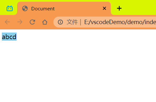
# 脱标的盒子不会触发外边距塌陷
浮动元素, 绝对定位 (固定定位) 元素的都不会触发外边距合并的问题。
# 绝对定位 (固定定位) 会完全压住盒子包括内容
浮动元素不同,只会压住它下面的标准流的盒子,但是不会压住下面标准流盒子里面的文字 / 图片.
代码:
<style> | |
* { | |
margin: 0; | |
padding: 0; | |
} | |
.box { | |
float: left; | |
width: 150px; | |
height: 150px; | |
background-color: pink; | |
} | |
</style> | |
</head> | |
<body> | |
<div class="box"></div> | |
<p>阁下何不同风起,扶摇直上九万里</p> | |
</body> |
效果:
但是绝对定位 (固定定位) 会压住下面标准流所有的内容.
<style> | |
* { | |
margin: 0; | |
padding: 0; | |
} | |
.box { | |
/* float: left; */ | |
position: absolute; | |
width: 150px; | |
height: 150px; | |
background-color: pink; | |
} | |
</style> | |
</head> | |
<body> | |
<div class="box"></div> | |
<p>阁下何不同风起,扶摇直上九万里</p> | |
</body> |
效果:
浮动之所以不会压住文字,因为浮动产生的目的最初是为了做文字环绕效果的,文字会围绕浮动元素。
<strong style="color:red"> 注意 </strong>:但是浮动和绝对定位一起使用文字还是会被压下面去的!
<style> | |
* { | |
margin: 0; | |
padding: 0; | |
} | |
.box { | |
float: left; | |
position: absolute; | |
width: 150px; | |
height: 150px; | |
background-color: pink; | |
} | |
</style> | |
</head> | |
<body> | |
<div class="box"></div> | |
<p>阁下何不同风起,扶摇直上九万里</p> | |
</body> |
效果:
# 网页布局总结
通过盒子模型,清楚直到大部分 html 标签是一个盒子。
通过 CSS 浮动,定位可以让每个盒子排列到成为网页。
一个完整的网页,是标准流,浮动,定位一起完成布局的,每个都有自己的专门用法。
1 标准流
可以让盒子上下排列或者左右排列,<strong style="color:red"> 垂直的块级盒子显示就用标准流局部 </strong>。
2 浮动
可以让多个块级元素一行显示或者左右对齐盒子,<strong style="color:red"> 多个块级盒子水平显示就用浮动布局 </strong>。
3 定位
定位最大的特点是有层叠的概念,就是可以让多个盒子前后叠压来显示。<strong style="color:red"> 如果元素自由在某个盒子内移动就用定位局部 </strong>。
# 元素的显示与隐藏
类似网站广告,当我们点击关闭就不见了,但是我们重新刷新页面,会重新出现!
本质:<strong style="color:red"> 让一个元素在页面中隐藏或者显示出来 </strong>。
# display 属性⭐️
display 属性用于设置一个元素对应如何显示。
- display:none; 隐藏对象
- display:block; 除了转换为块级元素之外,同时还有显示元素的意思
<strong style="color:red">display 隐藏元素后,不再占有原来的位置 </strong>。
后面应用及其广泛,搭配 JS 可以做很多的网页特效。
<style> | |
.peppa { | |
display: none; | |
/*display:block;*/ | |
width: 200px; | |
height: 200px; | |
background-color: pink; | |
} | |
.george { | |
width: 200px; | |
height: 200px; | |
background-color: skyblue; | |
} | |
</style> | |
</head> | |
<body> | |
<div class="peppa">佩奇</div> | |
<div class="george">乔治</div> | |
</body> |
效果:
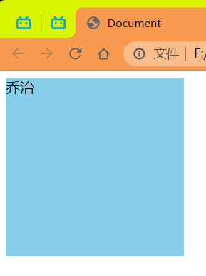
# visibility 可见性
<strong style="color:red">visibility</strong > 属性用于指定一个元素应可见还是隐藏
- visibility:visible; 元素可视
- visibility:hidden; 元素隐藏
- <strong style="color:red"> 注意:visibility 隐藏元素后,继续占有原来的位置 </strong>。
<style> | |
.peppa { | |
visibility: hidden; | |
width: 200px; | |
height: 200px; | |
background-color: pink; | |
} | |
.george { | |
width: 200px; | |
height: 200px; | |
background-color: skyblue; | |
} | |
</style> | |
</head> | |
<body> | |
<div class="peppa">佩奇</div> | |
<div class="george">乔治</div> | |
</body> |
效果:
# 总结:
如果隐藏元素想要原来位置,就用 visibility:hidden;
如果隐藏元素不想要原来位置,就用 display:none; (用处更多 重点)
# overflow 溢出
overflow 属性指定了如果内容溢出一个元素的框 (超过其指定高度及宽度) 时,会发生什么。
| 属性值 | 描述 |
|---|---|
| visible | 不剪切内容也不添加滚动条 |
| hidden | 不显示超过对象尺寸的内容,超出的部分隐藏掉 |
| scroll | 不管超出内容是否,总是显示滚动条 |
| auto | 按需求来决定,超出自动显示滚动条,不超出不显示滚动条 |
一般情况下,我们都不想让溢出的内容显示出来,因为溢出的部分会影响布局。
<font color=red> 但是如果有定位的盒子,请慎用 overflow:hidden 因为它会隐藏 </font>.
代码:
<style> | |
.peppa { | |
/* 隐藏溢出部分 */ | |
/* overflow: hidden; */ | |
/* 滚动条显示溢出部分,不溢出也会显示滚动条 */ | |
/* overflow: scroll; */ | |
/* 按需显示滚动条 */ | |
overflow: auto; | |
width: 200px; | |
height: 200px; | |
border: 3px pink solid; | |
margin: 100px auto; | |
} | |
</style> | |
</head> | |
<body> | |
<div class="peppa"> | |
《小猪佩奇》(Peppa Pig)是英国动画公司Astley Baker Davies、Entertainment | |
One制作的原创欧洲儿童系列电视动画 [11] [13] ,由内维尔·阿斯特利、马克·贝克、 | |
菲尔·霍尔与乔里斯·范胡尔岑执导 [14] ,于2004年5月31日在英国电视五台首播 [15] , | |
2015年6月,《小猪佩奇》引进中国大陆,并在中央电视台少儿频道首播 [17] 。 | |
</div> | |
</body> |
效果:
# 隐藏滚动条但保留功能
要隐藏滚动条,但仍能保持滚动,可以使用以下代码:
/* 隐藏 Chrome、Safari 和 Opera 的滚动条 */ | |
.example::-webkit-scrollbar { | |
display: none; | |
} | |
/* 隐藏 IE、Edge 和 Firefox 的滚动条 */ | |
.example { | |
-ms-overflow-style: none; /* IE and Edge */ | |
scrollbar-width: none; /* Firefox */ | |
} |
代码:
<!DOCTYPE html> | |
<html> | |
<head> | |
<style> | |
.example { | |
background-color: #eee; | |
width: 200px; | |
height: 100px; | |
border: 1px dotted black; | |
overflow-y: scroll; /* 添加滚动功能 */ | |
} | |
/* 隐藏 Chrome、Safari 和 Opera 的滚动条 */ | |
.example::-webkit-scrollbar { | |
display: none; | |
} | |
/* 为 IE、Edge 和 Firefox 隐藏滚动条 */ | |
.example { | |
-ms-overflow-style: none; /* IE 和 Edge */ | |
scrollbar-width: none; /* Firefox */ | |
} | |
</style> | |
</head> | |
<body> | |
<h2>隐藏滚动条但保留功能</h2> | |
<p>尝试在下面的 div 中滚动:</p> | |
<div class="example">一些启用滚动的文本.. 一些启用滚动的文本.. 一些启用滚动的文本.. 一些启用滚动的文本.. 一些启用滚动的文本.. 一些启用滚动的文本.. 一些启用滚动的文本.. 一些启用滚动的文本.. 一些启用滚动的文本.. 一些启用滚动的文本.. 一些启用滚动的文本.. 一些启用滚动的文本.. 一些启用滚动的文本.. 一些启用滚动的文本.. 一些启用滚动的文本.. 一些启用滚动的文本.. 一些启用滚动的文本.. 一些启用滚动的文本.. 一些启用滚动的文本.. 一些启用滚动的文本.. 一些启用滚动的文本.. 一些启用滚动的文本.. 一些启用滚动的文本.. 一些启用滚动的文本.. 一些启用滚动的文本.. 一些启用滚动的文本.. 一些启用滚动的文本.. 一些启用滚动的文本.. 一些启用滚动的文本.. 一些启用滚动的文本.. 一些启用滚动的文本.. 一些启用滚动的文本.. 一些启用滚动的文本.. </div> | |
</body> | |
</html> |
效果:
# 背景线性渐变

语法:
background: linear-gradient(起始方向,颜色1,颜色2,...); | |
background: -webkit-linear-gradient(left,red,blue); | |
background: -webkit-linear-gradient(left top,red,blue); | |
background: linear-gradient(透明/方向,rgba(0,0,0,.5)); /* 使用 rgba 三原色 和 透明度 */ | |
background: linear-gradient(transparent,rgba(0,0,0,.5)); |
<font color=red> 背景渐变必须添加浏览器私有前缀 </font>. -webkit-
起始方向可以是:访问名词 或者 度数,如果省略默认就是 top.
代码:
<style> | |
div { | |
width: 600px; | |
height: 200px; | |
/* 背景渐变必须加浏览器私有前缀 */ | |
background: -webkit-linear-gradient(top left,red,blue); | |
} | |
</style> | |
</head> | |
<body> | |
<div></div> | |
</body> |
效果: