# CSS 高级
# 精灵图
为什么需要精灵图
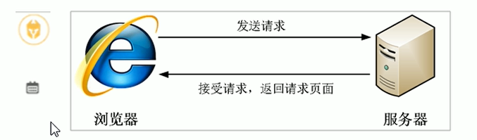
一个网页中往往会应用很小的背景图像作为修饰,当网页中的图像过多,服务器就会频繁地接收和发送请求图片,造成服务器请求压力过大,这将大大降低页面的加载速度。
因此,<strong style="color:red"> 为了有效地减少服务器接收和发送请求的次数,提高页面的加载速度 </strong>,出现了 < strong style="color:red">CSS 精灵技术 </strong>(也称 CSS Sprites, CSS 雪碧)
<strong style="color:red"> 核心原理:将网页中的一些小背景图像整合到一张大图中,这样服务器只需要一次请求就可以了 </strong>。
# 精灵图的使用
使用精灵图核心:
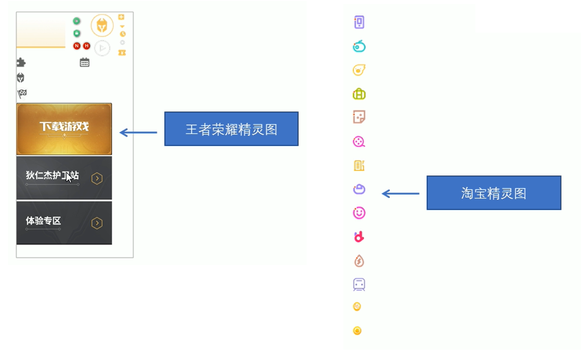
- 精灵技术主要针对于背景图片。就是把多个小背景图片整合到一张大的图片中。
- 这个大图片也成为 sprites 精灵图或者雪碧图
- 移动背景图片位置,此时可以使用 <font style="color:red">background-position</font>.
- 移动的距离就是这个目标图片的 <font style="color:red">x</font > 和 < font style="color:red">y</font > 坐标。注意网页中的坐标有所不同
- 因为一半情况下都是网上往左移动,所以数值是负数
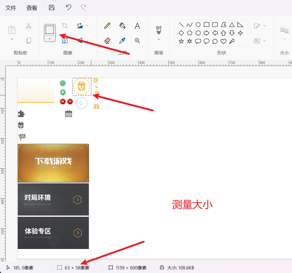
- 使用精灵图的时候需要精确测量,每个小背景图片的大小和位置
# 使用精灵图核心总结:
- 精灵图主要针对于小的背景图片使用。
- 主要借助于背景位置来实现 ——<font style="color:red">background-position</font>.
- 一半情况下精灵图都是负值。(千万注意网页中的坐标:x 轴右边走是正值,左边走是负值,y 轴同理)
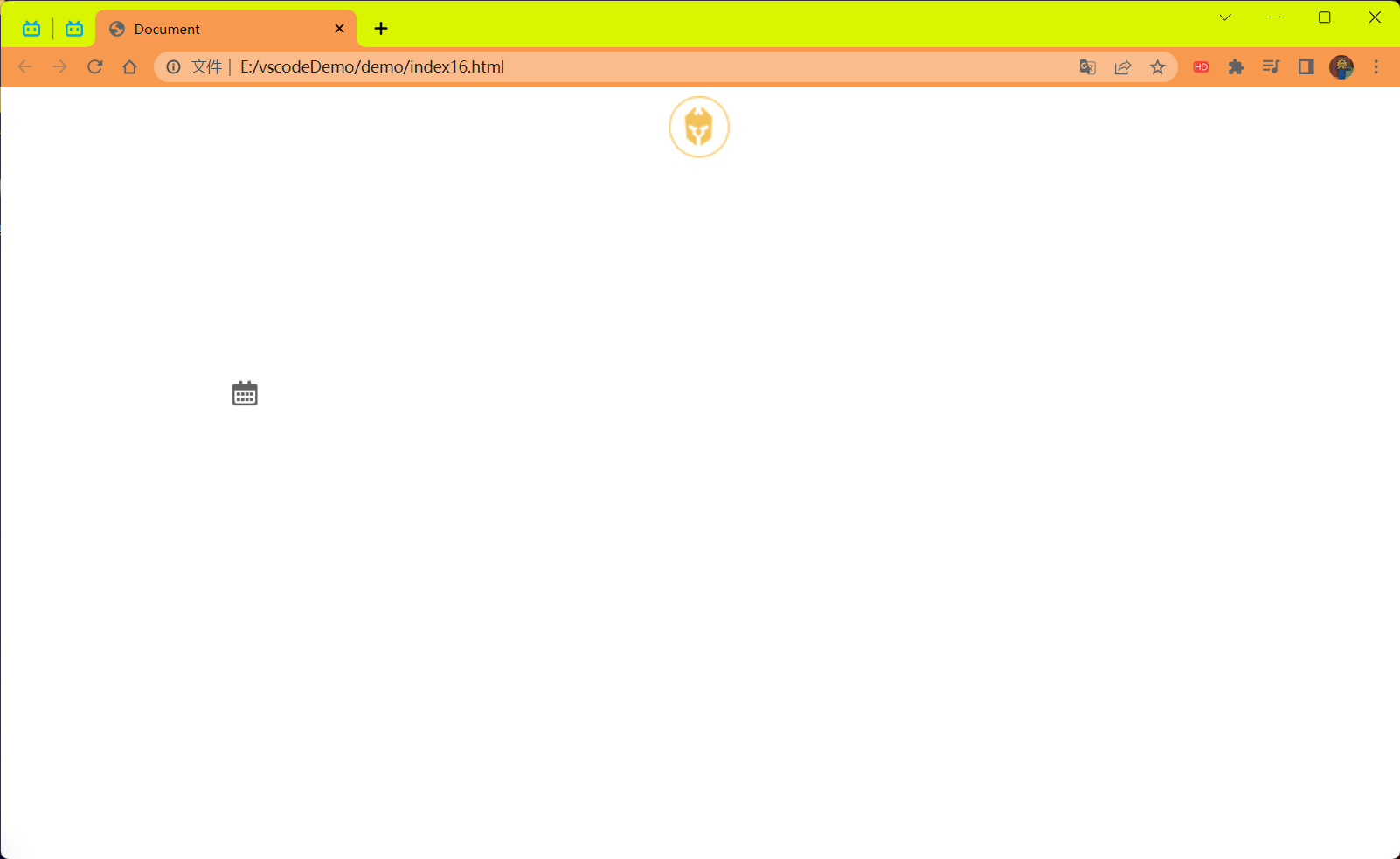
# 使用案例:
需求请显示出下面需要的一个人物头图标和日期图标其它不显示
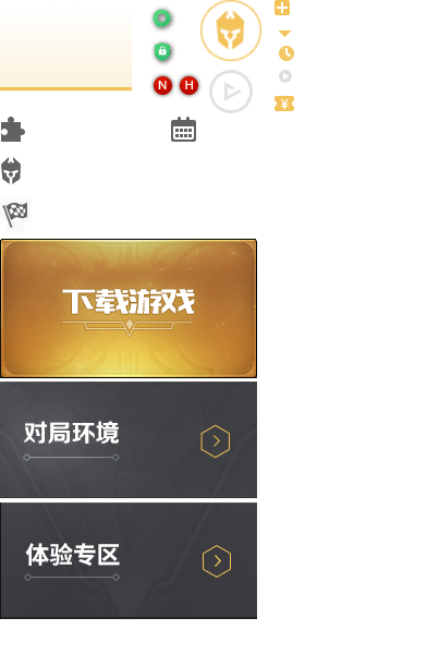
操作步骤:
将这个图片放入到 Win 自带的画板里面进行测量
测量大小和坐标
代码:
<!DOCTYPE html> | |
<html lang="en"> | |
<head> | |
<meta charset="UTF-8"> | |
<meta name="viewport" content="width=device-width, initial-scale=1.0"> | |
<title>Document</title> | |
<style> | |
div { | |
background:url('../imgage/index.png') no-repeat; | |
} | |
.ren { | |
width: 63px; | |
height: 58px; | |
margin: 0 auto; | |
background-position: -182px -0px; | |
} | |
.ri { | |
width: 33px; | |
height: 33px; | |
margin: 200px; | |
background-position: -153px -105px; | |
} | |
</style> | |
</head> | |
<body> | |
<div class="ren"></div> | |
<div class="ri"></div> | |
</body> | |
</html> |
效果:
# 字体图标
字体图标使用场景:主要用于显示网页中通用,常用的一些小图标。
精灵图是有诸多优点的,但是缺点很明显。
- 图片文件还是比较大的。
- 图片本身放大和缩小会失真。
- 一旦图片制作完毕想要更换非常复杂。
此时,有一种技术的出现很好的解决了以上问题,就是 <font style="color:red"> 字体图标 iconfont</font>。
<font style="Color:red"> 字体图标 </font> 可以为前端工程师提供一种方便高效的图标使用方式,<font style="color:red"> 展示的是图标,本质属于字体 </font>。
# 字体图标的优点
轻量级:一个图标字体要比一系列的图像更小。一旦字体加载了,图标就会马上渲染出来,减少了服务器请求。
灵活性:本质其实是文字,可以很随意的改变颜色,产生阴影,透明效果,旋转等。
兼容性:字体图标不能替代精灵技术,只是对工作中图标部分技术的提升和优化。
总结:
- 如果遇到一些结构和样式比较简单的小图标,就用字体图标。
![image-20230718141821202]()
- 如果遇到一些结构和样式复杂一点的小图片,就用精灵图
![image-20230718141845456]()
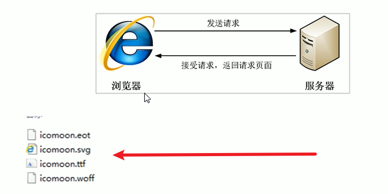
字体文件格式:
不同浏览器所支持的字体格式是不一样的,字体图标之所以兼容,就是因为包含了主流浏览器支持的字体文件。
- TureType (<font style="color:red">.ttf</font>) 格式.ttf 字体是 Windows 和 Mac 的最常见的字体,支持这种字体的浏览器有 IE9+,Firefox3.5+,Chrome4+,Safari3+,Opera10+,IOSMobile,Safari4.2+;
- Web Open Font Foramt (<font style="color:red">.woff</font>) 格式 woff 字体,支持这种字体的浏览器有 IE9+,Firefox3.5+,Chrome6+,Safari3.6+,Opera11.1+;
- Embedded Open Type (<font style="color:red">.eot</font>) 格式.eot 字体是 IE 专用字体,支持这种字体的浏览器有 IE4+;
- SVG (<font style="color:red">.svg</font>) 格式.svg 字体是基于 SVG 字体渲染的一种格式,支持这种字体的浏览器有 Chrome4+,Safari3.1+,Opera10.0+,IOSMobile Safari3.2+;
字体图标是一些网页常见的小图标,我们直接网上下载即可。因此使用可以分为:
# 1 字体图标的下载
# 推荐下载网站:
icomoon 字库:https://icomoon.io/app/#/select
阿里 iconfont 字库:https://www.iconfont.cn/
# 2 字体图标的引入 (引入到我们 HTML 页面中)
在 CSS 样式中全局声明字体:简单理解把这些字体文件通过 CSS 引入到我们页面中。
下面的内容可以在下载好的 icomoon 中找到
一定注意字体路径问题:
@font-face { | |
font-family: 'icomoon'; | |
src: url('fonts/icomoon.eot?nzdx0k'); | |
src: url('fonts/icomoon.eot?nzdx0k#iefix') format('embedded-opentype'), | |
url('fonts/icomoon.ttf?nzdx0k') format('truetype'), | |
url('fonts/icomoon.woff?nzdx0k') format('woff'), | |
url('fonts/icomoon.svg?nzdx0k#icomoon') format('svg'); | |
font-weight: normal; | |
font-style: normal; | |
font-display: block; | |
} |
代码:
将上面的复制到 style 标签中然后再 span 标签中引入字体的样式不然并不会生效的。
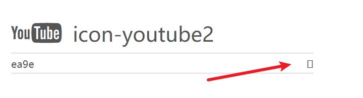
打开下载 icomoon 时解压文件中的一个网页
![image-20230718150732839]()
选择想要的图标后复制小框框到 span 标签中就可以了 也可以使用左边的编号 <strong style="color:red"> 注意:必须加上
\进行转义 </strong>.![image-20230718150808215]()
<!DOCTYPE html> | |
<html lang="en"> | |
<head> | |
<meta charset="UTF-8"> | |
<meta name="viewport" content="width=device-width, initial-scale=1.0"> | |
<title>Document</title> | |
<style> | |
/* 字体声明 */ | |
@font-face { | |
font-family: 'icomoon'; | |
src: url('fonts/icomoon.eot?nzdx0k'); | |
src: url('fonts/icomoon.eot?nzdx0k#iefix') format('embedded-opentype'), | |
url('fonts/icomoon.ttf?nzdx0k') format('truetype'), | |
url('fonts/icomoon.woff?nzdx0k') format('woff'), | |
url('fonts/icomoon.svg?nzdx0k#icomoon') format('svg'); | |
font-weight: normal; | |
font-style: normal; | |
font-display: block; | |
} | |
span { | |
font-family: 'icomoon'; | |
font-size: 100px; | |
color: pink; | |
} | |
</style> | |
</head> | |
<body> | |
<span></span> | |
<span>\{编号}</span> | |
</body> | |
</html> |
效果:
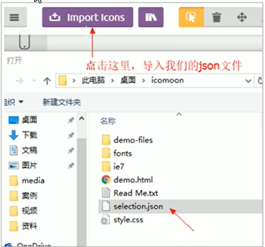
# 3 字体图标的追加 (以后添加新的小图标)
如果工作中,原来的字体图标不够用了,我们需要添加新的字体图标到原来的字体文件中。
把压缩包里面的 selection.json 重新上传,然后选中自己想要新的图标,重新下载压缩包,并替换原来的文件即可。
上传时自己之前选过的就会重新选上的。
字体图标加载的原理:
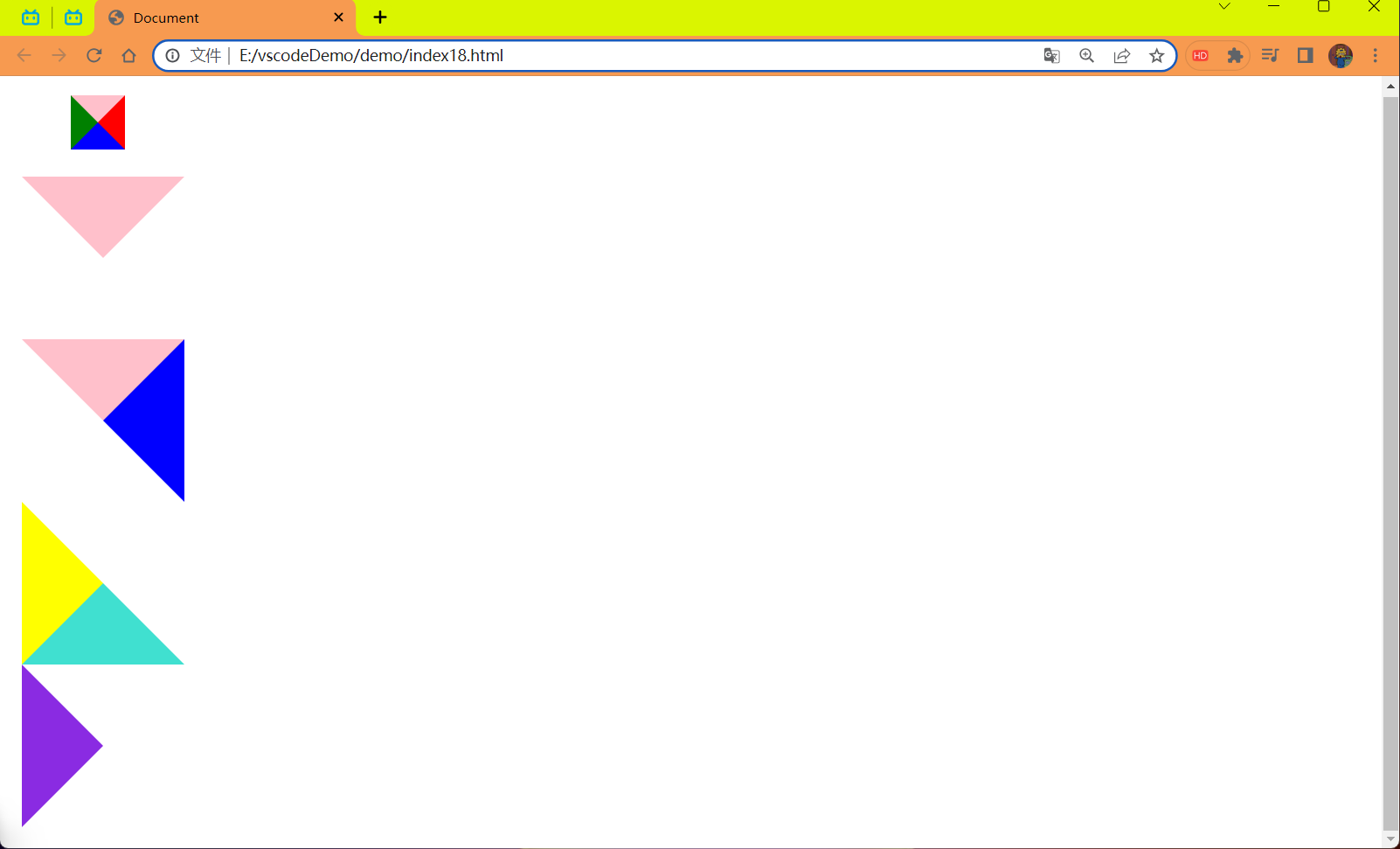
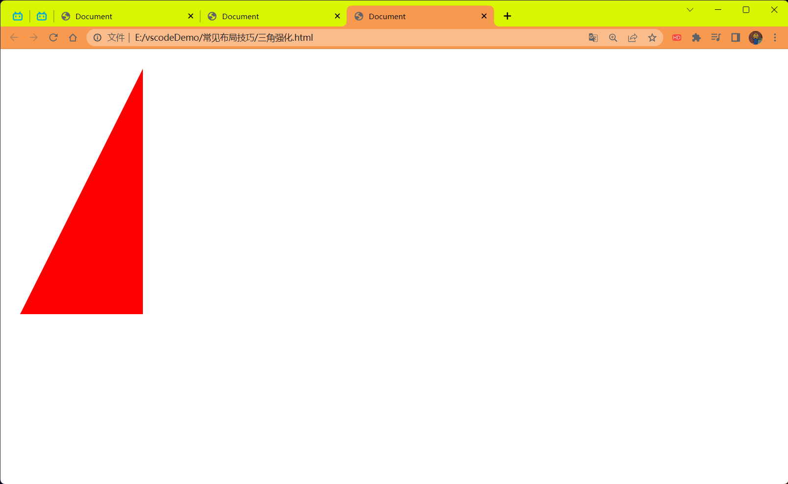
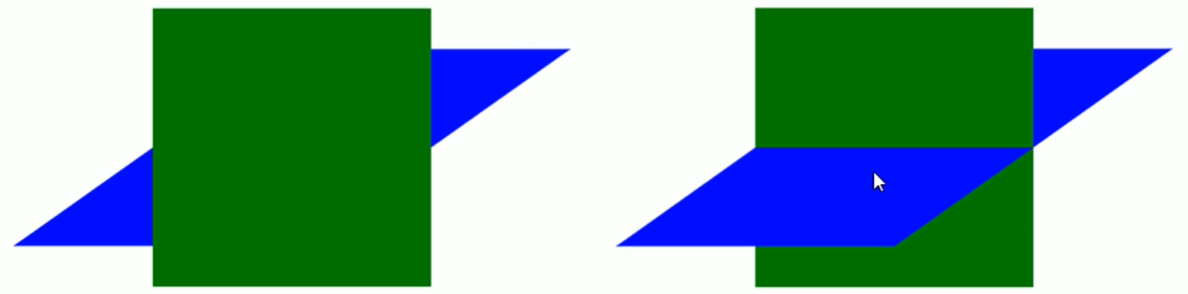
# CSS 三角
网页中常见一些三角形,使用 CSS 直接画出来就可以,不必做成图片或者字体图标。

一张图,你就直到 CSS 三角形是怎么来的了,做法如下:

思路:
盒子我们不可见
- 设置盒子的大小都为 0
- 设置盒子的边框 (重点)
- 通过盒子的边框的方向来进行显示和隐藏就可以实现效果了
代码:
<!DOCTYPE html> | |
<html lang="en"> | |
<head> | |
<meta charset="UTF-8"> | |
<meta name="viewport" content="width=device-width, initial-scale=1.0"> | |
<title>Document</title> | |
<style> | |
.box { | |
width: 0; | |
height: 0; | |
margin-left: 18px; | |
/* border: 10px pink solid; */ | |
border-top: 10px pink solid; | |
border-right: 10px red solid; | |
border-bottom: 10px blue solid; | |
border-left: 10px green solid; | |
} | |
.box1 { | |
width: 0; | |
height: 0; | |
border: 30px solid transparent; | |
margin-top: 10px; | |
border-top-color: pink; | |
} | |
.box2 { | |
width: 0; | |
height: 0; | |
border: 30px solid transparent; | |
border-top-color: pink; | |
border-right-color: blue; | |
} | |
.box3 { | |
width: 0; | |
height: 0; | |
border: 30px solid transparent; | |
border-left-color: yellow; | |
border-bottom-color: turquoise; | |
} | |
.box4 { | |
width: 0; | |
height: 0; | |
border: 30px solid transparent; | |
border-left-color: blueviolet; | |
} | |
</style> | |
</head> | |
<body> | |
<div class="box"></div> | |
<div class="box1"></div> | |
<div class="box2"></div> | |
<div class="box3"></div> | |
<div class="box4"></div> | |
</body> | |
</html> |
效果:
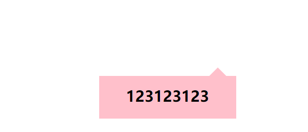
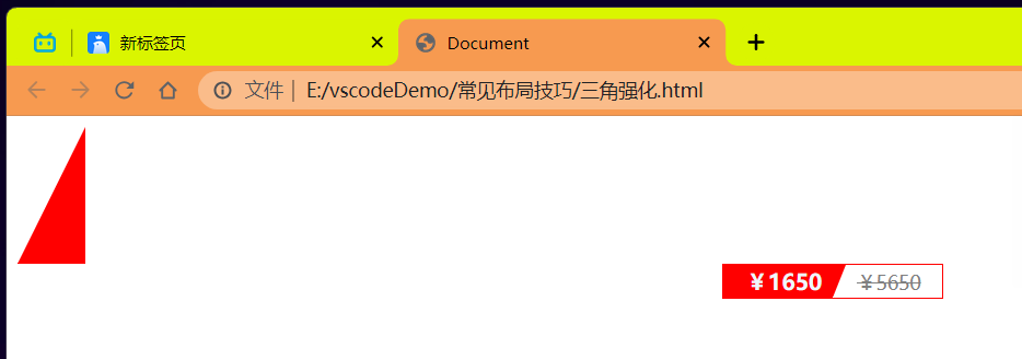
# 三角形应用 —— 京东案例
代码:
<style> | |
.jd { | |
position: relative; | |
width: 220px; | |
height: 69px; | |
background-color: pink; | |
margin: 150px auto; | |
} | |
.jd span { | |
position: absolute; | |
right: 15px; | |
top: -28px; | |
width: 0; | |
height: 0; | |
line-height: 0; | |
font-size: 0; | |
border: 15px solid transparent; | |
border-bottom-color: pink; | |
} | |
.jd h2 { | |
line-height: 65.5px; | |
text-align: center; | |
} | |
</style> | |
</head> | |
<body> | |
<div class="jd"> | |
<span></span> | |
<h2>123123123</h2> | |
</div> | |
</body> |
结果:
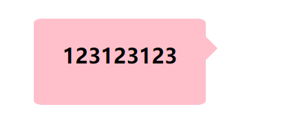
代码 2:
<style> | |
.box { | |
position: relative; | |
margin: 100px auto; | |
width: 200px; | |
height: 100px; | |
background-color: pink; | |
border-radius: 5%; | |
} | |
.box span { | |
position: absolute; | |
top: 20px; | |
right: -28px; | |
width: 0; | |
height: 0; | |
border: 15px solid transparent; | |
border-left-color: pink; | |
} | |
.box h2 { | |
line-height: 85.5px; | |
text-align: center; | |
} | |
</style> | |
</head> | |
<body> | |
<div class="box"> | |
<span></span> | |
<h2>123123123</h2> | |
</div> | |
</body> |
效果:
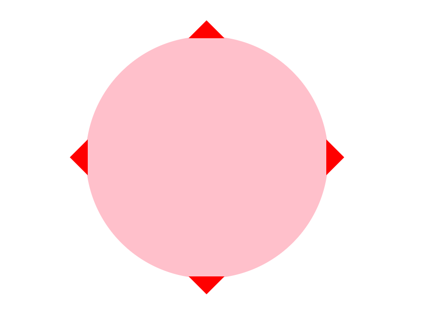
代码 3:
<style> | |
.box { | |
position: relative; | |
width: 200px; | |
height: 200px; | |
border-radius: 50%; | |
background-color: pink; | |
margin: 100px auto; | |
} | |
.box span:nth-child(1) { | |
position: absolute; | |
top: -28px; | |
left: 50%; | |
margin-left: -15px; | |
width: 0; | |
height: 0; | |
border: 15px solid transparent; | |
border-bottom-color: red; | |
} | |
.box span:nth-child(2) { | |
position: absolute; | |
bottom: -28px; | |
left: 50%; | |
margin-left: -15px; | |
width: 0; | |
height: 0; | |
border: 15px solid transparent; | |
border-top-color: red; | |
} | |
.box span:nth-child(3) { | |
position: absolute; | |
top: 50%; | |
margin-top: -15px; | |
right: -28px; | |
width: 0; | |
height: 0; | |
border: 15px solid transparent; | |
border-left-color: red; | |
} | |
.box span:nth-child(4){ | |
position: absolute; | |
top: 50%; | |
margin-top: -15px; | |
left: -28px; | |
width: 0; | |
height: 0; | |
border: 15px solid transparent; | |
border-right-color: red; | |
} | |
</style> | |
</head> | |
<body> | |
<div class="box"> | |
<span></span> | |
<span></span> | |
<span></span> | |
<span></span> | |
<h2></h2> | |
</div> | |
</body> |
效果:
# 什么是界面样式
所谓的 <font style="color:red"> 界面样式 </font>,就是更改一些用户操作样式,以便提高更好的用户体验
# 更改用户的鼠标样式
# 鼠标样式 cursor
语法:
li {cursor:pointer;}
设置或检索在对象上移动的鼠标指针采用何种系统预定义的光标形状。
| 属性值 | 描述 |
|---|---|
| default | 小白,默认 |
| pointer | 小手 |
| move | 移动 |
| text | 文本 |
| not-allowed | 禁止 |
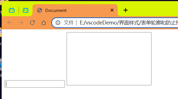
# 表单轮廓
# 轮廓线 outline
给表单添加 outline:none; 样式之后,就可以去掉默认的蓝色边框。
# 防止表单域拖拽
实际开发中,我们文本域右下角是不可以拖拽的。
textarea{resize:none;}
代码:
<style> | |
input,textarea { | |
/* 取消表单轮廓 */ | |
outline: 0; | |
} | |
textarea { | |
/* 防止拖拽文本域 */ | |
resize: none; | |
} | |
</style> | |
</head> | |
<body> | |
<!-- 取消表单轮廓 --> | |
<input type="text"/> | |
<!-- 防止拖拽文本域 --> | |
<textarea name="" id="" cols="30" rows="10"></textarea> | |
</body> |
效果:
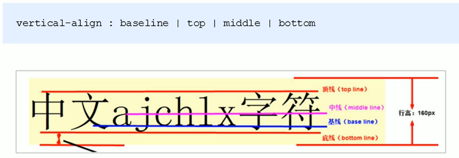
# vertical-align 属性应用
CSS 的 <font style="color:red">vertical-align</font > 属性使用场景:经常用于设置图片或者表单 (行内块元素) 和文字垂直对齐。
官方解释:用于设置一个元素的 <font style="color:red"> 垂直对齐方式 </font>,但是它只针对于行内元素或者行内块元素有效。
语法:
vertical-align: baseline | top | middle | bottom
| 值 | 描述 |
|---|---|
| baseline | 默认,元素放置在父元素的基线上。 |
| top | 把元素的顶端与行中最高元素的顶端对齐 |
| middle | 把此元素放置在父元素的中部 |
| bottom | 把元素的顶端与行中最低的元素的顶端对齐 |
# 图片,表单和文字对齐
图片,表单都属于行内行元素,默认的 vertical-align 是基线对齐。
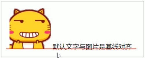
此时可以给图片,表单这些行内块元素的 <font style="color:red">vertical-align 属性设置为 middle</font > 就可以让文字和图片垂直居中对齐了。
# 解决图片底部默认空白缝隙问题
bug: 图片地侧会有一个空白缝隙,原因是行内块元素会和文字的基线对齐。
主要解决办法有两种:
- 给图片添加 vertical-align: middle | top | bottom 等。(建议使用)
- 把图片转换为块级元素 display:block;
# 溢出的文字省略号显示
# 1 单行文本溢出显示省略号
必须满足三个条件
/*1. 先强制一行内显示文本 */ | |
white-space:nowrap; (默认normal自动换行) | |
/*2. 超出的部分隐藏 */ | |
overflow:hidden; | |
/*3. 文字用省略号替代超出的部分 */ | |
text-overflow:ellipsis; |
代码:
<style> | |
div { | |
width: 150px; | |
height: 80px; | |
background-color: pink; | |
margin: 100px auto; | |
/* 这个单词的意思是如果文字显示不开自动换行 */ | |
/* white-space: normal; */ | |
/* 这个单词的意思是如果文字显示不开自动换行也必须强制一行显示 */ | |
white-space: nowrap; | |
/*2. 超出的部分隐藏 */ | |
overflow: hidden; | |
/*3. 文字用省略号替代超出的部分 */ | |
text-overflow: ellipsis; | |
} | |
</style> | |
</head> | |
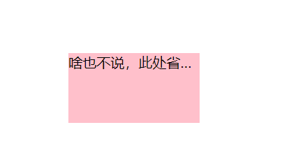
<body> | |
<div>啥也不说,此处省略一万字</div> | |
</body> |
效果:
# 2 多行文本溢出显示省略号
多行文本溢出显示省略号,有较大兼容性问题,适合于 webkit 浏览器或移动端 (移动端大部分是 webkit 内核)
.ellipsis-2 { | |
overflow: hidden; | |
text-overflow: elipsis; | |
/* 弹性伸缩盒子模型显示 */ | |
display: -webkit-box; | |
/* 限制在一个块元素显示的文本的行数 */ | |
-webkit-line-clamp: 2 | |
/* 设置或检索伸缩盒对象的子元素的排列方式 */ | |
-webkit-box-orient: vertical; | |
} |
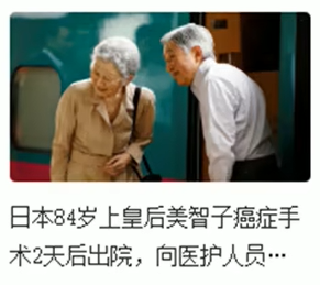
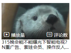
<font style="color:red"> 更推荐让后台人员来做这个效果,因为后台人员可以设置显示多少个字,操作更简单 </font>。
提前在 CSS 中写如上的内容,只需要在标签中 clss=".ellipsis-2" 调用上面的类名即可
代码:
<p class="title ellipsis-2"> | |
315晚会能不能曝光下智能电视?N重广告、套娃会员、操作反人类,当代年轻人是怎么被智能电视逼疯的?【商业B面&牛顿】 | |
</p> |
效果:
# 常见布局技巧
巧妙利用一个技术更快更好的布局:
- margin 负值的运用
- 文字围绕浮动元素
- 行内块的巧妙运用
- CSS 三角强化
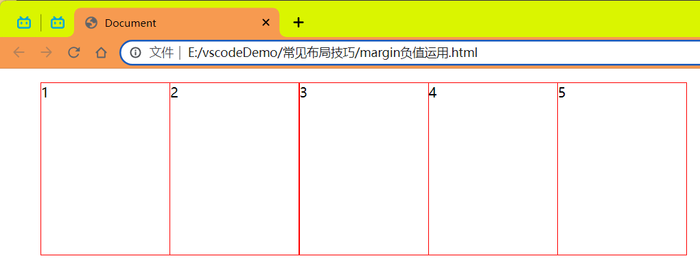
# 1 margin 负值的运用
让每个盒子 margin 我往左侧移动 -1px 正好压住相邻盒子边框
代码实现:
<style> | |
ul li { | |
float: left; | |
list-style: none; | |
width: 150px; | |
height: 200px; | |
border: 1px red solid; | |
margin-left: -1px; | |
} | |
</style> | |
</head> | |
<body> | |
<ul> | |
<li>1</li> | |
<li>2</li> | |
<li>3</li> | |
<li>4</li> | |
<li>5</li> | |
</ul> | |
</body> |
效果:
实现选中哪个那个边框的颜色改变
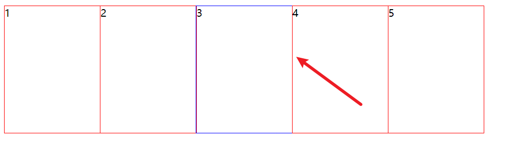
问题:除了最后一个外前面的边框的右侧都被遮住了
解决办法:
让每个盒子 margin 往左侧移动 -1px 正好压住相邻盒子边框
- 鼠标经过某个盒子的时候,提高当前盒子的层级即可 (如果没有定位,则加相对定位 (保留位置), 如果有定位,则加
z-index)- 让哪个边框被选中就提高哪个边框的显示优先级
代码:
<style> | |
ul li { | |
float: left; | |
list-style: none; | |
width: 150px; | |
height: 200px; | |
border: 1px red solid; | |
margin-left: -1px; | |
} | |
ul li:hover { | |
/* 添加相对定位 (保留原有的位置)*/ | |
position: relative; | |
/* 设置优先级 */ | |
z-index: 1; | |
border: 1px blue solid; | |
} | |
</style> | |
</head> | |
<body> | |
<ul> | |
<li>1</li> | |
<li>2</li> | |
<li>3</li> | |
<li>4</li> | |
<li>5</li> | |
</ul> | |
</body> |
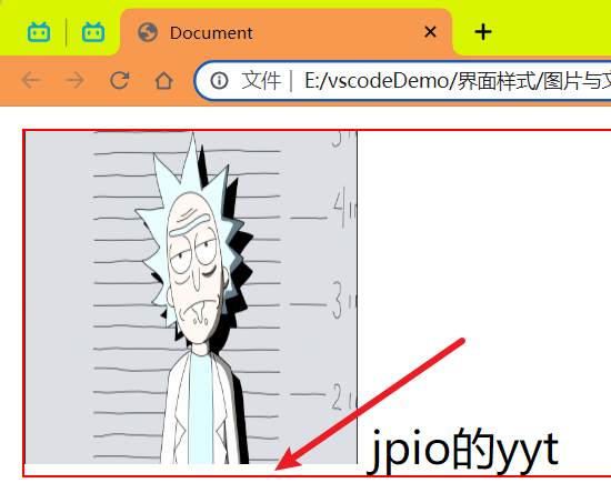
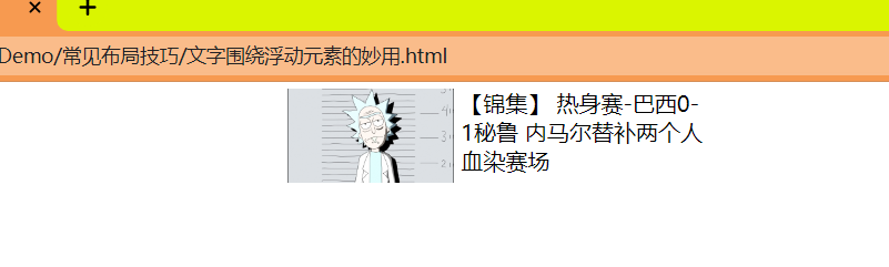
# 2 文字围绕浮动元素
巧妙运用浮动元素不会压住文字的特性.
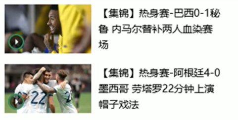
代码:
注意点:奇怪的是中文会自动换行而没有中文的话不会换行而是直接图片下面显示了
<style> | |
* { | |
margin: 0; | |
padding: 0; | |
} | |
.box { | |
width: 300px; | |
height: 70px; | |
margin: 0 auto; | |
padding: 5px; | |
} | |
.pic { | |
float: left; | |
width: 120px; | |
height: 60px; | |
margin-right: 5px; | |
} | |
.pic img { | |
width: 100%; | |
} | |
</style> | |
</head> | |
<body> | |
<div class="box"> | |
<div class="pic"> | |
<img src="../imgage/瑞克.png" alt=""/> | |
</div> | |
<p>【锦集】 热身赛-巴西0-1秘鲁 内马尔替补两个人血染赛场</p> | |
</div> | |
</body> |
效果:
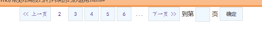
# 3 行内块巧妙运用
实现效果:
代码:
<style> | |
* { | |
margin: 0; | |
padding: 0; | |
} | |
.box { | |
text-align: center; | |
} | |
.box a { | |
display: inline-block; | |
width: 36px; | |
height: 36px; | |
background-color: aliceblue; | |
border: 1px #ccc solid; | |
text-align: center; | |
text-decoration: none; | |
font: 14px/36px 楷体; | |
} | |
.box .pre,.box .next { | |
width: 80px; | |
} | |
.box .current,.box .elp { | |
background-color: #fff; | |
border: none; | |
} | |
input { | |
width: 36px; | |
height: 36px; | |
background-color: aliceblue; | |
border: 1px #ccc solid; | |
outline: none; | |
} | |
.box button { | |
width: 60px; | |
height: 36px; | |
background-color: aliceblue; | |
border: 1px #ccc solid; | |
} | |
</style> | |
</head> | |
<body> | |
<div class="box"> | |
<a href="#" class="pre"><< 上一页</a> | |
<a href="#" class="current">2</a> | |
<a href="#">3</a> | |
<a href="#">4</a> | |
<a href="#">5</a> | |
<a href="#">6</a> | |
<a href="#" class="elp">...</a> | |
<a href="#" class="next">下一页 >></a> | |
到第 | |
<input type="text"/> | |
页 | |
<button>确定</button> | |
</div> | |
</body> |
# 4 CSS 三角强化
完成需求如下:
原理:
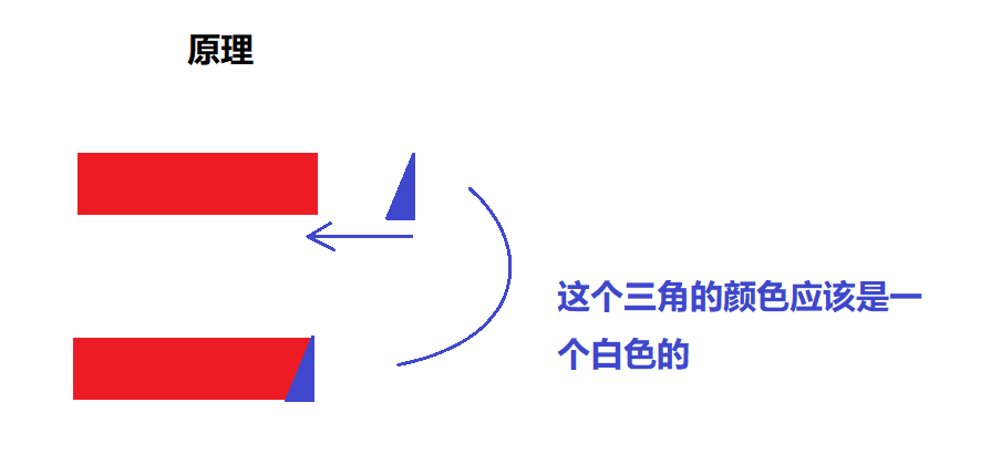
核心代码:
width: 0; | |
height: 0; | |
/* border-top: 100px solid transparent; */ | |
/* border-right: 55px solid blue; */ | |
/* 上面的写法和下面的写法的意思一样 */ | |
/*1. 只保留右边的边框有颜色 */ | |
border-color: transparent red transparent transparent; | |
/*2. 样式都是 solid*/ | |
border-style: solid; | |
/*3. 上边框宽度要大,有边框宽度稍小,其余的边框为 0*/ | |
border-width: 100px 50px 0 0; |
完整代码:
<style> | |
.box { | |
width: 0; | |
height: 0; | |
/* border-top: 100px solid transparent; */ | |
/* border-right: 55px solid blue; */ | |
/* 上面的写法和下面的写法的意思一样 */ | |
/*1. 只保留右边的边框有颜色 */ | |
border-color: transparent red transparent transparent; | |
/*2. 样式都是 solid*/ | |
border-style: solid; | |
/*3. 上边框宽度要大,有边框宽度稍小,其余的边框为 0*/ | |
border-width: 100px 50px 0 0; | |
} | |
</style> | |
</head> | |
<body> | |
<div class="box"></div> | |
</body> |
效果:
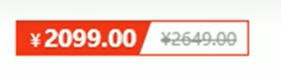
完成需求完整代码:
<style> | |
.box { | |
width: 0; | |
height: 0; | |
/* border-top: 100px solid transparent; */ | |
/* border-right: 55px solid blue; */ | |
/* 上面的写法和下面的写法的意思一样 */ | |
/*1. 只保留右边的边框有颜色 */ | |
border-color: transparent red transparent transparent; | |
/*2. 样式都是 solid*/ | |
border-style: solid; | |
/*3. 上边框宽度要大,有边框宽度稍小,其余的边框为 0*/ | |
border-width: 100px 50px 0 0; | |
} | |
.price { | |
width: 160px; | |
height: 24px; | |
border: 1px red solid; | |
line-height: 24px; | |
margin: 0 auto; | |
} | |
.miaosha { | |
position: relative; | |
float: left; | |
width: 90px; | |
height: 100%; | |
background-color: red; | |
text-align: center; | |
color: aliceblue; | |
font-weight: bold; | |
margin-right: 8px; | |
} | |
.miaosha i { | |
position: absolute; | |
right: 0; | |
top: 0; | |
width: 0; | |
height: 0; | |
border-color: transparent #ffffff transparent transparent; | |
border-style: solid; | |
border-width: 24px 10px 0 0; | |
} | |
.origin { | |
font-size: 14px; | |
color: gray; | |
text-decoration: line-through; | |
} | |
</style> | |
</head> | |
<body> | |
<div class="box"></div> | |
<div class="price"> | |
<span class="miaosha"> | |
¥1650 | |
<i></i> | |
</span> | |
<span class="origin">¥5650</span> | |
</div> | |
</body> |
效果:
# 5 CSS 初始化
不同浏览器对有些标签的默认值是不同的,为了消除不同浏览器对 HTML 文本呈现的差异,照顾浏览器的兼容,我们需要对 CSS 初始化
# HTML5 和 CSS3 提高
# HTML5 新特性
<font style="color:red">HTML5</font > 的新增特性主要是针对于以前的不足,增加了一些 < font style="color:red"> 新的标签,新的表单 </font > 和 < font style="color:red"> 新的表单属性 </font > 等。
注意:
这些新特性都有兼容性问题,基本是 IE9 + 以上版本的浏览器才支持,如果不考虑兼容性问题,可以大量使用这些新特性。
以前布局,我们基本用 div 来做。div 对于搜索引擎来说,是没有语义的。
<div class="header"></div> | |
<div class="nav"></div> | |
<div class="content"></div> | |
<div class="footer"></div> |
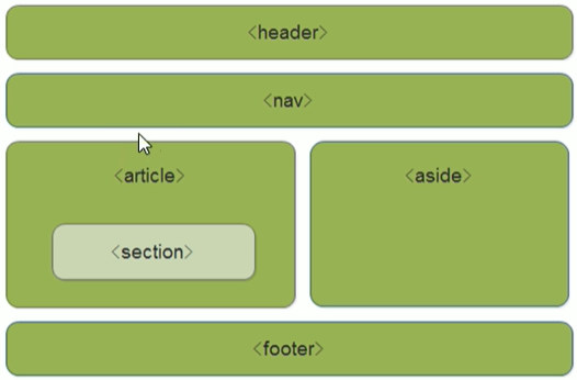
# HTML5 新增的语义化标签
<header>:头部标签<nav>:导航标签<article>:内容标签<section>:定义文档某个区域<aside>:侧边栏标签<footer>:尾部标签
# HTML5 新增 input 类型
| 属性值 | 说明 |
|---|---|
| type="email" | 限制用户输入必须为 Email 类型 |
| type="url" | 限制用户输入必须为 URL 类型 |
| type="date" | 限制用户输入必须为日期类型 |
| type="time" | 限制用户输入必须为时间类型 |
| type="month" | 限制用户输入必须为月类型 |
| type="week" | 限制用户输入必须为周类型 |
| type="number" | 限制用户输入必须为数字类型 |
| type="tel" | 手机号码 |
| type="search" | 搜索框 |
| type="color" | 生成一个颜色选择表单 |
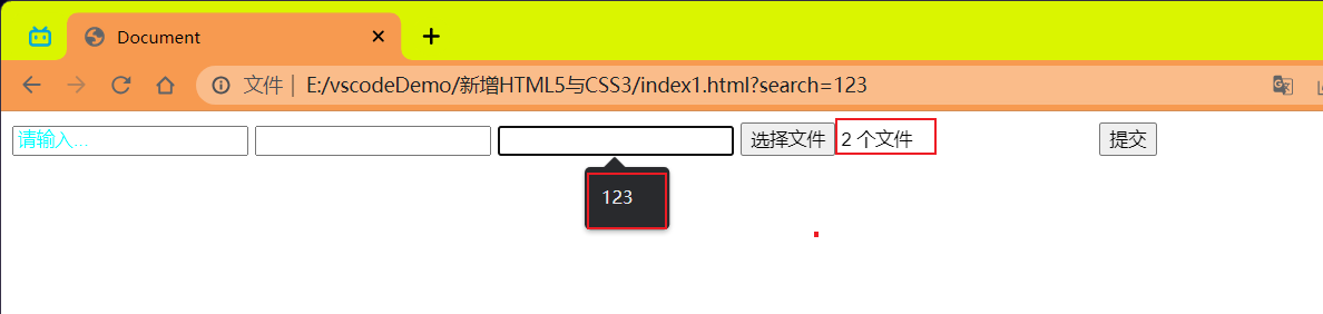
# HTML5 新增的表单属性
<font style="color:red"> 一半建议把 autocomplete 功能关闭它默认是开启的。考虑个人隐私问题建议关了 </font>。
| 属性 | 值 | 说明 |
|---|---|---|
| required | required | 表单拥有该属性表示其内容不能为空,必填 |
| placeholder | 提示文本 | 表单的提示信息,存在默认值将不显示 |
| autofocus | autofocus | 自动聚焦属性,页面加载完成自动聚焦到指定表单 |
| autocomplete | off/on | 当用户在字段开始键入时,浏览器基于之前键入过的值,应该显示出在字段中填写的选项。<br> 默认已经打开,如 autocomplete="on" ,关闭 autocomplete="off"<br > 需要放在表单内,同时加上 name 属性,同时成功提交 |
| multiple | multiple | 可以多选文件提交 |
代码:
<!DOCTYPE html> | |
<html lang="en"> | |
<head> | |
<meta charset="UTF-8"> | |
<meta name="viewport" content="width=device-width, initial-scale=1.0"> | |
<title>Document</title> | |
<style> | |
input::placeholder { | |
color: aqua; | |
} | |
</style> | |
</head> | |
<body> | |
<form> | |
<input type="text" name="text" id="" required="required" placeholder="请输入..."/> | |
<input type="text" name="text" id="" autofocus="autofocus"/> | |
<input type="search" name="search" id="" autocomplete="on"/> | |
<input type="file" name="file" id="" multiple="mutiple"/> | |
<input type="submit"/> | |
</form> | |
</body> | |
</html> |
效果:
# CSS3 新特性
CSS3 给我们新增了选择器,可以更加便捷,更加自由的选择目标元素。
- 属性选择器
- 结构伪类选择器
- 伪元素选择器
# 属性选择器
属性选择器可以根据元素特定属性来选择元素。这样就可以不用借助于类或者 id 选择器。
| 选择符 | 简介 |
|---|---|
| E[att] | 选择具有 att 属性的 E 元素 |
| E[att="val"] | 选择具有 att 属性且属性值等于 val 的 E 元素 |
| E[att^="val"] | 匹配具有 att 属性且值以 val 开头的 E 元素 |
| E[att$="val"] | 匹配具有 att 属性且值以 val 结尾的 E 元素 |
| E[att*="val"] | 匹配具有 att 属性且值中包含有 val 的 E 元素 |
<font style="color:red"> 注意:类选择器,属性选择器,伪类选择器,权重为 10</font>。
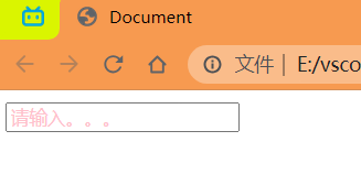
代码演示如下:
E[att]
<style> | |
/* 必须是 input 但是同时具有 value 这个属性,选择这个元素 */ | |
input[value] { | |
color: pink; | |
} | |
</style> | |
<!--1. 利用属性选择器就可以不用借助于类或者 id 选择器 --> | |
<input type="text" value="请输入。。。"/> |
效果:
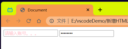
E[att="val"]
<style> | |
/* 必须是 input 但是同时具有 type 这个属性,选择这个元素的类型为 text 的 */ | |
input[type=text] { | |
color: pink; | |
} | |
</style> | |
<!--2. 属性选择器还可以选择属性 = 值的某些元素 务必掌握 --> | |
<input type="text" value="请输入账号。。。"/> | |
<input type="password" value="请输入密码。。。"/> |
效果:
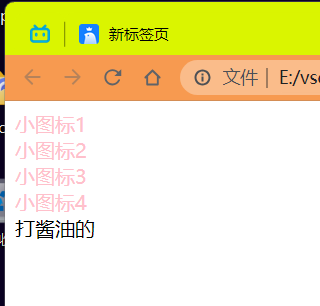
E[att^="val"]
<style> | |
/* 必须是 div 但是同时具有 class 这个属性,选择这个元素开头为 *** 的标签 */ | |
div[class^=icon] { | |
color: pink; | |
} | |
</style> | |
<!--3. 属性选择器可以选择属性值开头的某些元素 --> | |
<div class="icon1">小图标1</div> | |
<div class="icon2">小图标2</div> | |
<div class="icon3">小图标3</div> | |
<div class="icon4">小图标4</div> | |
<div>打酱油的</div> |
效果:
E[att$="val"]
<style> | |
/* 必须是 select 但是同时具有 class 这个属性,选择这个元素结尾为 *** 的标签 */ | |
select[class$=data] { | |
color: pink; | |
} | |
</style> | |
<!--4. 属性选择器可以选择属性值结尾的某些元素 --> | |
<select class="icon1-data">小图标1</select> | |
<select class="icon2-data">小图标2</select> | |
<select class="icon3-icon">小图标3</select> |
效果:
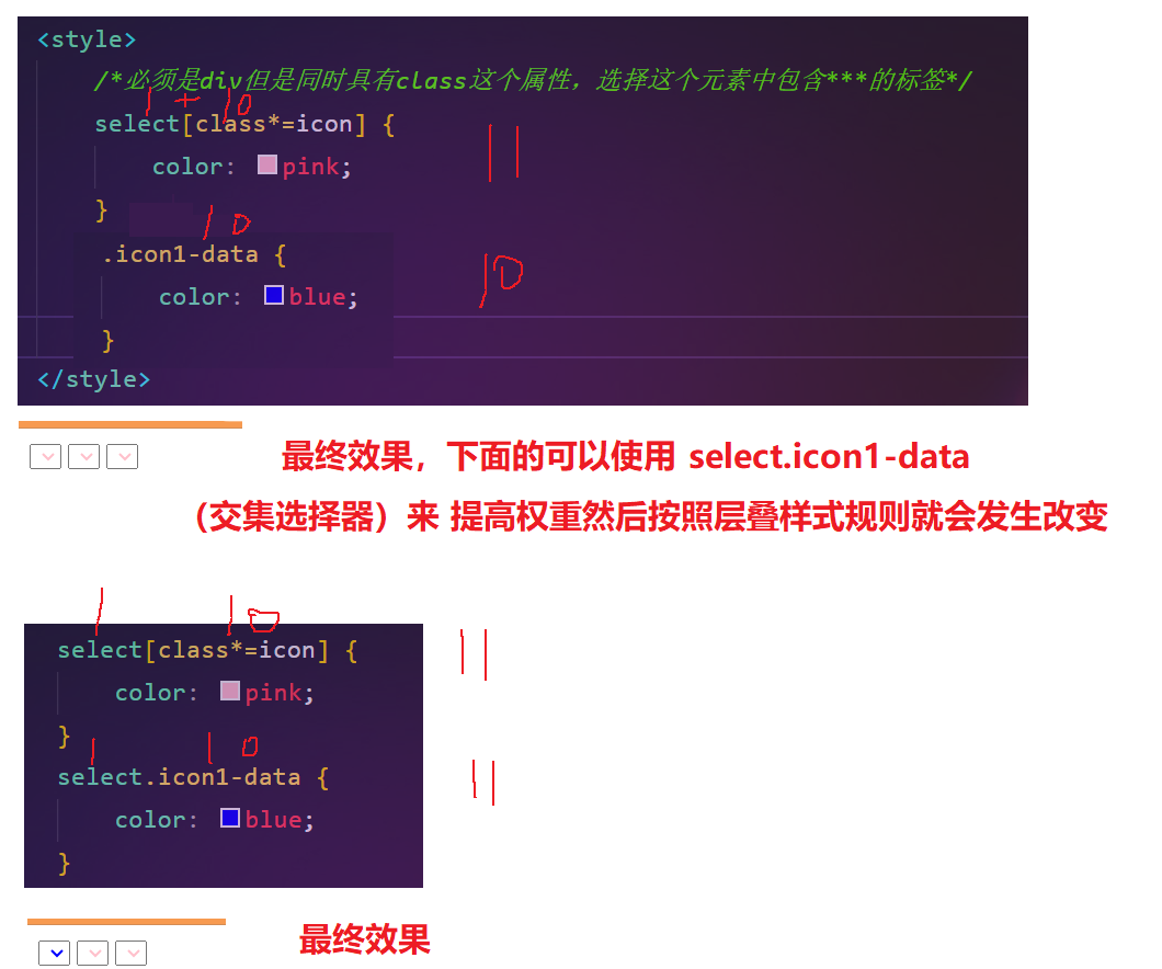
E[att*="val"]
<style> | |
/* 必须是 select 但是同时具有 class 这个属性,选择这个元素中包含 *** 的标签 */ | |
select[class*=icon] { | |
color: pink; | |
} | |
</style> | |
<!--4. 属性选择器可以选择属性值结尾的某些元素 --> | |
<select class="icon1-data">小图标1</select> | |
<select class="icon2-data">小图标2</select> | |
<select class="icon3-icon">小图标3</select> |
结果:
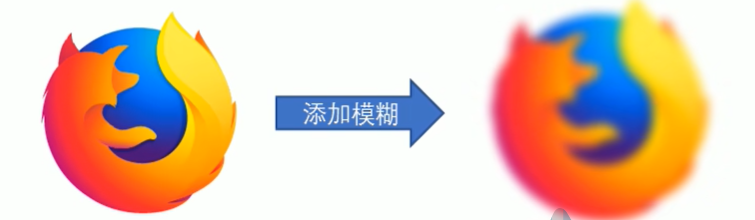
# 滤镜 filter
filter CSS 属性将模糊或颜色偏移等图形效果应用于元素。
语法:
filter:函数();例如:filter:blur(5px);blur模糊处理 数值越大越模糊
效果:
代码:
<style> | |
img { | |
width: 100%; | |
height: 100%; | |
/*blur 是一个函数 小括号里面数值越大,图片越模糊 注意数值要加 px 单位 */ | |
filter: blur(5px); | |
} | |
img:hover { | |
/*blur 是一个函数 小括号里面数值越大,图片越模糊 注意数值要加 px 单位 */ | |
filter: blur(0px); | |
} | |
</style> | |
</head> | |
<body> | |
<img src="../imgage/瑞克.png" alt="123"/> | |
</body> |
效果:
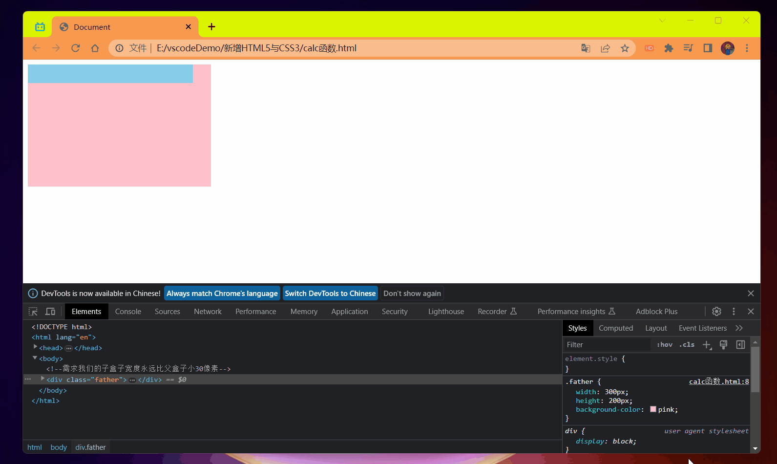
# CSS calc 函数
calc () 此 CSS 函数让你在声明 CSS 属性值时执行一些计算
width:calc(100% - 80px);
括号里面可以使用 + - * / 来进行计算
代码:
<style> | |
.father { | |
width: 300px; | |
height: 200px; | |
background-color: pink; | |
} | |
.son { | |
/* width: 150px; */ | |
/*100% 是父盒子的宽度再减去 30px*/ | |
width: calc(100% - 30px); | |
height: 30px; | |
background-color: skyblue; | |
} | |
</style> | |
</head> | |
<body> | |
<!-- 需求我们的子盒子宽度永远比父盒子小 30 像素 --> | |
<div class="father"> | |
<div class="son"></div> | |
</div> | |
</body> |
效果:
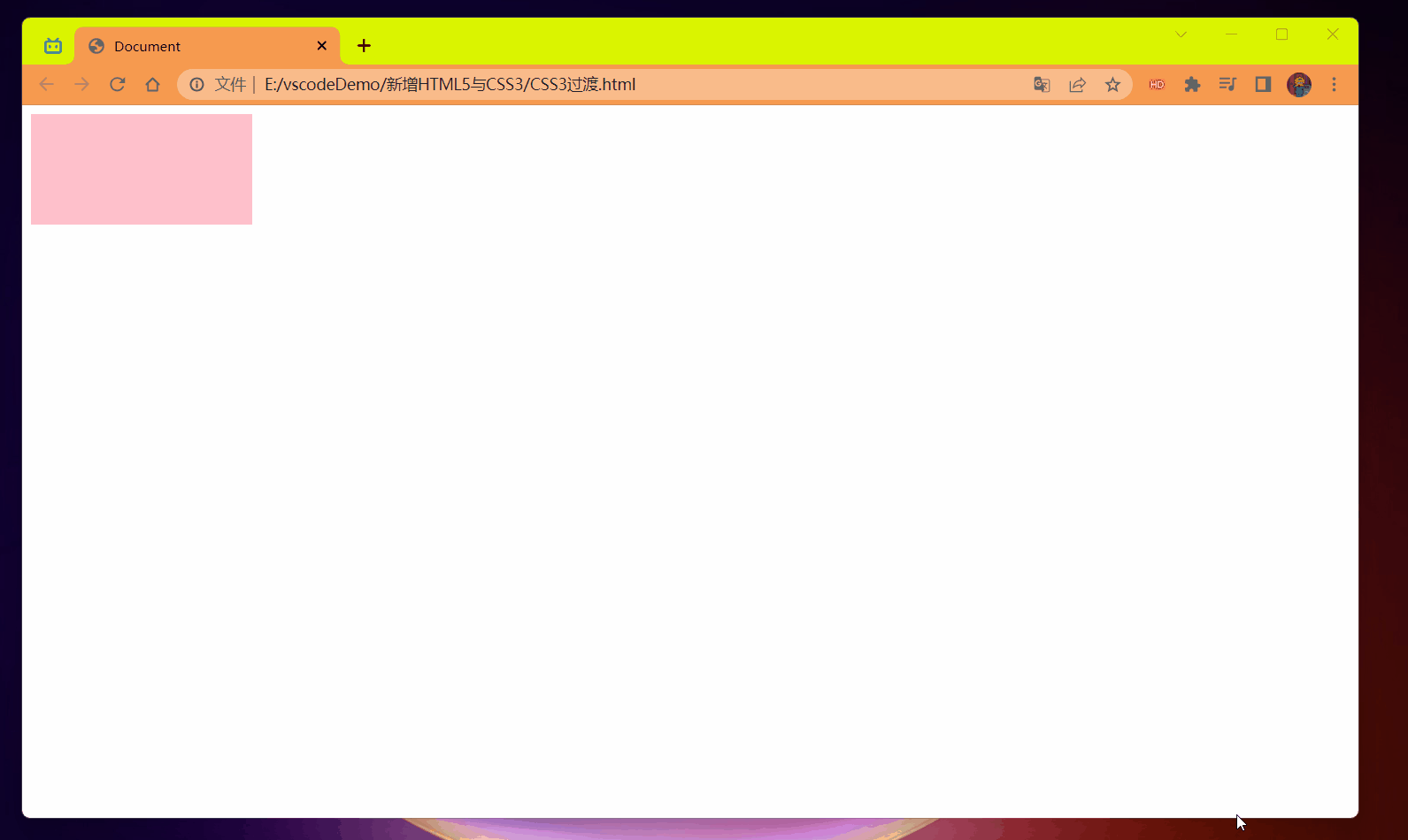
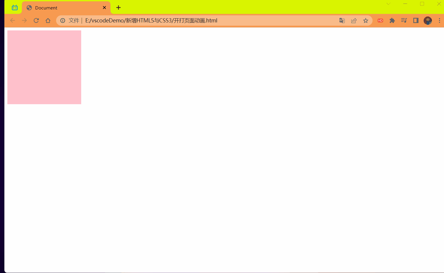
# CSS3 过渡 (重点)
过渡 (transtion) 是 CSS3 中具有颠覆性的特征之一,我们可以在不使用 Flash 动画或 JavaScript 的情况下,当元素从一种样式变换为另一种样式时为元素添加效果。
过渡动画:是从一个状态 逐渐 的过渡到另外一个状态.
可以让我们页面更好看,更动感十足,虽然 低版本浏览器不支持 (ie9 以下版本) 但是不会影响页面布局。
<font style="color:red"> 我们现在经常和:hover 一起搭配使用 </font>.
<strong style="color:red"> 记住过渡的使用口诀:谁做过渡给谁加 </strong>.
语法:
transition:要过渡的属性 花费时间 运动曲线 何时开始; |
1 属性:想要变化的 css 属性,宽度高度 背景颜色 内外边距都可以。如果想要所有的属性都变化过渡,写一个 all 就可以。
2 花费时间:单位是 秒 (<strong style="color:red"> 必须写单位 </strong>) 比如 0.5s
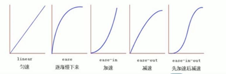
3 运动曲线:默认是 ease (可以省略)
4 何时开始:单位是 秒 (<strong style="color:red"> 必须写单位 </strong>) 可以设置延迟触发时间 默认是 0s (可以省略)
代码:
<style> | |
div { | |
width: 200px; | |
height: 100px; | |
background-color: pink; | |
/*transition: 变化的属性 花费时间 运动曲线 何时开始 | |
多个属性使用 "," 号分割即可 */ | |
/* transition: width .5s,height .2s; */ | |
/* 如果想要多个属性都变化,属性写 all 就可以了 */ | |
transition: all .5s; | |
} | |
div:hover { | |
width: 400px; | |
height: 200px; | |
background-color: skyblue; | |
} | |
</style> | |
</head> | |
<body> | |
<div></div> | |
</body> |
效果:
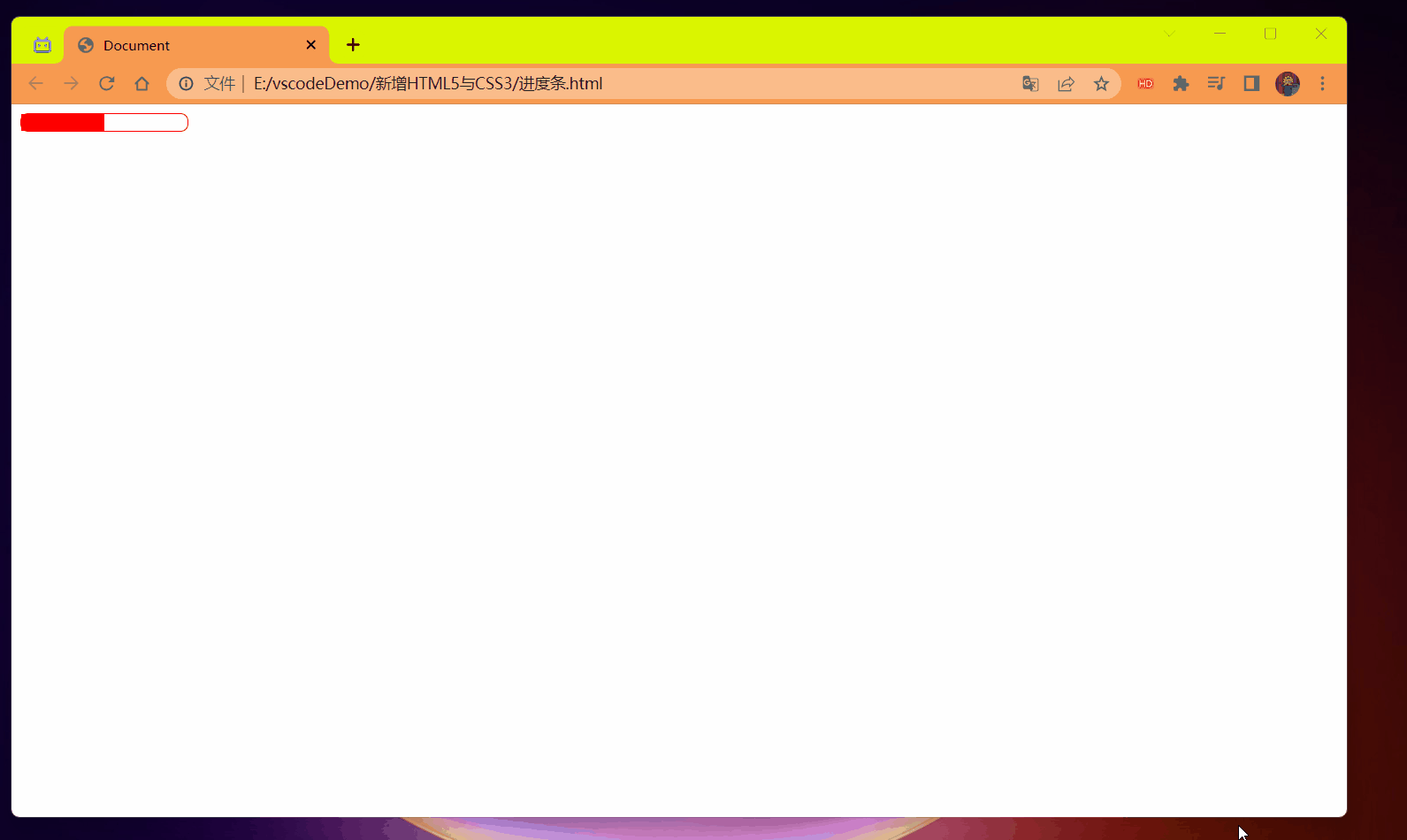
# 进度条案例
- 进度条如何布局
- 过渡的使用
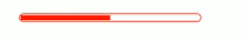
代码:
<style> | |
.bar { | |
width: 150px; | |
height: 15px; | |
border: 1px red solid; | |
border-radius: 7px; | |
} | |
.bar_in { | |
width: 50%; | |
height: 100%; | |
background-color: red; | |
transition: all .7s; | |
} | |
.bar:hover .bar_in { | |
width: 100%; | |
} | |
</style> | |
</head> | |
<body> | |
<div class="bar"> | |
<div class="bar_in"></div> | |
</div> | |
</body> |
效果:
# 2D 转换
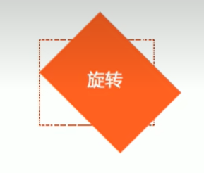
<font style="color:red"> 转换 (transform) 是 CSS3 中具有颠覆性的特征之一,可以实现元素的位移,旋转,缩放等效果 </font>.
转换 (transform) 你可以简单理解为变形
- 移动:tanslate
- 旋转:rotate
- 缩放:scale
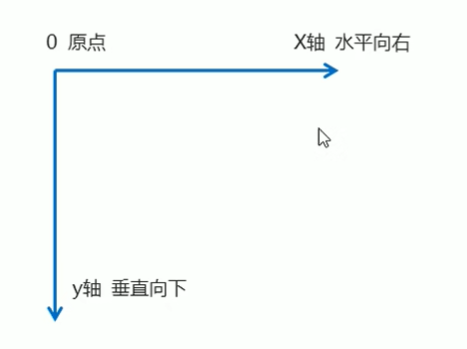
# 二维坐标系
2D 转换是改变标签在二维平面上的位置和形状的一种技术,先来学习二维坐标系
# 转换之移动 <font style="color:red">translate</font>.
2D 移动是 2D 转换里面的一种功能,可以改变元素在页面中的位置,类似 <strong style="color:red"> 定位 </strong>.
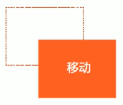
语法:
transform: translate(x,y); /* 或者分开写 */ | |
transform: translateX(n); /*X 坐标 */ | |
transform: translateY(n); /*Y 坐标 */ |
重点:
- 定义 2D 转换中的移动,沿着 X 和 Y 轴移动元素
- translate 最大的优点:不会影响到其它元素的位置.
- translate 中的百分比单位是相对于自身元素的 translate:(50%,50%);
- <font color=red> 对行内标签没有效果 </font>.
重点 1 演示
代码:
<style> | |
div { | |
/* 移动盒子的位置:定位 盒子的外边距 2d 转换移动 */ | |
width: 200px; | |
height: 200px; | |
background-color: pink; | |
/*x 就是 x 轴上移动位置 y 就是 y 轴上移动位置 中间用逗号分隔 */ | |
/* transform: translate(100px,100px); */ | |
/* transform: translateX(100px); */ | |
transform: translateY(100px); | |
} | |
</style> | |
</head> | |
<body> | |
<div></div> | |
</body> |
效果:
重点 2 演示
代码:
<style> | |
div { | |
width: 200px; | |
height: 200px; | |
} | |
div:first-child { | |
transform: translate(30px,30px); | |
background-color: pink; | |
} | |
div:last-child { | |
background-color: blue; | |
} | |
</style> | |
</head> | |
<body> | |
<div></div> | |
<div></div> | |
</body> |
效果:
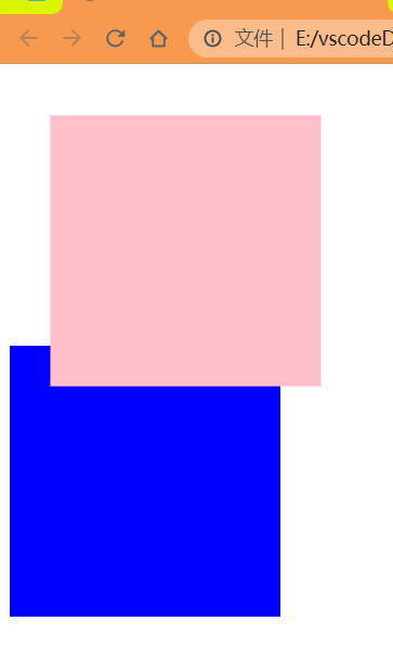
重点 3 演示
代码:
<style> | |
div { | |
width: 200px; | |
height: 200px; | |
background-color: pink; | |
/* | |
1. 我们 translate 里面的参数是可以用 % | |
2. 如果里面的参数是 % 移动的距离是 盒子自身的宽度或者高度来对比的 | |
这里的 50% 就是 50px 因为盒子的宽度是 100px 一半就是 50px | |
*/ | |
transform: translateX(50%); | |
} | |
</style> | |
</head> | |
<body> | |
<div></div> | |
</body> |
效果:
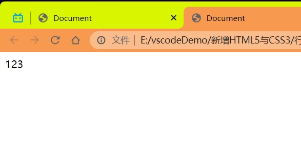
重点 4 演示
代码:
<style> | |
span { | |
/*translate 对于行内元素是无效的 */ | |
transform: translate(300px,300px); | |
} | |
</style> | |
</head> | |
<body> | |
<span>123</span> | |
</body> |
效果:
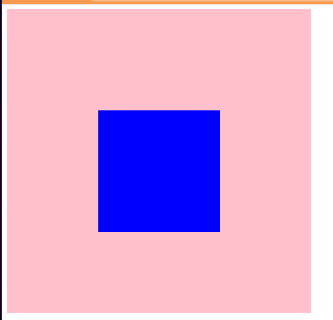
# 让一个盒子水平垂直居中
使用到的:
- 定位
- 设置上,左 各 50% 定位到中间,但是位置是靠右和下的
- 使用 translate 来动态的解决超出位置的值,利用重点 3 这个部分。
好处:父盒子改变了,子盒子动态改变。
代码:
<style> | |
div { | |
position: relative; | |
width: 500px; | |
height: 500px; | |
background-color: pink; | |
} | |
p { | |
position: absolute; | |
top: 50%; | |
left: 50%; | |
width: 200px; | |
height: 200px; | |
background-color: blue; | |
/* 这样写就是动态的相应页面的方式了,父盒子改变子盒子自动改变 */ | |
transform: translate(-50%,-50%); | |
} | |
</style> | |
</head> | |
<body> | |
<div> | |
<p></p> | |
</div> | |
</body> |
效果:
# 2D 转换之旋转 rotate
2D 旋转指的是让元素在 2 维平面内顺时针旋转或者逆时针旋转。
语法:
transform: rotate(度数) |
重点:
- rotate 里面跟度数,单位是 deg 比如 rotate (45deg)
- 角度为正时 -> 顺时针,负时 -> 逆时针
- 默认旋转的中心点是元素的中心点
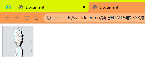
代码:
<style> | |
img { | |
/* 顺时针旋转 45 度 */ | |
transform: rotate(45deg); | |
} | |
</style> | |
</head> | |
<body> | |
<img src="../imgage/瑞克.png" width="100px" height="100px" alt=""/> | |
</body> |
效果:
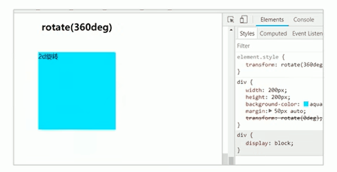
旋转没有动画是直接就是旋转后的样式,设想以下如果是 360deg 呢?就会回到原来的样式吗?看如下代码:
<style> | |
img { | |
/* 顺时针旋转 360 度 */ | |
transform: rotate(360deg); | |
} | |
</style> | |
</head> | |
<body> | |
<img src="../imgage/瑞克.png" width="100px" height="100px" alt=""/> | |
</body> |
效果:
图片看起来还是跟原来的一样因为 360 没有动画就是这样的。
如果想要有选择一圈 (360) 的动画则需要加上 过渡
<strong style="color:red"> 注意:过渡写在本身上,谁做动画给谁加 </strong>。
代码:
<style> | |
img { | |
/* transform: rotate(45deg); */ | |
border-radius: 50%; | |
border: 1px red solid; | |
/* 过渡写在本身上,谁做动画给谁加 */ | |
/* 变化的属性 花费时间 运动曲线 何时开始 */ | |
transition: all .5s; | |
} | |
img:hover { | |
/* 顺时针旋转 */ | |
transform: rotate(360deg); | |
} | |
</style> | |
</head> | |
<body> | |
<img src="../imgage/瑞克.png" width="100px" height="100px" alt=""/> | |
</body> |
效果:
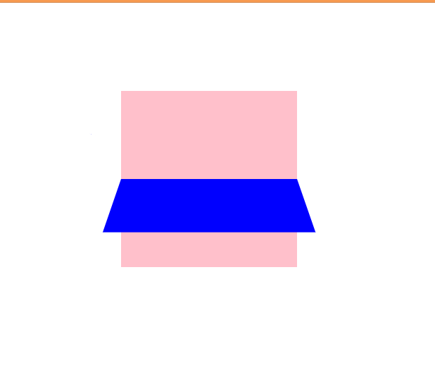
# 旋转三角
效果:
思路:
- 先使用伪元素画出一个正方形,然后显示 border-right 和 border-bottom 右边和下边的边框
- 使用 rotate 进行 45 度旋转就得到了一个向下的三角了,下面做个过渡就行了
- 想起口诀:过渡写在本身,谁做动画给谁加,我们写到伪元素中
- 编写好过渡后就 OK 了
代码实现:
<style> | |
div { | |
position: relative; | |
width: 249px; | |
height: 35px; | |
border: 1px #000 solid; | |
} | |
div:after { | |
content: ''; | |
position: absolute; | |
top: 5px; | |
right: 15px; | |
width: 15px; | |
height: 15px; | |
border-right: 1px #000 solid; | |
border-bottom: 1px #000 solid; | |
transform: rotate(45deg); | |
/* 过渡写在本身,谁做动画给谁加 */ | |
transition: all .6s; | |
} | |
div:hover:after { | |
/*45+180=225*/ | |
transform: rotate(225deg); | |
} | |
</style> | |
</head> | |
<body> | |
<div></div> | |
</body> |
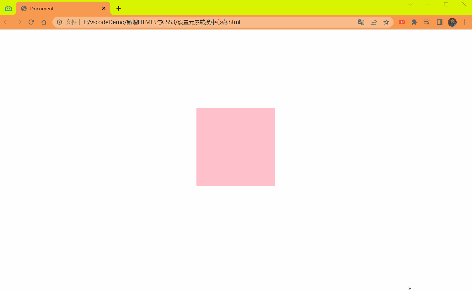
# 2D 转换中心点 transform-origin
我们可以设置元素转换的中心点
语法:
transform-origin: x y; |
重点
- 注意后面的参数 x 和 y 用空格隔开
- x y 默认转换的中心点是元素的中心点 (50% 50%)
- 还可以给 x y 设置 像素 或者 方位名词 (top bottom left right center)
代码:
<style> | |
div { | |
width: 200px; | |
height: 200px; | |
background-color: pink; | |
/* 过渡写在本身上,谁做动画给谁加 */ | |
transition: all .6s; | |
/* transform-origin: left bottom; */ | |
transform-origin: 50px 50px; | |
margin: 200px auto; | |
} | |
div:hover { | |
transform: rotate(360deg); | |
background-color: red; | |
} | |
</style> | |
</head> | |
<body> | |
<div></div> | |
</body> |
效果:
中心点旋转案例:
效果:
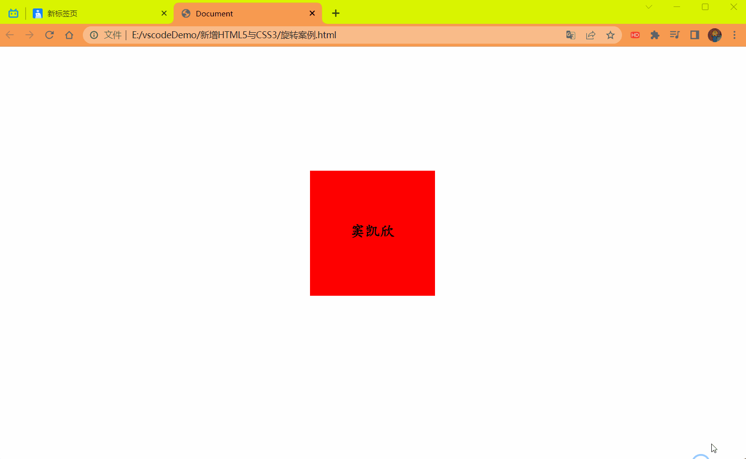
代码:
<style> | |
div { | |
position: relative; | |
width: 200px; | |
height: 200px; | |
border: 1px red solid; | |
margin: 200px auto; | |
overflow: hidden; | |
text-align: center; | |
} | |
div:after { | |
content: '你好'; | |
font: bold 24px/8 楷体; | |
display: block; | |
height: 100%; | |
background-color: blue; | |
transform-origin: left bottom; | |
transform: rotate(180deg); | |
transition: all .6s; | |
} | |
div:before { | |
position: absolute; | |
content: '窦凯欣'; | |
font: bold 24px/8 楷体; | |
top: 0; | |
left: 0; | |
width: 100%; | |
height: 100%; | |
background-color: red; | |
transform-origin: left top; | |
transform: rotate(0deg); | |
transition: all .6s; | |
} | |
div:hover:after { | |
transform: rotate(0deg); | |
} | |
div:hover:before { | |
transform: rotate(180deg); | |
} | |
</style> | |
</head> | |
<body> | |
<div></div> | |
</body> |
# 2D 转换之缩放 scale
缩放,顾名思义,可以放大和缩小。只要给元素添加上了这个属性就能控制它放大还是缩小。
语法:
transform:scale(x,y); |
注意:
- 注意其中的 x 和 y 用逗号分隔
- transform:scale (1,1):宽和高都放大一倍,相对于没有放大
- transform:scale (2,2):宽和高都放大了 2 倍
- transform:scale (2):只写一个参数,第二个参数则和第一个参数一样,相当于 scale (2,2)
- transform:scale (0.5,0.5):缩小
- scale 缩放最大的优势:可以设置转换中心点缩放,默认以中心点缩放的,而且不影响其它盒子。
代码:
<style> | |
div.box { | |
width: 200px; | |
height: 200px; | |
background-color: pink; | |
margin: 200px auto; | |
transition: all .6s; | |
transform-origin: left bottom; | |
} | |
div.box:hover { | |
/* 里面写的数字不跟单位,就是倍数的意思 1 就是 1 倍 2 就是 2 倍 */ | |
/*1 倍就是本身鼠标放上不会有变化 */ | |
/* transform: scale(1,1); */ | |
/* transform: scale(2,2); */ | |
/*scale 的优势之处:不会影响到其它的盒子,而且可以设置缩放的中心点 */ | |
transform: scale(0.5,0.5); | |
} | |
</style> | |
</head> | |
<body> | |
<div class="box"></div> | |
</body> |
效果:

# 图片放大案例
要求效果如下:
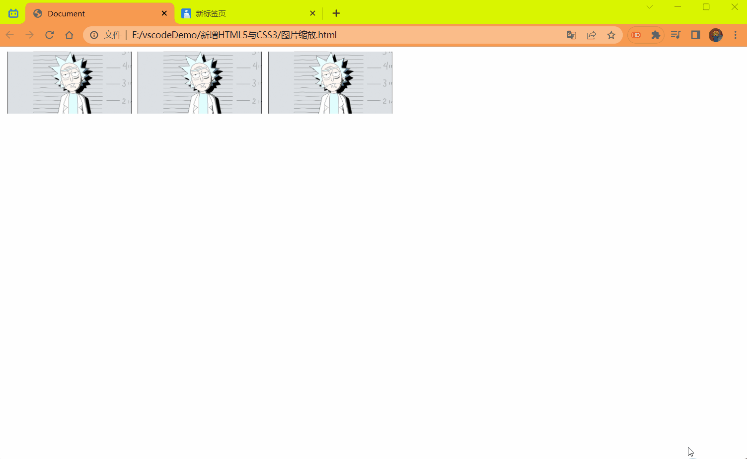
代码:
<style> | |
div { | |
float: left; | |
margin-left: 10px; | |
} | |
div img { | |
transition: all .4s; | |
} | |
div img:hover { | |
transform: scale(1.1); | |
} | |
</style> | |
</head> | |
<body> | |
<div><a><img src="../imgage/瑞克.png" alt="" width="200px" height="100px" /></a></div> | |
<div><a><img src="../imgage/瑞克.png" alt="" width="200px" height="100px" /></a></div> | |
<div><a><img src="../imgage/瑞克.png" alt="" width="200px" height="100px" /></a></div> | |
</body> |
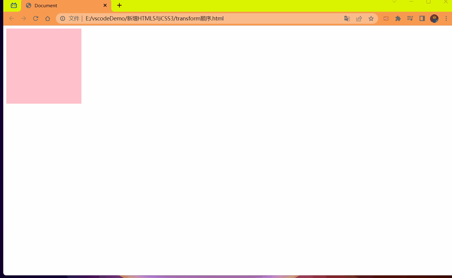
# 2D 转换综合写法
<strong style="color:red"> 注意 </strong>:
- 同时使用多个转换,其格式为: transform: translate () rotate () scale ()... 等
- 其顺序会影响转换的效果。(先旋转会改变坐标方向)
- <strong style="color:red"> 当我们同时有位移和其它属性的时候,记得要将位移放到最前 </strong>。
代码:
<style> | |
div { | |
width: 200px; | |
height: 200px; | |
background-color: pink; | |
transition: all .6s; | |
} | |
div:hover { | |
/* 这种写法有问题 | |
旋转会改变坐标位置 再进行位移就会出错 */ | |
/* transform: rotate(360deg) translate(200px,200px); */ | |
/* 同时有位移和其它属性 ,则需要把位移放到最前面 以防坐标改变出错 */ | |
transform: translate(200px,200px) rotate(360deg) scale(0.5); | |
} | |
</style> | |
</head> | |
<body> | |
<div></div> | |
</body> |
效果:
# 2D 转换总结
- 转换 transform 我们简单理解就是变形,有 2D 和 3D 之分
- 我们暂且学了三个分别是 位移,旋转和缩放
- 2D 移动 tranlate (x,y) 最大的优势是不影响其它盒子,里面参数用 %,是相对于自身宽度和高度来计算的。
- 可以分开写比如 translateX (x) 和 translateY (y)。
- 2D 旋转 rotate (度数) 可以实现旋转元素,度数的单位是 deg
- 2D 缩放 sacle (x,y) 里面参数是数字 不跟单位 可以是小数,最大的优势 不影响其它盒子
- 设置转换中心点 transform-origin: x,y; 参数可以百分比,像素或者是方位名词
- 当我们进行综合写法,同时有位移和其它属性的时候,记得要将位移放到最前。
# CSS3 动画
<font style="color:red"> 动画 (animation) </font > 是 CSS3 中具有颠覆性的特征之一,可通过设置多个节点来精确控制一个或一组动画,常用来实现复杂的动画效果。
相比较过渡,动画可以实现更多变化,更多控制,连续自动播放等效果。
# 动画的基本使用
# 定义动画:
制作动画分为两步:
- 先定义动画
- 再使用 (调用) 动画
用 keyframes (翻译:关键帧) 定义动画 (类似定义类选择器)
@keyframes 动画名称{ | |
0%{ | |
width: 100px; | |
} | |
100%{ | |
width: 200px; | |
} | |
} |
动画序列
- 0% 是动画的 <font style="color:red"> 开始 </font>,100% 是动画的 < font style="color:red"> 完成 </font>。这样的规则就是动画序列。
- 在 <font style="color:red">@keyframes</font > 中规定某项 CSS 样式,就能创建由当前样式逐渐改为新样式的动画效果。
- 动画是使元素从一种样式逐渐变化为另一种样式的效果。您可以改变任意多的样式任意多的 <font style="color:red"> 次数 </font>。
- 请用百分比来规定变化发生的时间,或用关键词 "<font style="color:red">form</font>" 和 "<font style="color:red">to</font>",等同于 < font style="color:red">0%</font > 和 < font style="color:red">100%</font>。
# 使用动画:
div{ | |
animation: 动画名称 花费时间; | |
} |
代码:
<style> | |
/* 定义动画 */ | |
@keyframes move { | |
0% { | |
transform: translateX(0px); | |
} | |
100% { | |
transform: translateX(1000px); | |
} | |
} | |
div { | |
width: 200px; | |
height: 200px; | |
background-color: pink; | |
/* 调用名称 动画时间 */ | |
animation: move 2s; | |
} | |
</style> | |
</head> | |
<body> | |
<div></div> | |
</body> |
效果:
# 动画序列案例:
效果:
代码:
<style> | |
@keyframes move { | |
/* 1. 可以做多个状态的变化 keyframe 关键帧 | |
2. 里面的百分比要是整数 | |
3. 里面的百分比就是 总的时间 (我们这个案例 10s) 的划分 */ | |
0% { | |
transform: translate(0,0); | |
} | |
25% { | |
transform: translateX(1000px); | |
} | |
50% { | |
transform: translate(1000px,500px); | |
} | |
75% { | |
transform: translate(0,500px); | |
} | |
100% { | |
transform: translate(0,0); | |
} | |
} | |
div { | |
width: 100px; | |
height: 100px; | |
background-color: pink; | |
animation: move 15s; | |
} | |
</style> | |
</head> | |
<body> | |
<div></div> | |
</body> |
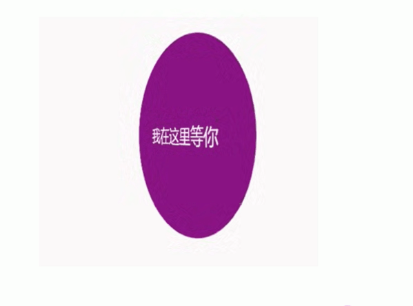
# 动画常用属性
| 属性 | 描述 |
|---|---|
| @keyframes | 规定动画 |
| animation | 所有动画属性的简写属性,除了 animation-play-state 属性。 |
| animation-name | 规定 @keyframes 动画的名称。(必须的) |
| animation-duration | 规定动画完成一个周期所花费的秒或者毫秒,默认是 0。(必须的) |
| animation-timing-function | 规定动画的速度曲线,默认是 "ease" |
| animatioon-delay | 规定动画何时开始,默认是 0 |
| animation-iteratino-count | 规定动画被播放的次数,默认是 1,还有 infinite |
| animation-direction | 规定动画是否在下一周期逆向播放,默认是 "normal",alternate 逆播放 |
| animation-play-state | 规定动画是否正在运行或暂停。默认是 "runing" 还有,"paused" |
| animation-fill-mode | 规定动画结束后状态,保持 forwards,回到起始 backwards |
速度曲线细节
animation-timing-function:规定动画的速度曲线,默认是 "ease"
| 值 | 描述 |
|---|---|
| linear | 动画从头到尾的速度是相同的。匀速 |
| ease | 默认。动画以低速开始,然后加快,在结束前变慢 |
| ease-in | 动画以低速开始 |
| ease-out | 动画以低速结束 |
| ease-in-out | 动画以低速开始和结束 |
| steps() | 指定了时间函数中的间隔数量 (步长) |
代码:
<style> | |
div { | |
font-size: 20px; | |
width: 0; | |
height: 30px; | |
background-color: pink; | |
overflow: hidden; | |
white-space: nowrap; | |
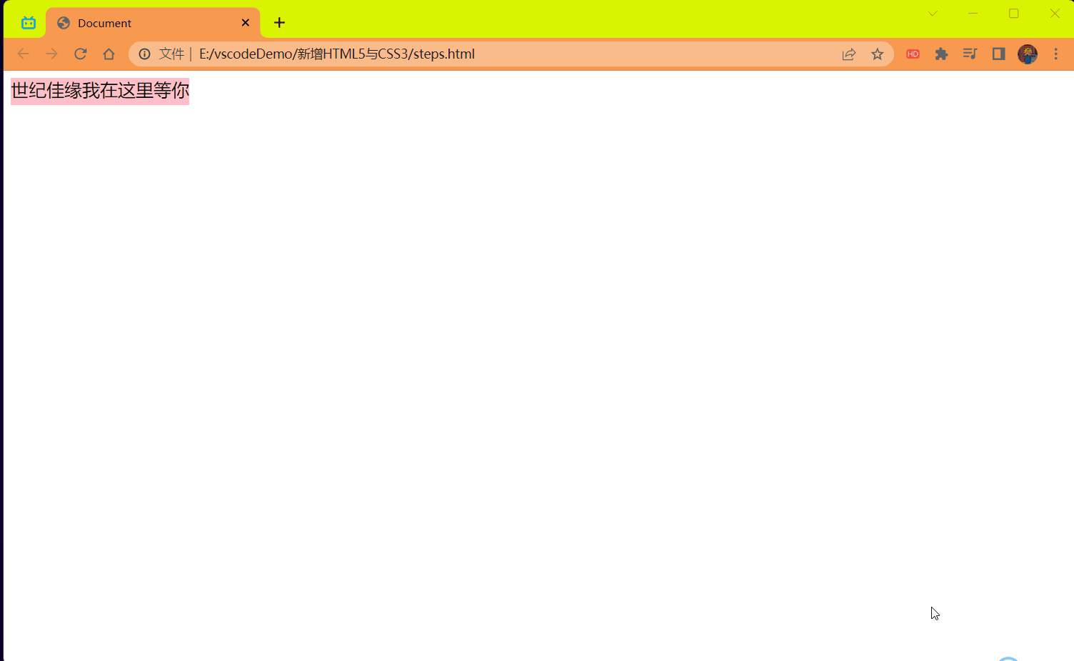
/* steps 就是分几步来完成我们的动画 有了 steps 就不要在写 ease 或者 linear 了 */ | |
animation: move 5s steps(10) forwards; | |
} | |
@keyframes move { | |
0% { | |
width: 0; | |
} | |
100% { | |
width: 200px; | |
} | |
} | |
</style> | |
</head> | |
<body> | |
<div>世纪佳缘我在这里等你.</div> | |
</body> |
效果:
# 熊大案例
效果:
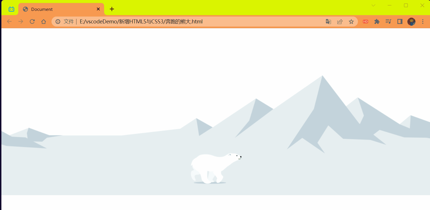
代码:
<style> | |
body { | |
position: relative; | |
background: url(./image/bg1.png) no-repeat; | |
animation: movebg 8s linear infinite; | |
margin-top: 600px; | |
} | |
@keyframes movebg { | |
from { | |
background-position: 0,0; | |
} | |
to { | |
background-position: -1600px,0; | |
} | |
} | |
div { | |
position: absolute; | |
width: 200px; | |
height: 100px; | |
background:url(./image/bear.png) no-repeat; | |
animation: move .5s steps(8) infinite,move1 3s forwards; | |
} | |
@keyframes move { | |
from { | |
background-position: 0,0; | |
} | |
to { | |
background-position: -1600px,0; | |
} | |
} | |
@keyframes move1 { | |
from { | |
left: 0; | |
top: -259px; | |
} | |
to { | |
left: 50%; | |
top: -259px; | |
transform: translateX(-50%); | |
} | |
} | |
</style> | |
</head> | |
<body> | |
<div></div> | |
</body> |
# 动画简写属性
animation:动画名称 ,持续时间,运动曲线,何时开始,播放次数,是否反方向,动画起始或者结束的状态。
语法:
animation: myfirst 5s linear 2s infinite alternate forwards; |
注意:
- 简写属性里面不包含 animation-play-state
- 可见下面代码演示中是单独拿出来使用的
- 暂停动画:animation-play-state: puased; 经常和鼠标经过等其它配合使用
- 先要动画走回来,而不是直接跳回来:animatioon-direction: alternate
- 盒子动画结束后,停在结束位置:animation-fill-mode: forwards
- <font style="color:red"> 只能省略前两个后面的随意 </font>。
代码:
<style> | |
@keyframes move { | |
from { | |
transform: translateX(0); | |
} | |
to { | |
transform: translateX(1000px); | |
} | |
} | |
div { | |
width: 200px; | |
height: 200px; | |
background-color: pink; | |
/* 动画名称 花费时间 运动曲线 播放次数 逆向播放 保持动画结束状态 */ | |
animation: move 3s linear infinite alternate forwards; | |
} | |
div:hover { | |
/* 动画是否暂停或播放 鼠标经过就暂停 */ | |
animation-play-state: paused; | |
} | |
</style> | |
</head> | |
<body> | |
<div></div> | |
</body> |
效果:
# 3D 转换
我们生活的环境是 3D 的,照片就是 3D 物体在 2D 平面呈现的例子。
有什么特点
- 近大远小
- 物体后面遮挡不可见
# 三维坐标系
三维坐标系其实就是指立体空间,立体空间是由 3 个轴共同组成的。
- x 轴:水平向右 <strong style="color:red"> 注意:x 右边是正值,左边是负值 </strong>。
- y 轴:垂直向下 <strong style="color:red"> 注意:y 下面是正值,上面是负值 </strong>。
- z 轴:垂直屏幕 <strong style="color:red"> 注意:往外面是正值,往里面是负值 </strong>。
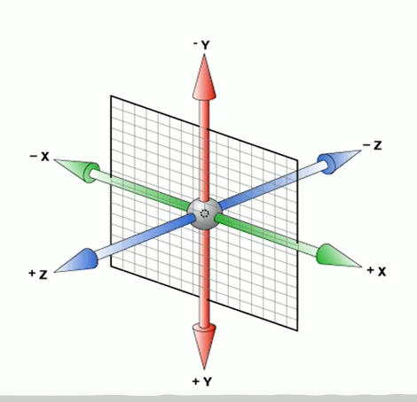
3D 转换我们主要学习工作中 最常用的 3D 位移和 3D 旋转
主要知识点
- 3D 位移:translate3d (x,y,z)
- 3D 旋转:rotate3d (x,y,z)
- 透视:perspective (添加给父级的一般给 body).
- 3D 呈现:transform-style (添加给当前动画的父级).
# 3D 移动 translate3d
3D 移动在 2D 移动的基础上多加了一个可以移动的方向,就是 z 轴方向。
- transform:translateX (100px); 仅仅是在 x 轴上移动
- transform:translateY (100px); 仅仅是在 y 轴上移动
- transform:translateZ (100px); 仅仅是在 z 轴上移动 (注意:translateZ 一般用 px 单位)
- transform:translate3d (x,y,z); 其中 x,y,z 分别指要移动的轴的方向的距离
# 透视 perspective
在 2D 平面产生近大远小视觉立体,但是只是效果二维的。
- 如果想要在网页产生 3D 效果需要透视 (理解成 3D 物体投影在 2D 平面内)
- 模拟人类的视觉位置,可认为安排一只眼睛去看
- 透视我们也称为视距:视距就是人的眼睛到屏幕的距离
- 距离视觉点越近的在电脑平面成像越大,越远成像越小
- 透视的单位是像素
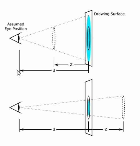
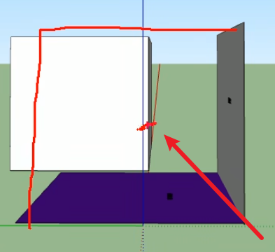
# <strong style="color:red"> 透视写在被观察元素的父盒子上面的 </strong>。
d:就是视距,视距就是一个距离人的眼睛到屏幕的距离。
z:就是 z 轴,物体距离屏幕的距离,z 轴越大 (正值) 我们看到的物体就越大。
代码:
<style> | |
body { | |
/* 透视写在被观察元素的父盒子上面 */ | |
perspective: 500px; | |
} | |
div { | |
width: 200px; | |
height: 200px; | |
background-color: pink; | |
/* x,y 分开写上面的会覆盖下面的导致 x 的就失效了 */ | |
/* transform: translateX(100px); */ | |
/* transform: translateY(100px); */ | |
/* 这么写两个都会生效 */ | |
/* transform: translateX(100px) translateY(100px); */ | |
/* transform: translateX(100px) translateY(100px) translateZ(100px); */ | |
/* 1.translateZ 沿着 z 轴移动 | |
2. 单位一定是 px | |
3.translateZ (100px) 向外移动 100px | |
3D 移动有简写的方法 */ | |
/* 使用 z 轴但是没有效果是因为 需要配合 "透视" 使用 */ | |
transform: translate3d(400px,100px,100px); | |
/* xyz 是不能省略的,如果没有就写 0 */ | |
/* transform: translate3d(0,100px,100px); */ | |
} | |
</style> | |
</head> | |
<body> | |
<div></div> | |
</body> |
效果:
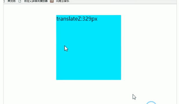
# translateZ
transform:translateZ (100px); 仅仅是在 z 轴上移动。有了透视,就能看到 translateZ 引起的变化了。
# 3D 旋转 rotate3d
3D 旋转指可以让元素在三维平面内沿着 x 轴,y 轴,z 轴或者自定义轴进行旋转。
语法:
- transform:rotateX (45deg); 沿着 x 轴正方向旋转 45 度
- transform:rotateY (45deg); 沿着 y 轴正方向旋转 45deg
- transform:rotateZ (45deg); 沿着 z 轴正方向旋转 45deg
- transform:rotate3d (x,y,z,deg); 沿着自定义轴旋转 deg 为角度 (了解即可)
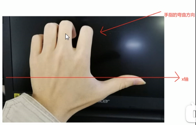
对于元素旋转的方向判断 我们需要先学习一个左手准则
# 左手准则
X 轴
- 左手的拇指指向 x 轴的正方向
- 其余手指的弯曲方向就是该元素沿着 x 轴旋转的方向 (正值)
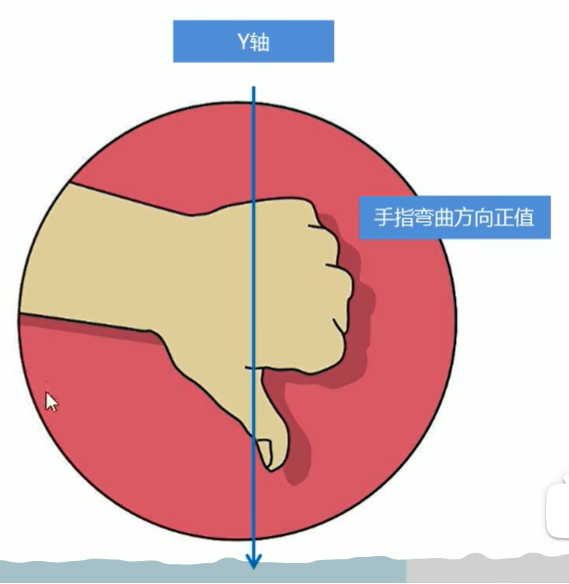
Y 轴
- 左手的拇指指向 y 轴的方向
- 其余手指的弯曲方向就是该元素沿着 y 轴旋的方向 (正值)
transform:rotate3d (x,y,z,deg):沿着自定义轴旋转 deg 为角度
xyz 表示旋转轴的矢量,是标识你是否希望沿着该轴旋转,最后一个标识旋转的角度。
- transform:rotate3d (1,0,0,45deg) 就是沿着 x 轴旋转 45deg
- transform:rotate3d (1,1,0,45deg) 就是沿着对角线 (矢量) 旋转 45deg
代码:
<style> | |
body { | |
perspective: 300px; | |
} | |
img { | |
display: block; | |
margin: 100px auto; | |
transition: all 1s; | |
} | |
img:hover { | |
/* transform: rotateX(360deg); */ | |
/* transform: rotateY(-360deg); */ | |
/* transform: rotateZ(360deg); */ | |
/* transform: rotate3d(1,0,0,45deg); */ | |
/* transform: rotate3d(0,1,0,45deg); */ | |
transform: rotate3d(1,1,0,360deg); | |
} | |
</style> | |
</head> | |
<body> | |
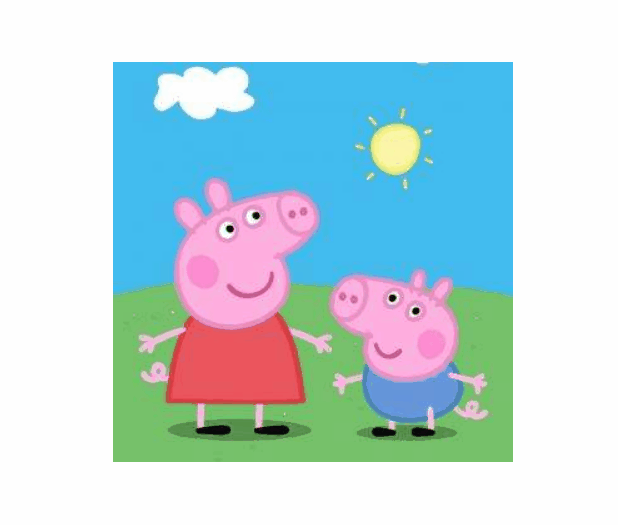
<img src="./image/pig.jpg" alt=""/> | |
</body> |
效果:
# 3D 呈现 transform-style
- 控制子元素是否开启三维立体环境。。
- transform-style:flat 子元素不开启 3d 立体空间 默认的
- transform-style:preserver-3d; 子元素开启立体空间
- 代码写给父级,但是影响的是子盒子.
- 这个属性很重要,后面必用。
代码:
<style> | |
body { | |
margin: 0; | |
padding: 0; | |
/* 设置透视度 */ | |
perspective: 500px; | |
} | |
.box { | |
/* 子绝父相 */ | |
position: relative; | |
width: 200px; | |
height: 200px; | |
/* 设置位置 */ | |
margin: 100px auto; | |
/* 过渡写在本身,谁做动画给谁加 */ | |
transition: all 1s; | |
/* 子元素开启立体空间 */ | |
transform-style: preserve-3d; | |
} | |
.box:hover { | |
/* 鼠标停在上面后开始旋转顺时针 60 度 */ | |
transform: rotateY(60deg); | |
} | |
.box div { | |
/* 绝对定位 */ | |
position: absolute; | |
top: 0; | |
left: 0; | |
/* 继承父盒子的宽高 */ | |
width: 100%; | |
height: 100%; | |
background-color: pink; | |
} | |
.box div:last-child { | |
background-color: blue; | |
/* 设置旋转角度 */ | |
transform: rotateX(60deg); | |
} | |
</style> | |
</head> | |
<body> | |
<div class="box"> | |
<div></div> | |
<div></div> | |
</div> | |
</body> |
效果:
# 两面翻转的盒子
需求:
- box 父盒子里面包含前后两个子盒子
- box 是翻转的盒子 front 是前面盒子 back 是后面盒子
代码:
<style> | |
body { | |
margin: 0; | |
padding: 0; | |
perspective: 450px; | |
} | |
.box { | |
position: relative; | |
width: 300px; | |
height: 300px; | |
margin: 100px auto; | |
transition: all 1s; | |
transform-style: preserve-3d; | |
backface-visibility: hidden; | |
} | |
.box:hover { | |
transform: rotateY(180deg); | |
} | |
.front, | |
.back { | |
position: absolute; | |
top: 0; | |
left: 0; | |
width: 100%; | |
height: 100%; | |
border-radius: 50%; | |
font: bold 30px/300px 楷体; | |
color: #fff; | |
text-align: center; | |
} | |
.front { | |
background-color: pink; | |
z-index: 1; | |
} | |
.back { | |
background-color: purple; | |
transform: rotateY(180deg); | |
} | |
</style> | |
</head> | |
<body> | |
<div class="box"> | |
<div class="front">窦凯欣</div> | |
<div class="back">123</div> | |
</div> | |
</body> |
效果:
# 3D 导航栏案例
效果:
旋转是以中心点来旋转的将正面的盒子向前移动中心点就到了一个看似为立方体的中心了这样就可以旋转了。
代码:
<style> | |
* { | |
margin: 0; | |
padding: 0; | |
} | |
ul { | |
margin: 100px; | |
} | |
ul li { | |
/* 每个盒子是独占一行的将其浮动 */ | |
float: left; | |
/* 将每个盒子隔开 */ | |
margin-left: 10px; | |
width: 120px; | |
height: 35px; | |
/* 消除 li 前面的小圆点 */ | |
list-style: none; | |
/* 一会需要给 box 旋转也需要透视 干脆给 Li 加里面的子盒子都有透视效果了 */ | |
perspective: 500px; | |
} | |
.box { | |
/* 子绝父相 */ | |
position: relative; | |
/* 继承父盒子的大小 */ | |
width: 100%; | |
height: 100%; | |
/* 开启子盒子立体空间 */ | |
transform-style: preserve-3d; | |
/* 过渡动画 */ | |
transition: all .4s; | |
/* 设置字体 */ | |
font: 20px/35px 楷体; | |
text-align: center; | |
color: blue; | |
} | |
.box:hover { | |
/* 鼠标停滞就向 x 轴旋转 90 度 */ | |
transform: rotateX(90deg); | |
} | |
.front, | |
.bottom { | |
/* 绝对定位 */ | |
position: absolute; | |
top: 0; | |
left: 0; | |
/* 继承父盒子大小 */ | |
width: 100%; | |
height: 100%; | |
} | |
.front { | |
background-color: pink; | |
/* 显示优先级 */ | |
z-index: 1; | |
/* 让盒子向 z 轴移动 17.5px 像素,这里是为了形成一个立体正方形的旋转方式 */ | |
transform: translateZ(17.5px); | |
} | |
.bottom { | |
background-color: purple; | |
/* 盒子向 Y 轴移动 17.5px 像素 再 旋转 - 90 度 就到了下面了 */ | |
transform: translateY(17.5px) rotateX(-90deg); | |
} | |
</style> | |
</head> | |
<body> | |
<ul> | |
<li> | |
<div class="box"> | |
<div class="front">窦凯欣</div> | |
<div class="bottom">首页</div> | |
</div> | |
</li> | |
<li> | |
<div class="box"> | |
<div class="front">窦凯欣</div> | |
<div class="bottom">商品</div> | |
</div> | |
</li> | |
<li> | |
<div class="box"> | |
<div class="front">窦凯欣</div> | |
<div class="bottom">推荐</div> | |
</div> | |
</li> | |
</ul> | |
</body> |
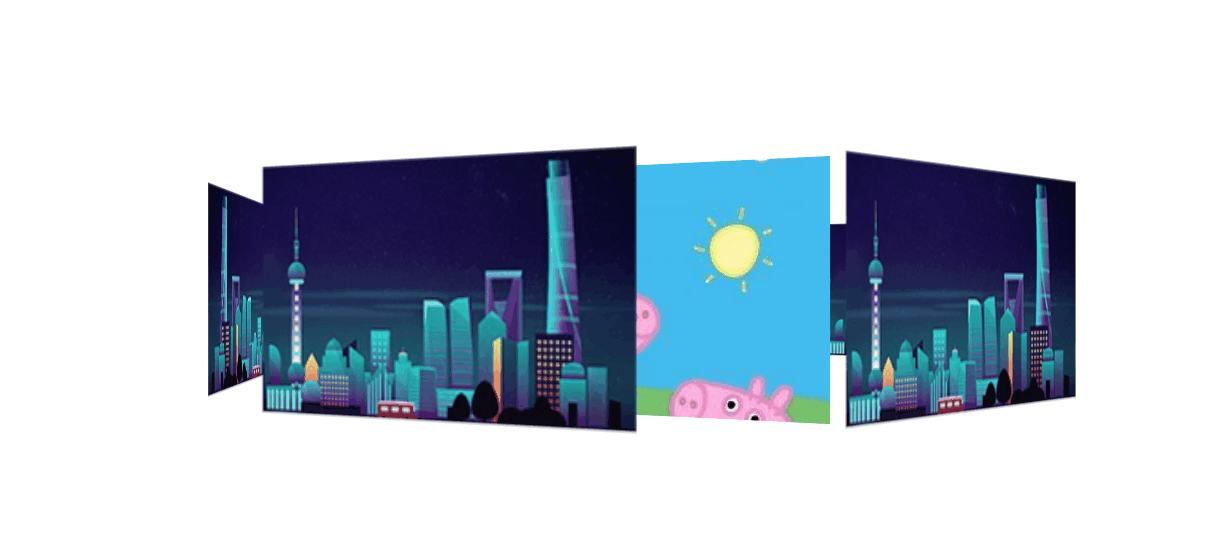
3D 旋转木马案例:
效果:
代码:
<style> | |
body { | |
margin: 0; | |
padding: 0; | |
perspective: 800px; | |
} | |
section { | |
position: relative; | |
background: url(./image/pig.jpg); | |
width: 300px; | |
height: 200px; | |
margin: 200px auto; | |
transform-style: preserve-3d; | |
animation: move 3s infinite alternate; | |
} | |
section:hover { | |
animation-play-state: paused; | |
} | |
section div { | |
position: absolute; | |
top: 0; | |
left: 0; | |
width: 100%; | |
height: 100%; | |
background: url(./image/scale.jpg) no-repeat center center; | |
} | |
section div:first-child { | |
transform: rotateY(0deg) translateZ(300px); | |
z-index: 1; | |
} | |
section div:nth-child(2) { | |
/* 这里 先旋转后移动 Z 轴 */ | |
/* 旋转 60 度后向 60 度的前面移动 300 像素 */ | |
transform: rotateY(60deg) translateZ(300px); | |
} | |
section div:nth-child(3) { | |
/* 根据前面的再加个 60deg 就是另一个角度的壁纸面了 然后再移动 300 像素 */ | |
transform: rotateY(120deg) translateZ(300px); | |
} | |
section div:nth-child(4) { | |
/* 根据前面的再加个 60deg 就是另一个角度的壁纸面了 然后再移动 300 像素 */ | |
transform: rotateY(180deg) translateZ(300px); | |
} | |
section div:nth-child(5) { | |
/* 根据前面的再加个 60deg 就是另一个角度的壁纸面了 然后再移动 300 像素 */ | |
transform: rotateY(240deg) translateZ(300px); | |
} | |
section div:last-child { | |
/* 根据前面的再加个 60deg 就是另一个角度的壁纸面了 然后再移动 300 像素 */ | |
transform: rotateY(300deg) translateZ(300px); | |
} | |
@keyframes move { | |
from { | |
transform: rotateY(0); | |
} | |
to { | |
transform: rotateY(360deg); | |
} | |
} | |
</style> | |
</head> | |
<body> | |
<section> | |
<div></div> | |
<div></div> | |
<div></div> | |
<div></div> | |
<div></div> | |
<div></div> | |
</section> | |
</body> |
# 浏览器私有前缀
浏览器私有前缀是为了兼容老版本的写法,比较新版本的浏览器无须添加
# 私有前缀
-moz-:代表 firefox 浏览器私有属性-ms-:代表 ie 浏览器私有属性-webkit:代表 safari,chrome 私有属性-o-:代表 Opera 私有属性
# 提倡写法
-moz-border-radius: 10px; | |
-webkit-border-radius: 10px; | |
-o-border-raduis: 10px; | |
border-radius: 10px; |