# 移动 WEB 开发之 rem 适配布局
# rem 基础
# rem 单位
rem (root em) 是一个相对单位,类似于 em,em 是父元素字体大小。
不同的是 <font color="red">rem</font > 的基准是相对于 html 元素的 < font color="red"> 字体大小 </font>。
比如,根元素 (html) 设置 font-size=12px; 非根元素设置 width:2rem; 则换成 px 表示就是 24px。
优点:
- 所有使用 rem 单位的盒子都通过 html 元素字体大小统一被控制
- 等比例缩放。
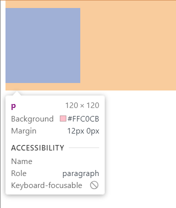
em:
<style> | |
div { | |
font-size: 12px; | |
} | |
p { | |
width: 10em; | |
height: 10em; | |
background-color: pink; | |
} | |
</style> | |
</head> | |
<body> | |
<div> | |
<p></p> | |
</div> | |
</body> |
效果:
rem:
<style> | |
html { | |
/* font-size: 14px; */ | |
/* html 字体大小变小后控制所有 rem 单位盒子也变小 */ | |
font-size: 10px; | |
} | |
div { | |
width: 15rem; | |
height: 15rem; | |
font-size: 12px; | |
background-color: purple; | |
} | |
p { | |
/* 1.em 相对于父元素的字体大小来说的 */ | |
/* width: 10em; | |
height: 10em; */ | |
/* 2.rem 相对于 html 元素字体大小来说的 */ | |
width: 10rem; | |
height: 10rem; | |
background-color: pink; | |
/* 3.rem 的优点就是可以通过修改 html 里面的文字大小来改变页面中元素的大小可以整体控制 */ | |
} | |
</style> | |
</head> | |
<body> | |
<div> | |
<p></p> | |
</div> | |
</body> |
# 媒体查询
# 什么是媒体查询
媒体查询 (Media Query) 是 CSS3 新语法。
- 使用
@media查询,可以针对不同的媒体类型定义不同的样式 - <font color="red">
@media可以针对不同的屏幕尺寸设置不同的样式 </font>. - 当你重置浏览器大小的过程中,页面也会根据浏览器的宽度和高度重新渲染页面
- 目前针对很多苹果手机,Android 手机,平板等设备都用得到 <font color="red"> 多媒体查询 </font>.
# 语法规范
@media mediatype and|not|only (media feature) { | |
CSS-Code; | |
} |
- 用
@media开头 注意@符号 mediatype媒体类型- 关键字
and not only. media feature媒体特性 必须有小括号包含
# 1 mediatype 查询类型
将不同的终端设备划分成不同的类型,成为媒体类型
| 值 | 解释说明 |
|---|---|
| all | 用于所有设备 |
| 用于打印机和打印预览 | |
| scree | 用于电脑屏幕,平板电脑,智能手机等 |
# 2 关键字
关键字将媒体类型或多个媒体特性连接到一起作为媒体查询的条件
and:可以将多个媒体特性连接到一起,相当于 "且" 的意思not:排除某个媒体类型,相当于 "非" 的意思,可以省略only:指定某个特定的媒体类型,可以省略。
# 3 媒体特性
每种媒体类型都具体各自不同的特性,根据不同媒体类型的媒体特性设置不同的展示风格。暂且了解三个 <font color="red"> 注意它们要加小括号 </font>。
| 值 | 解释说明 |
|---|---|
| width | 定义输出设备中页面可见区域的宽度 |
| min-width | 定义输出设备中页面最小可见区域宽度 |
| max-width | 定义输出设备中页面最大可见区域宽度 |
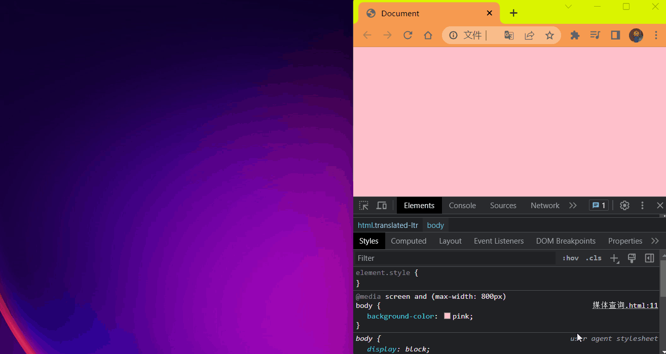
代码:
<style> | |
/* 这句话的意思就是:在我们屏幕上 并且 最大的宽度是 800 像素 设置我们想要的样式 | |
max-width 小于等于 800 像素 */ | |
@media screen and (max-width: 800px) { | |
body { | |
background-color: pink; | |
} | |
} | |
/* min-width 大于等于 800 像素 */ | |
@media screen and (min-width: 800px) { | |
body { | |
background-color: purple; | |
} | |
} | |
</style> |
效果:
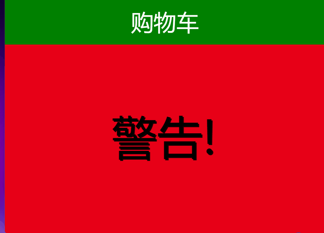
# 媒体查询 + rem 实现元素动态大小变化
rem 单位是跟着 html 来走的,有了 rem 页面元素可以设置不同大小尺寸
媒体查询可以根据不同设备宽度来修改样式
媒体查询 + rem 就可以实现不同设备宽度,实现页面元素大小的动态变化
代码:
<style> | |
* { | |
margin: 0; | |
} | |
@media screen and (min-width: 320px) { | |
html { | |
font-size: 50px; | |
} | |
} | |
@media screen and (min-width: 640px) { | |
html { | |
font-size: 100px; | |
} | |
} | |
@media screen and (min-width: 800px) { | |
html { | |
font-size: 120px; | |
background-color: red; | |
text-align: center; | |
line-height: 4rem; | |
animation: move 1s linear infinite; | |
&::after { | |
content: '警告!'; | |
font-size: 1rem; | |
display: block; | |
width: 3rem; | |
margin: 0 auto; | |
animation: dou 1s infinite; | |
text-shadow: 3px 3px rgba(17, 1, 1, 1); | |
} | |
} | |
@keyframes dou { | |
0%{} | |
45% { | |
transform: translateX(2px); | |
} | |
50% { | |
transform: translateX(0); | |
} | |
55% { | |
transform: translateX(-2px); | |
} | |
70% { | |
transform: translateX(0); | |
} | |
85% { | |
transform: translateX(-3px); | |
} | |
90% { | |
transform: translateX(0); | |
} | |
100% { | |
transform: translateX(3px); | |
} | |
} | |
@keyframes move { | |
from { | |
background-color: purple; | |
} | |
to { | |
background-color: red; | |
} | |
} | |
} | |
.top { | |
height: 1rem; | |
font-size: .5rem; | |
background-color: green; | |
color: #fff; | |
text-align: center; | |
line-height: 1rem; | |
} | |
</style> | |
</head> | |
<body> | |
<div class="top">购物车</div> | |
</body> |
效果:
# 引入资源 (理解)
当样式比较繁多的时候,我们可以针对不同的媒体使用不同 stylesheets (样式表)
原理,就是直接在 link 中判断设备的尺寸,然后引用不同的 css 文件达到预期的样式效果。
# 1 语法规范
<link rel="stylesheet" media="mediatype and|not|only (media feature)" href="mystylesheet.css"> |
# less 基础
# 维护 CSS 的弊端
CSS 是一门非程序式语言,没有变量,函数,SCOPE (作用域) 等概念。
- CSS 需要书写大量看似没有逻辑的代码 ,CSS 冗余度比较高的。
- 不方便维护及扩展,不利于复用
- CSS 没有很好的计算能力
- 非前端开发工程师来讲,往往会因为缺少 CSS 编写经验而很难写出组织良好且易于维护的 CSS 代码项目
# less 介绍
Less (Leaner Style Sheets 的 缩写) 是一门 CSS 扩展语言,也称为 CSS 预处理器
做为 CSS 的一种形式的扩展,它并没有减少 CSS 的功能,而是在现有的 CSS 语法上,为 CSS 加入程序式语言的特性。
它在 CSS 的语法基础之上,引入了变量,Mixin (混入),运算以及函数等功能,大大简化了 CSS 的编写,并且降低了 CSS 的维护成本,就像它的名称所说的那样,Less 可以让我们用更多的代码做更多的事情。
Less 中文网站:http://lesscss.cn/ or https://less.nodejs.cn/
常见的 CSS 预处理器:Sass,Less,Stylus
一句话:<strong style="color:red">Less 是一门 CSS 预处理语言,它扩展了 CSS 的动态特性 </strong>。
# 1 Less 使用
新建一个后缀名为 less 的文件,在这个 less 文件里面书写 less 语句。
# 2 Less 变量
变量是指没有固定的值,可以改变的。因为我们 CSS 中的一些颜色和数值等经常使用。
@变量名:值; |
例如:
/*@变量名:值;*/ | |
@color:pink; |
# 1.1 变量命名规范
- 必须有 @为前缀
- 不能包含特殊字符
- 不能以数字开头
- 大小写敏感
# 2.1 Less 注释
- 使用
//来进行注释
# 3 Less 编译
本质上,Less 包含一套自定义的语法及一个解析器,用户根据这些语法定义自己的样式规则,这些规则最终会通过解析器,编译生成对应的 CSS 文件。
所以,我们需要把我们的 less 文件,编译生成为 css 文件,这样我们的 html 页面才能使用。
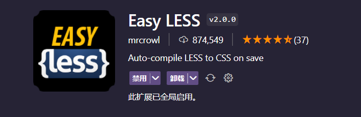
# 3.1 vscode Less 插件⭐️
Esay Less 插件用来把 less 文件编译为 css 文件
安装完毕插件,重新加载下 vscode。
只要把存一下 Less 文件,会自动生成 CSS 文件。
编写好 less 后 保存后目录结构发生的变化
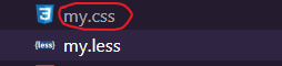
生成了一个 my.css 文件,将这个文件 link 引入大 html 文件中就可以使用了。每次修改 less 保存就可以修改 my.css 文件的内容了。
# 4 Less 嵌套
在 less 中将子级的元素写在父元素 css 作用域中
# 4.1 Less 嵌套写法
.header { | |
width: 200px; | |
height: 200px; | |
background-color: pink; | |
/*1.less 嵌套 子元素的样式直接写到父元素里面就好了 */ | |
a { | |
color: purple; | |
} | |
} |
经过编译后结果如下:
.header { | |
width: 200px; | |
height: 200px; | |
background-color: pink; | |
} | |
.header a { | |
color: purple; | |
} |
# 4.2 如果遇见 (交集 | 伪类 | 伪元素选择器)
- 内层选择器的前面没有 & 符号,则它被解析为选择器的后代;
- 如果有 & 符号,他就被解析为父元素自身或父元素的伪类;
- 如果有伪类,交集选择器,伪元素选择器 内层选择器的前面需要加 & 连接起来.
伪类选择器
CSS
a:hover { | |
color:red; | |
} |
Less 嵌套写法
a { | |
&:hover { | |
color: @变量名; | |
} | |
} |
伪元素
CSS
.nav .log { | |
color: green; | |
} | |
.nav::after { | |
content: '你也好啊,我是伪元素'; | |
color: green; | |
} |
Less 嵌套写法
.nav { | |
.log { | |
color: @colorLv; | |
} | |
&::after { | |
content: '你也好啊,我是伪元素'; | |
color: @colorLv; | |
} | |
} |
交集选择器
CSS
div.nav { | |
background-color: pink; | |
} | |
div.nav .log { | |
color: green; | |
} |
Less 嵌套写法
div&.nav{ | |
background-color: @colorP; | |
.log{ | |
color: @colorLv; | |
} | |
} |
# 5 Less 运算
任何数字,颜色或者变量都可以参与运算。就是 Less 提供了 加 (+) ,减 (-) ,乘 (*) ,除 (/) 算术运算。
<strong style="color:red"> 注意 </strong>:
- <strong style="color:red"> 如果
/运算符没有被解析则 在表达式中带上小括号抱起来 </strong>。 - 乘号 (*) 和除号 (/) 的写法
- 运算符中间左右有个空格隔开 1px + 5
- 对于两个不同的单位的值之间的运算,运算结果的值取第一个值的单位
- 如果两个值之间只有一个值有单位,则运算结果就取该单位
代码:
html
<link rel="stylesheet" href="./css/count.css"> | |
</head> | |
<body> | |
<div></div> | |
<img src="../imgage/hot图标.png" alt=""/> | |
</body> |
less
@baseFont: 50px; | |
@border: 5px + 5; | |
@colorRed: red; | |
html { | |
font-size: @baseFont; | |
} | |
div { | |
width: (200px - 50) * 2; | |
height: 200px * 2; | |
border: @border @colorRed solid; | |
// 运算结果:#44444 | |
background-color: #666 - #222; | |
} | |
img { | |
// 两个数都有单位结果为第一个单位为准 为 rem 单位 | |
width: (82rem / @baseFont); | |
height: (82rem / @baseFont); | |
} |
css
html { | |
font-size: 50px; | |
} | |
div { | |
width: 300px; | |
height: 400px; | |
border: 10px red solid; | |
background-color: #444444; | |
} | |
img { | |
width: 1.64rem; | |
height: 1.64rem; | |
} |
效果:
# 6 导入其它 less 文件到当前 less 文件中
将 common.less 引入到 index.less 中 语法如下:
// 在 index.less 中导入 common.less 文件 | |
@import "common"; |
common.less 文件
html {
    font-size: 50px;
}
// 设置常见的屏幕尺寸修改html里面的文字大小
// 320
// 我们此次定义的划分的份数为15
@no: 15;
@media screen and (min-width: 320px) {
    html {
        font-size: (320px / @no);
    }
}
// 360px
@media screen and (min-width: 360px) {
    html {
        font-size: (360px / @no);
    }
}
// 375px
@media screen and (min-width: 375px) {
    html {
        font-size: (375px / @no);
    }
}
// 384px
@media screen and (min-width: 384px) {
    html {
        font-size: (384px / @no);
    }
}
// 400px
@media screen and (min-width: 400px) {
    html {
        font-size: (400px / @no);
    }
}
// 414px
@media screen and (min-width: 414px) {
    html {
        font-size: (414px / @no);
    }
}
// 424px
@media screen and (min-width: 424px) {
    html {
        font-size: (424px / @no);
    }
}
// 480px
@media screen and (min-width: 480px) {
    html {
        font-size: (480px / @no);
    }
}
// 540px
@media screen and (min-width: 540px) {
    html {
        font-size: (540px / @no);
    }
}
// 720px
@media screen and (min-width: 720px) {
    html {
        font-size: (720px / @no);
    }
}
// 750px
@media screen and (min-width: 750px) {
    html {
        font-size: (750px / @no);
    }
}
导入到 index.less 中
@import "common";
生成的 index.css 查看如下:
html { | |
font-size: 50px; | |
} | |
@media screen and (min-width: 320px) { | |
html { | |
font-size: 21.33333333px; | |
} | |
} | |
@media screen and (min-width: 360px) { | |
html { | |
font-size: 24px; | |
} | |
} | |
@media screen and (min-width: 375px) { | |
html { | |
font-size: 25px; | |
} | |
} | |
@media screen and (min-width: 384px) { | |
html { | |
font-size: 25.6px; | |
} | |
} | |
@media screen and (min-width: 400px) { | |
html { | |
font-size: 26.66666667px; | |
} | |
} | |
@media screen and (min-width: 414px) { | |
html { | |
font-size: 27.6px; | |
} | |
} | |
@media screen and (min-width: 424px) { | |
html { | |
font-size: 28.26666667px; | |
} | |
} | |
@media screen and (min-width: 480px) { | |
html { | |
font-size: 32px; | |
} | |
} | |
@media screen and (min-width: 540px) { | |
html { | |
font-size: 36px; | |
} | |
} | |
@media screen and (min-width: 720px) { | |
html { | |
font-size: 48px; | |
} | |
} | |
@media screen and (min-width: 750px) { | |
html { | |
font-size: 50px; | |
} | |
} |
结果:会将 common.less 中的内容全部导入到 index.css 中
# rem 适配方案
- 让一些不能等比例自适应的元素,达到当设备尺寸发生改变的时候,等比例适配当前设备。
- 使用媒体查询根据不同设备按比例设置 html 的字体大小,然后页面元素使用 rem 做尺寸单位,当 html 字体大小变化元素尺寸也会发生变化,从而达到等比例缩放的适配。
# 1 rem 实际开发适配方案
- 按照设计稿与设备宽度的比例,动态计算并设置 html 跟标签的 font-size 大小;(媒体查询)
- CSS 中,设计稿元素的宽,高,相对位置等取值,按照同等比例换算为 rem 为单位的值;
# 2 rem 适配方案技术使用 (市场主流)
# 技术方案 1
- less
- 媒体查询
- rem
# 技术方案 2 (推荐)
- flexible.js
- rem
# 总结:
- 两种方案现在都存在。
- 方案 2 更简单,现阶段大家无需了解里面的 js 代码。
# 2.1 rem 实际开发适配方案 1
rem + 媒体查询 + less 技术
# 1 设计稿常见尺寸宽度
| 设备 | 常见宽度 |
|---|---|
| iphone 4.5 | 640px |
| iphone 6/7/8 | 750px |
| Android | 常见 320px,360px,375px,384px,400px,414px,500px,720px<br><font color="red"> 大部分 4.7 ~ 5 寸的安卓设备为 720px</font>. |
一般情况下,我们以一套或两套效果图适应大部分的屏幕,放弃极端屏或对其优雅降级,牺牲一些效果 <font color="red"> 现在基本以 750 为准 </font>。
# 2 动态设置 html 标签 font-size 大小
- 假设设计稿是 750px。
- 假设我们把整个屏幕划分为 15 等份 (划分标准不一定可以是 20 份 也可以是 10 等份)
- 每一份作为 html 字体大小,这里就是 50px。
- 那么在 320px 设备的时候,字体大小为 320 / 15 就是 21.33px。
- 用我们页面元素的大小 <strong style="color:red"> 除以 </strong> 不同的 html 字体大小会发现它们比例还是相同的
- 比如我们以 750px 为标准设计稿
- 一个 100 * 100 像素的页面元素在 750 屏幕下,就是 100 / 50 转换为 2rem * 2rem 比例是 1 比 1
- 320 屏幕下,html 字体大小为 21.33 则 2rem = 42.66px 此时宽和高都是 42.66 但是 宽和高的比例还是 1 比 1
- 但是已经能实现不同屏幕下,页面元素盒子等比例缩放的效果
# 3 元素大小取值方法
- 最后的公式:页面元素的 rem 值 = 页面元素值 (px) / (屏幕宽度 / 划分的份数)
- 比如:2rem = 100 / 50 (750 / 15 = 50)
- 屏幕宽度 / 划分的份数 就是 html font-size 的大小
- 或者:页面元素的 rem 值 = 页面元素值 (px) /html font-size 字体大小
- 比如:2rem = 100 / 50 (50 怎么来的看上面步骤 1)
代码:
<style> | |
@media screen and (min-width: 320px) { | |
html { | |
/*320px 屏幕划分 15 等份计算公式:320 / 15 = 21.33*/ | |
font-size: 21.33px; | |
} | |
} | |
@media screen and (min-width: 750px) { | |
html { | |
/*750px 屏幕划分 15 等份计算公式:750 / 15 = 50*/ | |
font-size: 50px; | |
} | |
} | |
div { | |
/*100 / 50 = 2rem | |
页面元素的 rem 值 = 页面元素值 (px) / (屏幕宽度 / 划分的份数)*/ | |
width: 2rem; | |
height: 2rem; | |
background-color: pink; | |
} | |
</style> | |
</head> | |
<body> | |
<div></div> | |
</body> |
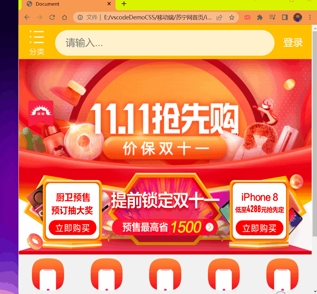
# 苏宁网移动端案例
# 1 技术选型
方案:采取单独制作移动页面方案
技术:布局采取 rem 适配布局 (less + rem + 媒体查询)
设计图:本设计图采用 750px 设计尺寸
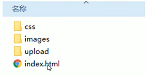
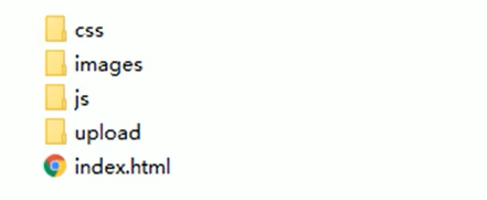
# 2 文件夹结构
# 3 设置公共 common.less 文件
- 新建 common.less 设置好最常见的屏幕尺寸,利用媒体查询设置不同的 html 字体大小,因为除了首页其它页面也需要
- 我们关心的尺寸有 320px,360px,375px,384px,400px,414px,424px,480px,540px,720px,750px
- 划分的份数我们定位 15 等份
- 因为我们 PC 端也可以打开我们苏宁移动端首页,我们默认 html 字体大小为 50px,<strong style="color:red"> 注意这句话写到最上面 </strong>.
# 4 新建 index.less 文件
- 新建 index.less 这里面写首页的样式
- 将刚才设置好的 common.less 引入到 index.less 里面 语法如下:
// 在 index.less 中导入 common.less 文件 | |
// 将公共样式导入到首页样式中节省代码空间看起来特别简洁 | |
@import "common"; |
查看 index.css 文件内容:
html { | |
font-size: 50px; | |
} | |
@media screen and (min-width: 320px) { | |
html { | |
font-size: 21.33333333px; | |
} | |
} | |
@media screen and (min-width: 360px) { | |
html { | |
font-size: 24px; | |
} | |
} | |
@media screen and (min-width: 375px) { | |
html { | |
font-size: 25px; | |
} | |
} | |
@media screen and (min-width: 384px) { | |
html { | |
font-size: 25.6px; | |
} | |
} | |
@media screen and (min-width: 400px) { | |
html { | |
font-size: 26.66666667px; | |
} | |
} | |
@media screen and (min-width: 414px) { | |
html { | |
font-size: 27.6px; | |
} | |
} | |
@media screen and (min-width: 424px) { | |
html { | |
font-size: 28.26666667px; | |
} | |
} | |
@media screen and (min-width: 480px) { | |
html { | |
font-size: 32px; | |
} | |
} | |
@media screen and (min-width: 540px) { | |
html { | |
font-size: 36px; | |
} | |
} | |
@media screen and (min-width: 720px) { | |
html { | |
font-size: 48px; | |
} | |
} | |
@media screen and (min-width: 750px) { | |
html { | |
font-size: 50px; | |
} | |
} |
直接将 index.css 引入到 index.html 页面中编写 index.less 这样就节省了很多的代码空间了
<link rel="stylesheet" href="./css/index.css"> |
代码:
<!DOCTYPE html> | |
<html lang="en"> | |
<head> | |
<meta charset="UTF-8"> | |
<meta name="viewport" content="width=device-width, initial-scale=1.0, | |
minimun-scale=1.0,maximun-scale=1.0,user-scalable=no"> | |
<title>Document</title> | |
<link rel="stylesheet" href="./css/normalize.css"> | |
<link rel="stylesheet" href="./css/index.css"> | |
</head> | |
<body> | |
<!-- 顶部搜索框 --> | |
<div class="search-content"> | |
<a href="#" class="classify"></a> | |
<div class="search"> | |
<form action="" method="get"> | |
<input type="search" id="" name="" placeholder="请输入..."/> | |
</form> | |
</div> | |
<a href="#" class="login">登录</a> | |
</div> | |
<!--banner 部分 --> | |
<div class="banner"> | |
<img src="./upload/banner.gif" alt=""/> | |
</div> | |
<!-- 广告部分 --> | |
<div class="ad"> | |
<a href="#"><img src="./upload/ad1.gif" alt=""/></a> | |
<a href="#"><img src="./upload/ad2.gif" alt=""/></a> | |
<a href="#"><img src="./upload/ad3.gif" alt=""/></a> | |
</div> | |
<!--nav 模块 --> | |
<nav> | |
<a href="#"> | |
<img src="./upload/nav1.png" alt=""/> | |
<span>爆款手机</span> | |
</a> | |
<a href="#"> | |
<img src="./upload/nav1.png" alt=""/> | |
<span>爆款手机</span> | |
</a> | |
<a href="#"> | |
<img src="./upload/nav1.png" alt=""/> | |
<span>爆款手机</span> | |
</a> | |
<a href="#"> | |
<img src="./upload/nav1.png" alt=""/> | |
<span>爆款手机</span> | |
</a> | |
<a href="#"> | |
<img src="./upload/nav1.png" alt=""/> | |
<span>爆款手机</span> | |
</a> | |
<a href="#"> | |
<img src="./upload/nav1.png" alt=""/> | |
<span>爆款手机</span> | |
</a> | |
<a href="#"> | |
<img src="./upload/nav1.png" alt=""/> | |
<span>爆款手机</span> | |
</a> | |
<a href="#"> | |
<img src="./upload/nav1.png" alt=""/> | |
<span>爆款手机</span> | |
</a> | |
<a href="#"> | |
<img src="./upload/nav1.png" alt=""/> | |
<span>爆款手机</span> | |
</a> | |
<a href="#"> | |
<img src="./upload/nav1.png" alt=""/> | |
<span>爆款手机</span> | |
</a> | |
</nav> | |
</body> | |
</html> |
index.less
@import "common"; | |
body { | |
min-width: 320px; | |
// 为什么是 15rem 因为要沾满等份显示内容如下: | |
// 750 / 50 = 15 总共分 15 等份宽度沾满 15 等份 | |
width: 15rem; | |
margin: 0 auto; | |
line-height: 1.5; | |
font-family: Arial, Helvetica; | |
background: #F2F2F2; | |
} | |
// 顶部搜索框 | |
@baseFont: 50; | |
.search-content { | |
display: flex; | |
position: fixed; | |
top: 0; | |
left: 50%; | |
transform: translateX(-50%); | |
width: 15rem; | |
height: (88rem / @baseFont); | |
background-color: #FFC001; | |
.classify { | |
width: (44rem / @baseFont); | |
height: (70rem / @baseFont); | |
// background-color: pink; | |
margin: (11rem / @baseFont) (25rem / @baseFont) (7rem / @baseFont) (24rem / @baseFont); | |
background: url(../image/classify.png) no-repeat; | |
background-size: 100% auto; | |
} | |
.search { | |
flex: 1; | |
input { | |
outline: none; | |
border: 0; | |
width: 100%; | |
height: (66rem / @baseFont); | |
border-radius: (33rem / @baseFont); | |
background-color: #FFF2CC; | |
margin-top: (12rem / @baseFont); | |
font-size: (25rem / @baseFont); | |
text-indent: 1em; | |
} | |
} | |
.login { | |
width: (75rem / @baseFont); | |
height: (70rem / @baseFont); | |
// background-color: purple; | |
margin: (10rem / @baseFont); | |
font-size: (25rem / @baseFont); | |
text-align: center; | |
color: #fff; | |
line-height: (70rem / @baseFont); | |
text-decoration: none; | |
} | |
} | |
//banner 部分 | |
.banner { | |
width: (750rem / @baseFont); | |
height: (368rem / @baseFont); | |
img { | |
width: 100%; | |
height: 100%; | |
} | |
} | |
// 广告部分 | |
.ad { | |
display: flex; | |
a { | |
flex: 1; | |
img { | |
width: 100%; | |
height: 100%; | |
} | |
} | |
} | |
//nav 模块 | |
nav { | |
width: (750rem / @baseFont); | |
a { | |
text-decoration: none; | |
float: left; | |
width: (150rem / @baseFont); | |
height: (140rem / @baseFont); | |
text-align: center; | |
line-height: .8; | |
img { | |
display: block; | |
width: (82rem / @baseFont); | |
height: (82rem / @baseFont); | |
margin: (10rem / @baseFont) auto 0; | |
} | |
span { | |
font-size: (25rem / @baseFont); | |
color: #333; | |
} | |
} | |
} |
对应 index.css
html { | |
font-size: 50px; | |
} | |
@media screen and (min-width: 320px) { | |
html { | |
font-size: 21.33333333px; | |
} | |
} | |
@media screen and (min-width: 360px) { | |
html { | |
font-size: 24px; | |
} | |
} | |
@media screen and (min-width: 375px) { | |
html { | |
font-size: 25px; | |
} | |
} | |
@media screen and (min-width: 384px) { | |
html { | |
font-size: 25.6px; | |
} | |
} | |
@media screen and (min-width: 400px) { | |
html { | |
font-size: 26.66666667px; | |
} | |
} | |
@media screen and (min-width: 414px) { | |
html { | |
font-size: 27.6px; | |
} | |
} | |
@media screen and (min-width: 424px) { | |
html { | |
font-size: 28.26666667px; | |
} | |
} | |
@media screen and (min-width: 480px) { | |
html { | |
font-size: 32px; | |
} | |
} | |
@media screen and (min-width: 540px) { | |
html { | |
font-size: 36px; | |
} | |
} | |
@media screen and (min-width: 720px) { | |
html { | |
font-size: 48px; | |
} | |
} | |
@media screen and (min-width: 750px) { | |
html { | |
font-size: 50px; | |
} | |
} | |
body { | |
min-width: 320px; | |
width: 15rem; | |
margin: 0 auto; | |
line-height: 1.5; | |
font-family: Arial, Helvetica; | |
background: #F2F2F2; | |
} | |
.search-content { | |
display: flex; | |
position: fixed; | |
top: 0; | |
left: 50%; | |
transform: translateX(-50%); | |
width: 15rem; | |
height: 1.76rem; | |
background-color: #FFC001; | |
} | |
.search-content .classify { | |
width: 0.88rem; | |
height: 1.4rem; | |
margin: 0.22rem 0.5rem 0.14rem 0.48rem; | |
background: url(../image/classify.png) no-repeat; | |
background-size: 100% auto; | |
} | |
.search-content .search { | |
flex: 1; | |
} | |
.search-content .search input { | |
outline: none; | |
border: 0; | |
width: 100%; | |
height: 1.32rem; | |
border-radius: 0.66rem; | |
background-color: #FFF2CC; | |
margin-top: 0.24rem; | |
font-size: 0.5rem; | |
text-indent: 1em; | |
} | |
.search-content .login { | |
width: 1.5rem; | |
height: 1.4rem; | |
margin: 0.2rem; | |
font-size: 0.5rem; | |
text-align: center; | |
color: #fff; | |
line-height: 1.4rem; | |
text-decoration: none; | |
} | |
.banner { | |
width: 15rem; | |
height: 7.36rem; | |
} | |
.banner img { | |
width: 100%; | |
height: 100%; | |
} | |
.ad { | |
display: flex; | |
} | |
.ad a { | |
flex: 1; | |
} | |
.ad a img { | |
width: 100%; | |
height: 100%; | |
} | |
nav { | |
width: 15rem; | |
} | |
nav a { | |
text-decoration: none; | |
float: left; | |
width: 3rem; | |
height: 2.8rem; | |
text-align: center; | |
line-height: 0.8; | |
} | |
nav a img { | |
display: block; | |
width: 1.64rem; | |
height: 1.64rem; | |
margin: 0.2rem auto 0; | |
} | |
nav a span { | |
font-size: 0.5rem; | |
color: #333; | |
} |
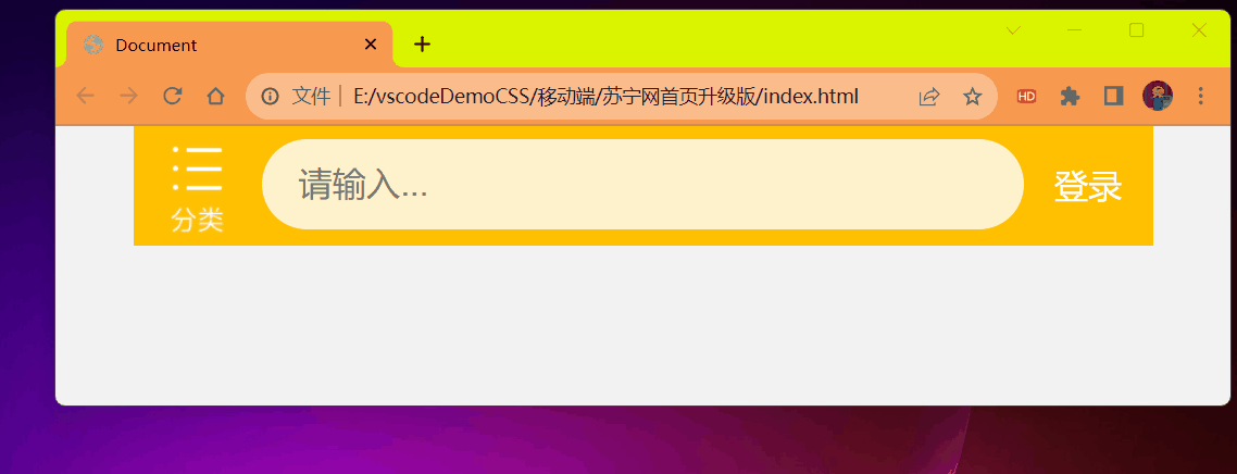
效果:
# 简洁高效的 rem 适配方案 flexible.js
# 技术方案 1
- less
- 媒体查询
- rem
# 技术方案 2 (推荐)
- flexible.js
- rem
手机淘宝团队出的简洁高效移动端适配库
我们再也不需要再写不同屏幕的媒体查询,因为里面 js 做了处理
它的原理是把当前设备划分为 10 等份,但是不同设备下,比例还是一致的。
我们要做的,就是确定好我们当前设备的 html 字体大小就可以了。
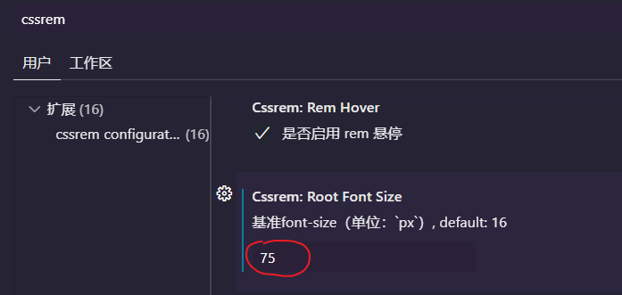
比如当前设计稿是 750px,那么我们只需要把 html 字体大小设置为 75px (750px / 10) 就可以
里面页面元素 rem 值:页面元素的 px 值 / 75
剩余的,让 flexible.js 来计算
github 地址:https://github.com/amfe/lib-flexible
修改等份需要下载好 flexible.js 现在版本应该名为 index.js 了打开在里面修改如下的值:
// set 1rem = viewWidth / 10 | |
function setRemUnit () { | |
var rem = docEl.clientWidth / 10 | |
docEl.style.fontSize = rem + 'px' | |
} |
修改 10 这个参数就好了。
# 使用适配方案 2 制作苏宁移动端首页
# 1 技术选型
方案:采取单独制作移动页面方案
技术:布局采取 rem 适配布局 2 (flexible.js + rem)
设计图:本设计图采用 750px 设计尺寸
# 2 文件结构
# VSCode px 转换 rem 插件 cssrem
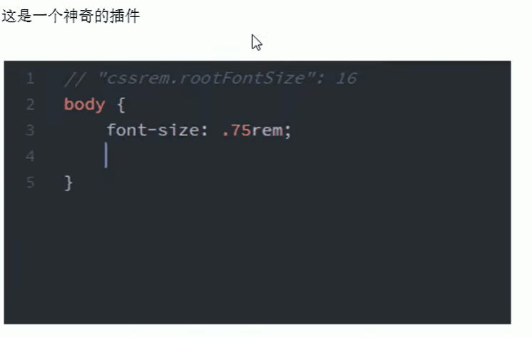
px 与 rem 单位之间使用 alt+z 快速切换
设置 html 字体大小基准值
- 打开 设置 快捷键是 ctrl + 逗号
或者
代码:
html
<!DOCTYPE html> | |
<html lang="en"> | |
<head> | |
<meta charset="UTF-8"> | |
<meta name="viewport" content="width=device-width, initial-scale=1.0, | |
minimun-scale=1.0,maximun-scale=1.0,user-scalable=no"> | |
<title>Document</title> | |
<link rel="stylesheet" href="./css/normalize.css"> | |
<link rel="stylesheet" href="./css/index.css"> | |
</head> | |
<body> | |
<div class="search-content"> | |
<a href="#" class="classify"></a> | |
<div class="search"> | |
<form action="" method="get"> | |
<input type="search" id="" name="" placeholder="请输入..."/> | |
</form> | |
</div> | |
<a href="#" class="login">登录</a> | |
</div> | |
<script src="./js/index.js"></script> | |
</body> | |
</html> |
css
body { | |
min-width: 320px; | |
max-width: 750px; | |
width: 10rem; | |
margin: 0 auto; | |
line-height: 1.5; | |
font-family: Arial, Helvetica; | |
background-color: #F2F2F2; | |
} | |
@media screen and (min-width: 750px) { | |
html { | |
/*flexible.js 中有一个权重比较高的页面字体大小我们要设置为自己想要的需要加权重!important*/ | |
font-size: 75px !important; | |
} | |
} | |
.search-content { | |
display: flex; | |
position: fixed; | |
top: 0; | |
width: 10rem; | |
height: 1.1733rem; | |
background-color: #FFC001; | |
} | |
.classify { | |
width: .5867rem; | |
height: .9333rem; | |
background-color: pink; | |
margin: .1467rem .3333rem .1333rem; | |
background: url(../image/classify.png) no-repeat; | |
background-size: .5867rem auto; | |
} | |
.search { | |
flex: 1; | |
/* background-color: purple; */ | |
} | |
.search input { | |
outline: none; | |
font-size: .3333rem; | |
border: 0; | |
width: 100%; | |
height: .88rem; | |
background-color: #FFF2CC; | |
margin-top: .1333rem; | |
border-radius: .44rem; | |
text-indent: 1em; | |
} | |
.login { | |
width: 1rem; | |
height: .9333rem; | |
margin: .1333rem; | |
text-align: center; | |
line-height: .9333rem; | |
text-decoration: none; | |
color: #fff; | |
font-size: .3333rem; | |
} |
normalize.css
/*! normalize.css v8.0.1 | MIT License | github.com/necolas/normalize.css */ | |
/* Document | |
========================================================================== */ | |
/** | |
* 1. Correct the line height in all browsers. | |
* 2. Prevent adjustments of font size after orientation changes in iOS. | |
*/ | |
html { | |
line-height: 1.15; /* 1 */ | |
-webkit-text-size-adjust: 100%; /* 2 */ | |
} | |
* { | |
margin: 0; | |
-webkit-top-higlight-color: transparent; | |
} | |
/* Sections | |
========================================================================== */ | |
/** | |
* Remove the margin in all browsers. | |
*/ | |
body { | |
margin: 0; | |
} | |
/** | |
* Render the `main` element consistently in IE. | |
*/ | |
main { | |
display: block; | |
} | |
/** | |
* Correct the font size and margin on `h1` elements within `section` and | |
* `article` contexts in Chrome, Firefox, and Safari. | |
*/ | |
h1 { | |
font-size: 2em; | |
margin: 0.67em 0; | |
} | |
/* Grouping content | |
========================================================================== */ | |
/** | |
* 1. Add the correct box sizing in Firefox. | |
* 2. Show the overflow in Edge and IE. | |
*/ | |
hr { | |
box-sizing: content-box; /* 1 */ | |
height: 0; /* 1 */ | |
overflow: visible; /* 2 */ | |
} | |
/** | |
* 1. Correct the inheritance and scaling of font size in all browsers. | |
* 2. Correct the odd `em` font sizing in all browsers. | |
*/ | |
pre { | |
font-family: monospace, monospace; /* 1 */ | |
font-size: 1em; /* 2 */ | |
} | |
/* Text-level semantics | |
========================================================================== */ | |
/** | |
* Remove the gray background on active links in IE 10. | |
*/ | |
a { | |
background-color: transparent; | |
} | |
/** | |
* 1. Remove the bottom border in Chrome 57- | |
* 2. Add the correct text decoration in Chrome, Edge, IE, Opera, and Safari. | |
*/ | |
abbr[title] { | |
border-bottom: none; /* 1 */ | |
text-decoration: underline; /* 2 */ | |
text-decoration: underline dotted; /* 2 */ | |
} | |
/** | |
* Add the correct font weight in Chrome, Edge, and Safari. | |
*/ | |
b, | |
strong { | |
font-weight: bolder; | |
} | |
/** | |
* 1. Correct the inheritance and scaling of font size in all browsers. | |
* 2. Correct the odd `em` font sizing in all browsers. | |
*/ | |
code, | |
kbd, | |
samp { | |
font-family: monospace, monospace; /* 1 */ | |
font-size: 1em; /* 2 */ | |
} | |
/** | |
* Add the correct font size in all browsers. | |
*/ | |
small { | |
font-size: 80%; | |
} | |
/** | |
* Prevent `sub` and `sup` elements from affecting the line height in | |
* all browsers. | |
*/ | |
sub, | |
sup { | |
font-size: 75%; | |
line-height: 0; | |
position: relative; | |
vertical-align: baseline; | |
} | |
sub { | |
bottom: -0.25em; | |
} | |
sup { | |
top: -0.5em; | |
} | |
/* Embedded content | |
========================================================================== */ | |
/** | |
* Remove the border on images inside links in IE 10. | |
*/ | |
img { | |
border-style: none; | |
} | |
/* Forms | |
========================================================================== */ | |
/** | |
* 1. Change the font styles in all browsers. | |
* 2. Remove the margin in Firefox and Safari. | |
*/ | |
button, | |
input, | |
optgroup, | |
select, | |
textarea { | |
font-family: inherit; /* 1 */ | |
font-size: 100%; /* 1 */ | |
line-height: 1.15; /* 1 */ | |
margin: 0; /* 2 */ | |
} | |
/** | |
* Show the overflow in IE. | |
* 1. Show the overflow in Edge. | |
*/ | |
button, | |
input { /* 1 */ | |
overflow: visible; | |
} | |
/** | |
* Remove the inheritance of text transform in Edge, Firefox, and IE. | |
* 1. Remove the inheritance of text transform in Firefox. | |
*/ | |
button, | |
select { /* 1 */ | |
text-transform: none; | |
} | |
/** | |
* Correct the inability to style clickable types in iOS and Safari. | |
*/ | |
button, | |
[type="button"], | |
[type="reset"], | |
[type="submit"] { | |
-webkit-appearance: button; | |
} | |
/** | |
* Remove the inner border and padding in Firefox. | |
*/ | |
button::-moz-focus-inner, | |
[type="button"]::-moz-focus-inner, | |
[type="reset"]::-moz-focus-inner, | |
[type="submit"]::-moz-focus-inner { | |
border-style: none; | |
padding: 0; | |
} | |
/** | |
* Restore the focus styles unset by the previous rule. | |
*/ | |
button:-moz-focusring, | |
[type="button"]:-moz-focusring, | |
[type="reset"]:-moz-focusring, | |
[type="submit"]:-moz-focusring { | |
outline: 1px dotted ButtonText; | |
} | |
/** | |
* Correct the padding in Firefox. | |
*/ | |
fieldset { | |
padding: 0.35em 0.75em 0.625em; | |
} | |
/** | |
* 1. Correct the text wrapping in Edge and IE. | |
* 2. Correct the color inheritance from `fieldset` elements in IE. | |
* 3. Remove the padding so developers are not caught out when they zero out | |
* `fieldset` elements in all browsers. | |
*/ | |
legend { | |
box-sizing: border-box; /* 1 */ | |
color: inherit; /* 2 */ | |
display: table; /* 1 */ | |
max-width: 100%; /* 1 */ | |
padding: 0; /* 3 */ | |
white-space: normal; /* 1 */ | |
} | |
/** | |
* Add the correct vertical alignment in Chrome, Firefox, and Opera. | |
*/ | |
progress { | |
vertical-align: baseline; | |
} | |
/** | |
* Remove the default vertical scrollbar in IE 10+. | |
*/ | |
textarea { | |
overflow: auto; | |
} | |
/** | |
* 1. Add the correct box sizing in IE 10. | |
* 2. Remove the padding in IE 10. | |
*/ | |
[type="checkbox"], | |
[type="radio"] { | |
box-sizing: border-box; /* 1 */ | |
padding: 0; /* 2 */ | |
} | |
/** | |
* Correct the cursor style of increment and decrement buttons in Chrome. | |
*/ | |
[type="number"]::-webkit-inner-spin-button, | |
[type="number"]::-webkit-outer-spin-button { | |
height: auto; | |
} | |
/** | |
* 1. Correct the odd appearance in Chrome and Safari. | |
* 2. Correct the outline style in Safari. | |
*/ | |
[type="search"] { | |
-webkit-appearance: textfield; /* 1 */ | |
outline-offset: -2px; /* 2 */ | |
} | |
/** | |
* Remove the inner padding in Chrome and Safari on macOS. | |
*/ | |
[type="search"]::-webkit-search-decoration { | |
-webkit-appearance: none; | |
} | |
/** | |
* 1. Correct the inability to style clickable types in iOS and Safari. | |
* 2. Change font properties to `inherit` in Safari. | |
*/ | |
::-webkit-file-upload-button { | |
-webkit-appearance: button; /* 1 */ | |
font: inherit; /* 2 */ | |
} | |
/* Interactive | |
========================================================================== */ | |
/* | |
* Add the correct display in Edge, IE 10+, and Firefox. | |
*/ | |
details { | |
display: block; | |
} | |
/* | |
* Add the correct display in all browsers. | |
*/ | |
summary { | |
display: list-item; | |
} | |
/* Misc | |
========================================================================== */ | |
/** | |
* Add the correct display in IE 10+. | |
*/ | |
template { | |
display: none; | |
} | |
/** | |
* Add the correct display in IE 10. | |
*/ | |
[hidden] { | |
display: none; | |
} |
index.js 也就是大名鼎鼎的 flexible.js
(function flexible (window, document) { | |
var docEl = document.documentElement | |
var dpr = window.devicePixelRatio || 1 | |
// adjust body font size | |
function setBodyFontSize () { | |
if (document.body) { | |
document.body.style.fontSize = (12 * dpr) + 'px' | |
} | |
else { | |
document.addEventListener('DOMContentLoaded', setBodyFontSize) | |
} | |
} | |
setBodyFontSize(); | |
// set 1rem = viewWidth / 10 | |
function setRemUnit () { | |
var rem = docEl.clientWidth / 10 | |
docEl.style.fontSize = rem + 'px' | |
} | |
setRemUnit() | |
// reset rem unit on page resize | |
window.addEventListener('resize', setRemUnit) | |
window.addEventListener('pageshow', function (e) { | |
if (e.persisted) { | |
setRemUnit() | |
} | |
}) | |
// detect 0.5px supports | |
if (dpr >= 2) { | |
var fakeBody = document.createElement('body') | |
var testElement = document.createElement('div') | |
testElement.style.border = '.5px solid transparent' | |
fakeBody.appendChild(testElement) | |
docEl.appendChild(fakeBody) | |
if (testElement.offsetHeight === 1) { | |
docEl.classList.add('hairlines') | |
} | |
docEl.removeChild(fakeBody) | |
} | |
}(window, document)) |
效果:
非常的 <strong style="color:red"> 丝滑 </strong>。
# 移动 WEB 开发响应式布局
# 1 响应式开发原理
就是使用媒体查询针对不同宽度的设备进行布局和样式的设置,从而适配不同设备的目的。
| 设备划分 | 尺寸区间 |
|---|---|
| 超小屏幕 (手机) | < 768px |
| 小屏设备 (平板) | >= 768px ~ < 992px |
| 中等屏幕 (桌面显示器) | >= 992px ~ < 1200px |
| 宽屏设备 (大桌面显示器) | >= 1200px |
# 1.2 响应式布局容器
响应式需要一个父级作为布局容器,来配合子级元素来实现变化效果。
原理就是在不同屏幕下,通过媒体查询来改变这个布局容器的大小,再改变里面子元素的排列方式和大小,从而实现不同屏幕下,看到不同的页面布局和样式变化。
平时我们的响应式尺寸划分
- 超小屏幕 (手机,小于 768px):设置宽度为 100%
- 小屏幕 (平板,大于等于 768px):设置宽度为 750px
- 中等屏幕 (桌面显示器,大于等于 992px):设置宽度为 970px
- 大屏幕 (大桌面显示器,大于等于 1200px):设置宽度为 1170px
布局容器比页面尺寸稍微小一点点就是为了居中对齐 两侧留空白看起来舒服些。
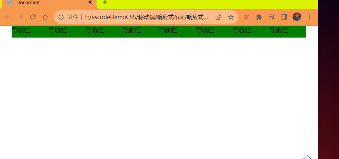
# 响应式导航 —— 案例
# 需求分析
- 当我们屏幕大于等于 768px,我们给布局容器 container 宽度为 750px。
- container 里面包含了 8 个小 li 盒子,每个盒子的宽度定为 93.75px (750 / 8),高度为 30px,浮动一行显示。
- 当我们屏幕缩放,宽度小于 768px 的时候,container 盒子宽度修改为 100% 宽度。
- 此时里面的 8 个小 li,宽度修改为 33.33%,这样一行就只能显示 3 个小 li,剩余下行显示。
代码:
<style> | |
* { | |
margin: 0; | |
padding: 0; | |
-webkit-tap-higlight-color: transparent; | |
} | |
.container { | |
width: 750px; | |
margin: 0 auto; | |
} | |
.container ul li { | |
float: left; | |
width: 93.75px; | |
height: 30px; | |
background-color: green; | |
list-style: none; | |
} | |
@media screen and (max-width: 767px) { | |
.container { | |
width: 100%; | |
} | |
.container ul li { | |
width: 33.33%; | |
} | |
} | |
</style> | |
</head> | |
<body> | |
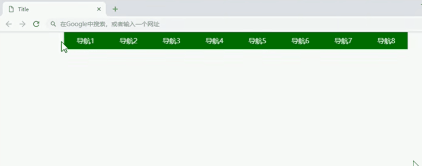
<div class="container"> | |
<ul> | |
<li>导航栏</li> | |
<li>导航栏</li> | |
<li>导航栏</li> | |
<li>导航栏</li> | |
<li>导航栏</li> | |
<li>导航栏</li> | |
<li>导航栏</li> | |
<li>导航栏</li> | |
</ul> | |
</div> | |
</body> |
效果: