# 移动 WEB 开发之 flex 布局
# 传统布局
- 兼容性好
- 布局繁琐
- 局限性,不能再移动端很好的布局
# flex 弹性布局
- 操作方便,布局极为简单,移动端应该很广泛
- PC 端浏览器支持情况较差
- IE 11 或更低版本,不支持或仅部分支持
建议:
- 如果是 PC 端页面布局,我们还是传统布局
- 如果是移动端或者不考虑兼容性问题的 PC 端页面布局,我们还是使用 flex 弹性布局
# flex 布局原理
flex 是 flexible Box 的缩写,意为 "弹性布局",用来为盒状模型提供最大的灵活性,任何一个容器都可以指定为 flex 布局。
<font color="red"> 注意 </font>:
- 当我们为父盒子设为 flex 布局以后,子元素的 float,clear 和 vertical-align 属性将失效。
- 伸缩布局 = 弹性布局 = 伸缩盒布局 = 弹性盒布局 = flex 布局
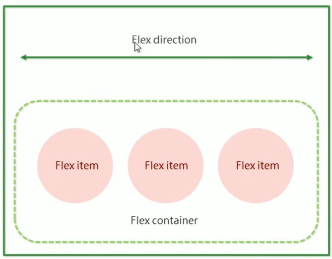
采用 flex 布局的元素,称为 flex 容器 (flex container),简称 "容器"。它的所有子元素自动成为 容器 成员,成为 flex 项目 (flex item),简称 "项目"。
- 体验中 div 就是 flex 父容器。
- 体验中 span 就是 子容器 flex 项目
- 子容器可以横向排列也可以纵向排列
# 总结 flex 布局原理:
就是通过给父盒子添加 flex 属性,来控制子盒子的位置和排列方式。
# flex 布局父项常见属性
# 常见父项属性
以下由 6 个属性是对父元素设置的
- flex-direction:设置主轴的方向
- justify-content:设置主轴上的子元素排列方式
- flex-wrap:设置子元素是否换行
- align-content:设置侧轴上的子元素的排列方式 (多行)
- align-items:设置侧轴上的子元素排列方式 (单行)
- flex-flow:复合属性,相当于同时设置了 flex-direction 和 flex-wrap
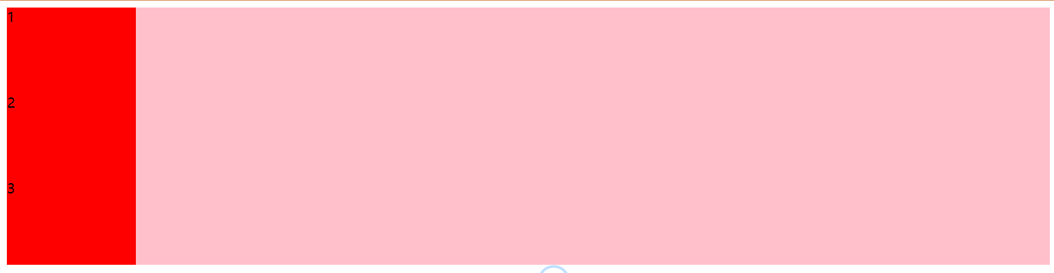
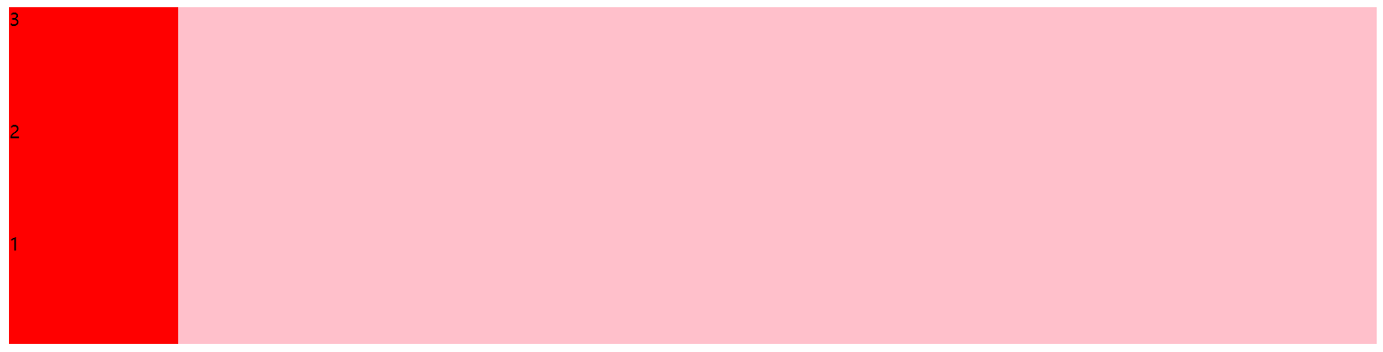
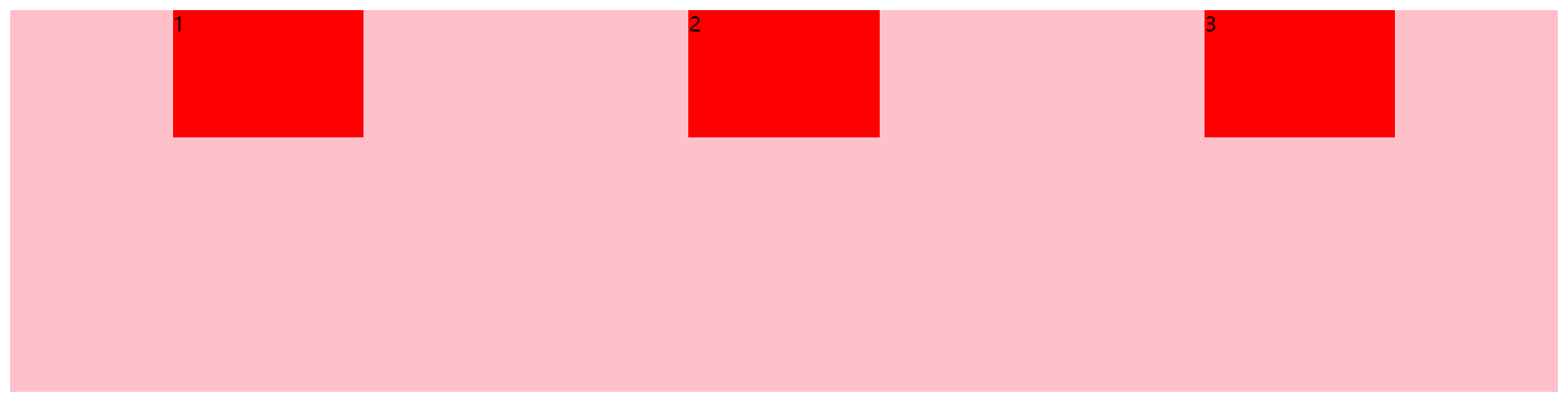
# flex-direction 设置主轴的方向
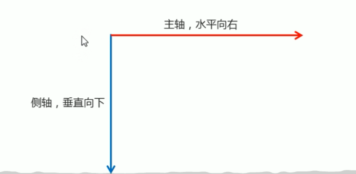
# 1 主轴与侧轴
在 flex 布局中,是分为主轴和侧轴两个方向,同样的叫法有:行和列,x 轴和 y 轴。
- 默认主轴方向就是 x 轴方向,水平向右
- 默认侧轴方向就是 y 轴方向,水平向下
# 2 属性值
flex-direction 属性决定主轴的方向 (即项目的排列方向)
注意:主轴和侧轴是会变化的,就看 flex-direction 设置谁为主轴,剩下的就是侧轴。而我们的子元素是跟着主轴来排列的。
| 属性值 | 说明 |
|---|---|
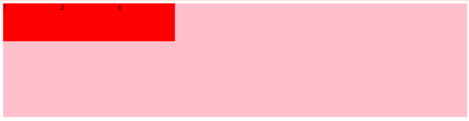
| row | 默认值从左到右 |
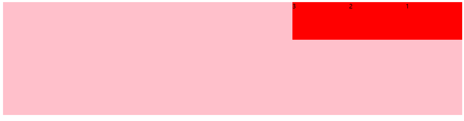
| row-reverse | 从右到左 |
| column | 从上到下 |
| column-reverse | 从下到上 |
各个属性值的效果如下:
row
row-reverse
column
column-reverse
完整代码如下:
<style> | |
div { | |
display: flex; | |
width: 80%; | |
height: 300px; | |
background-color: pink; | |
/* 默认的主轴是 x 轴 行 row 那么 y 轴就是侧轴 */ | |
/* 我们的元素是跟着主轴来排列的 */ | |
/* flex-direction: row; */ | |
/* 翻转 */ | |
/* flex-direction: row-reverse; */ | |
/* 将主轴设置为 y 轴来进行排列 那么 x 轴就成了侧轴 */ | |
/* flex-direction: column; */ | |
/* y 轴 翻转 */ | |
flex-direction: column-reverse; | |
} | |
div span { | |
width: 150px; | |
height: 100px; | |
background-color: red; | |
} | |
</style> | |
</head> | |
<body> | |
<div> | |
<span>1</span> | |
<span>2</span> | |
<span>3</span> | |
</div> | |
</body> |
# justify-content 设置主轴上的子元素排列方式
justify-content 属性定义了项目在主轴上的对齐方式。
注意:<font color="red"> 使用这个属性之前一定要确定好主轴是哪个 </font>.
| 属性值 | 说明 |
|---|---|
| flex-start | 默认值 从头部开始 如果主轴是 x 轴,则从左到右 |
| flex-end | 从尾部开始排列 |
| center | 在主轴居中对齐 (如果主轴是 x 轴则水平居中) |
| space-around | 平分剩余空间 |
| space-between | 先两边贴边再平分剩余空间 (重要) |
各个属性值的效果如下:
flex-start

flex-end
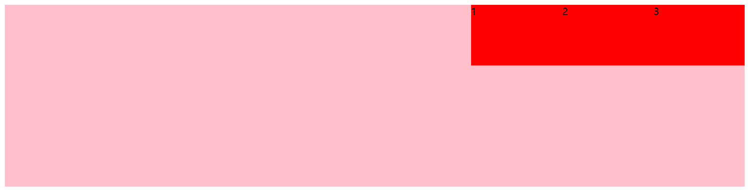
center
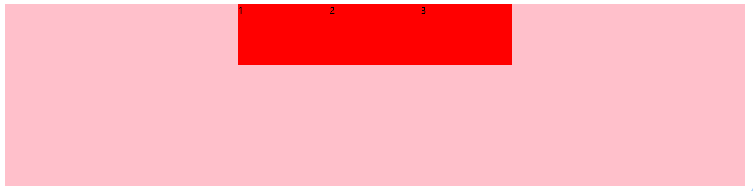
space-around
space-between
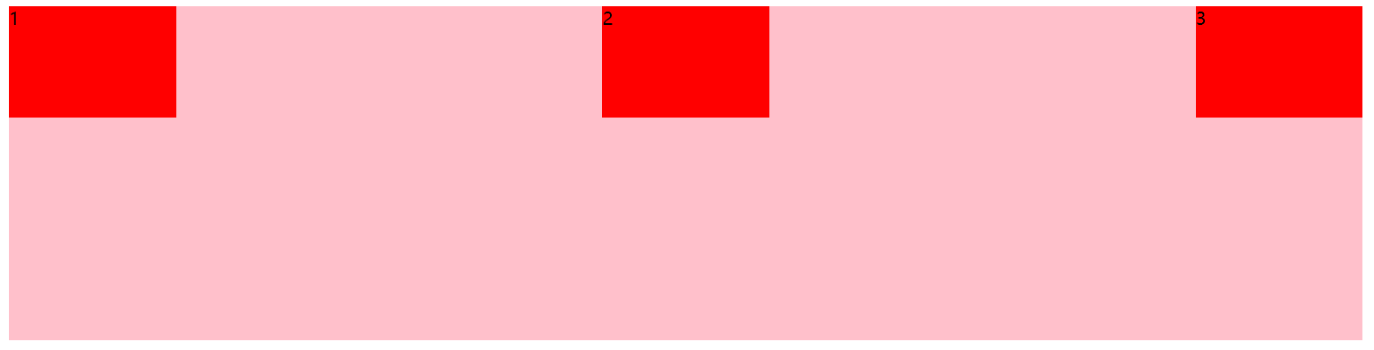
上面都是使用的是 x 为主轴的换成 y 轴就是按照如下的风格来展示的:
space-around
代码:
<style> | |
div { | |
display: flex; | |
width: 50%; | |
height: 600px; | |
background-color: pink; | |
/* 默认的主轴是 x 轴 行 row 那么 y 轴就是侧轴 */ | |
flex-direction: column; | |
/* justify-content: 是设置主轴上子元素的排列方式 */ | |
/* justify-content: flex-start; */ | |
/* 排列方式一定要先确定主轴是哪个 */ | |
/* 从尾部开始排列 */ | |
/* justify-content:end; */ | |
/* 居中对齐 */ | |
/* justify-content: center; */ | |
/* 平分剩余空间 */ | |
justify-content: space-around; | |
/* 先两边贴再评分剩余空间 */ | |
/* justify-content: space-between; */ | |
} | |
div span { | |
width: 150px; | |
height: 100px; | |
background-color: red; | |
} | |
</style> | |
</head> | |
<body> | |
<div> | |
<span>1</span> | |
<span>2</span> | |
<span>3</span> | |
</div> | |
</body> |
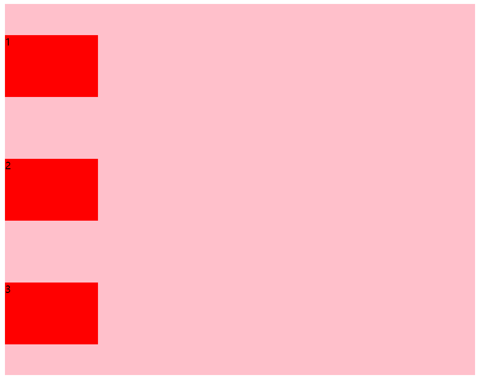
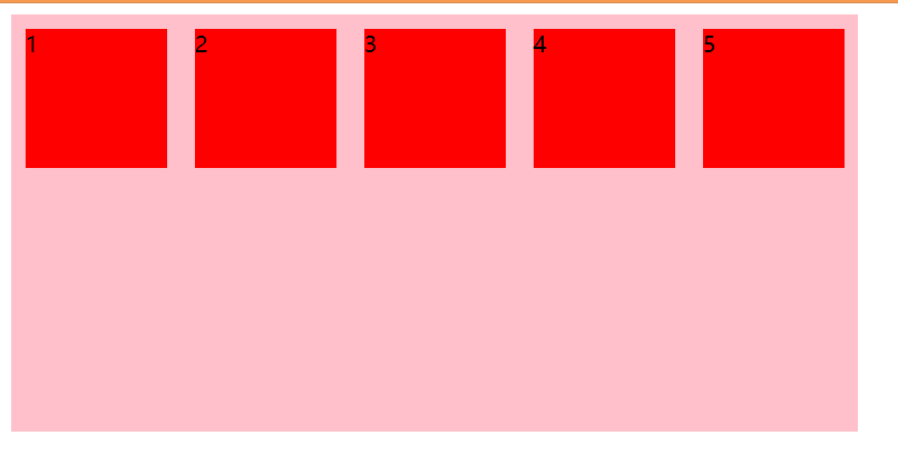
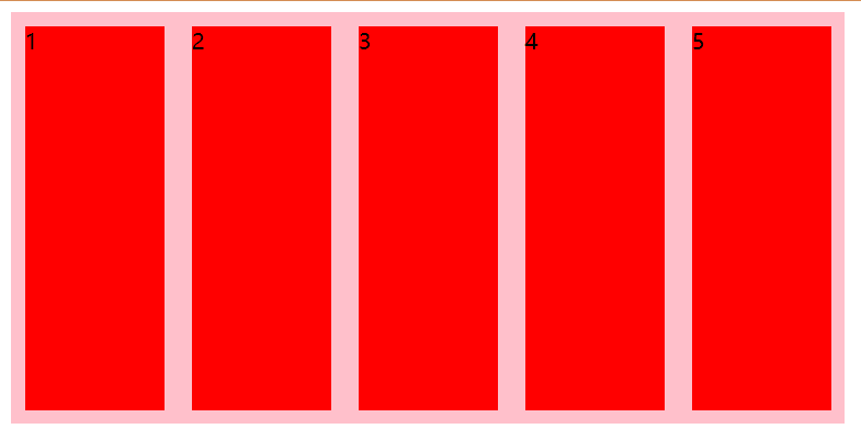
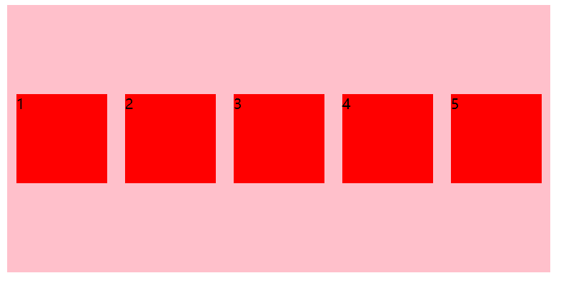
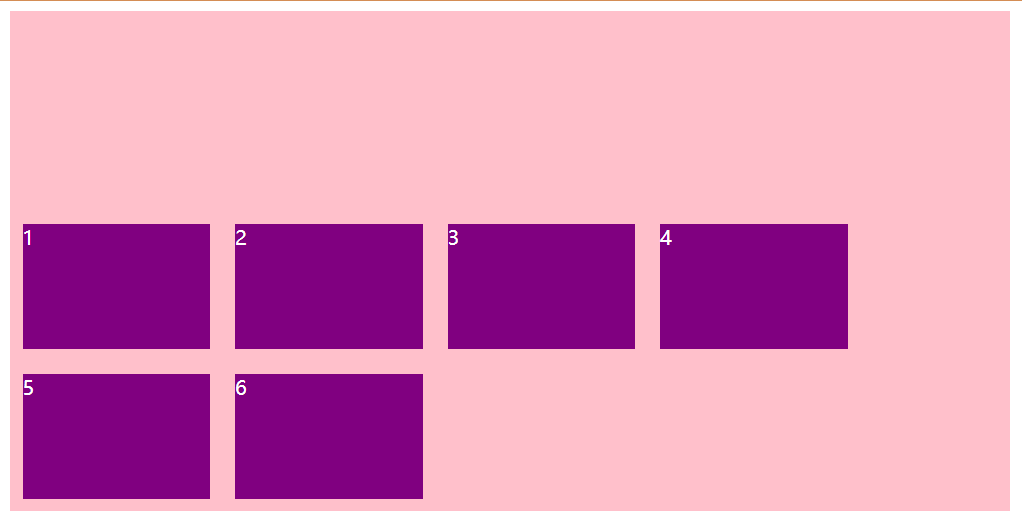
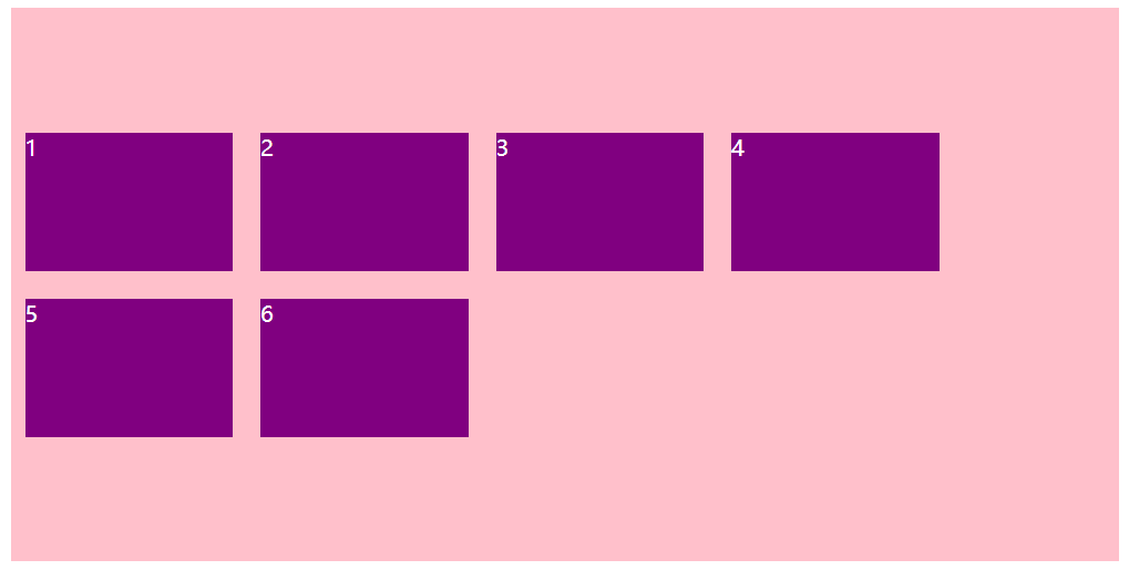
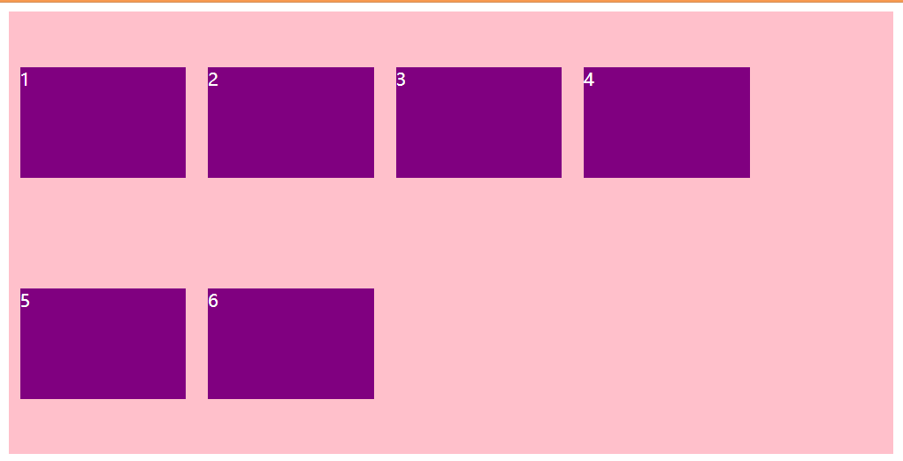
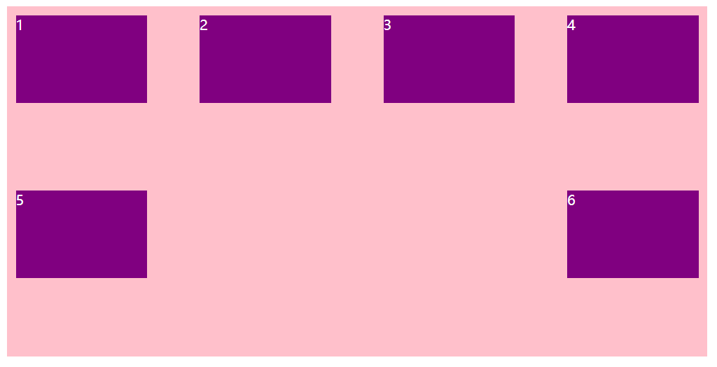
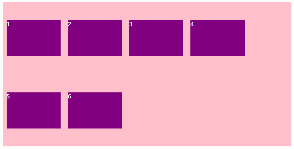
# flex-wrap 设置子元素是否换行
默认情况下,项目都排在一条线 (又称 "轴线") 上。flex-wrap 属性定义,flex 布局中默认是不换行的。
引入问题:
flex 属性默认子元素不换行,如果父盒子一行装不下就会缩小子盒子往里装
代码:
<style> | |
div { | |
display: flex; | |
width: 40%; | |
height: 300px; | |
background-color: pink; | |
/* flex 布局中,默认子元素是不换行的,如果装不开 | |
会缩小子元素的宽度,放到父元素里面 */ | |
} | |
div span { | |
width: 150px; | |
height: 100px; | |
background-color: red; | |
margin: 10px; | |
} | |
</style> | |
</head> | |
<body> | |
<div> | |
<span>1</span> | |
<span>2</span> | |
<span>3</span> | |
<span>4</span> | |
<span>5</span> | |
</div> | |
</body> |
效果:
| 属性值 | 说明 |
|---|---|
| nowrap | 默认值,不换行 |
| wrap | 换行 |
代码:
<style> | |
div { | |
display: flex; | |
width: 40%; | |
height: 300px; | |
background-color: pink; | |
/* flex 布局中,默认子元素是不换行的,如果装不开 | |
会缩小子元素的宽度,放到父元素里面 */ | |
/* 设置 flex 布局 换行显示 */ | |
flex-wrap: wrap; | |
} | |
div span { | |
width: 150px; | |
height: 100px; | |
background-color: red; | |
margin: 10px; | |
} | |
</style> | |
</head> | |
<body> | |
<div> | |
<span>1</span> | |
<span>2</span> | |
<span>3</span> | |
<span>4</span> | |
<span>5</span> | |
</div> | |
</body> |
效果:
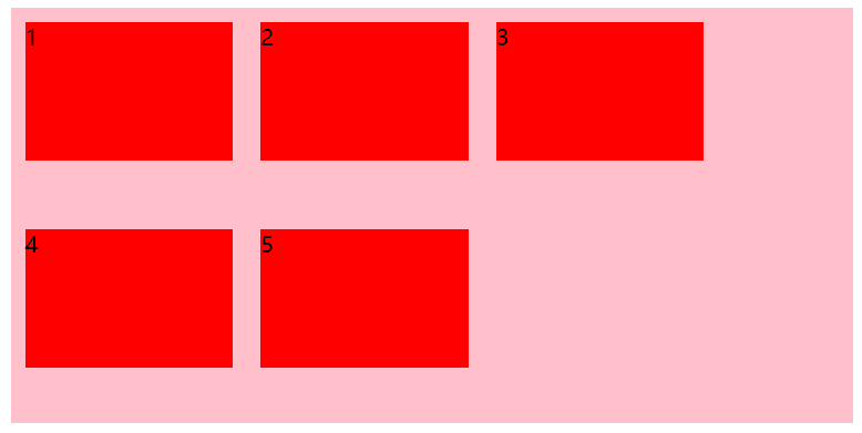
# align-items 设置侧轴上的子元素排列方式 (单行)
该属性是控制子项在侧轴 (默认是 y 轴) 上的排列方式 在子项为单项的时候使用。
| 属性值 | 说明 |
|---|---|
| flex-start | 从上到下 |
| flex-end | 从下到上 |
| center | 挤在一起居中 (垂直居中) |
| stretch | 拉伸 (默认值) 沿着父盒子高度拉伸 |
各个属性值的效果如下:
flex-start
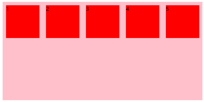
flex-end
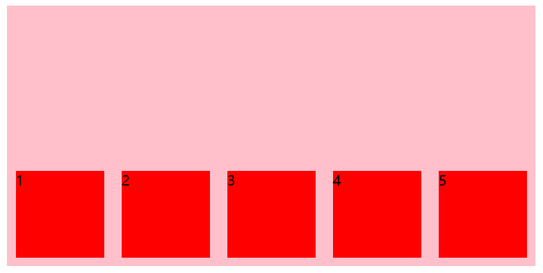
center
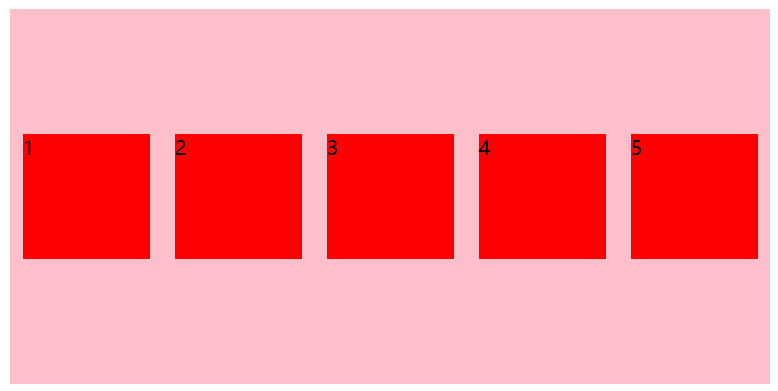
stretch - 不要给子盒子高度就会沿着父盒子高度拉伸
设置子盒子中的元素剧中垂直居中对齐
代码:
<style> | |
div { | |
display: flex; | |
width: 40%; | |
height: 300px; | |
background-color: pink; | |
/* flex 布局默认 row 主轴是 y 轴 */ | |
/* 主轴上的对齐方式 */ | |
justify-content: center; | |
/* align-items: center; */ | |
/* 侧轴上的对齐方式 */ | |
align-items: center; | |
} | |
div span { | |
width: 150px; | |
height: 100px; | |
background-color: red; | |
margin: 10px; | |
} | |
</style> | |
</head> | |
<body> | |
<div> | |
<span>1</span> | |
<span>2</span> | |
<span>3</span> | |
<span>4</span> | |
<span>5</span> | |
</div> | |
</body> |
效果:
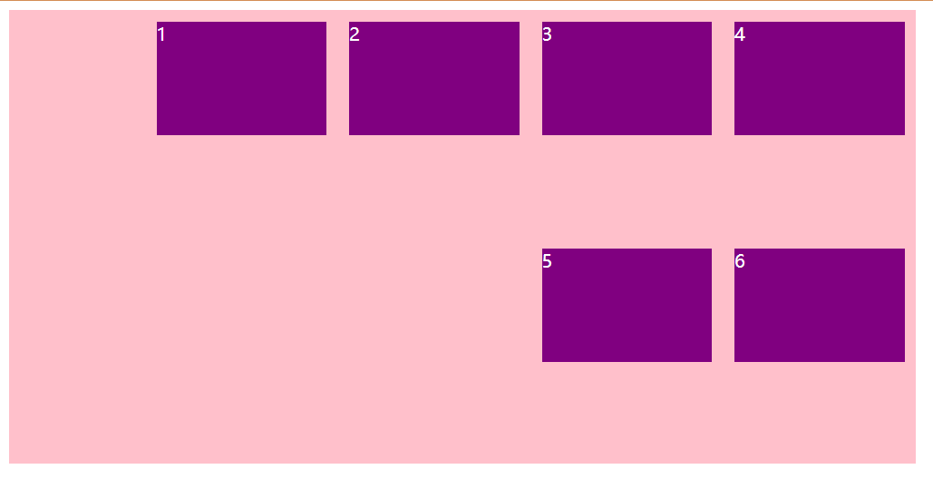
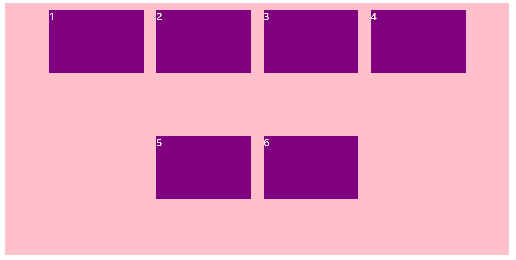
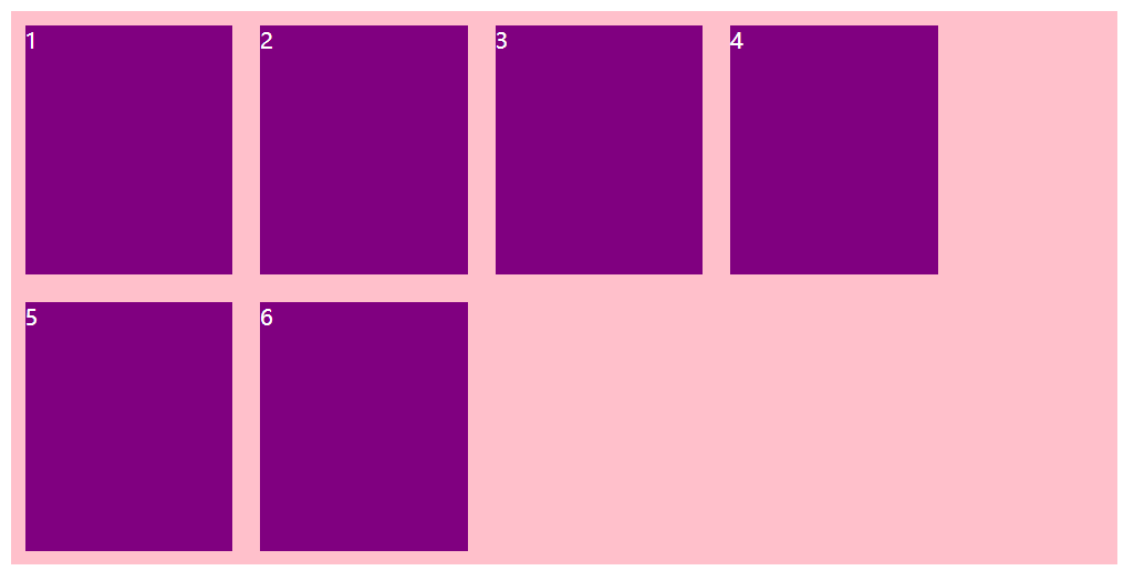
# align-content 设置侧轴上的子元素的排列方式 (多行)
设置子项在侧轴上的排列方式,并且只能用于子项出现换行的情况 (多行),在 < strong style="color:red"> 单行下是没有效果的 </strong>。
| 属性值 | 说明 |
|---|---|
| flex-start | 默认值在侧轴的头部开始排列 |
| flex-end | 在侧轴的尾部开始排列 |
| center | 在侧轴中间排列 |
| space-around | 子项在侧轴平分剩余空间 |
| space-between | 子项在侧轴先分布在两头,再平分剩余空间 |
| stretch | 设置子项元素高度平分父元素高度 |
对比 justify-content 与 align-content 中的各个属性效果:
flex-start
justify-content
align-content
flex-end
justify-content
align-content
center
justify-content
align-content
space-around
justify-content
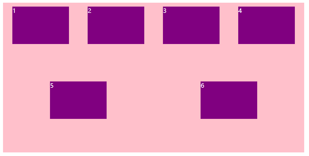
align-content
space-between
justify-content
align-content
stretch
align-items 将子盒子的高度去掉

align-content 将子盒子的高度去掉
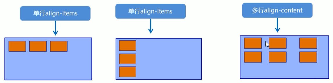
# align-content 和 align-items 的区别
- align-items 适用于 <strong style="color:red"> 单行 </strong > 情况下,只有上对齐,下对齐,居中和拉伸
- align-content 适用于 <strong style="color:red"> 换行 </strong>(多行) 的情况下 (单行情况下无效),可以设置上对齐,下对齐,居中,拉伸以及平均分配剩余空间 等属性值。
- 总结就是单行找 <font color="red">align-items</font> 多行找 <font color="red">align-content</font>.
# flex-flow
flex-flow 属性是 flex-direction 和 flex-wrap 属性的复合属性。
flex-flow: row/rowrever/column/columnrever wrap/nowrap; |
- flex-direction:设置主轴的方向
- justify-content:设置主轴上的子元素排列方式
- flex-wrap:设置子元素是否换行
- align-content:设置侧轴上的子元素的排列方式 (多行)
- align-items:设置侧轴上的子元素排列方式 (单行)
- flex-flow:复合属性,相当于同时设置了 flex-direction 和 flex-wrap
# flex 布局子项常见属性
学习目标
- flex 子项目占的份数
- align-self 控制子项自己再侧轴的排列方式
- order 属性定义子项的排列顺序 (前后顺序)
# flex 属性
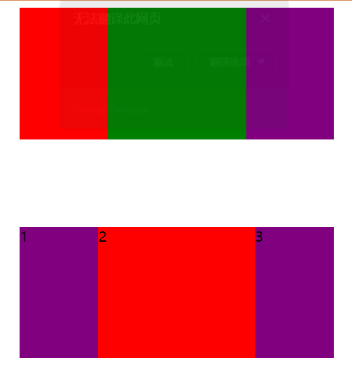
flex 属性定义子项目 <font color=red> 分配剩余空间 </font>,用 flex 来表示占多少 < font color=red > 份数 </font>.
相对于父盒子来说可以使用百分号来分配空间
.item { | |
flex: <number>; /*default 0*/ | |
} |
代码:
<style> | |
section { | |
display: flex; | |
width: 60%; | |
height: 150px; | |
background-color: pink; | |
margin: 0 auto; | |
} | |
section div:first-child { | |
width: 100px; | |
height: 150px; | |
background-color: red; | |
} | |
section div:nth-child(2) { | |
/* 占满剩余分配空间 */ | |
flex: 1; | |
background-color: green; | |
} | |
section div:last-child { | |
width: 100px; | |
height: 150px; | |
background-color: purple; | |
} | |
p { | |
display: flex; | |
width: 60%; | |
height: 150px; | |
background-color: pink; | |
margin: 100px auto; | |
} | |
p span { | |
/* 按父盒子的空间分两个占百分之 1 */ | |
flex: 1; | |
background-color: purple; | |
} | |
p span:nth-child(2) { | |
/* 按父盒子的空间分配出百分之 2 的空间 */ | |
flex: 2; | |
background-color: red; | |
} | |
</style> | |
</head> | |
<body> | |
<section> | |
<div></div> | |
<div></div> | |
<div></div> | |
</section> | |
<p> | |
<span>1</span><span>2</span><span>3</span> | |
</p> | |
</body> |
效果:
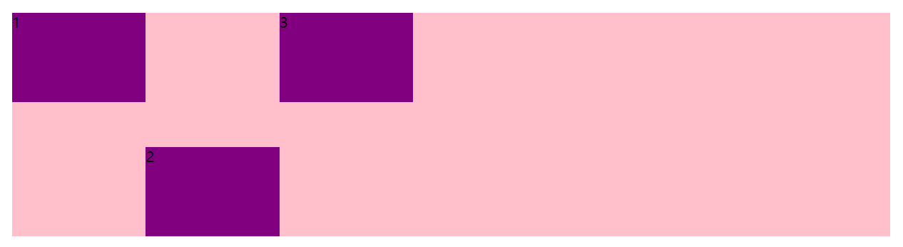
# align-self 控制子某一个子项在侧轴上的排列方式
align-self 属性允许单个项目有与其它项目不一样的对齐方式,可覆盖 align-items 属性。
默认值为 auto,表示继承父元素的 align-items 属性,如果没有父元素,则等同于 stretch。
span:nth-child(2) { | |
/* 设置自己在侧轴上的排列方式 */ | |
align-self: flex-end; | |
} |
代码:
<style> | |
p { | |
display: flex; | |
width: 80%; | |
height: 250px; | |
background-color: pink; | |
margin: 100px auto; | |
} | |
p span { | |
width: 150px; | |
height: 100px; | |
background-color: purple; | |
} | |
p span:nth-child(2) { | |
/* 控制某一个子元素在侧轴上的排列方式 */ | |
align-self: flex-end; | |
} | |
</style> | |
</head> | |
<body> | |
<p> | |
<span>1</span><span>2</span><span>3</span> | |
</p> | |
</body> |
效果:
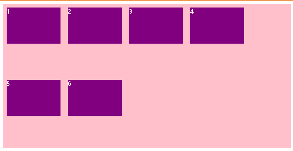
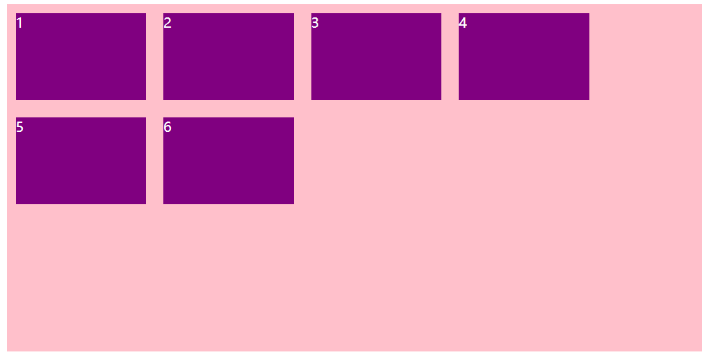
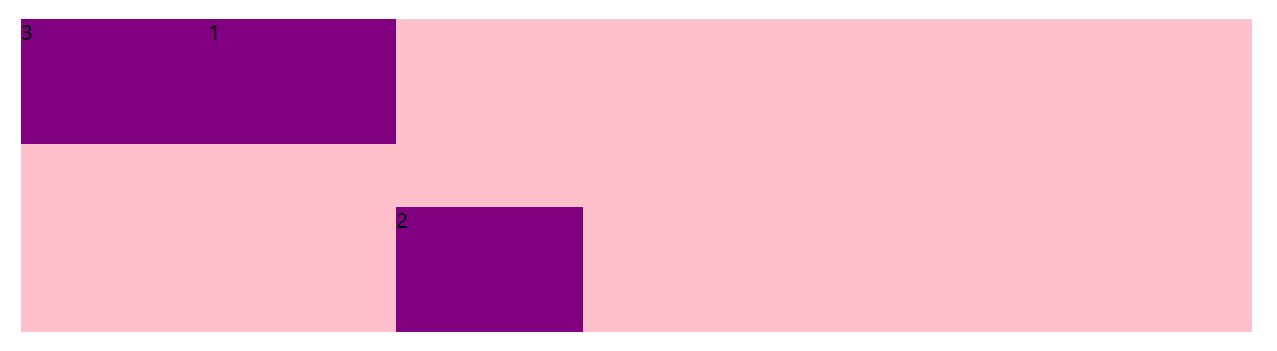
# order 属性定义项目的排列顺序
数值越小,排列越靠前,默认为 0
注意:和 z-index 不一样。
代码:
<style> | |
p { | |
display: flex; | |
width: 80%; | |
height: 250px; | |
background-color: pink; | |
margin: 100px auto; | |
} | |
p span { | |
width: 150px; | |
height: 100px; | |
background-color: purple; | |
} | |
p span:nth-child(3) { | |
/* 默认是 0 -1 比 0 小所以在前面 */ | |
order: -1; | |
} | |
p span:nth-child(2) { | |
/* 控制某一个子元素在侧轴上的排列方式 */ | |
align-self: flex-end; | |
} | |
</style> | |
</head> | |
<body> | |
<p> | |
<span>1</span><span>2</span><span>3</span> | |
</p> | |
</body> |
效果:
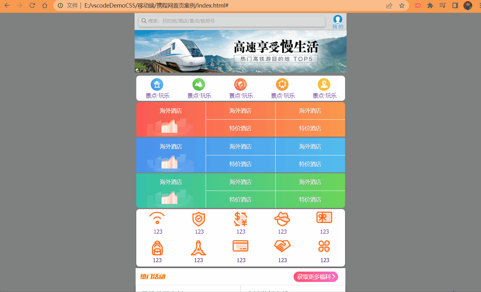
# 携程网首页案例制作
案例:携程网移动端首页
访问地址:https://m.ctrip.com/html5/
# 技术选型
方案:我们采取单独制作移动页面方案
技术:布局采取 flex 布局
# 搭建文件结构
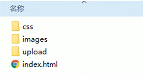
代码:
index.html
<!DOCTYPE html> | |
<html lang="en"> | |
<head> | |
<meta charset="UTF-8"> | |
<meta name="viewport" content="width=device-width, initial-scale=1.0, | |
maximum-scale=1.0,minimum-scale=1.0,user-scalable=no"> | |
<title>Document</title> | |
<link rel="stylesheet" href="./css/normalize.css"/> | |
<link rel="stylesheet" href="./css/index.css"/> | |
</head> | |
<body> | |
<!-- 头部搜索 --> | |
<div class="search-index"> | |
<a href="#" class="user">我 的</a> | |
</div> | |
<!-- 焦点图模块 --> | |
<div class="focus"> | |
<img src="./upload/focus.jpg" width="100%" alt=""/> | |
</div> | |
<!-- 布局导航栏 --> | |
<ul class="local-nav"> | |
<li> | |
<a href="#" title="景点·玩乐"></a> | |
</li> | |
<li> | |
<a href="#" title="景点·玩乐"></a> | |
</li> | |
<li> | |
<a href="#" title="景点·玩乐"></a> | |
</li> | |
<li> | |
<a href="#" title="景点·玩乐"></a> | |
</li> | |
<li> | |
<a href="#" title="景点·玩乐"></a> | |
</li> | |
</ul> | |
<!-- 主导航栏 --> | |
<nav> | |
<div class="nav-common"> | |
<div class="nav-items"> | |
<a href="#"> | |
海外酒店 | |
</a> | |
</div> | |
<div class="nav-items"> | |
<a href="#"> | |
海外酒店 | |
</a> | |
<a href="#"> | |
特价酒店 | |
</a> | |
</div> | |
<div class="nav-items"> | |
<a href="#"> | |
海外酒店 | |
</a> | |
<a href="#"> | |
特价酒店 | |
</a> | |
</div> | |
</div> | |
</nav> | |
<!-- 侧导航栏 --> | |
<ul class="subnav-entry"> | |
<li> | |
<a href="#"></a> | |
</li> | |
<li> | |
<a href="#"></a> | |
</li> | |
<li> | |
<a href="#"></a> | |
</li> | |
<li> | |
<a href="#"></a> | |
</li> | |
<li> | |
<a href="#"></a> | |
</li> | |
<li> | |
<a href="#"></a> | |
</li> | |
<li> | |
<a href="#"></a> | |
</li> | |
<li> | |
<a href="#"></a> | |
</li> | |
<li> | |
<a href="#"></a> | |
</li> | |
<li> | |
<a href="#"></a> | |
</li> | |
</ul> | |
<!-- 销售模块 --> | |
<div class="sales-box"> | |
<div class="sales-hd"> | |
<!-- <h2 > 热门活动 2</h2> --> | |
<a href="#" class="more">获取更多福利</a> | |
</div> | |
<div class="sales-db"> | |
<div class="row"> | |
<a href="#"> | |
<img src="./upload/pic1.jpg" alt=""/> | |
</a> | |
<a href="#"> | |
<img src="./upload/pic2.jpg" alt=""/> | |
</a> | |
</div> | |
<div class="row"> | |
<a href="#"> | |
<img src="./upload/pic3.jpg" alt=""> | |
</a> | |
<a href="#"> | |
<img src="./upload/pic4.jpg" alt=""> | |
</a> | |
</div> | |
<div class="row"> | |
<a href="#"> | |
<img src="./upload/pic5.jpg" alt=""/> | |
</a> | |
<a href="#"> | |
<img src="./upload/pic6.jpg" alt=""/> | |
</a> | |
</div> | |
</div> | |
</div> | |
<!-- 最低导航栏 --> | |
<div class="dwn"> | |
<div></div> | |
<div></div> | |
<div></div> | |
</div> | |
</body> | |
</html> |
index.css
@font-face { | |
font-family: 'icomoon'; | |
src: url('fonts/icomoon.eot?x8b7mx'); | |
src: url('fonts/icomoon.eot?x8b7mx#iefix') format('embedded-opentype'), | |
url('fonts/icomoon.ttf?x8b7mx') format('truetype'), | |
url('fonts/icomoon.woff?x8b7mx') format('woff'), | |
url('fonts/icomoon.svg?x8b7mx#icomoon') format('svg'); | |
font-weight: normal; | |
font-style: normal; | |
font-display: block; | |
} | |
body { | |
min-width: 320px; | |
max-width: 540px; | |
margin: 0 auto; | |
font: 14px/1.5 Tahoma,"Lucida Grande",Verdana,"Microsoft Yahei",STXihei, hei; | |
color: #000; | |
background-color: gray; | |
} | |
div { | |
box-sizing: border-box; | |
} | |
/* 头部搜索 */ | |
.search-index { | |
display: flex; | |
/* 固定定位跟父级没有关系,它以屏幕为准 */ | |
position: fixed; | |
top: 0; | |
left: 50%; | |
-webkit-transform: translateX(-50%); | |
transform: translateX(-50%); | |
width: 100%; | |
height: 44px; | |
min-width: 320px; | |
max-width: 540px; | |
overflow: hidden; | |
background-color:rgba(255, 255, 255, .7); | |
border-top: 1px solid darkgray; | |
border-bottom: 1px solid darkgray; | |
&::after { | |
content: ''; | |
position: absolute; | |
top: 13px; | |
left: 17px; | |
display: block; | |
width: 14px; | |
height: 13px; | |
background: url(../image/sprite.png) no-repeat -59px -280px; | |
background-size: 104px auto; | |
} | |
&::before { | |
content: '搜索:目的地/酒店/景点/航班号'; | |
font-size: 12px; | |
text-indent: 2em; | |
line-height: 1.9; | |
color: darkgray; | |
flex: 1; | |
height: 26px; | |
border-radius: 5px; | |
border: 1px #ccc solid; | |
margin: 7px 10px; | |
box-shadow: 0 2px 4px rgba(0,0,0,.2); | |
} | |
} | |
.user { | |
display: block; | |
width: 44px; | |
height: 44px; | |
text-align: center; | |
text-decoration: none; | |
font-size: 12px; | |
color: #2eaae0; | |
&::before { | |
content: ''; | |
display: block; | |
width: 23px; | |
height: 23px; | |
background: url(../image/sprite.png) no-repeat -59px -194px; | |
background-size: 104px auto; | |
margin: 4px auto -2px; | |
} | |
} | |
/* 焦点图模块 */ | |
.focus { | |
margin-top: 44px; | |
} | |
/* 布局导航栏 */ | |
ul { | |
list-style: none; | |
margin: 0; | |
padding: 0; | |
} | |
.local-nav { | |
display: flex; | |
height:64px; | |
background-color: #fff; | |
margin: 3px 4px; | |
border-radius: 8px; | |
} | |
.local-nav li { | |
flex: 1; | |
display: flex; | |
justify-content: center; | |
} | |
.local-nav li a { | |
position: relative; | |
text-decoration: none; | |
width: 32px; | |
height: 32px; | |
background: url(../image/localnav_bg.png) no-repeat 0 0; | |
background-size: 32px auto; | |
} | |
.local-nav li:first-child a { | |
margin-top: 6px; | |
background-position: 0 0; | |
&::after { | |
content: '景点·玩乐'; | |
position: absolute; | |
width: 80px; | |
top: 34px; | |
left: -13px; | |
} | |
} | |
.local-nav li:nth-child(2) a { | |
margin-top: 6px; | |
background-position: 0 -32px; | |
&::after { | |
content: '景点·玩乐'; | |
position: absolute; | |
width: 80px; | |
top: 34px; | |
left: -13px; | |
} | |
} | |
.local-nav li:nth-child(3) a { | |
margin-top: 6px; | |
background-position: 0 -64px; | |
&::after { | |
content: '景点·玩乐'; | |
position: absolute; | |
width: 80px; | |
top: 34px; | |
left: -13px; | |
} | |
} | |
.local-nav li:nth-child(4) a { | |
margin-top: 6px; | |
background-position: 0 -96px; | |
&::after { | |
content: '景点·玩乐'; | |
position: absolute; | |
width: 80px; | |
top: 34px; | |
left: -13px; | |
} | |
} | |
.local-nav li:last-child a { | |
margin-top: 6px; | |
background-position: 0 -128px; | |
&::after { | |
content: '景点·玩乐'; | |
position: absolute; | |
width: 80px; | |
top: 34px; | |
left: -13px; | |
} | |
} | |
/* 主导航栏 */ | |
.nav-common .nav-items a { | |
text-decoration: none; | |
} | |
nav { | |
border-radius: 8px; | |
margin: 0 4px 3px; | |
overflow: hidden; | |
} | |
.nav-common { | |
display: flex; | |
height: 88px; | |
/* background-color: pink; */ | |
} | |
.nav-common:first-child { | |
background: -webkit-linear-gradient(left,#FA5A55,#FA994D); | |
} | |
.nav-common:nth-child(2) { | |
background: -webkit-linear-gradient(left,#4B90ED,#53BCED); | |
} | |
.nav-common:last-child { | |
background: -webkit-linear-gradient(left,#34C2A9,#6CD559); | |
} | |
.nav-common:nth-child(2) { | |
margin: 3px 0; | |
} | |
.nav-items { | |
flex: 1; | |
display: flex; | |
flex-flow: column; | |
} | |
.nav-items a { | |
flex: 1; | |
text-align: center; | |
line-height: 44px; | |
color: #fff; | |
font-size: 14px; | |
text-shadow: 1px 1px rgba(0,0,0,.2); | |
} | |
.nav-items a:first-child { | |
border-bottom: 1px #fff solid; | |
} | |
.nav-items:first-child a { | |
border: 0; | |
background: url(../image/hotel.png) no-repeat bottom center; | |
background-size: 121px auto; | |
} | |
.nav-items:nth-child(-n+2) { | |
border-right: 1px #fff solid; | |
} | |
/* 侧导航栏 */ | |
.subnav-entry { | |
display: flex; | |
flex-wrap: wrap; | |
border-radius: 8px; | |
background-color: #fff; | |
margin: 0 4px; | |
box-shadow: 0 2px 4px rgba(0,0,0,.3); | |
} | |
.subnav-entry li { | |
/* 里面的子盒子可以写 % 相对于父盒子来说的 */ | |
flex: 20%; | |
height: 73px; | |
display: flex; | |
justify-content: center; | |
list-style: none; | |
margin: 0; | |
padding: 0; | |
} | |
.subnav-entry li a { | |
position: relative; | |
margin-top: 6px; | |
background: url(../image/subnav-bg.png) no-repeat 0 0; | |
background-size: 44px auto; | |
} | |
.subnav-entry li:first-child a { | |
width: 40px; | |
height: 33px; | |
background-position: 0 0; | |
&::after { | |
content: '123'; | |
position: absolute; | |
left: 11px; | |
top: 40px; | |
} | |
} | |
.subnav-entry li:nth-child(2) a { | |
width: 32px; | |
height: 39px; | |
background-position: -1px -46px; | |
&::after { | |
content: '123'; | |
position: absolute; | |
left: 6px; | |
top: 40px; | |
} | |
} | |
.subnav-entry li:nth-child(3) a { | |
width: 33px; | |
height: 38px; | |
background-position: -1px -100px; | |
&::after { | |
content: '123'; | |
position: absolute; | |
left: 6px; | |
top: 40px; | |
} | |
} | |
.subnav-entry li:nth-child(4) a { | |
width: 41px; | |
height: 38px; | |
background-position: 0 -156px; | |
&::after { | |
content: '123'; | |
position: absolute; | |
left: 9px; | |
top: 40px; | |
} | |
} | |
.subnav-entry li:nth-child(5) a { | |
width: 41px; | |
height: 30px; | |
background-position: 1px -211px; | |
&::after { | |
content: '123'; | |
position: absolute; | |
left: 10px; | |
top: 40px; | |
} | |
} | |
.subnav-entry li:nth-child(6) a { | |
width: 30px; | |
height: 39px; | |
background-position: 2px -256px; | |
&::after { | |
content: '123'; | |
position: absolute; | |
left: 4px; | |
top: 40px; | |
} | |
} | |
.subnav-entry li:nth-child(7) a { | |
width: 40px; | |
height: 39px; | |
background-position: -1px -311px; | |
&::after { | |
content: '123'; | |
position: absolute; | |
left: 8px; | |
top: 40px; | |
} | |
} | |
.subnav-entry li:nth-child(8) a { | |
width: 40px; | |
height: 29px; | |
background-position: 0 -367px; | |
&::after { | |
content: '123'; | |
position: absolute; | |
left: 10px; | |
top: 40px; | |
} | |
} | |
.subnav-entry li:nth-child(9) a { | |
width: 44px; | |
height: 31px; | |
background-position: 0 -413px; | |
&::after { | |
content: '123'; | |
position: absolute; | |
left: 11px; | |
top: 40px; | |
} | |
} | |
.subnav-entry li:last-child a { | |
width: 31px; | |
height: 31px; | |
background-position: 1px -458px; | |
&::after { | |
content: '123'; | |
position: absolute; | |
left: 6px; | |
top: 40px; | |
} | |
} | |
/* 销售模块 */ | |
.sales-box { | |
border-top: 1px #fff solid; | |
background-color: #fff; | |
margin: 4px 3px; | |
} | |
.sales-hd { | |
position: relative; | |
height: 44px; | |
border-bottom: 1px #fff solid; | |
&::before { | |
content: ''; | |
position: absolute; | |
top: 14px; | |
left: 10px; | |
width: 72px; | |
height: 17px; | |
background: url(../image/hot.png) no-repeat 0 -18px; | |
background-size: 72px; | |
} | |
} | |
.more { | |
position: absolute; | |
top: 8px; | |
right: 18px; | |
text-decoration: none; | |
background: -webkit-linear-gradient(left,#FF506C,#FF6BC6); | |
border-radius: 15px; | |
padding: 3px 20px 3px 10px; | |
color: #fff; | |
&::after { | |
content: ''; | |
position: absolute; | |
top: 8px; | |
right: 9px; | |
width: 7px; | |
height: 7px; | |
border-top: 3px #fff solid; | |
border-right: 3px #ccc solid; | |
transform: rotate(45deg); | |
} | |
} | |
.row { | |
display: flex; | |
border-bottom: 1px #ccc solid; | |
box-shadow: 0 2px 4px 2px rgba(0,0,0,.2); | |
} | |
.row a { | |
flex: 1; | |
} | |
.row a:first-child { | |
border-right: 1px #ccc solid; | |
} | |
.row a img { | |
width: 100%; | |
} | |
/* 最低导航栏 */ | |
.dwn { | |
display: flex; | |
justify-content: center; | |
background: -webkit-linear-gradient(top left,blue,red); | |
margin-bottom: 30px; | |
text-align: center; | |
height: 48px; | |
border-bottom: 1px #ccc solid; | |
box-shadow: 0 3px 5px 3px rgba(0,0,0,.5); | |
border-radius: 15px; | |
text-shadow: -2px 0px rgba(255, 255, 255, .4); | |
} | |
.dwn div { | |
position: relative; | |
flex: 1; | |
margin-top: 3px; | |
} | |
.dwn div:first-child { | |
&::before { | |
content: ''; | |
font-family: 'icomoon'; | |
} | |
&::after { | |
content: '点击预订'; | |
position: absolute; | |
top: 40%; | |
left: 50%; | |
transform: translateX(-50%); | |
} | |
} | |
.dwn div:nth-child(2) { | |
&::before { | |
content: ''; | |
font-family: 'icomoon'; | |
} | |
&::after { | |
content: '浏览世界'; | |
position: absolute; | |
top: 40%; | |
left: 50%; | |
transform: translateX(-50%); | |
} | |
} | |
.dwn div:last-child { | |
&::before { | |
content: ''; | |
font-family: 'icomoon'; | |
} | |
&::after { | |
content: '发布油管'; | |
position: absolute; | |
top: 40%; | |
left: 50%; | |
transform: translateX(-50%); | |
} | |
} |
normal.css
/*! normalize.css v8.0.1 | MIT License | github.com/necolas/normalize.css */ | |
/* Document | |
========================================================================== */ | |
/** | |
* 1. Correct the line height in all browsers. | |
* 2. Prevent adjustments of font size after orientation changes in iOS. | |
*/ | |
html { | |
line-height: 1.15; /* 1 */ | |
-webkit-text-size-adjust: 100%; /* 2 */ | |
} | |
* { | |
margin: 0; | |
-webkit-tap-higlight-color: transparent; | |
} | |
/* Sections | |
========================================================================== */ | |
/** | |
* Remove the margin in all browsers. | |
*/ | |
body { | |
margin: 0; | |
} | |
/** | |
* Render the `main` element consistently in IE. | |
*/ | |
main { | |
display: block; | |
} | |
/** | |
* Correct the font size and margin on `h1` elements within `section` and | |
* `article` contexts in Chrome, Firefox, and Safari. | |
*/ | |
h1 { | |
font-size: 2em; | |
margin: 0.67em 0; | |
} | |
/* Grouping content | |
========================================================================== */ | |
/** | |
* 1. Add the correct box sizing in Firefox. | |
* 2. Show the overflow in Edge and IE. | |
*/ | |
hr { | |
box-sizing: content-box; /* 1 */ | |
height: 0; /* 1 */ | |
overflow: visible; /* 2 */ | |
} | |
/** | |
* 1. Correct the inheritance and scaling of font size in all browsers. | |
* 2. Correct the odd `em` font sizing in all browsers. | |
*/ | |
pre { | |
font-family: monospace, monospace; /* 1 */ | |
font-size: 1em; /* 2 */ | |
} | |
/* Text-level semantics | |
========================================================================== */ | |
/** | |
* Remove the gray background on active links in IE 10. | |
*/ | |
a { | |
background-color: transparent; | |
} | |
/** | |
* 1. Remove the bottom border in Chrome 57- | |
* 2. Add the correct text decoration in Chrome, Edge, IE, Opera, and Safari. | |
*/ | |
abbr[title] { | |
border-bottom: none; /* 1 */ | |
text-decoration: underline; /* 2 */ | |
text-decoration: underline dotted; /* 2 */ | |
} | |
/** | |
* Add the correct font weight in Chrome, Edge, and Safari. | |
*/ | |
b, | |
strong { | |
font-weight: bolder; | |
} | |
/** | |
* 1. Correct the inheritance and scaling of font size in all browsers. | |
* 2. Correct the odd `em` font sizing in all browsers. | |
*/ | |
code, | |
kbd, | |
samp { | |
font-family: monospace, monospace; /* 1 */ | |
font-size: 1em; /* 2 */ | |
} | |
/** | |
* Add the correct font size in all browsers. | |
*/ | |
small { | |
font-size: 80%; | |
} | |
/** | |
* Prevent `sub` and `sup` elements from affecting the line height in | |
* all browsers. | |
*/ | |
sub, | |
sup { | |
font-size: 75%; | |
line-height: 0; | |
position: relative; | |
vertical-align: baseline; | |
} | |
sub { | |
bottom: -0.25em; | |
} | |
sup { | |
top: -0.5em; | |
} | |
/* Embedded content | |
========================================================================== */ | |
/** | |
* Remove the border on images inside links in IE 10. | |
*/ | |
img { | |
border-style: none; | |
} | |
/* Forms | |
========================================================================== */ | |
/** | |
* 1. Change the font styles in all browsers. | |
* 2. Remove the margin in Firefox and Safari. | |
*/ | |
button, | |
input, | |
optgroup, | |
select, | |
textarea { | |
font-family: inherit; /* 1 */ | |
font-size: 100%; /* 1 */ | |
line-height: 1.15; /* 1 */ | |
margin: 0; /* 2 */ | |
} | |
/** | |
* Show the overflow in IE. | |
* 1. Show the overflow in Edge. | |
*/ | |
button, | |
input { /* 1 */ | |
overflow: visible; | |
} | |
/** | |
* Remove the inheritance of text transform in Edge, Firefox, and IE. | |
* 1. Remove the inheritance of text transform in Firefox. | |
*/ | |
button, | |
select { /* 1 */ | |
text-transform: none; | |
} | |
/** | |
* Correct the inability to style clickable types in iOS and Safari. | |
*/ | |
button, | |
[type="button"], | |
[type="reset"], | |
[type="submit"] { | |
-webkit-appearance: button; | |
} | |
/** | |
* Remove the inner border and padding in Firefox. | |
*/ | |
button::-moz-focus-inner, | |
[type="button"]::-moz-focus-inner, | |
[type="reset"]::-moz-focus-inner, | |
[type="submit"]::-moz-focus-inner { | |
border-style: none; | |
padding: 0; | |
} | |
/** | |
* Restore the focus styles unset by the previous rule. | |
*/ | |
button:-moz-focusring, | |
[type="button"]:-moz-focusring, | |
[type="reset"]:-moz-focusring, | |
[type="submit"]:-moz-focusring { | |
outline: 1px dotted ButtonText; | |
} | |
/** | |
* Correct the padding in Firefox. | |
*/ | |
fieldset { | |
padding: 0.35em 0.75em 0.625em; | |
} | |
/** | |
* 1. Correct the text wrapping in Edge and IE. | |
* 2. Correct the color inheritance from `fieldset` elements in IE. | |
* 3. Remove the padding so developers are not caught out when they zero out | |
* `fieldset` elements in all browsers. | |
*/ | |
legend { | |
box-sizing: border-box; /* 1 */ | |
color: inherit; /* 2 */ | |
display: table; /* 1 */ | |
max-width: 100%; /* 1 */ | |
padding: 0; /* 3 */ | |
white-space: normal; /* 1 */ | |
} | |
/** | |
* Add the correct vertical alignment in Chrome, Firefox, and Opera. | |
*/ | |
progress { | |
vertical-align: baseline; | |
} | |
/** | |
* Remove the default vertical scrollbar in IE 10+. | |
*/ | |
textarea { | |
overflow: auto; | |
} | |
/** | |
* 1. Add the correct box sizing in IE 10. | |
* 2. Remove the padding in IE 10. | |
*/ | |
[type="checkbox"], | |
[type="radio"] { | |
box-sizing: border-box; /* 1 */ | |
padding: 0; /* 2 */ | |
} | |
/** | |
* Correct the cursor style of increment and decrement buttons in Chrome. | |
*/ | |
[type="number"]::-webkit-inner-spin-button, | |
[type="number"]::-webkit-outer-spin-button { | |
height: auto; | |
} | |
/** | |
* 1. Correct the odd appearance in Chrome and Safari. | |
* 2. Correct the outline style in Safari. | |
*/ | |
[type="search"] { | |
-webkit-appearance: textfield; /* 1 */ | |
outline-offset: -2px; /* 2 */ | |
} | |
/** | |
* Remove the inner padding in Chrome and Safari on macOS. | |
*/ | |
[type="search"]::-webkit-search-decoration { | |
-webkit-appearance: none; | |
} | |
/** | |
* 1. Correct the inability to style clickable types in iOS and Safari. | |
* 2. Change font properties to `inherit` in Safari. | |
*/ | |
::-webkit-file-upload-button { | |
-webkit-appearance: button; /* 1 */ | |
font: inherit; /* 2 */ | |
} | |
/* Interactive | |
========================================================================== */ | |
/* | |
* Add the correct display in Edge, IE 10+, and Firefox. | |
*/ | |
details { | |
display: block; | |
} | |
/* | |
* Add the correct display in all browsers. | |
*/ | |
summary { | |
display: list-item; | |
} | |
/* Misc | |
========================================================================== */ | |
/** | |
* Add the correct display in IE 10+. | |
*/ | |
template { | |
display: none; | |
} | |
/** | |
* Add the correct display in IE 10. | |
*/ | |
[hidden] { | |
display: none; | |
} |
效果: