# 移动端基础
# 移动端调式方法
- Chrome DevTools (谷歌浏览器) 的模拟手机调试
- 搭建本地 web 服务器,手机和服务器一个局域网内,通过手机访问服务器
- 使用外网服务器,直接 IP 或域名访问
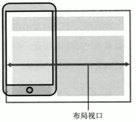
# 视口
<font color="red"> 视口 (viewport)</font > 就是浏览器显示页面内容的屏幕区域。视口可以分为布局视口,视觉视口和理想视口
# 布局视口 <font color="red">layout viewport</font>.
一般移动设备的浏览器都默认设置了一个布局视口,用于解决早期的 PC 端页面在手机上显示的问题。
IOS,Android 基本都将这个视口分辨率设置为 980px,所以 PC 上的网页大多都能在手机上呈现,只不过元素看上去很小,一般默认可以通过手动缩放网页。
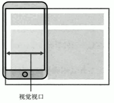
# 视觉视口 <font color="red">visual viewport</font>.
- 字面意思,它是用户正在看到的网站的区域。<font color="red"> 注意:是网站的区域 </font>。
- 我们可以通过缩放去操作视觉视口,但不会影响布局视口,布局视口仍保持原来的宽度。
# 理想视口 <font color=red>ideal viewport</font>.
- 为了是网站在移动端有最理想的浏览和阅读宽度而设定。
- 理想视口,对设备来讲,是最理想的视口尺寸。
- 需要手动填写 meta 视口标签通知浏览器操作。
- meta 视口标签的主要目的:布局视口的宽度应该与理想视口的宽度一致,简单理解就是设备有多宽,我们布局的视口就多宽。
# 总结:
- 视口就是浏览器显示页面内容的屏幕区域。
- 视口分为布局视口,视觉视口和理想视口。
- 我们移动端布局想要的是理想视口就是手机屏幕有多宽,我们的布局视口就有多宽。
- 想要理想视口,我们需要给我们的移动端页面添加 meta 视口标签。
# meta 视口标签
<meta name="viewport" content="width=device-width,user-scalable=no,initial-scale=1.0,maximum-scale=1.0,minimum-scale=1.0"> |
| 属性 | 解释说明 |
|---|---|
| width | 宽度设置的是 viewport 宽度,可以设置 device-width 特殊值 |
| initial-scale | 初始缩放比,大于 0 的数字 |
| maximum-scale | 最大缩放比,大于 0 的数字 |
| minimum-scale | 最小缩放比,大于 0 的数字 |
| user-scalable | 用户是否缩放,yes 或 no (1 或 0) |
# 标准的 viewport 设置
- 视口宽度和设备保持一致
- 视口的默认缩放比例 1.0
- 不允许用户自行缩放
- 最大允许的缩放比例 1.0
- 最小允许的缩放比例 1.0
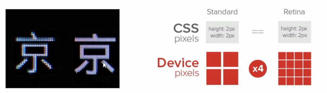
# 物理像素 & 物理像素比
- 物理像素点指的是屏幕显示的最小颗粒,是物理真实存在的。这是厂商在出厂时就设置好了,比如苹果 6/7/8 是 750*1334
- 我们开发的时候 1px 不是一定等于 1 个物理像素的
- PC 端页面,1 个 px 等于 1 个物理像素的,但是移动端就不尽相同
- 一个 px 的能显示的物理像素点的个数,称为物理像素比或屏幕像素比
代码:
<style> | |
* { | |
margin: 0; | |
padding: 0; | |
} | |
div { | |
width: 300px; | |
height: 300px; | |
background-color: pink; | |
} | |
/*1. 物理像素 就是我们说的分辨率,iphone8 的物理像素是 750 | |
2. 在 iphone8 里面 1px 开发像素 = 2 个物理像素 */ | |
</style> | |
</head> | |
<body> | |
<div></div> | |
</body> |
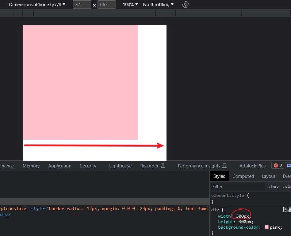
结果:
移动端 iphone8 的分辨率是 750 宽度而代码中设置了 300px 的像素且占了手机屏幕的一半多。因此在 iphone8 中 1px 等于 2 个物理像素。
下面图中的 375 x 667 是在 PC 端开发时显示的 px 单位而不是物理像素 750 像素,手机的出厂分辨率要去详细查看下。
PC 端和早前的手机屏幕 / 普通手机屏幕:1CSS 像素 = 1 物理像素的
Retina (视网膜屏幕) 是一种显示技术,可以将把更多的物理像素点压缩至一块屏幕里,从而达到更高的分辨率,并提高屏幕显示的细腻程度。
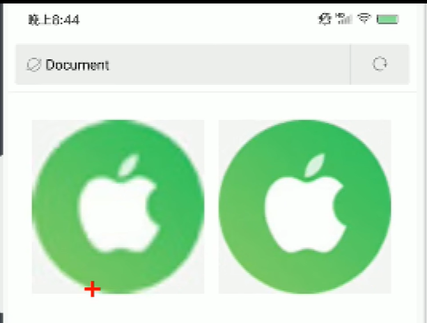
# 多倍图
- 对于一张 50px * 50px 的图片,在手机 Retina 屏中打开,按照刚才的物理像素比会放大倍数,这样会造成图片模糊
- 在标准的 viewport 设置中,使用倍图来提高图片质量,解决在高清设备中的模糊问题
- 通常使用二倍图,因为 iphone6/7/8 的影响,但是现在还存在 3 倍图 4 倍图的情况,这个看实际开发公司需求
- 背景图片 注意缩放问题
代码:
<style> | |
/* 我们需要一个 50*50 像素 (css 像素) 的图片,直接放到我们的 iphone8 里面会放大 2 倍 | |
100*100 就会模糊 | |
我们采取的是放一个 100*100 图片,然后手动的把这个图片 缩小为 50*50 (css 像素) | |
我们准备的图片,比我们实际需要的大小 大 2 倍,这种方式就是 2 倍图 */ | |
img:nth-child(2) { | |
width: 50px; | |
height: 50px; | |
} | |
</style> | |
</head> | |
<body> | |
<!-- 模糊的 --> | |
<img src="./image/apple50(1).jpg" alt=""/> | |
<!-- 采取 2 倍图 --> | |
<img src="./image/apple100.jpg" alt=""/> | |
</body> |
如下效果:防止第一个模糊的情况我们可以提前准备一个 100 像素的图片然后缩放到合适的大小。
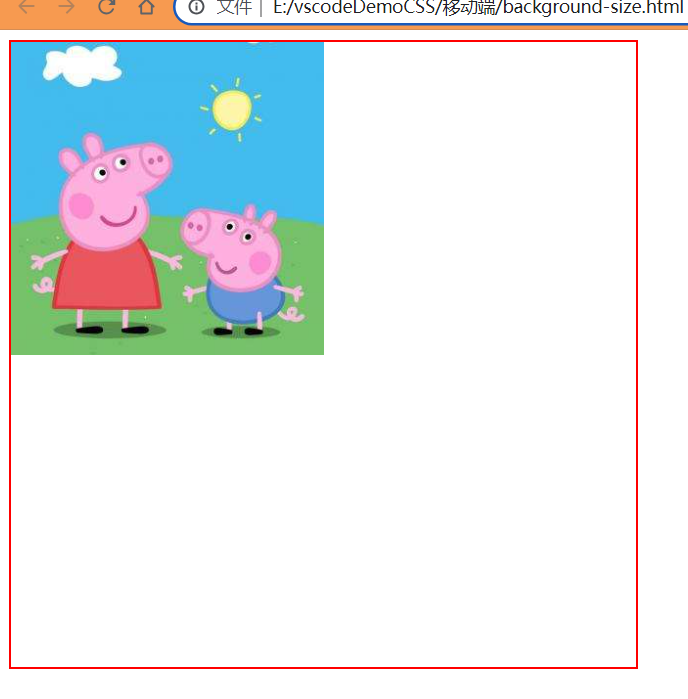
# 背景缩放 background-size
background-size 属性规定背景图像的尺寸
background-size: 背景图片宽度 背景图片高度; |
单位:长度 | 百分比 | cover | contain;
cover 把背景图片扩展至足够大,以使背景图片完全覆盖背景区域
![image-20230722174323976]()
宽度够了还不行必须使宽度和高度都够了但是就会余出一部分看不到了
contain 把图像图像扩展至最大尺寸,以使其宽度和高度完全适应内容区域
![image-20230722174409193]()
![image-20230722174506250]()
宽度或者高度其中一个够了就停止缩放
代码:
<style> | |
div { | |
width: 500px; | |
height: 500px; | |
border: 2px red solid; | |
background: url(./image/pig.jpg) no-repeat; | |
/* background-size: 图片宽度 图片高度 */ | |
/* background-size: 500px 200px; */ | |
/* 只写一个参数 肯定是 宽度 高度省略了 会等比例缩放 */ | |
/* background-size: 500px; */ | |
/* 里面的单位可以跟 % 相对于父盒子来说的 */ | |
background-size: 50%; | |
} | |
</style> | |
</head> | |
<body> | |
<div></div> | |
</body> |
效果:
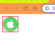
# background-size 二倍图缩放
代码:
<style> | |
div { | |
/* 1. 我们有一个 50*50 的盒子需要一个背景图片,但是根据分析这个图片还是要 | |
准备 2 倍,100*100 的 | |
2. 我们需要把这个图片缩放一半,也就是 50*50 background-size */ | |
width: 50px; | |
height: 50px; | |
border: 2px red solid; | |
background: url(./image/apple100.jpg) no-repeat; | |
background-size: 100%; | |
} | |
</style> | |
</head> | |
<body> | |
<div></div> | |
</body> |
效果:
# 多倍图切图 cutterman 切图神器
- @3x -> 3 倍图
- @2x -> 2 倍图
- @1x -> 1 倍图
# 移动端开发选择
# 移动端主流方案
# 单独制作 <font color="red"> 移动端 </font > 页面 (主流)
京东商城手机版
淘宝触屏版
苏宁易购手机版
...
通常情况下,网址域名前面加 <font color="red">m (moblie)</font > 可以打开移动端。通过判断设备,如果是移动设备打开,则跳转到 < font color="red"> 移动端页面 </font>。

# <font color="red"> 响应式 </font > 页面兼容移动端 (其次)
三星手机官网
...
三星电子官网:www.samsung.com/cn/,通过判断屏幕宽度来改变样式,以适应不同终端。
缺点:<font color="red"> 制作麻烦 </font>,需要花很大精力去调 < font color="red"> 兼容性 </font > 问题。
# 总结:
现在市场常见的移动端开发有 <font color="red"> 单独制作移动端页面 </font > 和 < font color="red"> 响应式页面 </font > 两种方案
现在市场主流的选择还是 <font color="red"> 单独制作移动端页面 </font>。
# 移动端技术选型
# 单独制作移动端页面 (主流)
- 流式布局 (百分比布局)
- flex 弹性布局 (强烈推荐)
- less + rem + 媒体查询布局
- 混合布局
# 响应式页面兼容移动端 (其次)
- 媒体查询
- bootstarp
# 移动端技术解决方案
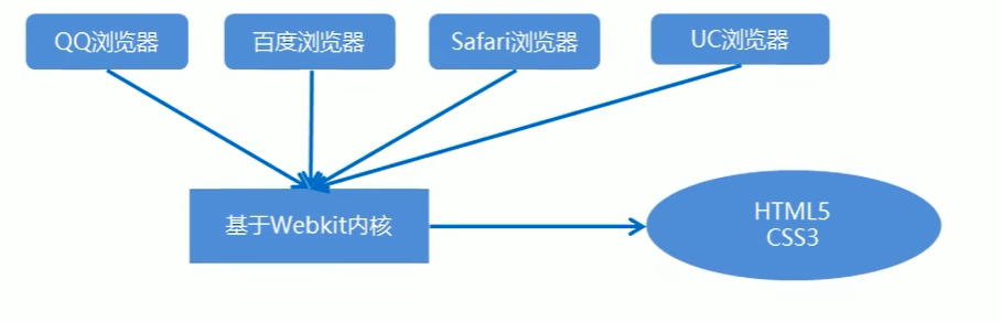
# 移动端浏览器
移动端浏览器基本以 webkit 内核为主,因此我们就考虑 webkit 兼容性问题。
我们可以放心使用 H5 标签和 CSS3 样式。
同时我们浏览器的私有前缀我们只需要考虑添加 webkit 即可。
# CSS 初始化 <font color="red">normalize.css</font>.
移动端 CSS 初始化推荐使用 normalize.css/
- Normalize.css:保护了有价值的默认值
- Normalize.css:修复了浏览器的 bug
- Normalize.css:是模块化的
- Normalize.css:拥有详细的文档
官网地址:http://necolas.github.io/normalize.css/
# CSS3 盒子模型 <font color="red">box-sizing</font>.
- 传统模式宽度计算:盒子的宽度 = CSS 中设置的 width + border + padding
- CSS3 盒子模型:盒子的宽度 = CSS 中设置的宽度 width 里面包含了 border 和 padding
也就是说,我们的 CSS3 中的盒子模型,padding 和 border 不会撑大盒子了。
/*CSS3 盒子模型 */ | |
box-sizing: border-box; | |
/* 传统盒子模型 */ | |
box-sizing: content-box; |
代码:
<style> | |
div:nth-child(1) { | |
width: 200px; | |
height: 200px; | |
background-color:pink; | |
padding: 10px; | |
border: 10px red solid; | |
/* 传统盒子模型 */ | |
box-sizing: content-box; | |
} | |
div:nth-child(2) { | |
/* 自动内减 也可以说 CSS3 盒子模型 */ | |
box-sizing:border-box; | |
width: 200px; | |
height: 200px; | |
background-color: purple; | |
padding: 10px; | |
border: 10px red solid; | |
} | |
</style> | |
</head> | |
<body> | |
<div></div> | |
<div></div> | |
</body> |
效果:
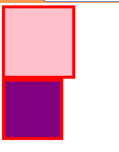
<strong style="color:red"> 传统 or CSS3 盒子模型 </strong>.
- 移动端可以全部 CSS3 盒子模型
- PC 端如果完全需要兼容,我们就用传统模式,如果不考虑兼容性,我们就选择 CSS3 盒子模型
# 特殊样式
/*CSS3 盒子模型 */ | |
box-sizing: border-box; | |
-webkit-box-sizing: border-box; | |
/* 点击高亮我们需要清除,设置为 transparent 完成透明 */ | |
-webkit-tap-highlight-color: transparent; | |
/* 在移动端浏览器默认的外观在 ios 上加上这个属性才能给按钮和输入框自定义样式 */ | |
-webkit-appearnce: none; | |
/* 禁用长按页面时的弹出菜单 */ | |
img,a{-webkit-touch-callout: none;} |
代码:
<style> | |
a { | |
-webkit-tap-highlight-color: transparent; | |
-webkit-touch-callout: none; | |
} | |
input[type='button'] { | |
-webkit-appearance: none; | |
} | |
</style> | |
</head> | |
<body> | |
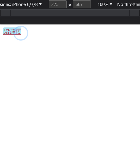
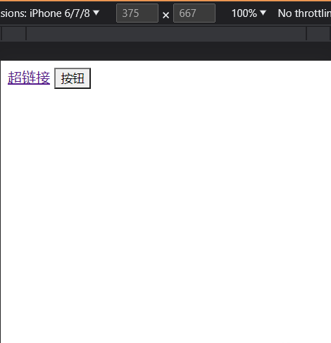
<a href="#">超链接</a> | |
<input type="button" id="" name="" value="按钮"/> | |
</body> |
效果:
# 移动端常见布局
# 流式布局 (百分比布局)
- 流式布局,就是百分比布局,也称非固定像素布局。
- 通过盒子的宽度设置成百分比来根据屏幕的宽度来进行伸缩,不受固定像素的限制,内容向两侧填充。
- 流式布局方式是移动 web 开发使用的比较常见的布局方式。
- max-width 最大宽度 (max-height 最大高度)
- min-width 最小宽度 (min-height 最小高度)
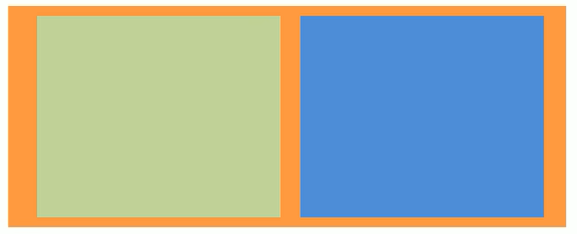
代码:
<style> | |
* { | |
margin: 0; | |
} | |
section { | |
width: 100%; | |
max-width: 980px; | |
min-width: 320px; | |
margin: 0 auto; | |
} | |
section div { | |
float: left; | |
width: 50%; | |
height: 400px; | |
} | |
section div:first-child { | |
background-color: pink; | |
} | |
section div:last-child { | |
background-color: purple; | |
} | |
</style> | |
</head> | |
<body> | |
<section> | |
<div></div> | |
<div></div> | |
</section> | |
</body> |
效果:
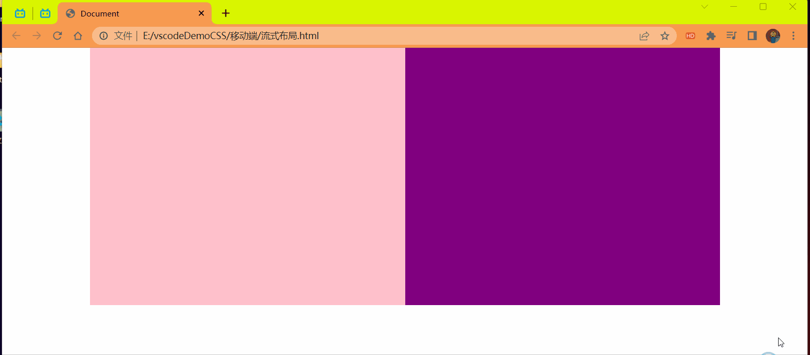
总结:
使用流式布局 (百分比) 可以根据屏幕缩放比例进行内容的伸缩,但是伸缩太小就会看不到一些内容了于是可以使用最小值 (min-width) 和最大值 (max-width) 来防止此情况的发生限制大小。
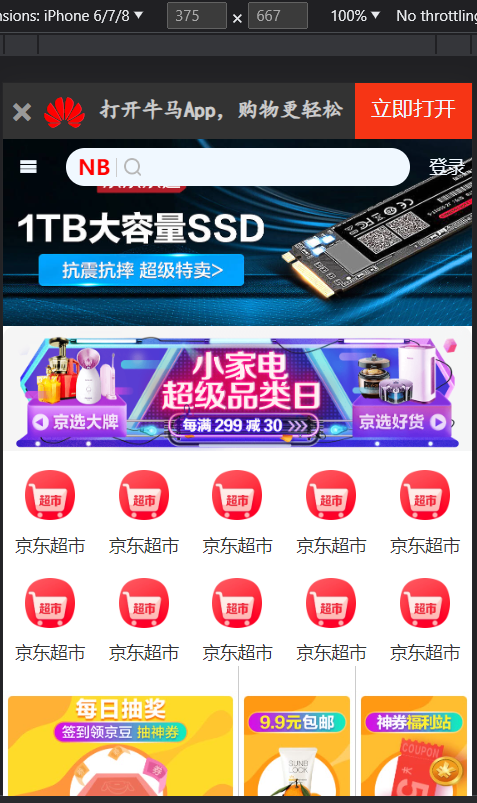
# 案例:京东移动端首页
# 技术选型
方案:我们采取单独制作移动页面方案
技术:布局采取流式布局
# 二倍精灵图做法
- 在 firework 里面把精灵图等比例缩放为原来的一半
- 之后根据大小 测量坐标
- 注意代码里面 background-size 也要写:精灵图原来宽度的一半
操作步骤:
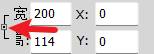
1 等比例缩放精灵图
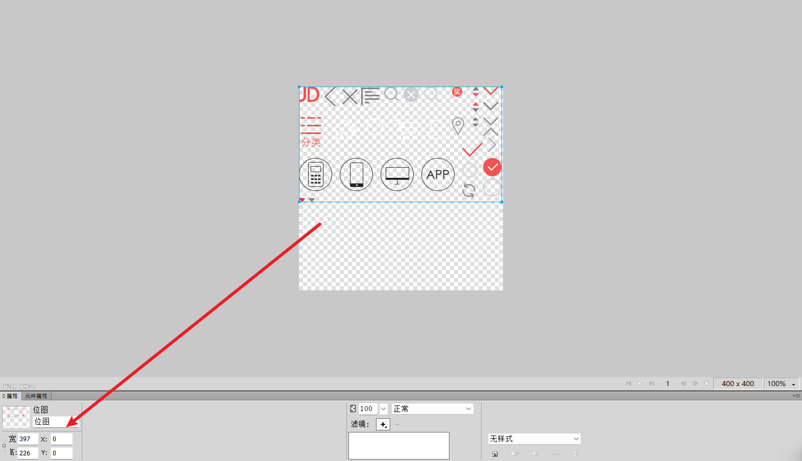
将宽度改为原来的一半如下:
点击指针指向的按钮后设置值就可以等比例的缩放了否则只是设置了单向的值
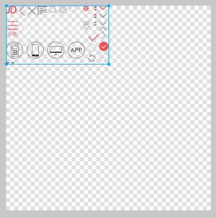
2 等比例缩放精灵图变小后测量改变之后的坐标
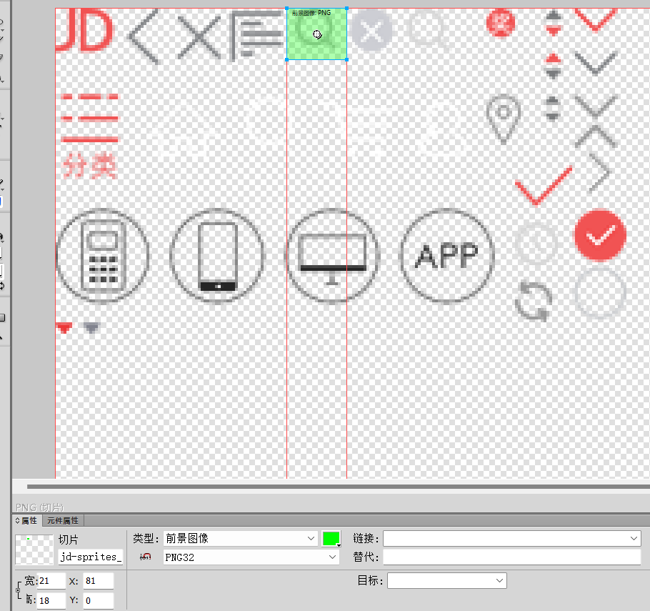
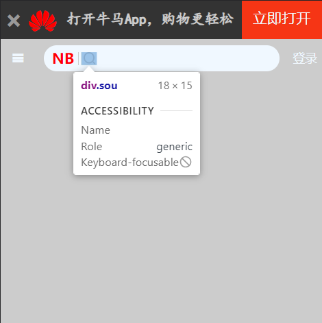
3 在代码中写上将精灵图缩放原来的一半
.sou { | |
position: absolute; | |
top: 8px; | |
left: 44px; | |
width: 18px; | |
height: 15px; | |
background: url(../image/jd-sprites.png) no-repeat -81px 0; | |
/* 这样设置的是整个图片的大小改变图片大小后上面就显示不出来了 */ | |
/* background-size: 18px 15px; */ | |
/* 完成二倍图缩放后第三步才可以设置如下操作 | |
缩放原来的一半 */ | |
background-size: 200px auto; | |
} |
项目结构:
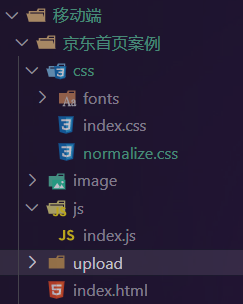
upload 存放样式背景图片
代码:
html
<!DOCTYPE html> | |
<html lang="en"> | |
<head> | |
<meta charset="UTF-8"> | |
<meta name="viewport" content="width=device-width, initial-scale=1.0, | |
user-scalable=no,maximun-scale=1.0,minimum-scale=1.0"> | |
<title>Document</title> | |
<link href="./css/normalize.css" rel="stylesheet"/> | |
<link rel="stylesheet" href="./css/index.css"/> | |
</head> | |
<body> | |
<!-- 顶部 --> | |
<header class="app"> | |
<ul> | |
<li></li> | |
<li></li> | |
<li>打开牛马App,购物更轻松</li> | |
<li>立即打开</li> | |
</ul> | |
</header> | |
<!-- 搜索 --> | |
<div class="search-wrap"> | |
<div class="search"> | |
<div class="sou"></div> | |
</div> | |
</div> | |
<!-- 主体内容部分 --> | |
<div class="main-content"> | |
<!-- 滑动图 --> | |
<div class="slider"> | |
<img src="./upload/a1.jpg" alt="商品"/> | |
</div> | |
<!-- 品牌日 --> | |
<div class="brand"> | |
<div> | |
<a href="#"> | |
<img src="./upload/pic11.dpg" alt=""/> | |
</a> | |
</div> | |
<div> | |
<a href="#"> | |
<img src="./upload/pic22.dpg" alt=""/> | |
</a> | |
</div> | |
<div> | |
<a href="#"> | |
<img src="./upload/pic33.dpg" alt=""/> | |
</a> | |
</div> | |
</div> | |
<!-- 导航部分 --> | |
<nav> | |
<a href="#"> | |
<img src="./upload/nav1.webp" alt=""/> | |
<span>京东超市</span> | |
</a> | |
<a href="#"> | |
<img src="./upload/nav1.webp" alt=""/> | |
<span>京东超市</span> | |
</a> | |
<a href="#"> | |
<img src="./upload/nav1.webp" alt=""/> | |
<span>京东超市</span> | |
</a> | |
<a href="#"> | |
<img src="./upload/nav1.webp" alt=""/> | |
<span>京东超市</span> | |
</a> | |
<a href="#"> | |
<img src="./upload/nav1.webp" alt=""/> | |
<span>京东超市</span> | |
</a> | |
<a href="#"> | |
<img src="./upload/nav1.webp" alt=""/> | |
<span>京东超市</span> | |
</a> | |
<a href="#"> | |
<img src="./upload/nav1.webp" alt=""/> | |
<span>京东超市</span> | |
</a> | |
<a href="#"> | |
<img src="./upload/nav1.webp" alt=""/> | |
<span>京东超市</span> | |
</a> | |
<a href="#"> | |
<img src="./upload/nav1.webp" alt=""/> | |
<span>京东超市</span> | |
</a> | |
<a href="#"> | |
<img src="./upload/nav1.webp" alt=""/> | |
<span>京东超市</span> | |
</a> | |
</nav> | |
<!-- 新闻模块 --> | |
<div class="news"> | |
<a href="#"> | |
<img src="./upload/new1.dpg" alt=""/> | |
</a> | |
<a href="#"> | |
<img src="./upload/new2.dpg" alt=""/> | |
</a> | |
<a href="#"> | |
<img src="./upload/new3.dpg" alt=""/> | |
</a> | |
</div> | |
</div> | |
<script src="./js/index.js"></script> | |
</body> | |
</html> |
css-index
@font-face { | |
font-family: 'icomoon'; | |
src: url('fonts/icomoon.eot?nzdx0k'); | |
src: url('fonts/icomoon.eot?nzdx0k#iefix') format('embedded-opentype'), | |
url('fonts/icomoon.ttf?nzdx0k') format('truetype'), | |
url('fonts/icomoon.woff?nzdx0k') format('woff'), | |
url('fonts/icomoon.svg?nzdx0k#icomoon') format('svg'); | |
font-weight: normal; | |
font-style: normal; | |
font-display: block; | |
} | |
img { | |
vertical-align: top; | |
} | |
body { | |
width: 100%; | |
max-width: 640px; | |
min-width: 320px; | |
margin: 0 auto; | |
font: 14px/1.5 -apple-system,Helvetica,sans-serif; | |
color: #666; | |
/* background-color: #ccc; */ | |
} | |
/* 顶部 */ | |
.app ul { | |
margin: 0; | |
padding: 0; | |
} | |
.app ul li { | |
list-style: none; | |
} | |
.app { | |
height: 45px; | |
} | |
.app ul li { | |
float: left; | |
height: 45px; | |
background-color: #333; | |
text-align: center; | |
} | |
.app ul li:first-child { | |
width: 8%; | |
&::after { | |
content: ''; | |
font-family: 'icomoon'; | |
line-height: 3.4; | |
color: #999; | |
} | |
} | |
.app ul li:nth-child(2) { | |
width: 10%; | |
&::after { | |
content: ''; | |
color: red; | |
font-family: 'icomoon'; | |
font-size: 32px; | |
} | |
} | |
.app ul li:nth-child(3) { | |
width: 57%; | |
font: bold 17px/2.5 楷体; | |
color: #ccc; | |
} | |
.app ul li:last-child { | |
width: 25%; | |
background-color: #F63515; | |
font: 17px/2.4 none; | |
color: aliceblue; | |
} | |
/* 搜索 */ | |
.search-wrap { | |
position: fixed; | |
height: 44px; | |
min-width: 320px; | |
max-width: 640px; | |
width: 100%; | |
overflow: hidden; | |
text-align: center; | |
line-height: 3.2; | |
&::after { | |
content: ''; | |
font-family: 'icomoon'; | |
position: absolute; | |
top: 0; | |
left: 0; | |
width: 40px; | |
height: 40px; | |
color: aliceblue; | |
} | |
&::before { | |
content: '登录'; | |
position: absolute; | |
top: 0; | |
right: 0; | |
width: 40px; | |
height: 40px; | |
color: aliceblue; | |
} | |
} | |
.search { | |
position: relative; | |
height: 30px; | |
background-color: aliceblue; | |
margin: 0 50px; | |
border-radius: 15px; | |
margin-top: 7px; | |
&::after { | |
content: 'NB'; | |
font: bold 17px/0.5 楷体; | |
font-family: 'icomoon'; | |
color: red; | |
position: absolute; | |
left: 10px; | |
top: 10px; | |
} | |
&::before { | |
content: ''; | |
position: absolute; | |
display: block; | |
left: 40px; | |
top: 8px; | |
width: 1px; | |
height: 15px; | |
background-color: #ccc; | |
} | |
} | |
.sou { | |
position: absolute; | |
top: 8px; | |
left: 44px; | |
width: 18px; | |
height: 15px; | |
background: url(../image/jd-sprites.png) no-repeat -81px 0; | |
/* 这样设置的是整个图片的大小改变图片大小后上面就显示不出来了 */ | |
/* background-size: 18px 15px; */ | |
/* 完成二倍图缩放后 search-wrap 第三步才可以设置如下操作 | |
缩放原来的一半 */ | |
background-size: 200px auto; | |
} | |
.slider img{ | |
width: 100%; | |
} | |
/* 品牌日 */ | |
.brand { | |
overflow: hidden; | |
border-radius: 10px 10px 0 0; | |
} | |
.brand div { | |
float: left; | |
width: calc(100% / 3); | |
} | |
.brand div img { | |
width: 100%; | |
} | |
/*nav 部分 */ | |
a { | |
color: #333; | |
text-decoration: none; | |
} | |
nav a { | |
width: 20%; | |
float: left; | |
text-align: center; | |
padding-top: 5px; | |
} | |
nav a img { | |
width: 40px; | |
margin: 10px 0; | |
} | |
nav a span { | |
display: block; | |
} | |
/* 新闻模块 */ | |
.news img { | |
width: 100%; | |
margin-top: 20px; | |
} | |
.news a { | |
float: left; | |
box-sizing: border-box; | |
} | |
.news a:first-child { | |
width: 50%; | |
} | |
.news a:nth-child(n+2) { | |
width: 25%; | |
border-left: 1px #ccc solid; | |
} |
css-normal
/*! normalize.css v8.0.1 | MIT License | github.com/necolas/normalize.css */ | |
/* Document | |
========================================================================== */ | |
/** | |
* 1. Correct the line height in all browsers. | |
* 2. Prevent adjustments of font size after orientation changes in iOS. | |
*/ | |
html { | |
line-height: 1.15; /* 1 */ | |
-webkit-text-size-adjust: 100%; /* 2 */ | |
} | |
/* Sections | |
========================================================================== */ | |
/** | |
* Remove the margin in all browsers. | |
*/ | |
body { | |
margin: 0; | |
} | |
/* 移动端添加 */ | |
* { | |
-webkit-tap-higlight-color: transparent; | |
} | |
/** | |
* Render the `main` element consistently in IE. | |
*/ | |
main { | |
display: block; | |
} | |
/** | |
* Correct the font size and margin on `h1` elements within `section` and | |
* `article` contexts in Chrome, Firefox, and Safari. | |
*/ | |
h1 { | |
font-size: 2em; | |
margin: 0.67em 0; | |
} | |
/* Grouping content | |
========================================================================== */ | |
/** | |
* 1. Add the correct box sizing in Firefox. | |
* 2. Show the overflow in Edge and IE. | |
*/ | |
hr { | |
box-sizing: content-box; /* 1 */ | |
height: 0; /* 1 */ | |
overflow: visible; /* 2 */ | |
} | |
/** | |
* 1. Correct the inheritance and scaling of font size in all browsers. | |
* 2. Correct the odd `em` font sizing in all browsers. | |
*/ | |
pre { | |
font-family: monospace, monospace; /* 1 */ | |
font-size: 1em; /* 2 */ | |
} | |
/* Text-level semantics | |
========================================================================== */ | |
/** | |
* Remove the gray background on active links in IE 10. | |
*/ | |
a { | |
background-color: transparent; | |
} | |
/** | |
* 1. Remove the bottom border in Chrome 57- | |
* 2. Add the correct text decoration in Chrome, Edge, IE, Opera, and Safari. | |
*/ | |
abbr[title] { | |
border-bottom: none; /* 1 */ | |
text-decoration: underline; /* 2 */ | |
text-decoration: underline dotted; /* 2 */ | |
} | |
/** | |
* Add the correct font weight in Chrome, Edge, and Safari. | |
*/ | |
b, | |
strong { | |
font-weight: bolder; | |
} | |
/** | |
* 1. Correct the inheritance and scaling of font size in all browsers. | |
* 2. Correct the odd `em` font sizing in all browsers. | |
*/ | |
code, | |
kbd, | |
samp { | |
font-family: monospace, monospace; /* 1 */ | |
font-size: 1em; /* 2 */ | |
} | |
/** | |
* Add the correct font size in all browsers. | |
*/ | |
small { | |
font-size: 80%; | |
} | |
/** | |
* Prevent `sub` and `sup` elements from affecting the line height in | |
* all browsers. | |
*/ | |
sub, | |
sup { | |
font-size: 75%; | |
line-height: 0; | |
position: relative; | |
vertical-align: baseline; | |
} | |
sub { | |
bottom: -0.25em; | |
} | |
sup { | |
top: -0.5em; | |
} | |
/* Embedded content | |
========================================================================== */ | |
/** | |
* Remove the border on images inside links in IE 10. | |
*/ | |
img { | |
border-style: none; | |
} | |
/* Forms | |
========================================================================== */ | |
/** | |
* 1. Change the font styles in all browsers. | |
* 2. Remove the margin in Firefox and Safari. | |
*/ | |
button, | |
input, | |
optgroup, | |
select, | |
textarea { | |
font-family: inherit; /* 1 */ | |
font-size: 100%; /* 1 */ | |
line-height: 1.15; /* 1 */ | |
margin: 0; /* 2 */ | |
} | |
/** | |
* Show the overflow in IE. | |
* 1. Show the overflow in Edge. | |
*/ | |
button, | |
input { /* 1 */ | |
overflow: visible; | |
} | |
/** | |
* Remove the inheritance of text transform in Edge, Firefox, and IE. | |
* 1. Remove the inheritance of text transform in Firefox. | |
*/ | |
button, | |
select { /* 1 */ | |
text-transform: none; | |
} | |
/** | |
* Correct the inability to style clickable types in iOS and Safari. | |
*/ | |
button, | |
[type="button"], | |
[type="reset"], | |
[type="submit"] { | |
-webkit-appearance: button; | |
} | |
/** | |
* Remove the inner border and padding in Firefox. | |
*/ | |
button::-moz-focus-inner, | |
[type="button"]::-moz-focus-inner, | |
[type="reset"]::-moz-focus-inner, | |
[type="submit"]::-moz-focus-inner { | |
border-style: none; | |
padding: 0; | |
} | |
/** | |
* Restore the focus styles unset by the previous rule. | |
*/ | |
button:-moz-focusring, | |
[type="button"]:-moz-focusring, | |
[type="reset"]:-moz-focusring, | |
[type="submit"]:-moz-focusring { | |
outline: 1px dotted ButtonText; | |
} | |
/** | |
* Correct the padding in Firefox. | |
*/ | |
fieldset { | |
padding: 0.35em 0.75em 0.625em; | |
} | |
/** | |
* 1. Correct the text wrapping in Edge and IE. | |
* 2. Correct the color inheritance from `fieldset` elements in IE. | |
* 3. Remove the padding so developers are not caught out when they zero out | |
* `fieldset` elements in all browsers. | |
*/ | |
legend { | |
box-sizing: border-box; /* 1 */ | |
color: inherit; /* 2 */ | |
display: table; /* 1 */ | |
max-width: 100%; /* 1 */ | |
padding: 0; /* 3 */ | |
white-space: normal; /* 1 */ | |
} | |
/** | |
* Add the correct vertical alignment in Chrome, Firefox, and Opera. | |
*/ | |
progress { | |
vertical-align: baseline; | |
} | |
/** | |
* Remove the default vertical scrollbar in IE 10+. | |
*/ | |
textarea { | |
overflow: auto; | |
} | |
/** | |
* 1. Add the correct box sizing in IE 10. | |
* 2. Remove the padding in IE 10. | |
*/ | |
[type="checkbox"], | |
[type="radio"] { | |
box-sizing: border-box; /* 1 */ | |
padding: 0; /* 2 */ | |
} | |
/** | |
* Correct the cursor style of increment and decrement buttons in Chrome. | |
*/ | |
[type="number"]::-webkit-inner-spin-button, | |
[type="number"]::-webkit-outer-spin-button { | |
height: auto; | |
} | |
/** | |
* 1. Correct the odd appearance in Chrome and Safari. | |
* 2. Correct the outline style in Safari. | |
*/ | |
[type="search"] { | |
-webkit-appearance: textfield; /* 1 */ | |
outline-offset: -2px; /* 2 */ | |
} | |
/** | |
* Remove the inner padding in Chrome and Safari on macOS. | |
*/ | |
[type="search"]::-webkit-search-decoration { | |
-webkit-appearance: none; | |
} | |
/** | |
* 1. Correct the inability to style clickable types in iOS and Safari. | |
* 2. Change font properties to `inherit` in Safari. | |
*/ | |
::-webkit-file-upload-button { | |
-webkit-appearance: button; /* 1 */ | |
font: inherit; /* 2 */ | |
} | |
/* Interactive | |
========================================================================== */ | |
/* | |
* Add the correct display in Edge, IE 10+, and Firefox. | |
*/ | |
details { | |
display: block; | |
} | |
/* | |
* Add the correct display in all browsers. | |
*/ | |
summary { | |
display: list-item; | |
} | |
/* Misc | |
========================================================================== */ | |
/** | |
* Add the correct display in IE 10+. | |
*/ | |
template { | |
display: none; | |
} | |
/** | |
* Add the correct display in IE 10. | |
*/ | |
[hidden] { | |
display: none; | |
} |
js-index
setInterval(fun,2000); | |
let img = document.querySelector('.slider img'); | |
let i = 0; | |
function fun(){ | |
i ++; | |
img.src = './upload/a'+i+'.jpg' | |
if(i == 3) | |
i = 0 | |
} |
效果: